


Hello friends, today in this blog you’ll learn to Create a Responsive Watches E-commerce Website Design Using HTML CSS & JavaScript. We’ll use HTML CSS and JavaScript to create this awesome Watches E-commerce Website. Build a complete responsive online Watches E-commerce website design step by step.
Features of Responsive Watches Website Design
- Responsive Watches Website Using HTML CSS & JavaScript.
- Smooth scrolling in each section.
- Includes a dark and light mode.
- Compatible with all mobile devices and with a beautiful and pleasant user interface.
What should you know before you start?
- HTML
- CSS
- JavaScript
Steps of Creating Watches E-commerce Website design
- Project Setup
- Variables CSS
- Reset HTML & Reusable CSS Classes
- Header & Nav Menu
- Home
- Buttons
- Change Background Header
- Featured
- Story
- Products
- Testimonial
- New
- Newsletter
- Footer
- Scroll Sections Active Link
- Scroll Up
- Scroll Bar
- Cart
- Dark/Light Theme
- Breakpoints For Responsive design
Watches E-commerce Website Design
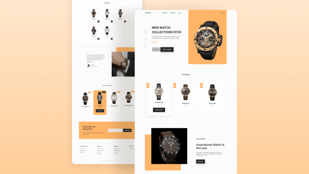
Now start the design. the first step is Project setup. So Create a folder Responsive Watches Website. You can see below, our project’s folder structure.

in index.html file link CSS and js file
<!DOCTYPE html>
    <html lang="en">
    <head>
        <meta charset="UTF-8">
        <meta name="viewport" content="width=device-width, initial-scale=1.0">

         <!--=============== FAVICON ===============-->
        <link rel="shortcut icon" href="assets/img/favicon.png" type="image/x-icon">

        <!--=============== BOXICONS ===============-->
        <link rel="stylesheet" href="https://cdn.jsdelivr.net/npm/boxicons@latest/css/boxicons.min.css">

        <!--=============== SWIPER CSS ===============-->
        <link rel="stylesheet" href="assets/css/swiper-bundle.min.css">

        <!--=============== CSS ===============-->
        <link rel="stylesheet" href="assets/css/styles.css">

        <title>Responsive watches website - Bedimcode</title>
    </head>
    <body>
        <!--==================== HEADER ====================-->
        <header class="header" id="header">
        </header>

        <!--==================== CART ====================-->
        <div class="cart" id="cart">
        </div>

        <main class="main">
            <!--==================== HOME ====================-->
            <section class="home" id="home">

            </section>

            <!--==================== FEATURED ====================-->
            <section class="featured section container" id="featured">

            </section>

            <!--==================== STORY ====================-->
            <section class="story section container">

            </section>

            <!--==================== PRODUCTS ====================-->
            <section class="products section container" id="products">

            </section>

            <!--==================== TESTIMONIAL ====================-->
            <section class="testimonial section container">

            </section>

            <!--==================== NEW ====================-->
            <section class="new section container" id="new">

            </section>

            <!--==================== NEWSLETTER ====================-->
            <section class="newsletter section container">

            </section>
        </main>

        <!--==================== FOOTER ====================-->
        <footer class="footer section">
        </footer>

        <!--=============== SCROLL UP ===============-->


        <!--=============== SWIPER JS ===============-->
        <script src="assets/js/swiper-bundle.min.js"></script>

        <!--=============== MAIN JS ===============-->
        <script src="assets/js/main.js"></script>    </body>
</html>
Now In the styles.css file, we need do to define some CSS Variables. A CSS Variables is Custom properties (sometimes referred to as CSS variables or cascading variables) are entities defined by CSS authors that contain specific values to be reused throughout a document.
/*=============== GOOGLE FONTS ===============*/
@import url("https://fonts.googleapis.com/css2?family=Roboto:wght@400;500;700&display=swap");

/*=============== VARIABLES CSS ===============*/
:root {
  --header-height: 3.5rem;

  /*========== Colors ==========*/
  --first-color: hsl(31, 100%, 70%);
  --button-color: hsl(0, 0%, 17%);
  --button-color-alt: hsl(0, 0%, 21%);
  --title-color: hsl(0, 0%, 15%);
  --text-color: hsl(0, 0%, 35%);
  --text-color-light: hsl(0, 0%, 55%);
  --body-color: hsl(0, 0%, 99%);
  --container-color: #fff;
  --border-color: hsl(0, 0%, 94%);

  /*========== Font and typography ==========*/
  --body-font: 'Roboto', sans-serif;
  --biggest-font-size: 2rem;
  --h1-font-size: 1.5rem;
  --h2-font-size: 1.25rem;
  --h3-font-size: 1rem;
  --normal-font-size: .938rem;
  --small-font-size: .813rem;
  --smaller-font-size: .75rem;

  /*========== Font weight ==========*/
  --font-medium: 500;
  --font-bold: 700;

  /*========== Margenes Bottom ==========*/
  --mb-0-5: .5rem;
  --mb-0-75: .75rem;
  --mb-1: 1rem;
  --mb-1-5: 1.5rem;
  --mb-2: 2rem;
  --mb-2-5: 2.5rem;
  --mb-3: 3rem;

  /*========== z index ==========*/
  --z-tooltip: 10;
  --z-fixed: 100;
}

@media screen and (min-width: 968px) {
  :root {
    --biggest-font-size: 2.5rem;
    --h1-font-size: 2.25rem;
    --h2-font-size: 1.5rem;
    --h3-font-size: 1.25rem;
    --normal-font-size: 1rem;
    --small-font-size: .875rem;
    --smaller-font-size: .813rem;
  }
}
Reset HTML & Reusable CSS Classes
/*=============== BASE ===============*/
* {
  box-sizing: border-box;
  padding: 0;
  margin: 0;
}

html {
  scroll-behavior: smooth;
}

body,
button,
input {
  font-family: var(--body-font);
  font-size: var(--normal-font-size);
}

body {
  margin: 0;
  background-color: var(--body-color);
  color: var(--text-color);
  /*For animation dark mode*/
  transition: .4s;
}

h1, h2, h3, h4 {
  color: var(--title-color);
  font-weight: var(--font-medium);
}

ul {
  list-style: none;
}

a {
  text-decoration: none;
}

img {
  max-width: 100%;
  height: auto;
}

button {
  cursor: pointer;
  border: none;
  outline: none;
}
/*=============== REUSABLE CSS CLASSES ===============*/
.container {
  max-width: 1024px;
  margin-left: var(--mb-1-5);
  margin-right: var(--mb-1-5);
}

.grid {
  display: grid;
}

.main {
  overflow: hidden;
}

.section {
  padding: 6.5rem 0 1rem;
}

.section__title {
  position: relative;
  font-size: var(--h3-font-size);
  margin-bottom: var(--mb-3);
  text-transform: uppercase;
  letter-spacing: 2px;
  text-align: center;
}

.section__title::before {
  content: '';
  position: absolute;
  top: -1rem;
  left: 0;
  right: 0;
  margin: 0 auto;
  width: 67px;
  height: 1px;
  background-color: var(--first-color);
}
Now we Create Header
<!--==================== HEADER ====================-->
        <header class="header" id="header">
            <nav class="nav container">
                <a href="#" class="nav__logo">
                    <i class='bx bxs-watch nav__logo-icon'></i> Rolex
                </a>

                <div class="nav__menu" id="nav-menu">
                    <ul class="nav__list">
                        <li class="nav__item">
                            <a href="#home" class="nav__link active-link">Home</a>
                        </li>
                        <li class="nav__item">
                            <a href="#featured" class="nav__link">Featured</a>
                        </li>
                        <li class="nav__item">
                            <a href="#products" class="nav__link">Products</a>
                        </li>
                        <li class="nav__item">
                            <a href="#new" class="nav__link">New</a>
                        </li>
                    </ul>

                    <div class="nav__close" id="nav-close">
                        <i class='bx bx-x' ></i>
                    </div>
                </div>

                <div class="nav__btns">
                    <!-- Theme change button -->
                    <i class='bx bx-moon change-theme' id="theme-button"></i>

                    <div class="nav__shop" id="cart-shop">
                        <i class='bx bx-shopping-bag' ></i>
                    </div>

                    <div class="nav__toggle" id="nav-toggle">
                        <i class='bx bx-grid-alt' ></i>
                    </div>
                </div>
            </nav>
        </header>
/*=============== HEADER & NAV ===============*/
.header {
  width: 100%;
  background: transparent;
  position: fixed;
  top: 0;
  left: 0;
  z-index: var(--z-fixed);
  /*For animation dark mode*/
  transition: .4s;
}

.nav {
  height: var(--header-height);
  display: flex;
  justify-content: space-between;
  align-items: center;
}

.nav__logo,
.nav__toggle,
.nav__shop,
.nav__close {
  color: var(--title-color);
}

.nav__logo {
  text-transform: uppercase;
  font-weight: var(--font-bold);
  letter-spacing: 1px;
  display: inline-flex;
  align-items: center;
  column-gap: .25rem;
}

.nav__logo-icon {
  font-size: 1.25rem;
}

.nav__btns {
  display: flex;
  align-items: center;
  column-gap: 1rem;
}

.nav__toggle,
.nav__shop {
  font-size: 1.25rem;
  cursor: pointer;
}

@media screen and (max-width: 767px) {
  .nav__menu {
    position: fixed;
    background-color: var(--body-color);
    top: 0;
    right: -100%;
    width: 100%;
    height: 100%;
    padding: 6rem 2rem 3.5rem;
    transition: .3s;
  }
}

.nav__list {
  display: flex;
  flex-direction: column;
  align-items: center;
  row-gap: 2rem;
}

.nav__link {
  color: var(--title-color);
  font-weight: var(--font-medium);
  text-transform: uppercase;
  font-size: var(--h2-font-size);
  transition: .3s;
}

.nav__link:hover {
  color: var(--first-color);
}

.nav__close {
  font-size: 2rem;
  position: absolute;
  top: .9rem;
  right: 1.25rem;
  cursor: pointer;
}

/* Show menu */
.show-menu {
  right: 0;
}

/* Change background header */
.scroll-header {
  background-color: var(--body-color);
  box-shadow: 0 1px 4px hsla(0, 4%, 15%, .10);
}

/* Active link */
.active-link {
  color: var(--first-color);
}
Creating Cart section
<!--==================== CART ====================-->
        <div class="cart" id="cart">
            <i class='bx bx-x cart__close' id="cart-close"></i>

            <h2 class="cart__title-center">My Cart</h2>

            <div class="cart__container">
                <article class="cart__card">
                    <div class="cart__box">
                        <img src="assets/img/featured1.png" alt="" class="cart__img">
                    </div>

                    <div class="cart__details">
                        <h3 class="cart__title">Jazzmaster</h3>
                        <span class="cart__price">$1050</span>

                        <div class="cart__amount">
                            <div class="cart__amount-content">
                                <span class="cart__amount-box">
                                    <i class='bx bx-minus' ></i>
                                </span>

                                <span class="cart__amount-number">1</span>

                                <span class="cart__amount-box">
                                    <i class='bx bx-plus' ></i>
                                </span>
                            </div>

                            <i class='bx bx-trash-alt cart__amount-trash' ></i>
                        </div>
                    </div>
                </article>

                <article class="cart__card">
                    <div class="cart__box">
                        <img src="assets/img/featured3.png" alt="" class="cart__img">
                    </div>

                    <div class="cart__details">
                        <h3 class="cart__title">Rose Gold</h3>
                        <span class="cart__price">$850</span>

                        <div class="cart__amount">
                            <div class="cart__amount-content">
                                <span class="cart__amount-box">
                                    <i class='bx bx-minus' ></i>
                                </span>

                                <span class="cart__amount-number">1</span>

                                <span class="cart__amount-box">
                                    <i class='bx bx-plus' ></i>
                                </span>
                            </div>

                            <i class='bx bx-trash-alt cart__amount-trash' ></i>
                        </div>
                    </div>
                </article>

                <article class="cart__card">
                    <div class="cart__box">
                        <img src="assets/img/new1.png" alt="" class="cart__img">
                    </div>

                    <div class="cart__details">
                        <h3 class="cart__title">Longines Rose</h3>
                        <span class="cart__price">$980</span>

                        <div class="cart__amount">
                            <div class="cart__amount-content">
                                <span class="cart__amount-box">
                                    <i class='bx bx-minus' ></i>
                                </span>

                                <span class="cart__amount-number">1</span>

                                <span class="cart__amount-box">
                                    <i class='bx bx-plus' ></i>
                                </span>
                            </div>

                            <i class='bx bx-trash-alt cart__amount-trash' ></i>
                        </div>
                    </div>
                </article>
            </div>

            <div class="cart__prices">
                <span class="cart__prices-item">3 items</span>
                <span class="cart__prices-total">$2880</span>
            </div>
        </div>
/*=============== CART ===============*/
.cart {
position: fixed;
background-color: var(--body-color);
z-index: var(--z-fixed);
width: 100%;
height: 100%;
top: 0;
right: -100%;
padding: 3.5rem 2rem;
transition: .4s;
}
.cart__title-center {
font-size: var(--h2-font-size);
text-align: center;
margin-bottom: var(--mb-3);
}
.cart__close {
font-size: 2rem;
color: var(--title-color);
position: absolute;
top: 1.25rem;
right: .9rem;
cursor: pointer;
}
.cart__container {
display: grid;
row-gap: 1.5rem;
}
.cart__card {
display: flex;
align-items: center;
column-gap: 1rem;
}
.cart__box {
background-color: var(--container-color);
padding: .75rem 1.25rem;
border: 1px solid var(--border-color);
}
.cart__img {
width: 50px;
}
.cart__title {
font-size: var(--normal-font-size);
margin-bottom: .5rem;
}
.cart__price {
display: block;
font-size: var(--small-font-size);
color: var(--first-color);
margin-bottom: var(--mb-1-5);
}
.cart__amount,
.cart__amount-content{
display: flex;
align-items: center;
}
.cart__amount{
column-gap: 3rem;
}
.cart__amount-content{
column-gap: 1rem;
}
.cart__amount-box {
display: inline-flex;
padding: .25rem;
background-color: var(--container-color);
border: 1px solid var(--border-color);
cursor: pointer;
}
.cart__amount-trash {
font-size: 1.15rem;
color: var(--first-color);
cursor: pointer;
}
.cart__prices {
margin-top: 6rem;
display: flex;
justify-content: space-between;
}
.cart__prices-item,
.cart__prices-total {
color: var(--title-color);
}
.cart__prices-item {
font-size: var(--small-font-size);
}
.cart__prices-total {
font-size: var(--h3-font-size);
font-weight: var(--font-medium);
}
/* Show cart */
.show-cart {
right: 0;
}Home Section
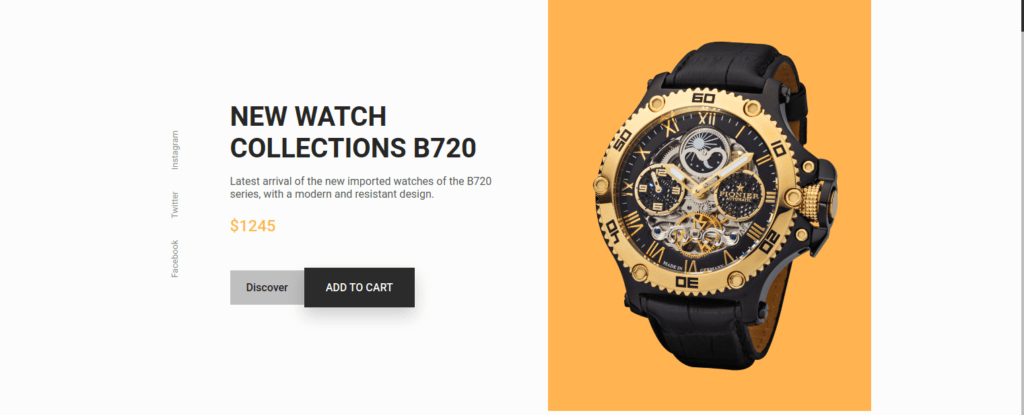
<!--==================== HOME ====================-->
            <section class="home" id="home">
                <div class="home__container container grid">
                    <div class="home__img-bg">
                        <img src="assets/img/home.png" alt="" class="home__img">
                    </div>

                    <div class="home__social">
                        <a href="https://www.facebook.com/" target="_blank" class="home__social-link">
                            Facebook
                        </a>
                        <a href="https://twitter.com/" target="_blank" class="home__social-link">
                            Twitter
                        </a>
                        <a href="https://www.instagram.com/" target="_blank" class="home__social-link">
                            Instagram
                        </a>
                    </div>

                    <div class="home__data">
                        <h1 class="home__title">NEW WATCH <br> COLLECTIONS B720</h1>
                        <p class="home__description">
                            Latest arrival of the new imported watches of the B720 series,
                            with a modern and resistant design.
                        </p>
                        <span class="home__price">$1245</span>

                        <div class="home__btns">
                            <a href="#" class="button button--gray button--small">
                                Discover
                            </a>

                            <button class="button home__button">ADD TO CART</button>
                        </div>
                    </div>
                </div>
            </section>
/*=============== HOME ===============*/
.home__container {
position: relative;
row-gap: 2.5rem;
}
.home__img {
width: 240px;
}
.home__img-bg {
background-color: var(--first-color);
width: 258px;
height: 430px;
padding-bottom: 2rem;
display: flex;
justify-content: center;
align-items: flex-end;
justify-self: flex-end;
transform: translateX(1.5rem);
}
.home__social {
position: absolute;
top: 35%;
left: -5rem;
transform: rotate(-90deg);
display: flex;
column-gap: 1rem;
}
.home__social-link {
font-size: var(--smaller-font-size);
color: var(--text-color-light);
transition: .3s;
}
.home__social-link:hover {
color: var(--title-color);
}
.home__title {
font-size: var(--biggest-font-size);
font-weight: var(--font-bold);
margin-bottom: var(--mb-1);
}
.home__description {
margin-bottom: var(--mb-1-5);
}
.home__price {
display: inline-block;
font-size: var(--h2-font-size);
font-weight: var(--font-medium);
color: var(--first-color);
margin-bottom: var(--mb-3);
}
.home__btns {
display: flex;
align-items: center;
}
.home__button {
box-shadow: 0 12px 24px hsla(0, 0%, 10%, .2);
}
FEATURED Section
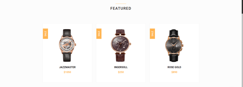
            <!--==================== FEATURED ====================-->
            <section class="featured section container" id="featured">
                <h2 class="section__title">
                    Featured
                </h2>

                <div class="featured__container grid">
                    <article class="featured__card">
                        <span class="featured__tag">Sale</span>

                        <img src="assets/img/featured1.png" alt="" class="featured__img">

                        <div class="featured__data">
                            <h3 class="featured__title">Jazzmaster</h3>
                            <span class="featured__price">$1050</span>
                        </div>

                        <button class="button featured__button">ADD TO CART</button>
                    </article>

                    <article class="featured__card">
                        <span class="featured__tag">Sale</span>

                        <img src="assets/img/featured2.png" alt="" class="featured__img">

                        <div class="featured__data">
                            <h3 class="featured__title">Ingersoll</h3>
                            <span class="featured__price">$250</span>
                        </div>

                        <button class="button featured__button">ADD TO CART</button>
                    </article>

                    <article class="featured__card">
                        <span class="featured__tag">Sale</span>

                        <img src="assets/img/featured3.png" alt="" class="featured__img">

                        <div class="featured__data">
                            <h3 class="featured__title">Rose gold</h3>
                            <span class="featured__price">$890</span>
                        </div>

                        <button class="button featured__button">ADD TO CART</button>
                    </article>
                </div>
            </section>
/*=============== FEATURED ===============*/
.featured__container {
row-gap: 2.5rem;
}
.featured__card {
position: relative;
text-align: center;
background-color: var(--container-color);
padding-top: 2rem;
border: 1px solid var(--border-color);
overflow-y: hidden;
transition: .3s;
}
.featured__tag {
background-color: var(--first-color);
padding: .5rem 1rem;
color: #fff;
text-transform: uppercase;
font-size: var(--small-font-size);
font-weight: var(--font-medium);
position: absolute;
transform: rotate(-90deg);
left: -1rem;
top: 3rem;
}
.featured__img {
height: 214px;
margin-bottom: var(--mb-1);
}
.featured__title,
.featured__price {
font-size: var(--h3-font-size);
font-weight: var(--font-bold);
}
.featured__title {
text-transform: uppercase;
margin-bottom: var(--mb-0-75);
}
.featured__price {
display: block;
color: var(--first-color);
transition: .3s;
}
.featured__button {
font-size: var(--small-font-size);
transform: translateY(1rem);
opacity: 0;
}
.featured__card:hover {
box-shadow: 0 12px 32px hsla(0, 0%, 20%, .1);
padding: 2rem 0 3rem 0;
}
.featured__card:hover .featured__button {
transform: translateY(0);
opacity: 1;
}
.featured__card:hover .featured__price {
margin-bottom: var(--mb-1-5);
}
Our Story Section
            <!--==================== STORY ====================-->
            <section class="story section container">
                <div class="story__container grid">
                    <div class="story__data">
                        <h2 class="section__title story__section-title">
                            Our Story
                        </h2>

                        <h1 class="story__title">
                            Inspirational Watch of <br> this year
                        </h1>

                        <p class="story__description">
                            The latest and modern watches of this year, is available in various
                            presentations in this store, discover them now.
                        </p>

                        <a href="#" class="button button--small">Discover</a>
                    </div>

                    <div class="story__images">
                        <img src="assets/img/story.png" alt="" class="story__img">
                        <div class="story__square"></div>
                    </div>
                </div>
            </section>
/*=============== STORY ===============*/
.story__container {
row-gap: 7.5rem;
}
.story__title {
font-size: var(--h1-font-size);
margin-bottom: var(--mb-1);
}
.story__description {
margin-bottom: var(--mb-2-5);
}
.story__images {
position: relative;
}
.story__img,
.story__square {
width: 250px;
}
.story__square {
height: 250px;
background-color: var(--first-color);
}
.story__img {
position: absolute;
left: 3rem;
top: -3rem;
}
Products Section
<!--==================== PRODUCTS ====================-->
            <section class="products section container" id="products">
                <h2 class="section__title">
                    Products
                </h2>

                <div class="products__container grid">
                    <article class="products__card">
                        <img src="assets/img/product1.png" alt="" class="products__img">

                        <h3 class="products__title">Spirit rose</h3>
                        <span class="products__price">$1500</span>

                        <button class="products__button">
                            <i class='bx bx-shopping-bag'></i>
                        </button>
                    </article>

                    <article class="products__card">
                        <img src="assets/img/product2.png" alt="" class="products__img">

                        <h3 class="products__title">Khaki pilot</h3>
                        <span class="products__price">$1350</span>

                        <button class="products__button">
                            <i class='bx bx-shopping-bag'></i>
                        </button>
                    </article>

                    <article class="products__card">
                        <img src="assets/img/product3.png" alt="" class="products__img">

                        <h3 class="products__title">Jubilee black</h3>
                        <span class="products__price">$870</span>

                        <button class="products__button">
                            <i class='bx bx-shopping-bag'></i>
                        </button>
                    </article>

                    <article class="products__card">
                        <img src="assets/img/product4.png" alt="" class="products__img">

                        <h3 class="products__title">Fosil me3</h3>
                        <span class="products__price">$650</span>

                        <button class="products__button">
                            <i class='bx bx-shopping-bag'></i>
                        </button>
                    </article>

                    <article class="products__card">
                        <img src="assets/img/product5.png" alt="" class="products__img">

                        <h3 class="products__title">Duchen</h3>
                        <span class="products__price">$950</span>

                        <button class="products__button">
                            <i class='bx bx-shopping-bag'></i>
                        </button>
                    </article>
                </div>
            </section>
/*=============== PRODUCTS ===============*/
.products__container {
grid-template-columns: repeat(2, 1fr);
gap: 2rem;
}
.products__card {
position: relative;
background-color: var(--container-color);
padding: 1.25rem 0;
border: 1px solid var(--border-color);
text-align: center;
transition: .3s;
}
.products__img {
height: 125px;
margin-bottom: var(--mb-1);
}
.products__title,
.products__price {
font-size: var(--small-font-size);
font-weight: var(--font-medium);
}
.products__title {
text-transform: uppercase;
margin-bottom: var(--mb-0-5);
}
.products__price {
color: var(--first-color);
}
.products__button {
background-color: var(--button-color);
padding: .4rem;
color: #fff;
font-size: 1rem;
position: absolute;
right: 0;
bottom: 0;
transition: .3s;
}
.products__button:hover {
background-color: var(--button-color-alt);
}
.products__card:hover {
box-shadow: 0 8px 32px hsla(0, 0%, 10%, .1);
}
TESTIMONIAL Section
 <!--==================== TESTIMONIAL ====================-->
            <section class="testimonial section container">
                <div class="testimonial__container grid">
                    <div class="swiper testimonial-swiper">
                        <div class="swiper-wrapper">
                            <div class="testimonial__card swiper-slide">
                                <div class="testimonial__quote">
                                    <i class='bx bxs-quote-alt-left' ></i>
                                </div>
                                <p class="testimonial__description">
                                    They are the best watches that one acquires, also they are always with the latest
                                    news and trends, with a very comfortable price and especially with the attention
                                    you receive, they are always attentive to your questions.
                                </p>
                                <h3 class="testimonial__date">March 27. 2021</h3>

                                <div class="testimonial__perfil">
                                    <img src="assets/img/testimonial1.jpg" alt="" class="testimonial__perfil-img">

                                    <div class="testimonial__perfil-data">
                                        <span class="testimonial__perfil-name">Lee Doe</span>
                                        <span class="testimonial__perfil-detail">Director of a company</span>
                                    </div>
                                </div>
                            </div>

                            <div class="testimonial__card swiper-slide">
                                <div class="testimonial__quote">
                                    <i class='bx bxs-quote-alt-left' ></i>
                                </div>
                                <p class="testimonial__description">
                                    They are the best watches that one acquires, also they are always with the latest
                                    news and trends, with a very comfortable price and especially with the attention
                                    you receive, they are always attentive to your questions.
                                </p>
                                <h3 class="testimonial__date">March 27. 2021</h3>

                                <div class="testimonial__perfil">
                                    <img src="assets/img/testimonial2.jpg" alt="" class="testimonial__perfil-img">

                                    <div class="testimonial__perfil-data">
                                        <span class="testimonial__perfil-name">Samantha Mey</span>
                                        <span class="testimonial__perfil-detail">Director of a company</span>
                                    </div>
                                </div>
                            </div>

                            <div class="testimonial__card swiper-slide">
                                <div class="testimonial__quote">
                                    <i class='bx bxs-quote-alt-left' ></i>
                                </div>
                                <p class="testimonial__description">
                                    They are the best watches that one acquires, also they are always with the latest
                                    news and trends, with a very comfortable price and especially with the attention
                                    you receive, they are always attentive to your questions.
                                </p>
                                <h3 class="testimonial__date">March 27. 2021</h3>

                                <div class="testimonial__perfil">
                                    <img src="assets/img/testimonial3.jpg" alt="" class="testimonial__perfil-img">

                                    <div class="testimonial__perfil-data">
                                        <span class="testimonial__perfil-name">Raul Zaman</span>
                                        <span class="testimonial__perfil-detail">Director of a company</span>
                                    </div>
                                </div>
                            </div>
                        </div>

                        <div class="swiper-button-next">
                            <i class='bx bx-right-arrow-alt' ></i>
                        </div>
                        <div class="swiper-button-prev">
                            <i class='bx bx-left-arrow-alt' ></i>
                        </div>
                    </div>

                    <div class="testimonial__images">
                        <div class="testimonial__square"></div>
                        <img src="assets/img/testimonial.png" alt="" class="testimonial__img">
                    </div>
                </div>
            </section>
/*=============== TESTIMONIAL ===============*/
.testimonial__container {
row-gap: 4rem;
}
.testimonial__quote {
display: inline-flex;
background-color: var(--container-color);
padding: .5rem .75rem;
font-size: 1.5rem;
color: var(--first-color);
box-shadow: 0 4px 12px hsla(0, 0%, 20%, .1);
margin-bottom: var(--mb-2);
}
.testimonial__description {
margin-bottom: var(--mb-1);
}
.testimonial__date {
font-size: var(--normal-font-size);
margin-bottom: var(--mb-2);
}
.testimonial__perfil {
display: flex;
align-items: center;
column-gap: 1rem;
margin-bottom: 7rem;
}
.testimonial__perfil-img {
width: 60px;
height: 60px;
border-radius: 3rem;
}
.testimonial__perfil-data {
display: flex;
flex-direction: column;
row-gap: .5rem;
}
.testimonial__perfil-name {
font-size: var(--h3-font-size);
font-weight: var(--font-medium);
color: var(--title-color);
}
.testimonial__perfil-detail {
font-size: var(--small-font-size);
}
.testimonial__images {
position: relative;
}
.testimonial__img,
.testimonial__square {
width: 250px;
}
.testimonial__square {
height: 250px;
background-color: var(--first-color);
margin-left: auto;
}
.testimonial__img {
position: absolute;
right: 2rem;
top: 3rem;
}
.testimonial-swiper {
margin-left: initial;
margin-right: initial;
}
.swiper-button-prev:after,
.swiper-button-next:after {
content: '';
}
/* Swiper class */
.swiper-button-next,
.swiper-button-prev {
top: initial;
bottom: 5%;
width: initial;
height: initial;
background-color: var(--container-color);
box-shadow: 0 4px 12px hsla(0, 0%, 20%, .1);
padding: .25rem;
font-size: 1.5rem;
color: var(--first-color);
}
.swiper-button-next {
right: initial;
left: 4rem;
}

NEW ARRIVALS Section
<!--==================== NEW ====================-->
            <section class="new section container" id="new">
                <h2 class="section__title">
                    New Arrivals
                </h2>

                <div class="new__container">
                    <div class="swiper new-swiper">
                        <div class="swiper-wrapper">
                            <article class="new__card swiper-slide">
                                <span class="new__tag">New</span>

                                <img src="assets/img/new1.png" alt="" class="new__img">

                                <div class="new__data">
                                    <h3 class="new__title">Longines rose</h3>
                                    <span class="new__price">$980</span>
                                </div>

                                <button class="button new__button">ADD TO CART</button>
                            </article>

                            <article class="new__card swiper-slide">
                                <span class="new__tag">New</span>

                                <img src="assets/img/new2.png" alt="" class="new__img">

                                <div class="new__data">
                                    <h3 class="new__title">Jazzmaster</h3>
                                    <span class="new__price">$1150</span>
                                </div>

                                <button class="button new__button">ADD TO CART</button>
                            </article>

                            <article class="new__card swiper-slide">
                                <span class="new__tag">New</span>

                                <img src="assets/img/new3.png" alt="" class="new__img">

                                <div class="new__data">
                                    <h3 class="new__title">Dreyfuss gold</h3>
                                    <span class="new__price">$750</span>
                                </div>

                                <button class="button new__button">ADD TO CART</button>
                            </article>

                            <article class="new__card swiper-slide">
                                <span class="new__tag">New</span>

                                <img src="assets/img/new4.png" alt="" class="new__img">

                                <div class="new__data">
                                    <h3 class="new__title">Portuguese rose</h3>
                                    <span class="new__price">$1590</span>
                                </div>

                                <button class="button new__button">ADD TO CART</button>
                            </article>
                        </div>
                    </div>
                </div>
            </section>
/*=============== NEW ===============*/
.new__card {
  position: relative;
  text-align: center;
  background-color: var(--container-color);
  padding-top: 2rem;
  border: 1px solid var(--border-color);
  overflow-y: hidden;
  transition: .3s;
}

.new__tag {
  background-color: var(--first-color);
  padding: .5rem 1rem;
  color: #fff;
  text-transform: uppercase;
  font-size: var(--small-font-size);
  font-weight: var(--font-medium);
  position: absolute;
  top: 1rem;
  right: 1rem;
  transition: .3s;
}

.new__img {
  height: 215px;
  margin-bottom: var(--mb-1);
}

.new__title,
.new__price {
  font-size: var(--h3-font-size);
  font-weight: var(--font-bold);
}

.new__title {
  text-transform: uppercase;
  margin-bottom: var(--mb-0-75);
}

.new__price {
  display: block;
  color: var(--first-color);
  transition: .3s;
}

.new__button {
  font-size: var(--small-font-size);
  transform: translateY(1rem);
  opacity: 0;
}

.new__card:hover {
  background-color: var(--first-color);
  box-shadow: 0 12px 32px hsla(0, 0%, 20%, .1);
  padding: 2rem 0 3rem 0;
}

.new__card:hover .new__tag {
  background-color: var(--button-color);
}

.new__card:hover .new__button {
  transform: translateY(0);
  opacity: 1;
}

.new__card:hover .new__title {
  color: hsl(0, 0%, 15%);
}

.new__card:hover .new__price {
  color: hsl(0, 0%, 15%);
  margin-bottom: var(--mb-1-5);
}

NEWSLETTER Section
<section class="newsletter section container">
                <div class="newsletter__bg grid">
                    <div>
                        <h2 class="newsletter__title">Subscribe Our <br> Newsletter</h2>
                        <p class="newsletter__description">
                            Don't miss out on your discounts. Subscribe to our email
                            newsletter to get the best offers, discounts, coupons,
                            gifts and much more.
                        </p>
                    </div>

                    <form action="" class="newsletter__subscribe">
                        <input type="email" placeholder="Enter your email" class="newsletter__input">
                        <button class="button">
                            SUBSCRIBE
                        </button>
                    </form>
                </div>
            </section>
/*=============== NEWSLETTER ===============*/
.newsletter__bg {
background-color: var(--first-color);
padding: 3rem 1.5rem;
text-align: center;
row-gap: 2.5rem;
}
.newsletter__title {
font-size: var(--h1-font-size);
color: hsl(0, 0%, 15%);
margin-bottom: var(--mb-1-5);
}
.newsletter__description {
color: hsl(0, 0%, 35%);
}
.newsletter__subscribe {
display: flex;
flex-direction: column;
row-gap: .75rem;
}
.newsletter__input {
border: none;
outline: none;
background-color: hsl(0, 0%, 94%);
padding: 1.25rem 1rem;
color: hsl(0, 0%, 15%);
}

FOOTER Section
<!--==================== FOOTER ====================-->
<footer class="footer section">
<div class="footer__container container grid">
<div class="footer__content">
<h3 class="footer__title">Our information</h3>
<ul class="footer__list">
<li>1234 - Peru</li>
<li>La Libertad 43210</li>
<li>123-456-789</li>
</ul>
</div>
<div class="footer__content">
<h3 class="footer__title">About Us</h3>
<ul class="footer__links">
<li>
<a href="#" class="footer__link">Support Center</a>
</li>
<li>
<a href="#" class="footer__link">Customer Support</a>
</li>
<li>
<a href="#" class="footer__link">About Us</a>
</li>
<li>
<a href="#" class="footer__link">Copy Right</a>
</li>
</ul>
</div>
<div class="footer__content">
<h3 class="footer__title">Product</h3>
<ul class="footer__links">
<li>
<a href="#" class="footer__link">Road bikes</a>
</li>
<li>
<a href="#" class="footer__link">Mountain bikes</a>
</li>
<li>
<a href="#" class="footer__link">Electric</a>
</li>
<li>
<a href="#" class="footer__link">Accesories</a>
</li>
</ul>
</div>
<div class="footer__content">
<h3 class="footer__title">Social</h3>
<ul class="footer__social">
<a href="https://www.facebook.com/" target="_blank" class="footer__social-link">
<i class='bx bxl-facebook'></i>
</a>
<a href="https://twitter.com/" target="_blank" class="footer__social-link">
<i class='bx bxl-twitter' ></i>
</a>
<a href="https://www.instagram.com/" target="_blank" class="footer__social-link">
<i class='bx bxl-instagram' ></i>
</a>
</ul>
</div>
</div>
<span class="footer__copy">© Bedimcode. All rigths reserved</span>
</footer>/*=============== FOOTER ===============*/
.footer__container {
row-gap: 2rem;
border-bottom: 1px solid var(--border-color);
padding-bottom: 3rem;
}
.footer__title {
font-size: var(--h2-font-size);
margin-bottom: var(--mb-1-5);
}
.footer__list,
.footer__links {
display: flex;
flex-direction: column;
row-gap: .75rem;
}
.footer__link {
color: var(--text-color);
}
.footer__link:hover {
color: var(--title-color);
}
.footer__social {
display: flex;
column-gap: 1rem;
}
.footer__social-link {
font-size: 1.25rem;
color: var(--text-color);
}
.footer__social-link:hover {
color: var(--title-color);
}
.footer__copy {
display: block;
margin: 3.5rem 0 1rem 0;
text-align: center;
font-size: var(--smaller-font-size);
color: var(--text-color-light);
}
main.js File
Inside Js File show menu & hide menu code below
/*=============== SHOW MENU ===============*/
const navMenu = document.getElementById('nav-menu'),
      navToggle = document.getElementById('nav-toggle'),
      navClose = document.getElementById('nav-close')

/*===== MENU SHOW =====*/
/* Validate if constant exists */
if(navToggle){
    navToggle.addEventListener('click', () =>{
        navMenu.classList.add('show-menu')
    })
}

/*===== MENU HIDDEN =====*/
/* Validate if constant exists */
if(navClose){
    navClose.addEventListener('click', () =>{
        navMenu.classList.remove('show-menu')
    })
}

/*=============== REMOVE MENU MOBILE ===============*/
const navLink = document.querySelectorAll('.nav__link')

function linkAction(){
    const navMenu = document.getElementById('nav-menu')
    // When we click on each nav__link, we remove the show-menu class
    navMenu.classList.remove('show-menu')
}
navLink.forEach(n => n.addEventListener('click', linkAction))
TESTIMONIAL SWIPER JS Code below
/*=============== TESTIMONIAL SWIPER ===============*/
let testimonialSwiper = new Swiper(".testimonial-swiper", {
    spaceBetween: 30,
    loop: 'true',

    navigation: {
        nextEl: ".swiper-button-next",
        prevEl: ".swiper-button-prev",
    },
});

/*=============== NEW SWIPER ===============*/
let newSwiper = new Swiper(".new-swiper", {
    spaceBetween: 24,
    loop: 'true',

    breakpoints: {
        576: {
          slidesPerView: 2,
        },
        768: {
          slidesPerView: 3,
        },
        1024: {
          slidesPerView: 4,
        },
    },
});
SCROLL UP & DOWN JS Code
/*=============== SCROLL SECTIONS ACTIVE LINK ===============*/
const sections = document.querySelectorAll('section[id]')

function scrollActive(){
    const scrollY = window.pageYOffset

    sections.forEach(current =>{
        const sectionHeight = current.offsetHeight,
              sectionTop = current.offsetTop - 58,
              sectionId = current.getAttribute('id')

        if(scrollY > sectionTop && scrollY <= sectionTop + sectionHeight){
            document.querySelector('.nav__menu a[href*=' + sectionId + ']').classList.add('active-link')
        }else{
            document.querySelector('.nav__menu a[href*=' + sectionId + ']').classList.remove('active-link')
        }
    })
}
window.addEventListener('scroll', scrollActive)

/*=============== SHOW SCROLL UP ===============*/
function scrollUp(){
    const scrollUp = document.getElementById('scroll-up');
    // When the scroll is higher than 350 viewport height, add the show-scroll class to the a tag with the scroll-top class
    if(this.scrollY >= 350) scrollUp.classList.add('show-scroll'); else scrollUp.classList.remove('show-scroll')
}
window.addEventListener('scroll', scrollUp)
Show Or Close Cart Section using JS
/*=============== SHOW CART ===============*/
const cart = document.getElementById('cart'),
      cartShop = document.getElementById('cart-shop'),
      cartClose = document.getElementById('cart-close')

/*===== CART SHOW =====*/
/* Validate if constant exists */
if(cartShop){
    cartShop.addEventListener('click', () =>{
        cart.classList.add('show-cart')
    })
}

/*===== CART HIDDEN =====*/
/* Validate if constant exists */
if(cartClose){
    cartClose.addEventListener('click', () =>{
        cart.classList.remove('show-cart')
    })
}
DARK LIGHT Mode
/*=============== DARK LIGHT THEME ===============*/
const themeButton = document.getElementById('theme-button')
const darkTheme = 'dark-theme'
const iconTheme = 'bx-sun'

// Previously selected topic (if user selected)
const selectedTheme = localStorage.getItem('selected-theme')
const selectedIcon = localStorage.getItem('selected-icon')

// We obtain the current theme that the interface has by validating the dark-theme class
const getCurrentTheme = () => document.body.classList.contains(darkTheme) ? 'dark' : 'light'
const getCurrentIcon = () => themeButton.classList.contains(iconTheme) ? 'bx bx-moon' : 'bx bx-sun'

// We validate if the user previously chose a topic
if (selectedTheme) {
  // If the validation is fulfilled, we ask what the issue was to know if we activated or deactivated the dark
  document.body.classList[selectedTheme === 'dark' ? 'add' : 'remove'](darkTheme)
  themeButton.classList[selectedIcon === 'bx bx-moon' ? 'add' : 'remove'](iconTheme)
}

// Activate / deactivate the theme manually with the button
themeButton.addEventListener('click', () => {
    // Add or remove the dark / icon theme
    document.body.classList.toggle(darkTheme)
    themeButton.classList.toggle(iconTheme)
    // We save the theme and the current icon that the user chose
    localStorage.setItem('selected-theme', getCurrentTheme())
    localStorage.setItem('selected-icon', getCurrentIcon())
})
Watch The Video Create a Responsive Watches E-commerce Website Design Using HTML CSS & JavaScript ⌚


