


In this article, we will learn to make a Responsive Covid-19 Website Using HTML, CSS, and JavaScript. This website will have simple UI, but has massive things in it. We will create it by using only HTML, CSS and little bit JavaScript to make it more cool. It will be completely responsive like any other website does. Let’s create it step by step.
Pre-requisites to Make Responsive Covid-19 Website Using HTML, CSS, and JavaScript
- Good knowledge of HTML.
- Good knowledge of CSS.
- Good knowledge of JavaScript.
Steps of an Responsive Covid-19 Website Using HTML, CSS, and JavaScript
- Basic structure of HTML and CSS
- Reset HTML & Reusable CSS Classes
- Header Section
- Home Section
- Protection Section
- Symptom Section
- Prevent Section
- Handwash Section
- Spread Section
- Footer Section
Creating HTML Markup and File Structure
First of all, we have added link of our style.css, Then we have added a font-awesome library to add some icon from this library. And Lastly, we have added our JavaScript file, And jQuery CDN file.
In CSS, we have added basic and common CSS styles for heading, buttons, text and we also added some sort of animation on them which are going to be used in whole project.
<!DOCTYPE html>
<html lang="en">
<head>
    <meta charset="UTF-8">
    <meta name="viewport" content="width=device-width, initial-scale=1.0">
    <title>Responsive Covid-19 Website Design Tutorial</title>

    <!-- font awesome cdn link  -->
    <link rel="stylesheet" href="https://cdnjs.cloudflare.com/ajax/libs/font-awesome/5.15.3/css/all.min.css">

    <!-- custom css file link  -->
    <link rel="stylesheet" href="style.css">

</head>
<body>
<!-- jquery cdn link  -->
<script src="https://cdnjs.cloudflare.com/ajax/libs/jquery/3.6.0/jquery.min.js"></script>

<!-- custom js file link  -->
<script src="script.js"></script>


</body>
</html>
@import url('https://fonts.googleapis.com/css2?family=Roboto:wght@100;300;400&display=swap');
:root{
--red:#FF4F5B;
}
*{
font-family: 'Roboto', sans-serif;
margin:0; padding:0;
box-sizing: border-box;
outline: none; border:none;
text-decoration: none;
transition:all .3s cubic-bezier(.16,.8,.62,1.52);
text-transform: capitalize;
}
*::selection{
background:var(--red);
color:#fff;
}
html{
font-size: 62.5%;
overflow-x: hidden;
}
html::-webkit-scrollbar{
width:1.3rem;
}
html::-webkit-scrollbar-track{
background: #000;
}
html::-webkit-scrollbar-thumb{
background: var(--red);
}
body{
background:#f9f9f9;
}
section{
min-height: 100vh;
padding:0 7%;
padding-top: 9rem;
}
.btn{
display: inline-block;
margin-top: 1rem;
padding:1rem 4rem;
border-radius: 5rem;
background:var(--red);
color:#fff;
overflow: hidden;
position: relative;
z-index: 0;
font-size: 1.7rem;
}
.btn::before{
content:'';
position: absolute;
top: 0; left: 0;
height: 100%;
width: 100%;
z-index: -1;
background:#444;
clip-path: polygon(0 0, 100% 0, 0 0, 0% 100%);
transition:.3s linear;
}
.btn:hover::before{
clip-path: polygon(0 0, 100% 0, 100% 100%, 0% 100%);
}
.heading{
font-size: 3rem;
color:#666;
}
.heading span{
color:var(--red);
}Adding The Header Section
In header section, we have added a div for header, in which we have added an icon and text as our logo. And then we have added to another div in which we have added menu button, and it will be shown when screen will be small. We will set it up using CSS later on in responsiveness section. Then after we have added a list to create our navbar, we have added home, protect, symptom, prevent, handwash, and spread and all have some links. For now, section IDs are links for these navbar elements.
Now in CSS, we have adjusted the size of the header and also, we gave some basic styles to the fonts. And also we have hid the menu button for now, we will access them while adding the responsiveness to the website. And added some effect on the navbar elements.
<header>
<a href="#" class="logo">c<span class="fas fa-virus"></span>vid-19</a>
<div id="menu" class="fas fa-bars"></div>
<nav class="navbar">
<ul>
<li><a class="active" href="#home">home</a></li>
<li><a href="#protect">protect</a></li>
<li><a href="#symtoms">symtoms</a></li>
<li><a href="#prevent">prevent</a></li>
<li><a href="#handwash">handwash</a></li>
<li><a href="#spread">spread</a></li>
</ul>
</nav>
</header>header{
width:100%;
background: #fff;
display: flex;
align-items: center;
justify-content: space-between;
position: fixed;
top:0; left: 0;
z-index: 1000;
padding:2.5rem 7%;
box-shadow: 0 .5rem 1rem rgba(0,0,0,.1);
}
header .logo{
font-size: 2.5rem;
color:#666;
}
header .logo span{
color:var(--red);
}
header .navbar ul{
display: flex;
align-items: center;
justify-content: center;
list-style: none;
}
header .navbar ul li{
margin-left: 2.5rem;
}
header .navbar ul li a{
color:#999;
font-size: 2rem;
}
header .navbar ul li a.active,
header .navbar ul li a:hover{
color:var(--red);
border-bottom: .2rem solid var(--red);
padding:.7rem 0;
}
#menu{
font-size: 3rem;
color:#999;
cursor: pointer;
display: none;
}
Adding Home Section
In Home section, we have added a div for banner section, In which we have added some text and heading. And then we have added a button, also we have added an image.
In CSS, we have adjusted the size of the image size, and we have applied some basic CSS and styling to the text of home section. Then after we have styled the both buttons using some basic styling.
In the JavaScript part, we have stuck the navbar and header at the top of the screen. So, if we scroll the website then still we can see the header and navbar at the top.
<section class="home" id="home">
<div class="content">
<span>Covid-19</span>
<h3>stay safe, stay home</h3>
<p>Lorem ipsum dolor sit amet consectetur adipisicing elit. Voluptas dolores quibusdam ad sapiente quod harum recusandae esse voluptates repellat tempore.</p>
<a href="#" class="btn">protect now</a>
</div>
<div class="image">
<img src="images/home-img.png" alt="">
</div>
</section>.home{
display: flex;
align-items: center;
justify-content: center;
flex-wrap: wrap;
}
.home .image{
flex:1 1 40rem;
}
.home .image img{
width:100%;
}
.home .content{
flex:1 1 40rem;
}
.home .content span{
color:var(--red);
font-size: 2.5rem;
}
.home .content h3{
color:#666;
font-size: 5rem;
}
.home .content p{
color:#999;
font-size: 2rem;
padding:1rem 0;
}$(window).on('scroll load',function(){
$('#menu').removeClass('fa-times');
$('.navbar').removeClass('nav-toggle');
if($(window).scrollTop() > 0){
$('.scroll-top').show();
}else{
$('.scroll-top').hide();
}
Adding Protection Section
In the protection section, we have added a div in which we will add some more divs for cards. In each of the card, we have added an image, and also we have added heading and some text, Then we have added a button to each of the card.
In CSS, we have adjusted the sizes and text of these cards, also we have applied some basic CSS styling on the images as well to maintain their sizes. Then we have added some hovering effect on the cards along with some transition effect.
<section class="protect" id="protect">
<h1 class="heading">take steps to <span>protect</span> yourself</h1>
<div class="box-container">
<div class="box">
<img src="images/protect-1.png" alt="">
<h3>Wear A Face Mask</h3>
<p>Lorem ipsum dolor sit amet consectetur, adipisicing elit. Et ab magni consequatur, quae in repellat. Placeat deserunt vitae alias dignissimos!</p>
<a href="#" class="btn">learn more</a>
</div>
<div class="box">
<img src="images/protect-2.png" alt="">
<h3>Wash Your Hands</h3>
<p>Lorem ipsum dolor sit amet consectetur, adipisicing elit. Et ab magni consequatur, quae in repellat. Placeat deserunt vitae alias dignissimos!</p>
<a href="#" class="btn">learn more</a>
</div>
<div class="box">
<img src="images/protect-3.png" alt="">
<h3>Avoid Close Contact</h3>
<p>Lorem ipsum dolor sit amet consectetur, adipisicing elit. Et ab magni consequatur, quae in repellat. Placeat deserunt vitae alias dignissimos!</p>
<a href="#" class="btn">learn more</a>
</div>
</div>
</section>.protect .heading{
text-align: center;
padding:1rem;
}
.protect .box-container{
display: flex;
align-items: center;
justify-content: center;
flex-wrap: wrap;
}
.protect .box-container .box{
background:#fff;
border:.1rem solid rgba(0,0,0,.1);
padding:2rem;
margin:2rem;
width:34rem;
border-radius: .5rem;
box-shadow: 0 .5rem 1rem rgba(0,0,0,.1);
text-align: center;
}
.protect .box-container .box img{
height: 17rem;
width:17rem;
}
.protect .box-container .box h3{
font-size: 2.5rem;
color:#666;
padding:1rem 0;
}
.protect .box-container .box p{
font-size: 1.4rem;
color:#999;
padding:.5rem;
}
.protect .box-container .box:hover{
transform:translateY(-1rem);
}
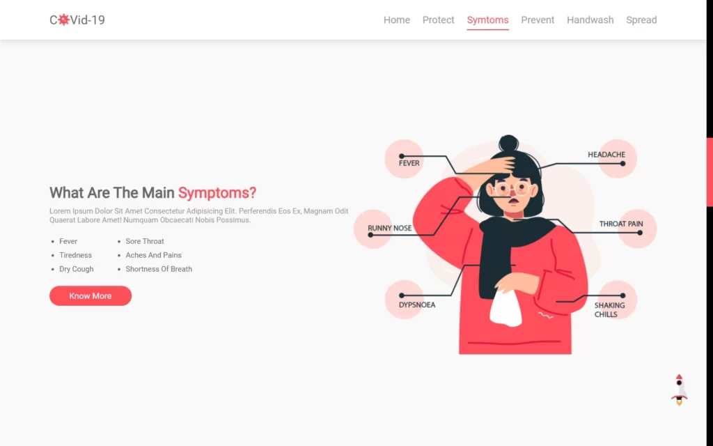
Adding Symptom Section
In the Symptom section, we have added a div, in which we have added a heading and some description. Then after, we have added a list of the symptom, and also we have added a button. Lastly, we have here an image in this div.
In the CSS part, we have maintained the size of the div, and also we have applied some CSS on the text and button to give some cool effect to them. Then after, we have resized the image according to the div size.
<section class="screenshot" id="screenshot">
<h1 class="heading"><span>app screenshot</span></h1>
<div class="screen-slider owl-carousel">
<div class="item">
<img src="images/img1.png" alt="">
</div>
<div class="item">
<img src="images/img2.png" alt="">
</div>
<div class="item">
<img src="images/img3.png" alt="">
</div>
<div class="item">
<img src="images/img4.png" alt="">
</div>
<div class="item">
<img src="images/img5.png" alt="">
</div>
</div>
</section>.symtoms{
display: flex;
align-items: center;
justify-content: center;
flex-wrap: wrap;
}
.symtoms .content{
flex:1 1 40rem;
}
.symtoms .image{
flex:1 1 40rem;
}
.symtoms .image img{
width:100%;
}
.symtoms .content p{
font-size: 1.5rem;
color:#999;
padding:1rem 0;
}
.symtoms .content ul{
display: flex;
flex-wrap: wrap;
padding:1rem 0;
}
.symtoms .content ul .two{
padding-left: 4.5rem;
}
.symtoms .content ul li{
margin-left: 2rem;
font-size: 1.5rem;
color:#666;
padding: .5rem 0;
}
Adding Prevent Section
In the prevention section, we have added a div, in which we have another 2 divs, in these divs we have added an image and some description with heading. Then we have added a list for each of the div.
In CSS part, we have styled the section and also we have maintained the size of the images. Then we have styled the text inside the divs. Also, we have added some little bit styling to the lists as well.
<section class="prevent" id="prevent">
<div class="row">
<div class="image">
<img src="images/dont-img.png" alt="">
</div>
<div class="content">
<h1 class="heading">things <span>not to do</span> during covid</h1>
<p>Lorem ipsum, dolor sit amet consectetur adipisicing elit. Fugiat nulla, dolor excepturi repellendus officiis expedita saepe veniam minima adipisci tenetur?</p>
<ul>
<li>Do Not Share Eating</li>
<li>Do Not Touch Your Face or Nose</li>
<li>Do Not Contact Sick People</li>
</ul>
</div>
</div>
<div class="row">
<div class="content">
<h1 class="heading">things <span>to do</span> during covid</h1>
<p>Lorem ipsum, dolor sit amet consectetur adipisicing elit. Fugiat nulla, dolor excepturi repellendus officiis expedita saepe veniam minima adipisci tenetur?</p>
<ul>
<li>Wash Your Hands For 20 sec</li>
<li>Wear a Mask if Available</li>
<li>Seek Medical Care Regularly</li>
</ul>
</div>
<div class="image">
<img src="images/do-img.png" alt="">
</div>
</div>
</section>.prevent{
background:#222;
}
.prevent .row{
display: flex;
align-items: center;
justify-content: center;
flex-wrap: wrap;
padding:2rem 0;
}
.prevent .row .image{
flex:1 1 37rem;
height:35rem;
text-align: center;
}
.prevent .row .image img{
height:100%;
width:100%;
object-fit: cover;
}
.prevent .row .content{
padding:2rem 0;
flex:1 1 37rem;
}
.prevent .row .content .heading{
color:#fff;
}
.prevent .row .content p{
font-size: 1.7rem;
color:#aaa;
padding:1rem 0;
}
.prevent .row .content ul li{
margin-left: 2rem;
font-size: 1.5rem;
color:#aaa;
padding:.5rem 0;
}
Adding Handwash Section
Now after that, we need to add some handwash section, in which we have 6 divs. Each div has an image and some text in it. We also, added a number on these cards.
In the CSS section, we have styled the elements of the cards. And we have formed these cards using CSS styling. Then we have adjusted the images size according to the cards. After that, we have added some styles to the numbers as well.
<section class="handwash" id="handwash">
<h1 class="heading">how to <span>wash you hand</span> properly</h1>
<div class="box-container">
<div class="box">
<span>1</span>
<img src="images/hadnwash-1.png" alt="">
<h3>Apply Soap on Hand</h3>
</div>
<div class="box">
<span>2</span>
<img src="images/hadnwash-2.png" alt="">
<h3>Palm to Palm</h3>
</div>
<div class="box">
<span>3</span>
<img src="images/hadnwash-3.png" alt="">
<h3>Between Fingers</h3>
</div>
<div class="box">
<span>4</span>
<img src="images/hadnwash-4.png" alt="">
<h3>Back of The Hands</h3>
</div>
<div class="box">
<span>5</span>
<img src="images/hadnwash-5.png" alt="">
<h3>clean with water</h3>
</div>
<div class="box">
<span>6</span>
<img src="images/hadnwash-6.png" alt="">
<h3>Use Towel to Dry</h3>
</div>
</div>
</section>.handwash .heading{
text-align: center;
padding:1rem;
}
.handwash .box-container{
display: flex;
align-items: center;
justify-content: center;
flex-wrap: wrap;
}
.handwash .box-container .box{
background:#fff;
border:.1rem solid rgba(0,0,0,.1);
margin:2rem;
margin-top: 3rem;
padding:2rem 3.5rem;
text-align: center;
position: relative;
}
.handwash .box-container .box img{
height:17rem;
width:17rem;
}
.handwash .box-container .box h3{
font-size: 2rem;
color:#666;
padding:1rem 0;
}
.handwash .box-container .box span{
display: block;
position: absolute;
top:-2rem; left:-2rem;
height:5rem; width:5rem;
line-height: 5rem;
font-size: 2rem;
color:#fff;
background:var(--red);
border-radius: 5rem;
}
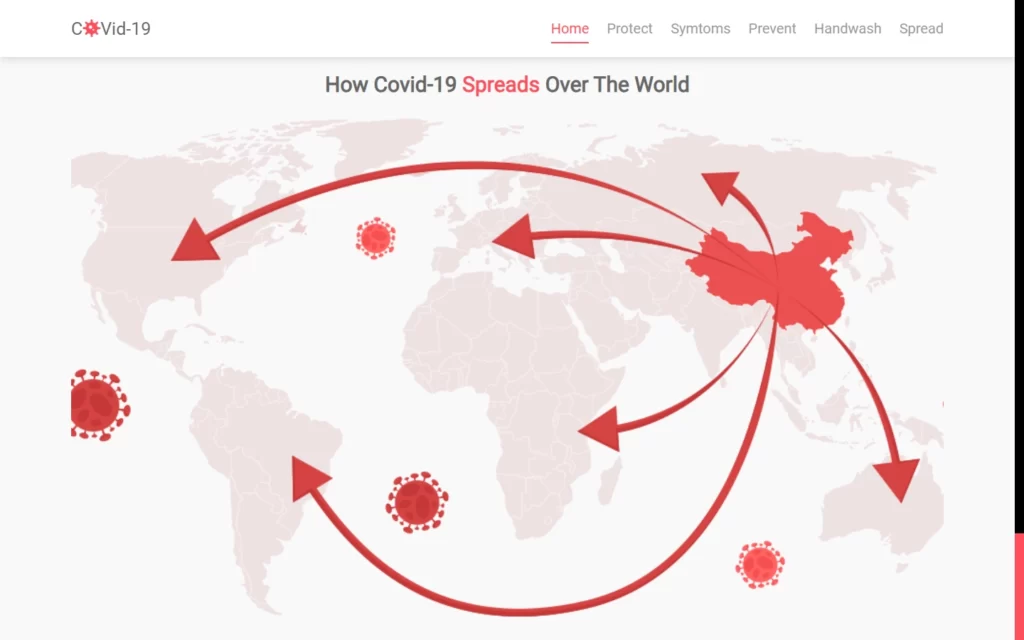
Adding Spread Section
Now we need to add a spread section, for this we have added a div, in which we have added a heading, and also we have added an image in it.
In CSS, we have applied some basic CSS to the heading with colors and also we have adjusted the resolution of the image according to the size of the div
<section class="spread" id="spread">
<h1 class="heading">how Covid-19 <span>spreads</span> over the world</h1>
<div class="image"></div>
</section>.spread .heading{
text-align: center;
padding:1rem;
}
.spread .image{
height: 80vh;
width:100%;
background:url(../images/map.png) no-repeat;
background-size: cover;
background-position: center;
}
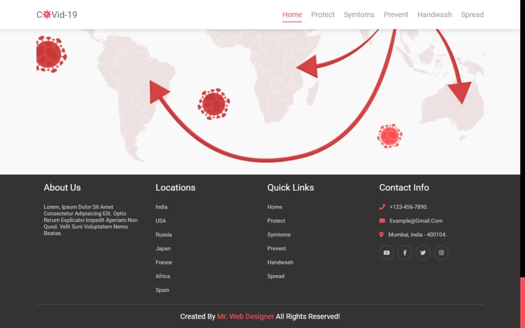
Adding The Footer Section
In footer section, we have added a div for footer section. In this we have added about us div with some information. Then we have added another div in which we have added a list of the countries with some links. Then we have quick links for home, symptom etc. you can add terms & conditions, privacy policy part as well. After that we have added contact us div with some general information.
In the CSS part, we have just added some basic styles on the text and added some effect on these elements. Like hovering effect on the text. Then we have customized the footer area as well.
<section class="footer">
<div class="box-container">
<div class="box">
<h3>about us</h3>
<p>Lorem, ipsum dolor sit amet consectetur adipisicing elit. Optio rerum explicabo impedit aperiam non quod. Velit sunt voluptatem nemo beatae.</p>
</div>
<div class="box">
<h3>locations</h3>
<a href="#">india</a>
<a href="#">USA</a>
<a href="#">russia</a>
<a href="#">japan</a>
<a href="#">france</a>
<a href="#">africa</a>
<a href="#">spain</a>
</div>
<div class="box">
<h3>quick links</h3>
<a href="#">home</a>
<a href="#">protect</a>
<a href="#">symtoms</a>
<a href="#">prevent</a>
<a href="#">handwash</a>
<a href="#">spread</a>
</div>
<div class="box">
<h3>contact info</h3>
<p> <i class="fas fa-phone"></i> +123-456-7890. </p>
<p> <i class="fas fa-envelope"></i> example@gmail.com </p>
<p> <i class="fas fa-map-marker-alt"></i> mumbai, india - 400104. </p>
<div class="share">
<a href="#" class="fab fa-youtube"></a>
<a href="#" class="fab fa-facebook-f"></a>
<a href="#" class="fab fa-twitter"></a>
<a href="#" class="fab fa-instagram"></a>
</div>
</div>
</div>
<h1 class="credit"> created by <a href="#"> mr. web designer </a> all rights reserved! </h1>
</section>.footer{
min-height: auto;
padding-top: 0;
background:#333;
}
.footer .box-container{
display: flex;
justify-content: center;
flex-wrap: wrap;
}
.footer .box-container .box{
flex:1 1 25rem;
margin:2rem;
}
.footer .box-container .box h3{
font-size: 2.5rem;
color:#fff;
padding-bottom: 2rem;
font-weight: normal;
}
.footer .box-container .box p{
font-size: 1.5rem;
color:#ccc;
padding:1rem 0;
}
.footer .box-container .box p i{
padding-right: 1rem;
color:var(--red);
}
.footer .box-container .box a{
font-size: 1.5rem;
color:#ccc;
padding:1rem 0;
display: block;
}
.footer .box-container .box a:hover{
color:var(--red);
}
.footer .box-container .box .share{
display: flex;
flex-wrap: wrap;
padding:1rem 0;
}
.footer .box-container .box .share a{
height:4rem;
width:4rem;
line-height: 2rem;
text-align: center;
border-radius: 5rem;
border:.1rem solid #fff3;
margin-right: 1rem;
}
.footer .box-container .box .share a:hover{
background:#fff;
}
.footer .credit{
padding:2rem 1rem;
text-align: center;
color:#fff;
font-weight: normal;
font-size: 2rem;
border-top: .1rem solid #fff3;
}
.footer .credit a{
color:var(--red);
}
Adding Responsiveness
For every screen resolution, we have added every element here. We used @media element to add every resolution, in this we have just adjusted every element size.
@media (max-width:768px){
#menu{
display: block;
}
header .navbar{
position: fixed;
top:8rem; left:-120%;
height: 100%;
width:100%;
background:#eee;
border-top: .2rem solid rgba(0,0,0,.1);
}
header .navbar ul{
flex-flow: column;
padding:2rem;
}
header .navbar ul li{
text-align: center;
width:100%;
margin:1rem 0;
}
header .navbar ul li a{
display: block;
padding:1rem;
}
header .navbar ul li a.active,
header .navbar ul li a:hover{
padding:1rem;
background:var(--red);
color:#fff;
border:none;
border-radius: 5rem;
}
.fa-times{
transform: rotate(180deg);
}
header .navbar.nav-toggle{
left:0;
}
.home .content{
text-align: center;
}
.prevent .row:last-child{
flex-flow: column-reverse;
}
}
@media (max-width:500px){
html{
font-size: 50%;
}
section{
padding:0 3%;
padding-top: 9rem;
}
}Adding Functionality to Back to Top & Menu
$(document).ready(function(){
$('#menu').click(function(){
$(this).toggleClass('fa-times');
$('.navbar').toggleClass('nav-toggle');
});
$(window).on('scroll load',function(){
$('#menu').removeClass('fa-times');
$('.navbar').removeClass('nav-toggle');
if($(window).scrollTop() > 0){
$('.scroll-top').show();
}else{
$('.scroll-top').hide();
}
// scroll spy
$('section').each(function(){
let height = $(this).height();
let offset = $(this).offset().top - 200;
let id = $(this).attr('id');
let top = $(window).scrollTop();
if(top > offset && top < offset + height){
$('.navbar ul li a').removeClass('active')
$('.navbar').find(`[href="#${id}"]`).addClass('active');
}
});
});
// smooth scrolling
$('a[href*="#"]').on('click',function(e){
e.preventDefault();
$('html, body').animate({
scrollTop : $($(this).attr('href')).offset().top,
},
500,
'linear'
)
})
});Full Source Code to Make Responsive Covid-19 Website Using HTML, CSS, and JavaScript
index.html
<!DOCTYPE html>
<html lang="en">
<head>
<meta charset="UTF-8">
<meta name="viewport" content="width=device-width, initial-scale=1.0">
<title>Responsive Covid-19 Website Design Tutorial</title>
<!-- font awesome cdn link -->
<link rel="stylesheet" href="https://cdnjs.cloudflare.com/ajax/libs/font-awesome/5.15.3/css/all.min.css">
<!-- custom css file link -->
<link rel="stylesheet" href="style.css">
</head>
<body>
<!-- header section starts -->
<header>
<a href="#" class="logo">c<span class="fas fa-virus"></span>vid-19</a>
<div id="menu" class="fas fa-bars"></div>
<nav class="navbar">
<ul>
<li><a class="active" href="#home">home</a></li>
<li><a href="#protect">protect</a></li>
<li><a href="#symtoms">symtoms</a></li>
<li><a href="#prevent">prevent</a></li>
<li><a href="#handwash">handwash</a></li>
<li><a href="#spread">spread</a></li>
</ul>
</nav>
</header>
<!-- header section ends -->
<!-- home section starts -->
<section class="home" id="home">
<div class="content">
<span>Covid-19</span>
<h3>stay safe, stay home</h3>
<p>Lorem ipsum dolor sit amet consectetur adipisicing elit. Voluptas dolores quibusdam ad sapiente quod harum recusandae esse voluptates repellat tempore.</p>
<a href="#" class="btn">protect now</a>
</div>
<div class="image">
<img src="images/home-img.png" alt="">
</div>
</section>
<!-- home section ends -->
<section class="protect" id="protect">
<h1 class="heading">take steps to <span>protect</span> yourself</h1>
<div class="box-container">
<div class="box">
<img src="images/protect-1.png" alt="">
<h3>Wear A Face Mask</h3>
<p>Lorem ipsum dolor sit amet consectetur, adipisicing elit. Et ab magni consequatur, quae in repellat. Placeat deserunt vitae alias dignissimos!</p>
<a href="#" class="btn">learn more</a>
</div>
<div class="box">
<img src="images/protect-2.png" alt="">
<h3>Wash Your Hands</h3>
<p>Lorem ipsum dolor sit amet consectetur, adipisicing elit. Et ab magni consequatur, quae in repellat. Placeat deserunt vitae alias dignissimos!</p>
<a href="#" class="btn">learn more</a>
</div>
<div class="box">
<img src="images/protect-3.png" alt="">
<h3>Avoid Close Contact</h3>
<p>Lorem ipsum dolor sit amet consectetur, adipisicing elit. Et ab magni consequatur, quae in repellat. Placeat deserunt vitae alias dignissimos!</p>
<a href="#" class="btn">learn more</a>
</div>
</div>
</section>
<!-- symtoms section starts -->
<section class="symtoms" id="symtoms">
<div class="content">
<h1 class="heading">What Are The Main <span>Symptoms?</span></h1>
<p>Lorem ipsum dolor sit amet consectetur adipisicing elit. Perferendis eos ex, magnam odit quaerat labore amet! Numquam obcaecati nobis possimus.</p>
<ul>
<div class="one">
<li>fever</li>
<li>Tiredness</li>
<li>Dry Cough</li>
</div>
<div class="two">
<li>Sore Throat</li>
<li>Aches and Pains</li>
<li>Shortness of Breath</li>
</div>
</ul>
<a href="#" class="btn">know more</a>
</div>
<div class="image">
<img src="images/symptoms-img.png" alt="">
</div>
</section>
<!-- symtoms section ends -->
<!-- prevent section starts -->
<section class="prevent" id="prevent">
<div class="row">
<div class="image">
<img src="images/dont-img.png" alt="">
</div>
<div class="content">
<h1 class="heading">things <span>not to do</span> during covid</h1>
<p>Lorem ipsum, dolor sit amet consectetur adipisicing elit. Fugiat nulla, dolor excepturi repellendus officiis expedita saepe veniam minima adipisci tenetur?</p>
<ul>
<li>Do Not Share Eating</li>
<li>Do Not Touch Your Face or Nose</li>
<li>Do Not Contact Sick People</li>
</ul>
</div>
</div>
<div class="row">
<div class="content">
<h1 class="heading">things <span>to do</span> during covid</h1>
<p>Lorem ipsum, dolor sit amet consectetur adipisicing elit. Fugiat nulla, dolor excepturi repellendus officiis expedita saepe veniam minima adipisci tenetur?</p>
<ul>
<li>Wash Your Hands For 20 sec</li>
<li>Wear a Mask if Available</li>
<li>Seek Medical Care Regularly</li>
</ul>
</div>
<div class="image">
<img src="images/do-img.png" alt="">
</div>
</div>
</section>
<!-- prevent section ends -->
<!-- handwash section starts -->
<section class="handwash" id="handwash">
<h1 class="heading">how to <span>wash you hand</span> properly</h1>
<div class="box-container">
<div class="box">
<span>1</span>
<img src="images/hadnwash-1.png" alt="">
<h3>Apply Soap on Hand</h3>
</div>
<div class="box">
<span>2</span>
<img src="images/hadnwash-2.png" alt="">
<h3>Palm to Palm</h3>
</div>
<div class="box">
<span>3</span>
<img src="images/hadnwash-3.png" alt="">
<h3>Between Fingers</h3>
</div>
<div class="box">
<span>4</span>
<img src="images/hadnwash-4.png" alt="">
<h3>Back of The Hands</h3>
</div>
<div class="box">
<span>5</span>
<img src="images/hadnwash-5.png" alt="">
<h3>clean with water</h3>
</div>
<div class="box">
<span>6</span>
<img src="images/hadnwash-6.png" alt="">
<h3>Use Towel to Dry</h3>
</div>
</div>
</section>
<!-- handwash section ends -->
<!-- spread section starts -->
<section class="spread" id="spread">
<h1 class="heading">how Covid-19 <span>spreads</span> over the world</h1>
<div class="image"></div>
</section>
<!-- spread section ends -->
<!-- footer section starts -->
<section class="footer">
<div class="box-container">
<div class="box">
<h3>about us</h3>
<p>Lorem, ipsum dolor sit amet consectetur adipisicing elit. Optio rerum explicabo impedit aperiam non quod. Velit sunt voluptatem nemo beatae.</p>
</div>
<div class="box">
<h3>locations</h3>
<a href="#">india</a>
<a href="#">USA</a>
<a href="#">russia</a>
<a href="#">japan</a>
<a href="#">france</a>
<a href="#">africa</a>
<a href="#">spain</a>
</div>
<div class="box">
<h3>quick links</h3>
<a href="#">home</a>
<a href="#">protect</a>
<a href="#">symtoms</a>
<a href="#">prevent</a>
<a href="#">handwash</a>
<a href="#">spread</a>
</div>
<div class="box">
<h3>contact info</h3>
<p> <i class="fas fa-phone"></i> +123-456-7890. </p>
<p> <i class="fas fa-envelope"></i> example@gmail.com </p>
<p> <i class="fas fa-map-marker-alt"></i> mumbai, india - 400104. </p>
<div class="share">
<a href="#" class="fab fa-youtube"></a>
<a href="#" class="fab fa-facebook-f"></a>
<a href="#" class="fab fa-twitter"></a>
<a href="#" class="fab fa-instagram"></a>
</div>
</div>
</div>
<h1 class="credit"> created by <a href="#"> mr. web designer </a> all rights reserved! </h1>
</section>
<!-- footer section ends -->
<!-- scroll top -->
<a href="#home" class="scroll-top">
<img src="images/scroll-img.png" alt="">
</a>
<!-- jquery cdn link -->
<script src="https://cdnjs.cloudflare.com/ajax/libs/jquery/3.6.0/jquery.min.js"></script>
<!-- custom js file link -->
<script src="script.js"></script>
</body>
</html>style.css
@import url('https://fonts.googleapis.com/css2?family=Roboto:wght@100;300;400&display=swap');

:root{
    --red:#FF4F5B;
}

*{
    font-family: 'Roboto', sans-serif;
    margin:0; padding:0;
    box-sizing: border-box;
    outline: none; border:none;
    text-decoration: none;
    transition:all .3s cubic-bezier(.16,.8,.62,1.52);
    text-transform: capitalize;
}

*::selection{
    background:var(--red);
    color:#fff;
}

html{
    font-size: 62.5%;
    overflow-x: hidden;
}

html::-webkit-scrollbar{
    width:1.3rem;
}

html::-webkit-scrollbar-track{
    background: #000;
}

html::-webkit-scrollbar-thumb{
    background: var(--red);
}

body{
    background:#f9f9f9;
}

section{
    min-height: 100vh;
    padding:0 7%;
    padding-top: 9rem;
}

.btn{
    display: inline-block;
    margin-top: 1rem;
    padding:1rem 4rem;
    border-radius: 5rem;
    background:var(--red);
    color:#fff;
    overflow: hidden;
    position: relative;
    z-index: 0;
    font-size: 1.7rem;
}

.btn::before{
    content:'';
    position: absolute;
    top: 0; left: 0;
    height: 100%;
    width: 100%;
    z-index: -1;
    background:#444;
    clip-path: polygon(0 0, 100% 0, 0 0, 0% 100%);
    transition:.3s linear;
}

.btn:hover::before{
    clip-path: polygon(0 0, 100% 0, 100% 100%, 0% 100%);
}

.heading{
    font-size: 3rem;
    color:#666;
}

.heading span{
    color:var(--red);
}
header{
    width:100%;
    background: #fff;
    display: flex;
    align-items: center;
    justify-content: space-between;
    position: fixed;
    top:0; left: 0;
    z-index: 1000;
    padding:2.5rem 7%;
    box-shadow: 0 .5rem 1rem rgba(0,0,0,.1);
}

header .logo{
    font-size: 2.5rem;
    color:#666;
}

header .logo span{
    color:var(--red);
}

header .navbar ul{
    display: flex;
    align-items: center;
    justify-content: center;
    list-style: none;
}

header .navbar ul li{
    margin-left: 2.5rem;
}

header .navbar ul li a{
    color:#999;
    font-size: 2rem;
}

header .navbar ul li a.active,
header .navbar ul li a:hover{
    color:var(--red);
    border-bottom: .2rem solid var(--red);
    padding:.7rem 0;
}

#menu{
    font-size: 3rem;
    color:#999;
    cursor: pointer;
    display: none;
}
.home{
    display: flex;
    align-items: center;
    justify-content: center;
    flex-wrap: wrap;
}

.home .image{
    flex:1 1 40rem;
}

.home .image img{
    width:100%;
}

.home .content{
    flex:1 1 40rem;
}

.home .content span{
    color:var(--red);
    font-size: 2.5rem;
}

.home .content h3{
    color:#666;
    font-size: 5rem;
}

.home .content p{
    color:#999;
    font-size: 2rem;
    padding:1rem 0;
}
.protect .heading{
text-align: center;
padding:1rem;
}
.protect .box-container{
display: flex;
align-items: center;
justify-content: center;
flex-wrap: wrap;
}
.protect .box-container .box{
background:#fff;
border:.1rem solid rgba(0,0,0,.1);
padding:2rem;
margin:2rem;
width:34rem;
border-radius: .5rem;
box-shadow: 0 .5rem 1rem rgba(0,0,0,.1);
text-align: center;
}
.protect .box-container .box img{
height: 17rem;
width:17rem;
}
.protect .box-container .box h3{
font-size: 2.5rem;
color:#666;
padding:1rem 0;
}
.protect .box-container .box p{
font-size: 1.4rem;
color:#999;
padding:.5rem;
}
.protect .box-container .box:hover{
transform:translateY(-1rem);
}
.symtoms{
display: flex;
align-items: center;
justify-content: center;
flex-wrap: wrap;
}
.symtoms .content{
flex:1 1 40rem;
}
.symtoms .image{
flex:1 1 40rem;
}
.symtoms .image img{
width:100%;
}
.symtoms .content p{
font-size: 1.5rem;
color:#999;
padding:1rem 0;
}
.symtoms .content ul{
display: flex;
flex-wrap: wrap;
padding:1rem 0;
}
.symtoms .content ul .two{
padding-left: 4.5rem;
}
.symtoms .content ul li{
margin-left: 2rem;
font-size: 1.5rem;
color:#666;
padding: .5rem 0;
}
.prevent{
background:#222;
}
.prevent .row{
display: flex;
align-items: center;
justify-content: center;
flex-wrap: wrap;
padding:2rem 0;
}
.prevent .row .image{
flex:1 1 37rem;
height:35rem;
text-align: center;
}
.prevent .row .image img{
height:100%;
width:100%;
object-fit: cover;
}
.prevent .row .content{
padding:2rem 0;
flex:1 1 37rem;
}
.prevent .row .content .heading{
color:#fff;
}
.prevent .row .content p{
font-size: 1.7rem;
color:#aaa;
padding:1rem 0;
}
.prevent .row .content ul li{
margin-left: 2rem;
font-size: 1.5rem;
color:#aaa;
padding:.5rem 0;
}
.handwash .heading{
text-align: center;
padding:1rem;
}
.handwash .box-container{
display: flex;
align-items: center;
justify-content: center;
flex-wrap: wrap;
}
.handwash .box-container .box{
background:#fff;
border:.1rem solid rgba(0,0,0,.1);
margin:2rem;
margin-top: 3rem;
padding:2rem 3.5rem;
text-align: center;
position: relative;
}
.handwash .box-container .box img{
height:17rem;
width:17rem;
}
.handwash .box-container .box h3{
font-size: 2rem;
color:#666;
padding:1rem 0;
}
.handwash .box-container .box span{
display: block;
position: absolute;
top:-2rem; left:-2rem;
height:5rem; width:5rem;
line-height: 5rem;
font-size: 2rem;
color:#fff;
background:var(--red);
border-radius: 5rem;
}
.spread .heading{
text-align: center;
padding:1rem;
}
.spread .image{
height: 80vh;
width:100%;
background:url(../images/map.png) no-repeat;
background-size: cover;
background-position: center;
}
.footer{
min-height: auto;
padding-top: 0;
background:#333;
}
.footer .box-container{
display: flex;
justify-content: center;
flex-wrap: wrap;
}
.footer .box-container .box{
flex:1 1 25rem;
margin:2rem;
}
.footer .box-container .box h3{
font-size: 2.5rem;
color:#fff;
padding-bottom: 2rem;
font-weight: normal;
}
.footer .box-container .box p{
font-size: 1.5rem;
color:#ccc;
padding:1rem 0;
}
.footer .box-container .box p i{
padding-right: 1rem;
color:var(--red);
}
.footer .box-container .box a{
font-size: 1.5rem;
color:#ccc;
padding:1rem 0;
display: block;
}
.footer .box-container .box a:hover{
color:var(--red);
}
.footer .box-container .box .share{
display: flex;
flex-wrap: wrap;
padding:1rem 0;
}
.footer .box-container .box .share a{
height:4rem;
width:4rem;
line-height: 2rem;
text-align: center;
border-radius: 5rem;
border:.1rem solid #fff3;
margin-right: 1rem;
}
.footer .box-container .box .share a:hover{
background:#fff;
}
.footer .credit{
padding:2rem 1rem;
text-align: center;
color:#fff;
font-weight: normal;
font-size: 2rem;
border-top: .1rem solid #fff3;
}
.footer .credit a{
color:var(--red);
}
.scroll-top{
position: fixed;
bottom:7.5rem; right:2rem;
z-index: 100;
display: none;
}
.scroll-top img{
height: 7rem;
}
/* media queries */
@media (max-width:991px){
html{
font-size: 55%;
}
}
@media (max-width:768px){
#menu{
display: block;
}
header .navbar{
position: fixed;
top:8rem; left:-120%;
height: 100%;
width:100%;
background:#eee;
border-top: .2rem solid rgba(0,0,0,.1);
}
header .navbar ul{
flex-flow: column;
padding:2rem;
}
header .navbar ul li{
text-align: center;
width:100%;
margin:1rem 0;
}
header .navbar ul li a{
display: block;
padding:1rem;
}
header .navbar ul li a.active,
header .navbar ul li a:hover{
padding:1rem;
background:var(--red);
color:#fff;
border:none;
border-radius: 5rem;
}
.fa-times{
transform: rotate(180deg);
}
header .navbar.nav-toggle{
left:0;
}
.home .content{
text-align: center;
}
.prevent .row:last-child{
flex-flow: column-reverse;
}
}
@media (max-width:500px){
html{
font-size: 50%;
}
section{
padding:0 3%;
padding-top: 9rem;
}
}script.js
$(document).ready(function(){
$('#menu').click(function(){
$(this).toggleClass('fa-times');
$('.navbar').toggleClass('nav-toggle');
});
$(window).on('scroll load',function(){

      $('#menu').removeClass('fa-times');
      $('.navbar').removeClass('nav-toggle');

      if($(window).scrollTop() > 0){
        $('.scroll-top').show();
      }else{
        $('.scroll-top').hide();
      }
// scroll spy
$('section').each(function(){
let height = $(this).height();
let offset = $(this).offset().top - 200;
let id = $(this).attr('id');
let top = $(window).scrollTop();
if(top > offset && top < offset + height){
$('.navbar ul li a').removeClass('active')
$('.navbar').find(`[href="#${id}"]`).addClass('active');
}
});
});
// smooth scrolling
$('a[href*="#"]').on('click',function(e){
e.preventDefault();
$('html, body').animate({
scrollTop : $($(this).attr('href')).offset().top,
},
500,
'linear'
)
})
});Output of Responsive Covid-19 Website Using HTML


Checkout Video Reference Here:
You May Also Like:


