


In this article, we will learn to make an Application Website Using HTML, CSS, and JavaScript. This website will have simple UI, but has massive things in it. We will create it by using only HTML, CSS and little bit JavaScript to make it more cool. It will be completely responsive like any other website does. Let’s create it step by step.
Pre-requisites to Make an Application Website Using HTML, CSS, and JavaScript
- Good knowledge of HTML.
- Good knowledge of CSS.
- Good knowledge of JavaScript.
Steps of an Application Website Using HTML, CSS, and JavaScript
- Basic structure of HTML and CSS
- Reset HTML & Reusable CSS Classes
- Header Section
- Home Section
- Feature Section
- Sticky Share Section
- Scroll Spy
- Screenshot Section
- Review Section
- Plan/Pricing Table Section
- Download Section
- Footer Section
Creating HTML Markup and File Structure
First of all, we have added link of our style.css, then we have added owl carousel link to make our slider responsive. Then we have added a font-awesome library to add some icon from this library. And Lastly, we have added our JavaScript file.
In CSS, we have added basic and common CSS styles for whole project.
<!DOCTYPE html>
<html lang="en">
<head>
    <meta charset="UTF-8">
    <meta name="viewport" content="width=device-width, initial-scale=1.0">
    <title>Complete Responsive App Landing Page Website Design Tutorial</title>

    <!-- owl carousel css cdn link  -->
    <link rel="stylesheet" href="https://cdnjs.cloudflare.com/ajax/libs/OwlCarousel2/2.3.4/assets/owl.carousel.min.css">

    <!-- font awesome cdn link  -->
    <link rel="stylesheet" href="https://cdnjs.cloudflare.com/ajax/libs/font-awesome/5.15.2/css/all.min.css">

    <!-- custom css file link  -->
    <link rel="stylesheet" href="style.css">

</head>
<body>
    <script src="https://cdnjs.cloudflare.com/ajax/libs/jquery/3.5.1/jquery.min.js"></script>
    <script src="https://cdnjs.cloudflare.com/ajax/libs/OwlCarousel2/2.3.4/owl.carousel.min.js"></script>
</body>
@import url('https://fonts.googleapis.com/css2?family=Open+Sans:wght@300;400;600&display=swap');
:root{
--blue:#3F50CC;
}
*{
font-family: 'Open Sans', sans-serif;
margin:0; padding:0;
box-sizing: border-box;
text-decoration: none;
outline: none;
text-transform: capitalize;
transition: all .2s linear;
}
*::selection{
background:var(--blue);
color:#fff;
}
html{
font-size: 62.5%;
overflow-x: hidden;
}Adding The Header Section
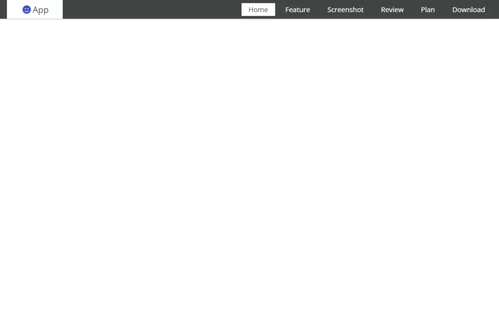
In header section, we have added a div for header, in which we have added an icon as our logo. And then we have added to another div in which we have added menu button, and it will be shown when screen will be small. We will set it up using CSS later on in responsiveness section. Then after we have added a list to create our navbar, we have added home, feature, screenshot, review, plan, and download and all have some links. For now, section ID’s for these navbar elements.
Now in CSS, we have adjusted the size of the header and also, we gave some basic styles to the fonts. And also we have hid the menu button for now, we will access them while adding the responsiveness to the website.
<header>
<a href="#" class="logo"><i class="fas fa-smile"></i>app</a>
<div id="menu" class="fas fa-bars"></div>
<nav class="navbar">
<ul>
<li><a class="active" href="#home">home</a></li>
<li><a href="#feature">feature</a></li>
<li><a href="#screenshot">screenshot</a></li>
<li><a href="#review">review</a></li>
<li><a href="#plan">plan</a></li>
<li><a href="#download">download</a></li>
</ul>
</nav>
</header>.heading{
text-align: center;
padding:1rem;
padding-top: 6.5rem;
}
.heading span{
display: inline-block;
font-size: 2.5rem;
padding:.5rem 7rem;
color:#444;
background:#fff;
border:.2rem solid var(--blue);
border-left-width: 1rem;
border-right-width: 1rem;
}
header{
width:100%;
display: flex;
align-items: center;
justify-content: space-between;
position: fixed;
top:0; left: 0;
padding:0 2rem;
background:#444;
z-index: 1000;
box-shadow: 0 .1rem .3rem rgba(0,0,0,.3);
}
header .logo{
font-size: 2.5rem;
padding:1rem 4rem;
background:#fff;
color:#444;
}
header .logo i{
padding:0 .5rem;
color:var(--blue);
}
header .navbar ul{
display: flex;
align-items: center;
justify-content: space-between;
list-style: none;
}
header .navbar ul li a{
font-size: 2rem;
color:#fff;
padding:.5rem 2rem;
margin-left: 1rem;
}
header .navbar ul li a.active,
header .navbar ul li a:hover{
color:#444;
background:#fff;
}
header #menu{
font-size: 3rem;
color:#fff;
cursor: pointer;
display: none;
}
Adding Share Section
Now in Share section, we have added a share icon, and also we have added some social media icons which have some links of course.
Now in CSS, we have fixed the position of this share button to the right side of the screen and also, we have hid the social media icons from here. We will bring these back when the share icon gets clicked. Then we have adjusted the icons color and hide them by default. We also added some hovering effect on these. Then after we have added some sliding effect after share icon becomes active.
In the JavaScript part, we have fetched the status of the share icon and if it is active, then we have applied active class using toggleClass method.
<div id="share">
<i class="fas fa-share"></i>
<a href="#" class="fab fa-facebook-f"></a>
<a href="#" class="fab fa-twitter"></a>
<a href="#" class="fab fa-instagram"></a>
<a href="#" class="fab fa-linkedin"></a>
<a href="#" class="fab fa-pinterest"></a>
</div>#share{
position: fixed;
top:50%; right:-29.5rem;
display: flex;
transform: translateY(-50%);
box-shadow: 0 .3rem .5rem rgba(0,0,0,.3);
z-index: 100;
}
#share.share-active{
right:0;
}
#share i, #share a{
font-size: 2rem;
padding:1.5rem 2rem;
}
#share i{
background:#444;
color:#fff;
cursor: pointer;
}
#share a{
background:#fff;
color:var(--blue);
border-left: .1rem solid rgba(0,0,0,.3);
}
#share a:hover{
background:var(--blue);
color:#fff;
}
#share i:hover{
background:#222;;
}$(document).ready(function(){
$('#share').click(function(){
$(this).toggleClass('share-active');
});
});
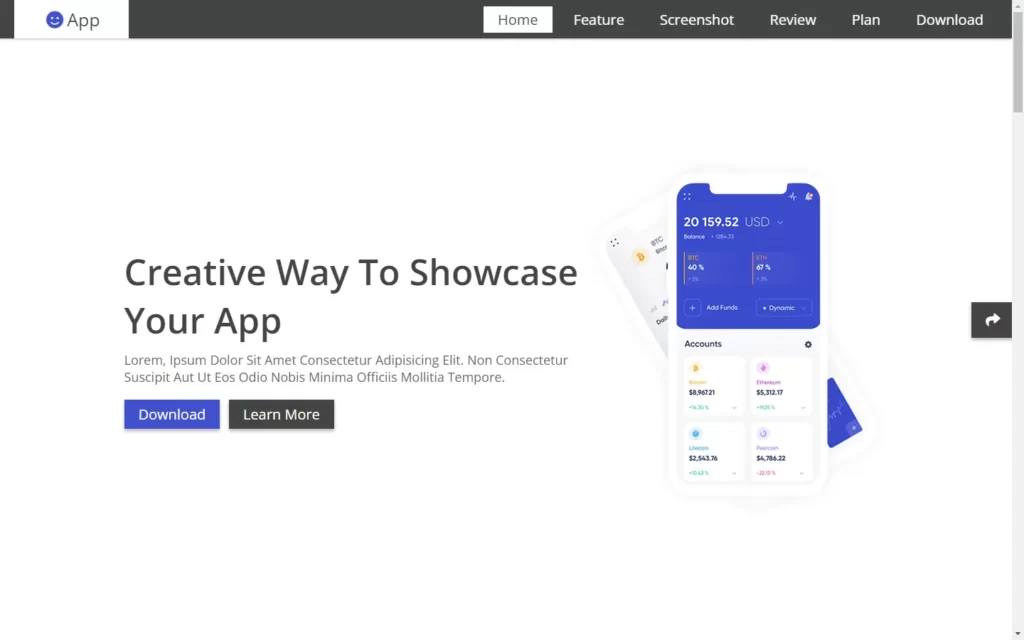
Adding Home Section
In Home section, we have added a div for blog section, In which we have added some text and heading. And then we have added 2 buttons, one for learn more and other for download button. Then we have added an image here.
In CSS, we have adjusted the size of the image size, and we have applied some basic CSS and styling to the text of home section. Then after we have styled the both buttons using some basic styling.
<section class="home" id="home">
<div class="content">
<h1>creative way to showcase your app</h1>
<p>Lorem, ipsum dolor sit amet consectetur adipisicing elit. Non consectetur suscipit aut ut eos odio nobis minima officiis mollitia tempore.</p>
<div class="buttons">
<a href="#"><button class="btn">download</button></a>
<a href="#"><button class="btn">learn more</button></a>
</div>
</div>
<div class="image">
<img src="images/main-img.png" alt="">
</div>
</section>.home{
min-height: 100vh;
background:url(../images/home.jpg) no-repeat;
background-size: cover;
background-position: center;
background-attachment: fixed;
display: flex;
align-items: center;
justify-content: center;
padding:1rem 2rem;
padding-top: 6rem;
}
.home .content{
width:45vw;
}
.home .content h1{
font-size: 5rem;
color:#444;
}
.home .content p{
font-size: 1.8rem;
color:#666;
padding:1rem 0;
}
.home .content .buttons a:nth-child(2) .btn{
background:#444;
margin-left: 1rem;
}
Adding Feature Section
In the Feature section, we have added a div in which we will add some more divs for feature cards. We will create these as cards of features, in these cards we have added icons and some description about the cards.
In CSS, we have adjusted the sizes and text of these cards, also we have applied some basic CSS styling on the icons as well. Then we have added some hovering effect on the cards as well.
<section class="feature" id="feature">
<h1 class="heading"><span>app features</span></h1>
<div class="box-container">
<div class="box">
<i class="fas fa-sync-alt"></i>
<h3>free updates</h3>
<p>Lorem ipsum dolor sit amet consectetur adipisicing elit. Minus, fuga alias ea quis repudiandae modi architecto reiciendis fugit libero sunt.</p>
</div>
<div class="box">
<i class="fas fa-headset"></i>
<h3>app support</h3>
<p>Lorem ipsum dolor sit amet consectetur adipisicing elit. Minus, fuga alias ea quis repudiandae modi architecto reiciendis fugit libero sunt.</p>
</div>
<div class="box">
<i class="fas fa-cogs"></i>
<h3>easy settings</h3>
<p>Lorem ipsum dolor sit amet consectetur adipisicing elit. Minus, fuga alias ea quis repudiandae modi architecto reiciendis fugit libero sunt.</p>
</div>
<div class="box">
<i class="fas fa-shield-alt"></i>
<h3>privacy protect</h3>
<p>Lorem ipsum dolor sit amet consectetur adipisicing elit. Minus, fuga alias ea quis repudiandae modi architecto reiciendis fugit libero sunt.</p>
</div>
<div class="box">
<i class="far fa-bell"></i>
<h3>notifications</h3>
<p>Lorem ipsum dolor sit amet consectetur adipisicing elit. Minus, fuga alias ea quis repudiandae modi architecto reiciendis fugit libero sunt.</p>
</div>
<div class="box">
<i class="far fa-credit-card"></i>
<h3>in app purchase</h3>
<p>Lorem ipsum dolor sit amet consectetur adipisicing elit. Minus, fuga alias ea quis repudiandae modi architecto reiciendis fugit libero sunt.</p>
</div>
</div>
</section>.feature{
min-height: 100vh;
}
.feature .box-container{
display: flex;
align-items: center;
justify-content: center;
flex-wrap: wrap;
}
.feature .box-container .box{
text-align: center;
width:30rem;
padding:2rem;
margin:2rem;
border:.1rem solid rgba(0,0,0,.1);
box-shadow: 0 0 2rem rgba(0,0,0,.1);
cursor: pointer;
}
.feature .box-container .box i{
font-size: 5rem;
padding:2rem 0;
color:var(--blue);
}
.feature .box-container .box h3{
font-size: 2rem;
color:#444;
}
.feature .box-container .box p{
font-size: 1.2rem;
color:#666;
padding:1rem;
}
.feature .box-container .box:hover{
background:#444;
}
.feature .box-container .box:hover i{
color:#fff;
}
.feature .box-container .box:hover h3{
color:#fff;
}
.feature .box-container .box:hover p{
color:#eee;
}
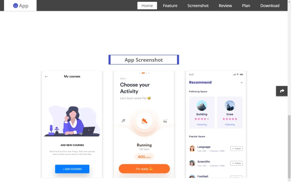
Adding Screenshot Section
In the Screenshot section, we have added a div, in which we have another 5 divs to form 5 cards. In each card, we have added an image for screenshot of the app.
In CSS, we have added some basic styling to adjust the sizes of the images.
In the JavaScript part, we have fetched the screenshot section and applied owlCarousel a method to in which we have looped these image and also added autoplay for these. Then we have managed the images for responsiveness perspective.
<section class="screenshot" id="screenshot">
<h1 class="heading"><span>app screenshot</span></h1>
<div class="screen-slider owl-carousel">
<div class="item">
<img src="images/img1.png" alt="">
</div>
<div class="item">
<img src="images/img2.png" alt="">
</div>
<div class="item">
<img src="images/img3.png" alt="">
</div>
<div class="item">
<img src="images/img4.png" alt="">
</div>
<div class="item">
<img src="images/img5.png" alt="">
</div>
</div>
</section>.screen-slider{
width:75%;
margin:2rem auto;
}
.screen-slider .item{
margin:0 auto;
width:30rem;
}
.screen-slider .item img{
box-shadow: 0 0 1rem rgba(0,0,0,.2);
border:.1rem solid rgba(0,0,0,.1);
}$('.screen-slider').owlCarousel({
loop:true,
center:true,
autoplay:true,
nav:false,
dots:false,
responsive:{
0:{
items:1
},
710:{
items:2
},
1200:{
items:3
}
}
});
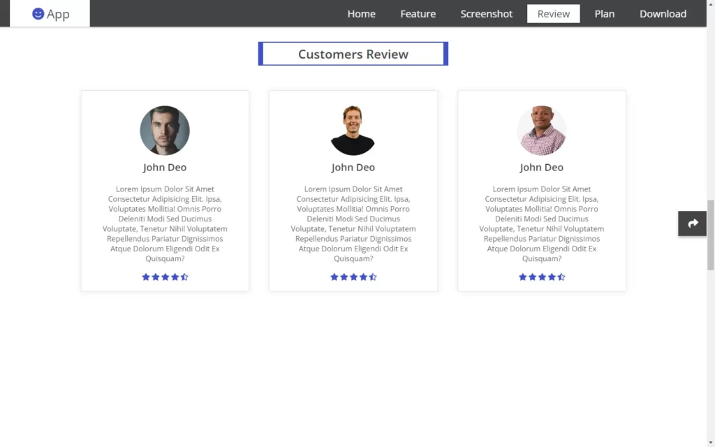
Adding Review Section
In the Review section, we have added a div, in which we have another 4 divs to form 4 cards. In each card, we have added an image for the person. And we have added some description of them, then we have added a div in which we have added star icon for the 5 times.
In CSS, we have added some basic styling to adjust the sizes of the images. And we have styled these cards with the help of CSS styling.
In the JavaScript part, we have fetched the screenshot section and applied owlCarousel a method to in which we have looped these image and also added autoplay for these. Then we have managed the images for responsiveness perspective.
<section class="review" id="review">
<h1 class="heading"><span>customers review</span></h1>
<div class="review-slider owl-carousel">
<div class="box">
<img src="images/pic1.jpg" alt="">
<h3>john deo</h3>
<p>Lorem ipsum dolor sit amet consectetur adipisicing elit. Ipsa, voluptates mollitia! Omnis porro deleniti modi sed ducimus voluptate, tenetur nihil voluptatem repellendus pariatur dignissimos atque dolorum eligendi odit ex quisquam?</p>
<div class="stars">
<i class="fas fa-star"></i>
<i class="fas fa-star"></i>
<i class="fas fa-star"></i>
<i class="fas fa-star"></i>
<i class="fas fa-star-half-alt"></i>
</div>
</div>
<div class="box">
<img src="images/pic2.jpg" alt="">
<h3>john deo</h3>
<p>Lorem ipsum dolor sit amet consectetur adipisicing elit. Ipsa, voluptates mollitia! Omnis porro deleniti modi sed ducimus voluptate, tenetur nihil voluptatem repellendus pariatur dignissimos atque dolorum eligendi odit ex quisquam?</p>
<div class="stars">
<i class="fas fa-star"></i>
<i class="fas fa-star"></i>
<i class="fas fa-star"></i>
<i class="fas fa-star"></i>
<i class="fas fa-star-half-alt"></i>
</div>
</div>
<div class="box">
<img src="images/pic3.jpg" alt="">
<h3>john deo</h3>
<p>Lorem ipsum dolor sit amet consectetur adipisicing elit. Ipsa, voluptates mollitia! Omnis porro deleniti modi sed ducimus voluptate, tenetur nihil voluptatem repellendus pariatur dignissimos atque dolorum eligendi odit ex quisquam?</p>
<div class="stars">
<i class="fas fa-star"></i>
<i class="fas fa-star"></i>
<i class="fas fa-star"></i>
<i class="fas fa-star"></i>
<i class="fas fa-star-half-alt"></i>
</div>
</div>
<div class="box">
<img src="images/pic4.jpg" alt="">
<h3>john deo</h3>
<p>Lorem ipsum dolor sit amet consectetur adipisicing elit. Ipsa, voluptates mollitia! Omnis porro deleniti modi sed ducimus voluptate, tenetur nihil voluptatem repellendus pariatur dignissimos atque dolorum eligendi odit ex quisquam?</p>
<div class="stars">
<i class="fas fa-star"></i>
<i class="fas fa-star"></i>
<i class="fas fa-star"></i>
<i class="fas fa-star"></i>
<i class="fas fa-star-half-alt"></i>
</div>
</div>
</div>
</section>.review{
min-height: 100vh;
}
.review .review-slider{
margin:2rem auto;
width:80%;
}
.review .review-slider .box{
text-align: center;
padding:2rem;
margin:2rem;
box-shadow: 0 0 1rem rgba(0,0,0,.1);
border:.1rem solid rgba(0,0,0,.1);
}
.review .review-slider .box img{
height:10rem;
width:10rem;
margin:1rem auto;
border-radius: 50%;
object-fit: cover;
}
.review .review-slider .box h3{
color:#444;
font-size: 2rem;
}
.review .review-slider .box p{
color:#666;
font-size: 1.5rem;
padding:2rem;
}
.review .review-slider .box .stars i{
color:var(--blue);
font-size: 1.5rem;
}$('.review-slider').owlCarousel({
loop:true,
center:true,
autoplay:true,
nav:false,
dots:false,
responsive:{
0:{
items:1
},
750:{
items:2
},
1200:{
items:3
}
}
});
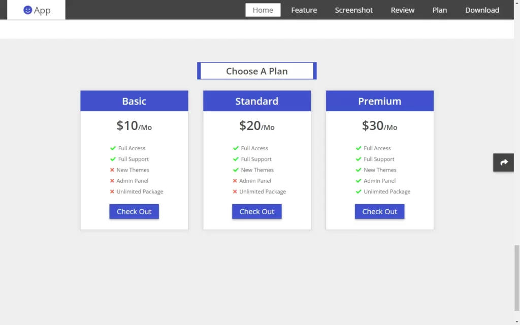
Adding Plan Section
Now after that, we need to add some plan and subscription section. For that, we have added a div in which we have added 3 more divs for the three plan sections. In these cards we have added some details about the plans like prices, And also we have added some cross and check icons for the list of access. Also, we have added a button for each of the card.
In the CSS section, we have styled the elements of the cards. And we have formed these cards using CSS styling. Then we have styled the button with some hovering effect. And lastly we have added some animation on these cards on hover effect.
<section class="plan" id="plan">
<h1 class="heading"><span>choose a plan</span></h1>
<div class="box-container">
<div class="box">
<h3 class="title">basic</h3>
<h3 class="price">$10<span>/mo</span></h3>
<ul class="list">
<li> <i class="fas fa-check"></i> full access </li>
<li> <i class="fas fa-check"></i> full support </li>
<li> <i class="fas fa-times"></i> new themes </li>
<li> <i class="fas fa-times"></i> admin panel </li>
<li> <i class="fas fa-times"></i> unlimited package </li>
</ul>
<a href="#"><button class="btn">check out</button></a>
</div>
<div class="box">
<h3 class="title">standard</h3>
<h3 class="price">$20<span>/mo</span></h3>
<ul class="list">
<li> <i class="fas fa-check"></i> full access </li>
<li> <i class="fas fa-check"></i> full support </li>
<li> <i class="fas fa-check"></i> new themes </li>
<li> <i class="fas fa-times"></i> admin panel </li>
<li> <i class="fas fa-times"></i> unlimited package </li>
</ul>
<a href="#"><button class="btn">check out</button></a>
</div>
<div class="box">
<h3 class="title">premium</h3>
<h3 class="price">$30<span>/mo</span></h3>
<ul class="list">
<li> <i class="fas fa-check"></i> full access </li>
<li> <i class="fas fa-check"></i> full support </li>
<li> <i class="fas fa-check"></i> new themes </li>
<li> <i class="fas fa-check"></i> admin panel </li>
<li> <i class="fas fa-check"></i> unlimited package </li>
</ul>
<a href="#"><button class="btn">check out</button></a>
</div>
</div>
</section>.plan{
min-height: 100vh;
background:#eee;
}
.plan .box-container{
display: flex;
align-items: center;
justify-content: center;
flex-wrap: wrap;
}
.plan .box-container .box{
margin:2rem;
background:#fff;
text-align: center;
width:30rem;
border:.1rem solid rgba(0,0,0,.2);
box-shadow: 0 0 1rem rgba(0,0,0,.1);
}
.plan .box-container .box .title{
background:var(--blue);
color:#fff;
font-size: 2.7rem;
padding:1rem 0;
}
.plan .box-container .box .price{
color:#444;
font-size: 3.5rem;
padding:1.5rem 0;
}
.plan .box-container .box .price span{
font-size: 2rem;
}
.plan .box-container .box .list{
text-align: left;
list-style: none;
padding:1rem 0;
padding-left: 8rem;
}
.plan .box-container .box .list li{
font-size: 1.5rem;
padding:.5rem 0;
color:#666;
}
.plan .box-container .box .list li .fa-check{
padding:0 .3rem;
color:lime;
}
.plan .box-container .box .list li .fa-times{
padding:0 .3rem;
color:tomato;
}
.plan .box-container .box .btn{
margin-bottom: 3rem;
}
.plan .box-container .box:hover{
transform: scale(1.02);
}
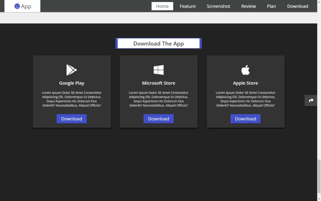
Adding Download Section
Now we need to add a download section, for this we have added a div, in which we have added other 3 divs for the three cards. In these cards, we have added an icon and some description, Then we added a button to each of the card.
In CSS, we have formed these cards using the CSS styling. And we have customized the icons, then we have styled the button and added some hovering effect on the button as well.
<section class="download" id="download">
<h1 class="heading"><span>download the app</span></h1>
<div class="box-container">
<div class="box">
<i class="fab fa-google-play"></i>
<h3>google play</h3>
<p>Lorem ipsum dolor sit amet consectetur adipisicing elit. Doloremque ex delectus, sequi asperiores hic dolorum eius deleniti? Necessitatibus, aliquid officiis?</p>
<a href="#"><button class="btn">download</button></a>
</div>
<div class="box">
<i class="fab fa-windows"></i>
<h3>microsoft store</h3>
<p>Lorem ipsum dolor sit amet consectetur adipisicing elit. Doloremque ex delectus, sequi asperiores hic dolorum eius deleniti? Necessitatibus, aliquid officiis?</p>
<a href="#"><button class="btn">download</button></a>
</div>
<div class="box">
<i class="fab fa-apple"></i>
<h3>apple store</h3>
<p>Lorem ipsum dolor sit amet consectetur adipisicing elit. Doloremque ex delectus, sequi asperiores hic dolorum eius deleniti? Necessitatibus, aliquid officiis?</p>
<a href="#"><button class="btn">download</button></a>
</div>
</div>
</section>.download{
min-height: 100vh;
background:#222;
}
.download .box-container{
display: flex;
align-items: center;
justify-content: center;
flex-wrap: wrap;
}
.download .box-container .box{
margin:2rem;
text-align: center;
margin:2rem;
padding:2rem;
background:#333;
box-shadow: 0 .3rem .5rem #000;
width:35rem;
}
.download .box-container .box i{
color:#fff;
font-size: 5rem;
padding:2rem 0;
}
.download .box-container .box h3{
color:#fff;
font-size: 2rem;
}
.download .box-container .box p{
color:#eee;
font-size: 1.4rem;
padding:2rem;
}
Adding The Footer Section
In footer section, we have added a div for footer section. In this we have added 3 div, in first one, we have added some text and description then we have added some quick links. And lastly, we have added an input field for email and a button for subscribe. Basically newsletter section.
In the CSS part, we have just added some basic styles on the text and added some effect on these elements. Then we have added some styling on newsletter section using CSS.
<section class="footer">
<div class="box-container">
<div class="box">
<h3>why choose us?</h3>
<p>Lorem ipsum dolor sit amet consectetur, adipisicing elit. Consequuntur, facere iusto excepturi at modi illo tenetur atque fugiat numquam rerum.</p>
</div>
<div class="box">
<h3>quick links</h3>
<a href="#">home</a>
<a href="#">feature</a>
<a href="#">screenshot</a>
<a href="#">review</a>
<a href="#">plan</a>
<a href="#">download</a>
</div>
<div class="box">
<h3>newsletter</h3>
<p>subscribe for latest updates</p>
<form action="">
<input type="email" placeholder="enter your email">
<button class="fas fa-paper-plane"></button>
</form>
</div>
</div>
<h1 class="credit">created by <a href="#">mr. web designer</a> | all rights reserved. </h1>
</section>.footer{
background:#eee;
}
.footer .box-container{
display: flex;
justify-content: center;
flex-wrap: wrap;
}
.footer .box-container .box{
margin:2rem;
flex:1 1 30rem;
}
.footer .box-container .box h3{
color:var(--blue);
font-size: 2.5rem;
}
.footer .box-container .box p{
color:#333;
font-size: 1.5rem;
padding:1rem 0;
}
.footer .box-container .box:nth-child(2){
text-align: center;
}
.footer .box-container .box a{
color:#333;
font-size: 1.8rem;
padding:.5rem 0;
display: block;
}
.footer .box-container .box a:hover{
text-decoration: underline;
}
.footer .box-container .box form{
display: flex;
width:100%;
}
.footer .box-container .box form input{
height:4.5rem;
width:100%;
background:#fff;
padding:0 1rem;
font-size: 1.7rem;
color:#333;
border:none;
box-shadow: 0 .1rem .3rem rgba(0,0,0,.2);
}
.footer .box-container .box form button{
height:4.5rem;
width:6rem;
line-height: 4rem;
text-align: center;
background:var(--blue);
font-size: 1.7rem;
color:#fff;
border:none;
box-shadow: 0 .1rem .3rem rgba(0,0,0,.2);
cursor: pointer;
}
.footer .box-container .box form button:hover{
background:#333;
}
.footer .credit{
text-align: center;
padding:2rem 1rem;
font-size: 2rem;
background:#444;
color:#ccc;
}
.footer .credit a{
color:#fff;
}
Adding Responsiveness
For every screen resolution, we have added every element here. We used @media element to add every resolution, in this we have just adjusted every element size.
/* media queries */
@media (max-width:991px){
html{
font-size: 55%;
}
header #menu{
display: block;
}
header .navbar{
position: fixed;
top:5.3rem; right:-120%;
height:100vh;
background:#222;
z-index: 1000;
width: 35rem;
}
header .navbar ul{
flex-flow: column;
justify-content: center;
height:100%;
}
header .navbar ul li a{
display: block;
font-size: 2.5rem;
border:.2rem solid #fff;
margin:1rem 0;
}
.fa-times{
transform: rotate(180deg);
}
header .navbar.nav-toggle{
right: 0;
}
}
@media (max-width:768px){
.home{
flex-flow: column-reverse;
}
.home .content{
padding:2rem 0;
width:auto;
}
.home .content h1{
font-size: 4rem;
}
}
@media (max-width:500px){
html{
font-size: 50%;
}
header .navbar{
width:100vw;
}
.home .image img{
width:90vw;
}
.screen-slider{
width:90%;
}
.review .review-slider{
width:auto;
}
}Adding Functionality to Scroll and Adding Owl Carousel
$(document).ready(function(){
$('#menu').click(function(){
$(this).toggleClass('fa-times');
$('.navbar').toggleClass('nav-toggle');
});
$('#share').click(function(){
$(this).toggleClass('share-active');
});
$(window).on('load scroll',function(){
$('#menu').removeClass('fa-times');
$('.navbar').removeClass('nav-toggle');
$('section').each(function(){
let height = $(this).height();
let top = $(window).scrollTop();
let id = $(this).attr('id');
let offset = $(this).offset().top - 200;
if(top >= offset && top < height + offset){
$('.navbar ul li a').removeClass('active');
$('.navbar').find(`[href="#${id}"]`).addClass('active');
}
});
});
$('.screen-slider').owlCarousel({
loop:true,
center:true,
autoplay:true,
nav:false,
dots:false,
responsive:{
0:{
items:1
},
710:{
items:2
},
1200:{
items:3
}
}
});
$('.review-slider').owlCarousel({
loop:true,
center:true,
autoplay:true,
nav:false,
dots:false,
responsive:{
0:{
items:1
},
750:{
items:2
},
1200:{
items:3
}
}
});
});Full Source Code to Make Application Website Using HTML, CSS, and JavaScript
index.html
<!DOCTYPE html>
<html lang="en">
<head>
<meta charset="UTF-8">
<meta name="viewport" content="width=device-width, initial-scale=1.0">
<title>Complete Responsive App Landing Page Website Design Tutorial</title>
<!-- owl carousel css cdn link -->
<link rel="stylesheet" href="https://cdnjs.cloudflare.com/ajax/libs/OwlCarousel2/2.3.4/assets/owl.carousel.min.css">
<!-- font awesome cdn link -->
<link rel="stylesheet" href="https://cdnjs.cloudflare.com/ajax/libs/font-awesome/5.15.2/css/all.min.css">
<!-- custom css file link -->
<link rel="stylesheet" href="style.css">
</head>
<body>
<!-- header section starts -->
<header>
<a href="#" class="logo"><i class="fas fa-smile"></i>app</a>
<div id="menu" class="fas fa-bars"></div>
<nav class="navbar">
<ul>
<li><a class="active" href="#home">home</a></li>
<li><a href="#feature">feature</a></li>
<li><a href="#screenshot">screenshot</a></li>
<li><a href="#review">review</a></li>
<li><a href="#plan">plan</a></li>
<li><a href="#download">download</a></li>
</ul>
</nav>
</header>
<!-- header section ends -->
<!-- share icons -->
<div id="share">
<i class="fas fa-share"></i>
<a href="#" class="fab fa-facebook-f"></a>
<a href="#" class="fab fa-twitter"></a>
<a href="#" class="fab fa-instagram"></a>
<a href="#" class="fab fa-linkedin"></a>
<a href="#" class="fab fa-pinterest"></a>
</div>
<!-- home section starts -->
<section class="home" id="home">
<div class="content">
<h1>creative way to showcase your app</h1>
<p>Lorem, ipsum dolor sit amet consectetur adipisicing elit. Non consectetur suscipit aut ut eos odio nobis minima officiis mollitia tempore.</p>
<div class="buttons">
<a href="#"><button class="btn">download</button></a>
<a href="#"><button class="btn">learn more</button></a>
</div>
</div>
<div class="image">
<img src="images/main-img.png" alt="">
</div>
</section>
<!-- home section ends -->
<!-- feature section starts -->
<section class="feature" id="feature">
<h1 class="heading"><span>app features</span></h1>
<div class="box-container">
<div class="box">
<i class="fas fa-sync-alt"></i>
<h3>free updates</h3>
<p>Lorem ipsum dolor sit amet consectetur adipisicing elit. Minus, fuga alias ea quis repudiandae modi architecto reiciendis fugit libero sunt.</p>
</div>
<div class="box">
<i class="fas fa-headset"></i>
<h3>app support</h3>
<p>Lorem ipsum dolor sit amet consectetur adipisicing elit. Minus, fuga alias ea quis repudiandae modi architecto reiciendis fugit libero sunt.</p>
</div>
<div class="box">
<i class="fas fa-cogs"></i>
<h3>easy settings</h3>
<p>Lorem ipsum dolor sit amet consectetur adipisicing elit. Minus, fuga alias ea quis repudiandae modi architecto reiciendis fugit libero sunt.</p>
</div>
<div class="box">
<i class="fas fa-shield-alt"></i>
<h3>privacy protect</h3>
<p>Lorem ipsum dolor sit amet consectetur adipisicing elit. Minus, fuga alias ea quis repudiandae modi architecto reiciendis fugit libero sunt.</p>
</div>
<div class="box">
<i class="far fa-bell"></i>
<h3>notifications</h3>
<p>Lorem ipsum dolor sit amet consectetur adipisicing elit. Minus, fuga alias ea quis repudiandae modi architecto reiciendis fugit libero sunt.</p>
</div>
<div class="box">
<i class="far fa-credit-card"></i>
<h3>in app purchase</h3>
<p>Lorem ipsum dolor sit amet consectetur adipisicing elit. Minus, fuga alias ea quis repudiandae modi architecto reiciendis fugit libero sunt.</p>
</div>
</div>
</section>
<!-- feature section ends -->
<!-- screenshot section starts -->
<section class="screenshot" id="screenshot">
<h1 class="heading"><span>app screenshot</span></h1>
<div class="screen-slider owl-carousel">
<div class="item">
<img src="images/img1.png" alt="">
</div>
<div class="item">
<img src="images/img2.png" alt="">
</div>
<div class="item">
<img src="images/img3.png" alt="">
</div>
<div class="item">
<img src="images/img4.png" alt="">
</div>
<div class="item">
<img src="images/img5.png" alt="">
</div>
</div>
</section>
<!-- screenshot section ends -->
<!-- review section starts -->
<section class="review" id="review">
<h1 class="heading"><span>customers review</span></h1>
<div class="review-slider owl-carousel">
<div class="box">
<img src="images/pic1.jpg" alt="">
<h3>john deo</h3>
<p>Lorem ipsum dolor sit amet consectetur adipisicing elit. Ipsa, voluptates mollitia! Omnis porro deleniti modi sed ducimus voluptate, tenetur nihil voluptatem repellendus pariatur dignissimos atque dolorum eligendi odit ex quisquam?</p>
<div class="stars">
<i class="fas fa-star"></i>
<i class="fas fa-star"></i>
<i class="fas fa-star"></i>
<i class="fas fa-star"></i>
<i class="fas fa-star-half-alt"></i>
</div>
</div>
<div class="box">
<img src="images/pic2.jpg" alt="">
<h3>john deo</h3>
<p>Lorem ipsum dolor sit amet consectetur adipisicing elit. Ipsa, voluptates mollitia! Omnis porro deleniti modi sed ducimus voluptate, tenetur nihil voluptatem repellendus pariatur dignissimos atque dolorum eligendi odit ex quisquam?</p>
<div class="stars">
<i class="fas fa-star"></i>
<i class="fas fa-star"></i>
<i class="fas fa-star"></i>
<i class="fas fa-star"></i>
<i class="fas fa-star-half-alt"></i>
</div>
</div>
<div class="box">
<img src="images/pic3.jpg" alt="">
<h3>john deo</h3>
<p>Lorem ipsum dolor sit amet consectetur adipisicing elit. Ipsa, voluptates mollitia! Omnis porro deleniti modi sed ducimus voluptate, tenetur nihil voluptatem repellendus pariatur dignissimos atque dolorum eligendi odit ex quisquam?</p>
<div class="stars">
<i class="fas fa-star"></i>
<i class="fas fa-star"></i>
<i class="fas fa-star"></i>
<i class="fas fa-star"></i>
<i class="fas fa-star-half-alt"></i>
</div>
</div>
<div class="box">
<img src="images/pic4.jpg" alt="">
<h3>john deo</h3>
<p>Lorem ipsum dolor sit amet consectetur adipisicing elit. Ipsa, voluptates mollitia! Omnis porro deleniti modi sed ducimus voluptate, tenetur nihil voluptatem repellendus pariatur dignissimos atque dolorum eligendi odit ex quisquam?</p>
<div class="stars">
<i class="fas fa-star"></i>
<i class="fas fa-star"></i>
<i class="fas fa-star"></i>
<i class="fas fa-star"></i>
<i class="fas fa-star-half-alt"></i>
</div>
</div>
</div>
</section>
<!-- review section ends -->
<!-- plan section starts -->
<section class="plan" id="plan">
<h1 class="heading"><span>choose a plan</span></h1>
<div class="box-container">
<div class="box">
<h3 class="title">basic</h3>
<h3 class="price">$10<span>/mo</span></h3>
<ul class="list">
<li> <i class="fas fa-check"></i> full access </li>
<li> <i class="fas fa-check"></i> full support </li>
<li> <i class="fas fa-times"></i> new themes </li>
<li> <i class="fas fa-times"></i> admin panel </li>
<li> <i class="fas fa-times"></i> unlimited package </li>
</ul>
<a href="#"><button class="btn">check out</button></a>
</div>
<div class="box">
<h3 class="title">standard</h3>
<h3 class="price">$20<span>/mo</span></h3>
<ul class="list">
<li> <i class="fas fa-check"></i> full access </li>
<li> <i class="fas fa-check"></i> full support </li>
<li> <i class="fas fa-check"></i> new themes </li>
<li> <i class="fas fa-times"></i> admin panel </li>
<li> <i class="fas fa-times"></i> unlimited package </li>
</ul>
<a href="#"><button class="btn">check out</button></a>
</div>
<div class="box">
<h3 class="title">premium</h3>
<h3 class="price">$30<span>/mo</span></h3>
<ul class="list">
<li> <i class="fas fa-check"></i> full access </li>
<li> <i class="fas fa-check"></i> full support </li>
<li> <i class="fas fa-check"></i> new themes </li>
<li> <i class="fas fa-check"></i> admin panel </li>
<li> <i class="fas fa-check"></i> unlimited package </li>
</ul>
<a href="#"><button class="btn">check out</button></a>
</div>
</div>
</section>
<!-- plan section ends -->
<!-- download section starts -->
<section class="download" id="download">
<h1 class="heading"><span>download the app</span></h1>
<div class="box-container">
<div class="box">
<i class="fab fa-google-play"></i>
<h3>google play</h3>
<p>Lorem ipsum dolor sit amet consectetur adipisicing elit. Doloremque ex delectus, sequi asperiores hic dolorum eius deleniti? Necessitatibus, aliquid officiis?</p>
<a href="#"><button class="btn">download</button></a>
</div>
<div class="box">
<i class="fab fa-windows"></i>
<h3>microsoft store</h3>
<p>Lorem ipsum dolor sit amet consectetur adipisicing elit. Doloremque ex delectus, sequi asperiores hic dolorum eius deleniti? Necessitatibus, aliquid officiis?</p>
<a href="#"><button class="btn">download</button></a>
</div>
<div class="box">
<i class="fab fa-apple"></i>
<h3>apple store</h3>
<p>Lorem ipsum dolor sit amet consectetur adipisicing elit. Doloremque ex delectus, sequi asperiores hic dolorum eius deleniti? Necessitatibus, aliquid officiis?</p>
<a href="#"><button class="btn">download</button></a>
</div>
</div>
</section>
<!-- download section ends -->
<!-- footer section starts -->
<section class="footer">
<div class="box-container">
<div class="box">
<h3>why choose us?</h3>
<p>Lorem ipsum dolor sit amet consectetur, adipisicing elit. Consequuntur, facere iusto excepturi at modi illo tenetur atque fugiat numquam rerum.</p>
</div>
<div class="box">
<h3>quick links</h3>
<a href="#">home</a>
<a href="#">feature</a>
<a href="#">screenshot</a>
<a href="#">review</a>
<a href="#">plan</a>
<a href="#">download</a>
</div>
<div class="box">
<h3>newsletter</h3>
<p>subscribe for latest updates</p>
<form action="">
<input type="email" placeholder="enter your email">
<button class="fas fa-paper-plane"></button>
</form>
</div>
</div>
<h1 class="credit">created by <a href="#">mr. web designer</a> | all rights reserved. </h1>
</section>
<!-- footer section ends -->
<!-- jquery cdn link -->
<script src="https://cdnjs.cloudflare.com/ajax/libs/jquery/3.5.1/jquery.min.js"></script>
<!-- owl carousel js cdn link -->
<script src="https://cdnjs.cloudflare.com/ajax/libs/OwlCarousel2/2.3.4/owl.carousel.min.js"></script>
<!-- custom js file link -->
<script src="js.js"></script>
</body>
</html>style.css
@import url('https://fonts.googleapis.com/css2?family=Open+Sans:wght@300;400;600&display=swap');

:root{
    --blue:#3F50CC;
}

*{
    font-family: 'Open Sans', sans-serif;
    margin:0; padding:0;
    box-sizing: border-box;
    text-decoration: none;
    outline: none;
    text-transform: capitalize;
    transition: all .2s linear;
}

*::selection{
    background:var(--blue);
    color:#fff;
}

html{
    font-size: 62.5%;
    overflow-x: hidden;
}
.btn{
font-size: 2rem;
padding:.7rem 2rem;
color:#fff;
background:var(--blue);
cursor: pointer;
margin-top: 1rem;
border:none;
box-shadow: 0 .3rem .5rem rgba(0,0,0,.3);
}
.btn:hover{
opacity: .8;
box-shadow: none;
}
.heading{
    text-align: center;
    padding:1rem;
    padding-top: 6.5rem;
}

.heading span{
    display: inline-block;
    font-size: 2.5rem;
    padding:.5rem 7rem;
    color:#444;
    background:#fff;
    border:.2rem solid var(--blue);
    border-left-width: 1rem;
    border-right-width: 1rem;
}

header{
    width:100%;
    display: flex;
    align-items: center;
    justify-content: space-between;
    position: fixed;
    top:0; left: 0;
    padding:0 2rem;
    background:#444;
    z-index: 1000;
    box-shadow: 0 .1rem .3rem rgba(0,0,0,.3);
}

header .logo{
    font-size: 2.5rem;
    padding:1rem 4rem;
    background:#fff;
    color:#444;
}

header .logo i{
    padding:0 .5rem;
    color:var(--blue);
}

header .navbar ul{
    display: flex;
    align-items: center;
    justify-content: space-between;
    list-style: none;
}

header .navbar ul li a{
    font-size: 2rem;
    color:#fff;
    padding:.5rem 2rem;
    margin-left: 1rem;
}

header .navbar ul li a.active,
header .navbar ul li a:hover{
    color:#444;
    background:#fff;
}

header #menu{
    font-size: 3rem;
    color:#fff;
    cursor: pointer;
    display: none;
}
#share{
    position: fixed;
    top:50%; right:-29.5rem;
    display: flex;
    transform: translateY(-50%);
    box-shadow: 0 .3rem .5rem rgba(0,0,0,.3);
    z-index: 100;
}

#share.share-active{
    right:0;
}

#share i, #share a{
    font-size: 2rem;
    padding:1.5rem 2rem;
}

#share i{
    background:#444;
    color:#fff;
    cursor: pointer;
}

#share a{
    background:#fff;
    color:var(--blue);
    border-left: .1rem solid rgba(0,0,0,.3);
}

#share a:hover{
    background:var(--blue);
    color:#fff;
}

#share i:hover{
    background:#222;;
}
.home{
    min-height: 100vh;
    background:url(../images/home.jpg) no-repeat;
    background-size: cover;
    background-position: center;
    background-attachment: fixed;
    display: flex;
    align-items: center;
    justify-content: center;
    padding:1rem 2rem;
    padding-top: 6rem;
}

.home .content{
    width:45vw;
}

.home .content h1{
    font-size: 5rem;
    color:#444;
}

.home .content p{
    font-size: 1.8rem;
    color:#666;
    padding:1rem 0;
}

.home .content .buttons a:nth-child(2) .btn{
    background:#444;
    margin-left: 1rem;
}
.feature{
    min-height: 100vh;
}

.feature .box-container{
    display: flex;
    align-items: center;
    justify-content: center;
    flex-wrap: wrap;
}

.feature .box-container .box{
    text-align: center;
    width:30rem;
    padding:2rem;
    margin:2rem;
    border:.1rem solid rgba(0,0,0,.1);
    box-shadow: 0 0 2rem rgba(0,0,0,.1);
    cursor: pointer;
}

.feature .box-container .box i{
    font-size: 5rem;
    padding:2rem 0;
    color:var(--blue);
}

.feature .box-container .box h3{
    font-size: 2rem;
    color:#444;
}

.feature .box-container .box p{
    font-size: 1.2rem;
    color:#666;
    padding:1rem;
}

.feature .box-container .box:hover{
    background:#444;
}

.feature .box-container .box:hover i{
    color:#fff;
}

.feature .box-container .box:hover h3{
    color:#fff;
}

.feature .box-container .box:hover p{
    color:#eee;
}
.screen-slider{
    width:75%;
    margin:2rem auto;
}

.screen-slider .item{
    margin:0 auto;
    width:30rem;
}

.screen-slider .item img{
    box-shadow: 0 0 1rem rgba(0,0,0,.2);
    border:.1rem solid rgba(0,0,0,.1);
}
.review{
min-height: 100vh;
}
.review .review-slider{
margin:2rem auto;
width:80%;
}
.review .review-slider .box{
text-align: center;
padding:2rem;
margin:2rem;
box-shadow: 0 0 1rem rgba(0,0,0,.1);
border:.1rem solid rgba(0,0,0,.1);
}
.review .review-slider .box img{
height:10rem;
width:10rem;
margin:1rem auto;
border-radius: 50%;
object-fit: cover;
}
.review .review-slider .box h3{
color:#444;
font-size: 2rem;
}
.review .review-slider .box p{
color:#666;
font-size: 1.5rem;
padding:2rem;
}
.review .review-slider .box .stars i{
color:var(--blue);
font-size: 1.5rem;
}
.plan{
min-height: 100vh;
background:#eee;
}
.plan .box-container{
display: flex;
align-items: center;
justify-content: center;
flex-wrap: wrap;
}
.plan .box-container .box{
margin:2rem;
background:#fff;
text-align: center;
width:30rem;
border:.1rem solid rgba(0,0,0,.2);
box-shadow: 0 0 1rem rgba(0,0,0,.1);
}
.plan .box-container .box .title{
background:var(--blue);
color:#fff;
font-size: 2.7rem;
padding:1rem 0;
}
.plan .box-container .box .price{
color:#444;
font-size: 3.5rem;
padding:1.5rem 0;
}
.plan .box-container .box .price span{
font-size: 2rem;
}
.plan .box-container .box .list{
text-align: left;
list-style: none;
padding:1rem 0;
padding-left: 8rem;
}
.plan .box-container .box .list li{
font-size: 1.5rem;
padding:.5rem 0;
color:#666;
}
.plan .box-container .box .list li .fa-check{
padding:0 .3rem;
color:lime;
}
.plan .box-container .box .list li .fa-times{
padding:0 .3rem;
color:tomato;
}
.plan .box-container .box .btn{
margin-bottom: 3rem;
}
.plan .box-container .box:hover{
transform: scale(1.02);
}
.download{
min-height: 100vh;
background:#222;
}
.download .box-container{
display: flex;
align-items: center;
justify-content: center;
flex-wrap: wrap;
}
.download .box-container .box{
margin:2rem;
text-align: center;
margin:2rem;
padding:2rem;
background:#333;
box-shadow: 0 .3rem .5rem #000;
width:35rem;
}
.download .box-container .box i{
color:#fff;
font-size: 5rem;
padding:2rem 0;
}
.download .box-container .box h3{
color:#fff;
font-size: 2rem;
}
.download .box-container .box p{
color:#eee;
font-size: 1.4rem;
padding:2rem;
}
.footer{
background:#eee;
}
.footer .box-container{
display: flex;
justify-content: center;
flex-wrap: wrap;
}
.footer .box-container .box{
margin:2rem;
flex:1 1 30rem;
}
.footer .box-container .box h3{
color:var(--blue);
font-size: 2.5rem;
}
.footer .box-container .box p{
color:#333;
font-size: 1.5rem;
padding:1rem 0;
}
.footer .box-container .box:nth-child(2){
text-align: center;
}
.footer .box-container .box a{
color:#333;
font-size: 1.8rem;
padding:.5rem 0;
display: block;
}
.footer .box-container .box a:hover{
text-decoration: underline;
}
.footer .box-container .box form{
display: flex;
width:100%;
}
.footer .box-container .box form input{
height:4.5rem;
width:100%;
background:#fff;
padding:0 1rem;
font-size: 1.7rem;
color:#333;
border:none;
box-shadow: 0 .1rem .3rem rgba(0,0,0,.2);
}
.footer .box-container .box form button{
height:4.5rem;
width:6rem;
line-height: 4rem;
text-align: center;
background:var(--blue);
font-size: 1.7rem;
color:#fff;
border:none;
box-shadow: 0 .1rem .3rem rgba(0,0,0,.2);
cursor: pointer;
}
.footer .box-container .box form button:hover{
background:#333;
}
.footer .credit{
text-align: center;
padding:2rem 1rem;
font-size: 2rem;
background:#444;
color:#ccc;
}
.footer .credit a{
color:#fff;
}
/* media queries */
@media (max-width:991px){
html{
font-size: 55%;
}
header #menu{
display: block;
}
header .navbar{
position: fixed;
top:5.3rem; right:-120%;
height:100vh;
background:#222;
z-index: 1000;
width: 35rem;
}
header .navbar ul{
flex-flow: column;
justify-content: center;
height:100%;
}
header .navbar ul li a{
display: block;
font-size: 2.5rem;
border:.2rem solid #fff;
margin:1rem 0;
}
.fa-times{
transform: rotate(180deg);
}
header .navbar.nav-toggle{
right: 0;
}
}
@media (max-width:768px){
.home{
flex-flow: column-reverse;
}
.home .content{
padding:2rem 0;
width:auto;
}
.home .content h1{
font-size: 4rem;
}
}
@media (max-width:500px){
html{
font-size: 50%;
}
header .navbar{
width:100vw;
}
.home .image img{
width:90vw;
}
.screen-slider{
width:90%;
}
.review .review-slider{
width:auto;
}
}script.js
$(document).ready(function(){
$('#menu').click(function(){
$(this).toggleClass('fa-times');
$('.navbar').toggleClass('nav-toggle');
});
$('#share').click(function(){
$(this).toggleClass('share-active');
});
$(window).on('load scroll',function(){
$('#menu').removeClass('fa-times');
$('.navbar').removeClass('nav-toggle');
$('section').each(function(){
let height = $(this).height();
let top = $(window).scrollTop();
let id = $(this).attr('id');
let offset = $(this).offset().top - 200;
if(top >= offset && top < height + offset){
$('.navbar ul li a').removeClass('active');
$('.navbar').find(`[href="#${id}"]`).addClass('active');
}
});
});
$('.screen-slider').owlCarousel({
        loop:true,
        center:true,
        autoplay:true,
        nav:false,
        dots:false,
        responsive:{
            0:{
                items:1
            },
            710:{
                items:2
            },
            1200:{
                items:3
            }
        }
    });
$('.review-slider').owlCarousel({
        loop:true,
        center:true,
        autoplay:true,
        nav:false,
        dots:false,
        responsive:{
            0:{
                items:1
            },
            750:{
                items:2
            },
            1200:{
                items:3
            }
        }
    });
});Output


Checkout Video Reference Here:
You May Also Like:


