


In this article, we will create a Paint Loading Animation in CSS. This will be a beginner-friendly project, and also it will bring some new ideas to intermediate programmers. Basically, we will create a roller to paint, and it leaves a tail of paint. Here we will use only CSS, not including images etc.
Pre-requisites to Make Paint Loading Animation in CSS
- Basic knowledge of HTML.
- Basic knowledge of CSS and CSS animations.
Building Basic Structure
<!DOCTYPE html>
<html>
    <head>
        <title>Paint Loader</title>
        <link rel="stylesheet" href="style.css">
    </head>
    <body>
        <div class="container">
            <div class="roller">
                <div class="handle"></div>
            </div>
            <div class="paint"></div>
        </div>
    </body>
</html>
body{
background-color: #5f1760;
padding: 0;
margin: 0;
}
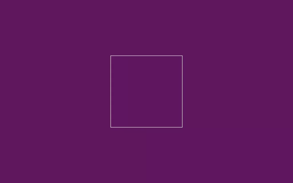
.container{
height: 350px;
width: 350px;
border: 2px solid white;
position: absolute;
top: 50%;
left: 50%;
transform: translate(-50%, -50%) ;
}Firstly, in our HTML, we have a div with container class which includes another class roller, again roller class have another class handle. Container has another class for paint. This all for our HTML markup, now we need to style these elements using style.css.
Now in CSS part, we need to remove default padding and margin, also we have added a background color as #5f1760 to fill the whole screen. Then we will customize our container, for that we have given some height and width. And we have gave a white border, so the area will be visible, also we have centered our container using transform: translate(-50%, -50%) property, You can use align-items and justify-content to center to do the same thing.
Creating Roller
.roller{
    height: 45px;
    width: 150px;
    border: 5px solid #040e15;
    border-radius: 7px;
    background-image: linear-gradient(to bottom, #ffca3e 0, #ffca3e 80%, #fc8f2e 80%);
    position: absolute;
    margin: auto;
    left: 0;
    right: 0;
    top: 0;
}

.roller::before{
    position: absolute;
    content: "";
    background-color: rgba(255, 255, 255, 0.7);
    height: 7px;
    width: 75px;
    top: 8px;
    left: 8px;
    border-radius: 10px;
}

.roller::after{
    position: absolute;
    content: "";
    height: 40px;
    width: 85px;
    border: 7px solid #040e15;
    border-left: none;
    right: -20px;
    top: 20px;
    z-index: -1;
    border-radius: 7px;
}
Now to create roller, we have gave some height and width with yellow border, also we have filled roller color with linear-gradient property, we have added #ffca3e color till 80% of roller body, and rest 20% is filled with #fc8f2ecolor. Also, we have set position to absolute.
Now in before element we have just did some basic CSS as we have done in roller, here we have added some white line inside the roller which looks like 3D and shiny roller. In after element, we have designed a rod for handle attachment, using border, and we have just removed its left side of the border, and lastly we have adjusted it. So it looks like some rod attached to the roller, also we have used z-index to -1, so rod should hide behind the roller if it is overlapping.
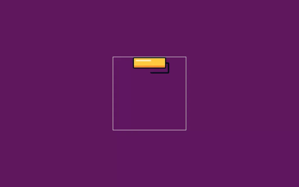
Adding Handle
.handle{
    height: 30px;
    width: 7px;
    background-color: #040e15;
    position: absolute;
    top: 68px;
    right: 65px;
}

.handle::after{
    position: absolute;
    content: "";
    height: 75px;
    width: 25px;
    background-color: #040e15;
    bottom: -75px;
    right: -8px;
    border-radius: 5px;
}
Now to add handle, we have gave some basic styling to create the handle, and we have position it to the roller of handle using top and right properties. In after element, we have added color to make it visible and using bottom and right properties, and adjusted it to the rod of the roller.

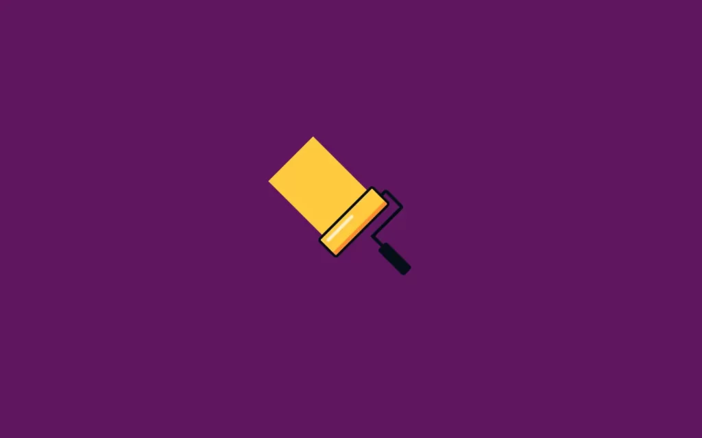
Adding Paint and Animations
.roller{
    height: 45px;
    width: 150px;
    border: 5px solid #040e15;
    border-radius: 7px;
    background-image: linear-gradient(to bottom, #ffca3e 0, #ffca3e 80%, #fc8f2e 80%);
    position: absolute;
    margin: auto;
    left: 0;
    right: 0;
    top: 0;
    animation: roller 2s infinite;
}

 @keyframes roller{
    40%{
        top: 165px;
    }
}
.paint{
    background-color: #ffca3e;
    height: 0;
    width: 130px;
    position: absolute;
    margin: auto;
    left: 0;
    right: 0;
    z-index: -1;
    animation: paint 2s infinite;
}

@keyframes paint{
    40%{
        height: 165px;
    }
}
Now before making paint, we have here animated our roller which move from top to down for 2 seconds duration and infinite time, with using keyframes we can define animations. So in this keyframe we have just added animation on 40% we have just adjusted some height.
Now, we can make paint, we have used here some very basic properties to make paint with #ffca3e this color, also we have adjusted with roller, so it will show over the roller. We can hide this color behind a roller using z-index to -1. Again we have gave an animation for 2 second duration, for infinite times. Then we have defined animation and put property same as roller animation. Now we can remove the border from container, and we will rotate it by -45 degrees which is not necessary to do, but it looks better.
Full Source Code of Paint Loading Animation in CSS
index.html
<!DOCTYPE html>
<html>
    <head>
        <title>Paint Loader</title>
        <link rel="stylesheet" href="style.css">
    </head>
    <body>
        <div class="container">
            <div class="roller">
                <div class="handle"></div>
            </div>
            <div class="paint"></div>
        </div>
    </body>
</html>
style.css
body{
    background-color: #5f1760;
    padding: 0;
    margin: 0;
}

.container{
    height: 350px;
    width: 350px;
    position: absolute;
    top: 50%;
    left: 50%;
    transform: translate(-50%, -50%) rotate(-45deg) ;
}

.roller{
    height: 45px;
    width: 150px;
    border: 5px solid #040e15;
    border-radius: 7px;
    background-image: linear-gradient(to bottom, #ffca3e 0, #ffca3e 80%, #fc8f2e 80%);
    position: absolute;
    margin: auto;
    left: 0;
    right: 0;
    top: 0;
    animation: roller 2s infinite;
}

 @keyframes roller{
    40%{
        top: 165px;
    }
}

.roller::before{
    position: absolute;
    content: "";
    background-color: rgba(255, 255, 255, 0.7);
    height: 7px;
    width: 75px;
    top: 8px;
    left: 8px;
    border-radius: 10px;
}

.roller::after{
    position: absolute;
    content: "";
    height: 40px;
    width: 85px;
    border: 7px solid #040e15;
    border-left: none;
    right: -20px;
    top: 20px;
    z-index: -1;
    border-radius: 7px;
}

.handle{
    height: 30px;
    width: 7px;
    background-color: #040e15;
    position: absolute;
    top: 68px;
    right: 65px;
}

 .handle::after{
    position: absolute;
    content: "";
    height: 75px;
    width: 25px;
    background-color: #040e15;
    bottom: -75px;
    right: -8px;
    border-radius: 5px;
}

.paint{
    background-color: #ffca3e;
    height: 0;
    width: 130px;
    position: absolute;
    margin: auto;
    left: 0;
    right: 0;
    z-index: -1;
    animation: paint 2s infinite;
}

@keyframes paint{
    40%{
        height: 165px;

    }
}
Output


