


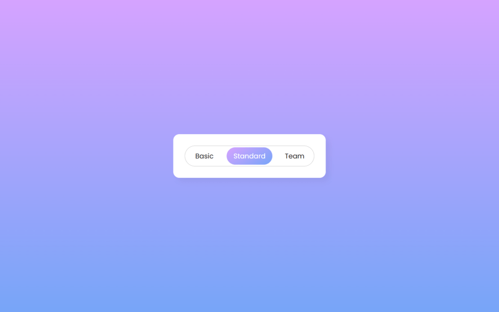
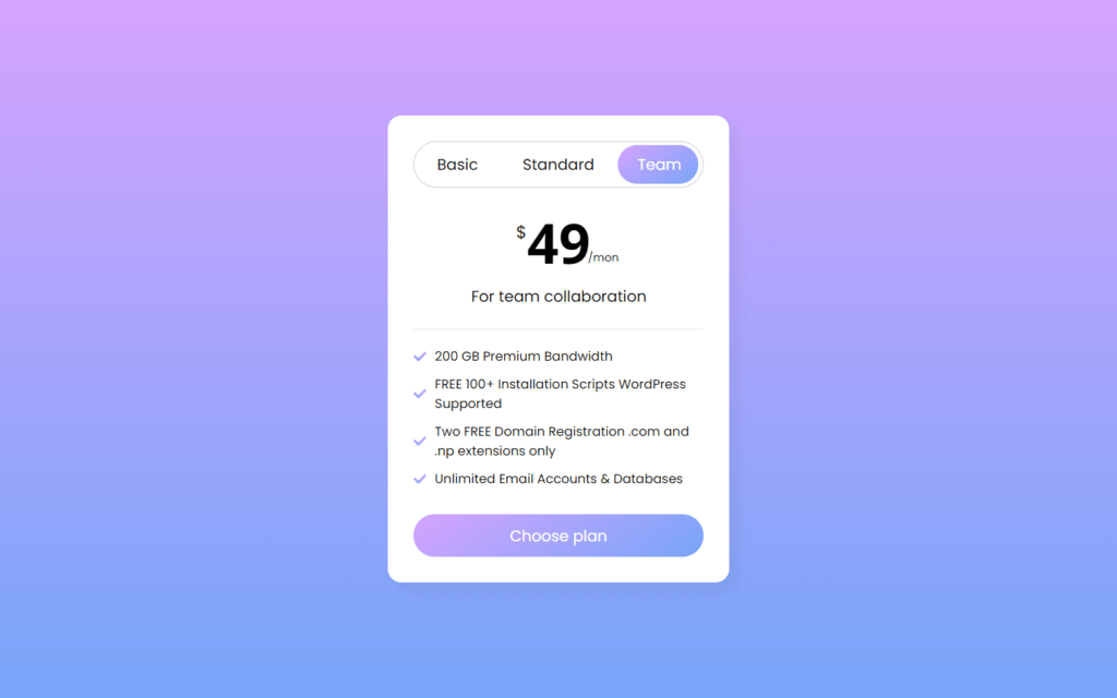
In this article, we will see how to create an Animated Pricing Card using only HTML & CSS. In this card, there is a total of 3 packages, and you can view each package with the help of a slider tab which is placed to the top. When you click on the particular tab, the particular package will appear with a sliding animation.
You can see the demo here Animated Pricing Card
Pre-requisites To Make Animated Login and Registration Form in HTML, CSS & JavaScript
- Good knowledge of HTML.
- Good knowledge of CSS & CSS3.
Creating HTML Markup
<head>
<link rel="stylesheet" href="<https://cdnjs.cloudflare.com/ajax/libs/font-awesome/5.15.3/css/all.min.css>"/>
</head>
<body>
	<div class="wrapper">
		<header>
			<label for="tab-1" class="tab-1">Basic</label>
      <label for="tab-2" class="tab-2">Standard</label>
      <label for="tab-3" class="tab-3">Team</label>
      <div class="slider"></div>
		<header>
	</div>
First of all in HTML markup let’s add font-awesome link with this we can add icon to our HTML, after that we have created 3 labels these labels will be our slider bar elements, so rest of the code we will add later we will design these labels first then the information part will be easy to maintain.
@import url('<https://fonts.googleapis.com/css2?family=Noto+Sans:wght@700&family=Poppins:wght@400;500;600&display=swap>');
*{
  margin: 0;
  padding: 0;
  box-sizing: border-box;
  font-family: "Poppins", sans-serif;
}
body{
  display: flex;
  align-items: center;
  justify-content: center;
  min-height: 100vh;
  background: linear-gradient(#D5A3FF 0%, #77A5F8 100%);
}
Let’s now remove the default values before that we have used Poppins google font here this font we’re going to use throughout this project, after that lets remove default margin and padding for that set it to 0 and also add font-family to Poppins, now we need to place all items to center for that we will use display to flex, align items and justify content to center also add minimum height of 100vh this means our elements at least have 100vh of height, then let’s set background to linear gradient colors of #77A5F8, #D5A3FF.

Customizing The Slider Bar
.wrapper{
  width: 400px;
  background: #fff;
  border-radius: 16px;
  padding: 30px;
  box-shadow: 10px 10px 15px rgba(0,0,0,0.05);
}
.wrapper header{
  height: 55px;
  display: flex;
  align-items: center;
  border: 1px solid #ccc;
  border-radius: 30px;
  position: relative;
}
header label{
  height: 100%;
  z-index: 2;
  width: 30%;
  display: flex;
  cursor: pointer;
  font-size: 18px;
  position: relative;
  align-items: center;
  justify-content: center;
  transition: color 0.3s ease;
}
Now we will customize the label, we will add z-index to 2, so the text of the label won’t get hide behind the background, also let’s make cursor to pointer if we hover on the labels, and now we need a transition here so if we switch to another label then give color for 0.3 seconds of ease type.
<input type="radio" name="slider" id="tab-1">
    <input type="radio" name="slider" id="tab-2" checked>
    <input type="radio" name="slider" id="tab-3">
Now we will add 3 radio buttons for the labels, and for tab-2 we have set here to checked, which means the second radio button will be selected by default on loading this project.
#tab-1:checked ~ header .tab-1,
#tab-2:checked ~ header .tab-2,
#tab-3:checked ~ header .tab-3{
  color: #fff;
}
header label:nth-child(2){
  width: 40%;
}
header .slider{
  position: absolute;
  height: 85%;
  border-radius: inherit;
  background: linear-gradient(145deg, #D5A3FF 0%, #77A5F8 100%);
  transition: all 0.3s ease;
}
#tab-1:checked ~ header .slider{
  left: 0%;
  width: 90px;
  transform: translateX(5%);
}
#tab-2:checked ~ header .slider{
  left: 50%;
  width: 120px;
  transform: translateX(-50%);
}
#tab-3:checked ~ header .slider{
  left: 100%;
  width: 95px;
  transform: translateX(-105%);
}
.wrapper input[type="radio"]{
  display: none;
}
After that, we need slider bar on absolute position and border’s radius will be to inherit with this we can give button tube type shape, also we will add here background same as project’s background but at 145 degrees, now we will add some transition for 0.3 seconds for ease type, then we will use transform, so it will have transition effect on switching between two labels. and finally, we will hide these radio buttons with display: none.
Adding The Cards
<div class="card-area">
<div class="cards">
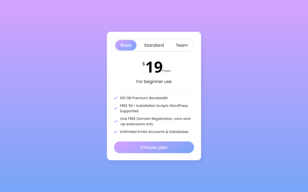
<div class="row row-1">
<div class="price-details">
<span class="price">19</span>
<p>For beginner use</p>
</div>
<ul class="features">
<li><i class="fas fa-check"></i><span>100 GB Premium Bandwidth</span></li>
<li><i class="fas fa-check"></i><span>FREE 50+ Installation Scripts WordPress Supported</span></li>
<li><i class="fas fa-check"></i><span>One FREE Domain Registration .com and .np extensions only</span></li>
<li><i class="fas fa-check"></i><span>Unlimited Email Accounts & Databases</span></li>
</ul>
</div>
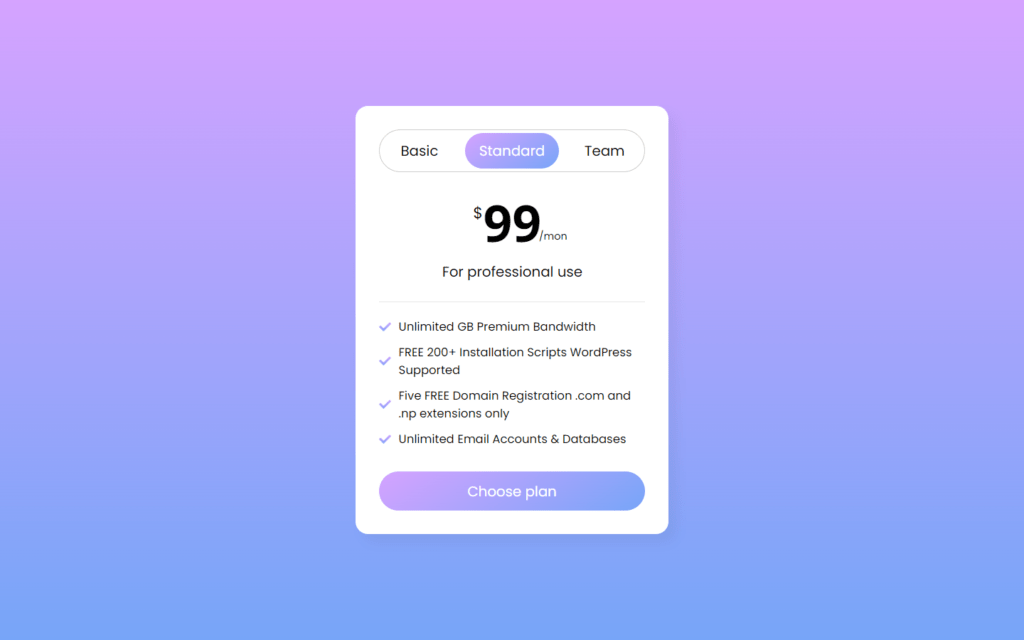
<div class="row">
<div class="price-details">
<span class="price">99</span>
<p>For professional use</p>
</div>
<ul class="features">
<li><i class="fas fa-check"></i><span>Unlimited GB Premium Bandwidth</span></li>
<li><i class="fas fa-check"></i><span>FREE 200+ Installation Scripts WordPress Supported</span></li>
<li><i class="fas fa-check"></i><span>Five FREE Domain Registration .com and .np extensions only</span></li>
<li><i class="fas fa-check"></i><span>Unlimited Email Accounts & Databases</span></li>
</ul>
</div>
<div class="row">
<div class="price-details">
<span class="price">49</span>
<p>For team collaboration</p>
</div>
<ul class="features">
<li><i class="fas fa-check"></i><span>200 GB Premium Bandwidth</span></li>
<li><i class="fas fa-check"></i><span>FREE 100+ Installation Scripts WordPress Supported</span></li>
<li><i class="fas fa-check"></i><span>Two FREE Domain Registration .com and .np extensions only</span></li>
<li><i class="fas fa-check"></i><span>Unlimited Email Accounts & Databases</span></li>
</ul>
</div>
</div>
</div>
<button>Choose plan</button>
</div>
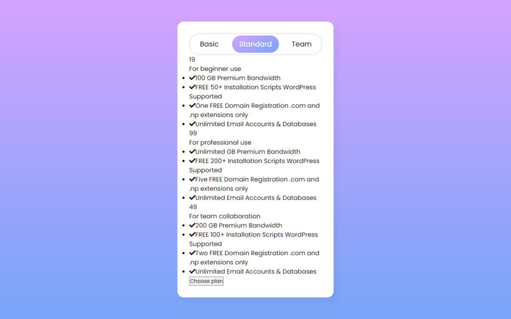
Now we need to add cards with information, for this we need 3 cards for each radio button these cards contains span tag in which we’ll have price, paragraph tag for purpose and also description, here we have used font awesome to get check icon, and lastly we have a button to choose plan.
Customizing The Card
.card-area{
  overflow: hidden;
}
.card-area .cards{
  display: flex;
  width: 300%;
}
.cards .row{
  width: 33.4%;
}
.cards .row-1{
  transition: all 0.3s ease;
}
#tab-1:checked ~ .card-area .cards .row-1{
   margin-left: 0%;
}
#tab-2:checked ~ .card-area .cards .row-1{
  margin-left: -33.4%;
}
#tab-3:checked ~ .card-area .cards .row-1{
   margin-left: -66.8%;
}
.row .price-details{
  margin: 20px 0;
  text-align: center;
  padding-bottom: 25px;
  border-bottom: 1px solid #e6e6e6;
}
.price-details .price{
  font-size: 65px;
  font-weight: 600;
  position: relative;
  font-family: 'Noto Sans', sans-serif;
}
.price-details .price::before,
.price-details .price::after{
  position: absolute;
  font-weight: 400;
  font-family: "Poppins", sans-serif;
}
.price-details .price::before{
  content: "$";
  left: -13px;
  top: 17px;
  font-size: 20px;
}
.price-details .price::after{
  content: "/mon";
  right: -33px;
  bottom: 17px;
  font-size: 13px;
}
After that, we will add customization to cards, for card details we just need to add text alignment to center with border at bottom of 1px solid with #e6e6e6 color, now we will make the price font to 65px also we add relative position, in before section of price we will add ‘$’ sign which have font-size of 20px, and for after we need ‘/mon’ text which is somewhat lower than ‘$’ sign in size.
.price-details p{
  font-size: 18px;
  margin-top: 5px;
}
.row .features li{
  display: flex;
  font-size: 15px;
  list-style: none;
  margin-bottom: 10px;
  align-items: center;
}
.features li i{
  background: linear-gradient(#D5A3FF 0%, #77A5F8 100%);
  background-clip: text;
 -webkit-background-clip: text;
 -webkit-text-fill-color: transparent;
}
.features li span{
  margin-left: 10px;
}
Now we will resize paragraph for price-details to 18px, for icon set background same as main background, we used here background-clip: text with this background will get removed around the icon which is considered as text in here, after that we will clip the text with this background will be still there behind the icon, so to make it visible we have used text-fill-color to transparent.
.wrapper button{
  width: 100%;
  border-radius: 25px;
  border: none;
  outline: none;
  height: 50px;
  font-size: 18px;
  color: #fff;
  cursor: pointer;
  margin-top: 20px;
  background: linear-gradient(145deg, #D5A3FF 0%, #77A5F8 100%);
  transition: transform 0.3s ease;
}
.wrapper button:hover{
  transform: scale(0.98);
}
Finally, Let’s customize the button for that first we need to set border radius to 25px for some round shape at edges, after that set border and outline to none, so button don’t have default border, now set cursor to pointer so if we hover on button, so cursor will turn into pointer also background will be same slider’s background, and lastly we want span when we hover the button which means button shape will increase with 0.98 while hovering.
Full Source Code Of Animated Pricing Card Using Only HTML & CSS
index.html
<!DOCTYPE html>
<html lang="en">
<head>
  <meta charset="UTF-8">
  <meta name="viewport" content="width=device-width, initial-scale=1.0">
  <title>Pure CSS Pricing Cards</title>
  <link rel="stylesheet" href="style.css">
  <link rel="stylesheet" href="<https://cdnjs.cloudflare.com/ajax/libs/font-awesome/5.15.3/css/all.min.css>"/>
</head>
<body>
  <div class="wrapper">
    <input type="radio" name="slider" id="tab-1">
    <input type="radio" name="slider" id="tab-2" checked>
    <input type="radio" name="slider" id="tab-3">
    <header>
      <label for="tab-1" class="tab-1">Basic</label>
      <label for="tab-2" class="tab-2">Standard</label>
      <label for="tab-3" class="tab-3">Team</label>
      <div class="slider"></div>
    </header>
    <div class="card-area">
      <div class="cards">
        <div class="row row-1">
          <div class="price-details">
            <span class="price">19</span>
            <p>For beginner use</p>
          </div>
          <ul class="features">
            <li><i class="fas fa-check"></i><span>100 GB Premium Bandwidth</span></li>
            <li><i class="fas fa-check"></i><span>FREE 50+ Installation Scripts WordPress Supported</span></li>
            <li><i class="fas fa-check"></i><span>One FREE Domain Registration .com and .np extensions only</span></li>
            <li><i class="fas fa-check"></i><span>Unlimited Email Accounts & Databases</span></li>
          </ul>
        </div>
        <div class="row">
          <div class="price-details">
            <span class="price">99</span>
            <p>For professional use</p>
          </div>
          <ul class="features">
            <li><i class="fas fa-check"></i><span>Unlimited GB Premium Bandwidth</span></li>
            <li><i class="fas fa-check"></i><span>FREE 200+ Installation Scripts WordPress Supported</span></li>
            <li><i class="fas fa-check"></i><span>Five FREE Domain Registration .com and .np extensions only</span></li>
            <li><i class="fas fa-check"></i><span>Unlimited Email Accounts & Databases</span></li>
          </ul>
        </div>
        <div class="row">
          <div class="price-details">
            <span class="price">49</span>
            <p>For team collaboration</p>
          </div>
          <ul class="features">
            <li><i class="fas fa-check"></i><span>200 GB Premium Bandwidth</span></li>
            <li><i class="fas fa-check"></i><span>FREE 100+ Installation Scripts WordPress Supported</span></li>
            <li><i class="fas fa-check"></i><span>Two FREE Domain Registration .com and .np extensions only</span></li>
            <li><i class="fas fa-check"></i><span>Unlimited Email Accounts & Databases</span></li>
          </ul>
        </div>
      </div>
    </div>
    <button>Choose plan</button>
  </div>

</body>
</html>
style.css
@import url('<https://fonts.googleapis.com/css2?family=Noto+Sans:wght@700&family=Poppins:wght@400;500;600&display=swap>');
*{
  margin: 0;
  padding: 0;
  box-sizing: border-box;
  font-family: "Poppins", sans-serif;
}
body{
  display: flex;
  align-items: center;
  justify-content: center;
  min-height: 100vh;
  background: linear-gradient(#D5A3FF 0%, #77A5F8 100%);
}
.wrapper{
  width: 400px;
  background: #fff;
  border-radius: 16px;
  padding: 30px;
  box-shadow: 10px 10px 15px rgba(0,0,0,0.05);
}
.wrapper header{
  height: 55px;
  display: flex;
  align-items: center;
  border: 1px solid #ccc;
  border-radius: 30px;
  position: relative;
}
header label{
  height: 100%;
  z-index: 2;
  width: 30%;
  display: flex;
  cursor: pointer;
  font-size: 18px;
  position: relative;
  align-items: center;
  justify-content: center;
  transition: color 0.3s ease;
}

#tab-1:checked ~ header .tab-1,
#tab-2:checked ~ header .tab-2,
#tab-3:checked ~ header .tab-3{
  color: #fff;
}
header label:nth-child(2){
  width: 40%;
}
header .slider{
  position: absolute;
  height: 85%;
  border-radius: inherit;
  background: linear-gradient(145deg, #D5A3FF 0%, #77A5F8 100%);
  transition: all 0.3s ease;
}
 #tab-1:checked ~ header .slider{
  left: 0%;
  width: 90px;
  transform: translateX(5%);
}
#tab-2:checked ~ header .slider{
  left: 50%;
  width: 120px;
  transform: translateX(-50%);
}
#tab-3:checked ~ header .slider{
  left: 100%;
  width: 95px;
  transform: translateX(-105%);
}
.wrapper input[type="radio"]{
  display: none;
}

.card-area{
  overflow: hidden;
}
.card-area .cards{
  display: flex;
  width: 300%;
}
.cards .row{
  width: 33.4%;
}
.cards .row-1{
  transition: all 0.3s ease;
}
#tab-1:checked ~ .card-area .cards .row-1{
   margin-left: 0%;
}
#tab-2:checked ~ .card-area .cards .row-1{
  margin-left: -33.4%;
}
#tab-3:checked ~ .card-area .cards .row-1{
   margin-left: -66.8%;
}
.row .price-details{
  margin: 20px 0;
  text-align: center;
  padding-bottom: 25px;
  border-bottom: 1px solid #e6e6e6;
}
.price-details .price{
  font-size: 65px;
  font-weight: 600;
  position: relative;
  font-family: 'Noto Sans', sans-serif;
}
.price-details .price::before,
.price-details .price::after{
  position: absolute;
  font-weight: 400;
  font-family: "Poppins", sans-serif;
}
.price-details .price::before{
  content: "$";
  left: -13px;
  top: 17px;
  font-size: 20px;
}
.price-details .price::after{
  content: "/mon";
  right: -33px;
  bottom: 17px;
  font-size: 13px;
}
.price-details p{
  font-size: 18px;
  margin-top: 5px;
}
.row .features li{
  display: flex;
  font-size: 15px;
  list-style: none;
  margin-bottom: 10px;
  align-items: center;
}
.features li i{
  background: linear-gradient(#D5A3FF 0%, #77A5F8 100%);
  background-clip: text;
 -webkit-background-clip: text;
 -webkit-text-fill-color: transparent;
}
.features li span{
  margin-left: 10px;
}
.wrapper button{
  width: 100%;
  border-radius: 25px;
  border: none;
  outline: none;
  height: 50px;
  font-size: 18px;
  color: #fff;
  cursor: pointer;
  margin-top: 20px;
  background: linear-gradient(145deg, #D5A3FF 0%, #77A5F8 100%);
  transition: transform 0.3s ease;
}
.wrapper button:hover{
  transform: scale(0.98);
}
Output

Check out Full Source Code On Github


