


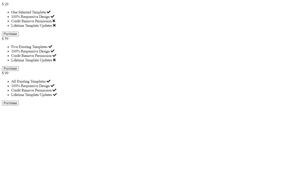
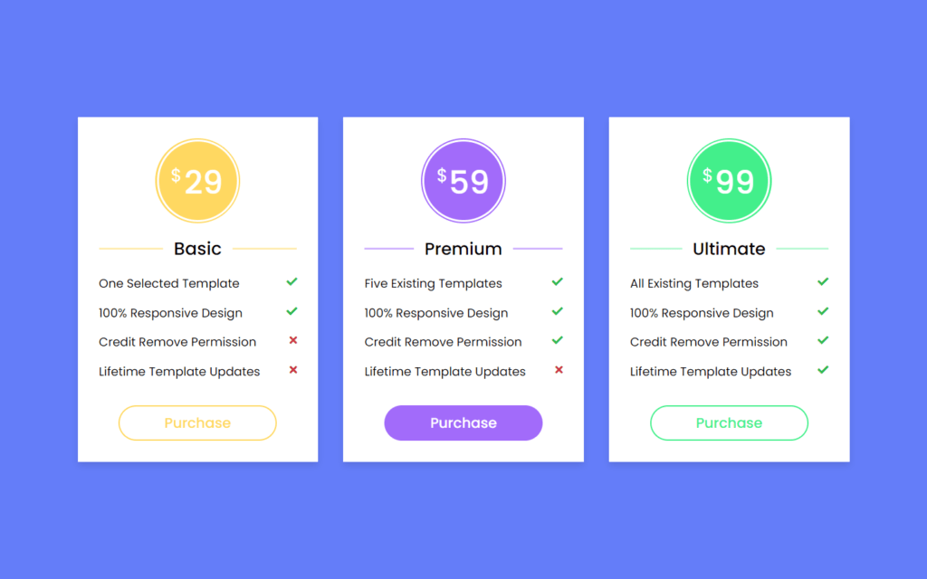
In this article, we will see how to create Responsive Pricing Table Card using only HTML & CSS. In this card, there is a total of 3 packages, A pricing table or card is a design element on a commercial website to display the various pricing plans or price comparisons.
You can see the demo here Responsive Pricing Table Card
Pre-requisites To Make Responsive Pricing Table Card Using Only HTML & CSS
- Good knowledge of HTML.
- Good knowledge of CSS & CSS3.
Creating HTML Markup
<body>
  <div class="wrapper">
    <div class="table basic">
      <div class="price-section">
        <div class="price-area">
          <div class="inner-area">
            <span class="text">$</span>
            <span class="price">29</span>
          </div>
        </div>
      </div>
      <div class="package-name"></div>
      <ul class="features">
        <li>
          <span class="list-name">One Selected Template</span>
          <span class="icon check"><i class="fas fa-check"></i></span>
        </li>
        <li>
          <span class="list-name">100% Responsive Design</span>
          <span class="icon check"><i class="fas fa-check"></i></span>
        </li>
        <li>
          <span class="list-name">Credit Remove Permission</span>
          <span class="icon cross"><i class="fas fa-times"></i></span>
        </li>
        <li>
          <span class="list-name">Lifetime Template Updates</span>
          <span class="icon cross"><i class="fas fa-times"></i></span>
        </li>
      </ul>
      <div class="btn"><button>Purchase</button></div>
    </div>
    <div class="table premium">
      <div class="price-section">
        <div class="price-area">
          <div class="inner-area">
            <span class="text">$</span>
            <span class="price">59</span>
          </div>
        </div>
      </div>
      <div class="package-name"></div>
      <ul class="features">
        <li>
          <span class="list-name">Five Existing Templates</span>
          <span class="icon check"><i class="fas fa-check"></i></span>
        </li>
        <li>
          <span class="list-name">100% Responsive Design</span>
          <span class="icon check"><i class="fas fa-check"></i></span>
        </li>
        <li>
          <span class="list-name">Credit Remove Permission</span>
          <span class="icon check"><i class="fas fa-check"></i></span>
        </li>
        <li>
          <span class="list-name">Lifetime Template Updates</span>
          <span class="icon cross"><i class="fas fa-times"></i></span>
        </li>
      </ul>
      <div class="btn"><button>Purchase</button></div>
    </div>
    <div class="table ultimate">
      <div class="price-section">
        <div class="price-area">
          <div class="inner-area">
            <span class="text">$</span>
            <span class="price">99</span>
          </div>
        </div>
      </div>
      <div class="package-name"></div>
      <ul class="features">
        <li>
          <span class="list-name">All Existing Templates</span>
          <span class="icon check"><i class="fas fa-check"></i></span>
        </li>
        <li>
          <span class="list-name">100% Responsive Design</span>
          <span class="icon check"><i class="fas fa-check"></i></span>
        </li>
        <li>
          <span class="list-name">Credit Remove Permission</span>
          <span class="icon check"><i class="fas fa-check"></i></span>
        </li>
        <li>
          <span class="list-name">Lifetime Template Updates</span>
          <span class="icon check"><i class="fas fa-check"></i></span>
        </li>
      </ul>
      <div class="btn"><button>Purchase</button></div>
    </div>
  </div>

</body>
Now let’s start to building it with HTML markup, Here we have added our price $29, and we added some features of it, we also used font awesome here, so we can use its icons, now also we needed here a button for purchase. After that, we will just copy and paste these lines of code twice, second for premium and third for ultimate plan.
Setting up Default Values
@import url('https://fonts.googleapis.com/css2?family=Poppins:wght@200;300;400;500;600;700&display=swap');
*{
margin: 0;
padding: 0;
box-sizing: border-box;
font-family: 'Poppins', sans-serif;
}
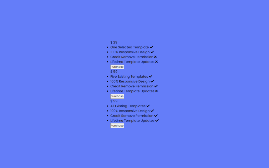
body{
display: flex;
align-items: center;
justify-content: center;
min-height: 100vh;
padding: 20px;
background: #647df9;
}Now, we need to do styling on these tables for that let’s jump into CSS part. First of all we will add a Google font which is Poppins this font looks awesome, so we have added it, then after we have to remove default padding and margin, and we need to add this font using font family. We need here our tables in the center for that we will use display: flex, align items and justify content to center also min height to 100vh with this our tables won’t get shrink if our screen gets shrink, and we will use #647df9 as a background color.
Customizing Pricing Tags
.wrapper{
max-width: 1090px;
width: 100%;
margin: auto;
display: flex;
flex-wrap: wrap;
justify-content: space-between;
}
.wrapper .table{
background: #fff;
width: calc(33% - 20px);
padding: 30px 30px;
position: relative;
box-shadow: 0 5px 10px rgba(0,0,0,0.1);
}
.table .price-section{
display: flex;
justify-content: center;
}
.table .price-area{
height: 120px;
width: 120px;
border-radius: 50%;
padding: 2px;
}
.price-area .inner-area{
height: 100%;
width: 100%;
border-radius: 50%;
border: 3px solid #fff;
line-height: 117px;
text-align: center;
color: #fff;
background-color: rgb(167, 167, 22);
position: relative;
}
.price-area .inner-area .text{
font-size: 25px;
font-weight: 400;
position: absolute;
top: -10px;
left: 17px;
}
.price-area .inner-area .price{
font-size: 45px;
font-weight: 500;
margin-left: 16px;
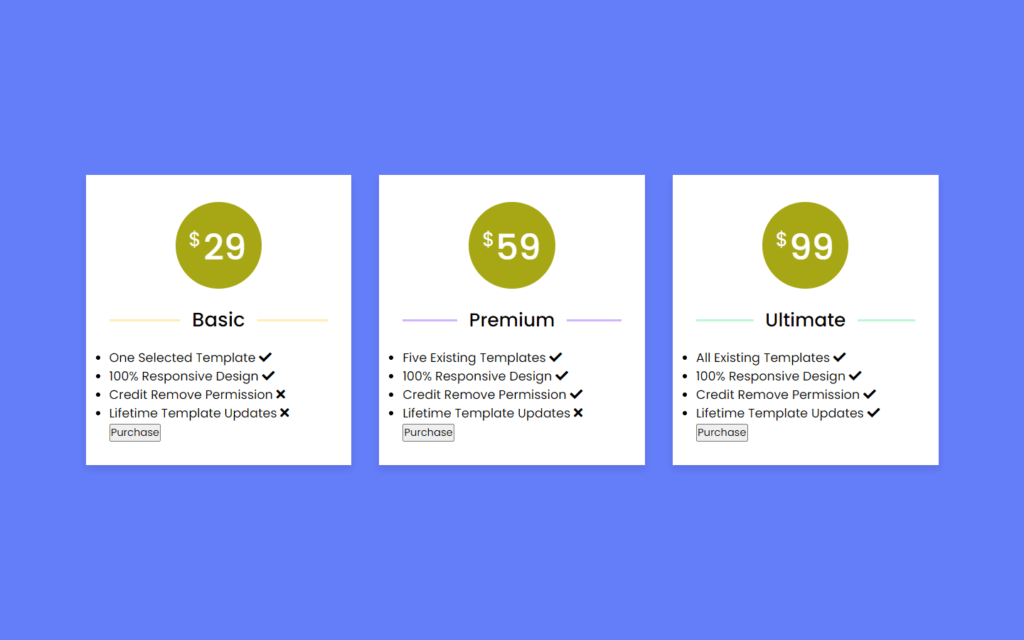
}Before we do anything with price tag, let’s customize the price tables first, for that we added max-width to 1090px which means tables will expand maximum of 1090 pixels then after we added flex-wrap to wrap this property specifies whether the flexible items should wrap or not. Also, we gave space between them using space-between.
After that, we need width of 33% – 20px space of table for pricing also we provided box-shadow here, now for price area border radius to 50%, so it will form round shape, color of price will be white now we added temporary background color, so the price will be show. Later we will remove this, then again we gave some font weight to $ sign and price.
Customizing Package Name
.table .package-name{
  width: 100%;
  height: 2px;
  margin: 35px 0;
  position: relative;
}
.table .package-name::before{
  position: absolute;
  top: 50%;
  left: 50%;
  font-size: 25px;
  font-weight: 500;
  background: #fff;
  padding: 0 15px;
  transform: translate(-50%, -50%);
}
.basic .package-name{
  background: #ffecb3;
}
.premium .package-name{
  background: #d0b3ff;
}
.ultimate .package-name{
  background: #baf8d4;
}
.basic .package-name::before{
  content: "Basic";
}
.premium .package-name::before{
  content: "Premium";
  font-size: 24px;
}
.ultimate .package-name::before{
  content: "Ultimate";
  font-size: 24px;
}
Let’s customize the package name for that we have added some adjustment as top, left, font-size and font-weight etc. After that used transform property with this we can place the name into the center, now we added background color for each package, also we changed package name for each table.
Customizing The Package Information
.table .features li{
margin-bottom: 15px;
list-style: none;
display: flex;
justify-content: space-between;
}
.features li .list-name{
font-size: 17px;
font-weight: 400;
}
.features li .icon{
font-size: 15px;
}
.features li .icon.check{
color: #2db94d;
}
.features li .icon.cross{
color: #cd3241;
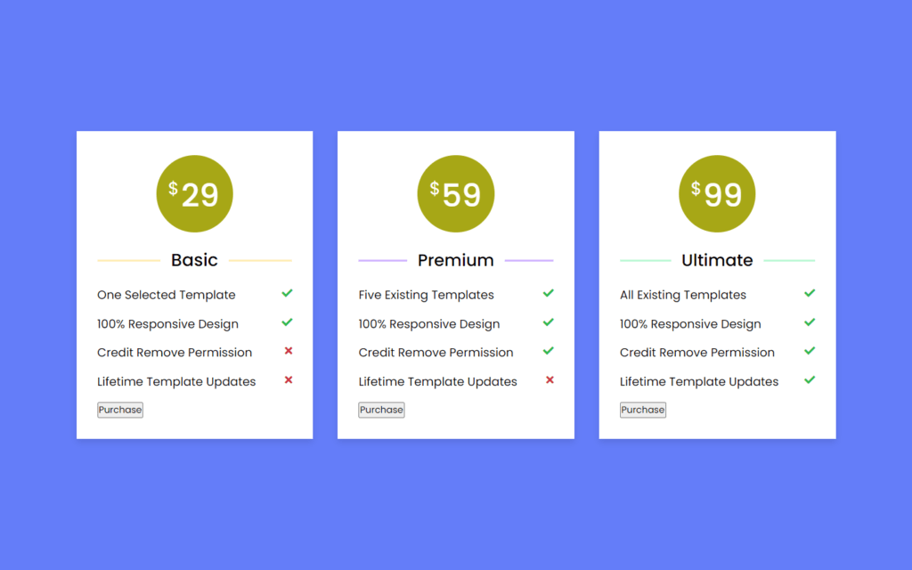
}For table feature we need space between them for that we used justify content, to remove the list dots we need list-style to none, also we added check color to red and for cross icon we added color of green.
Customizing The Button
.table .btn{
  width: 100%;
  display: flex;
  margin-top: 35px;
  justify-content: center;
}
.table .btn button{
  width: 80%;
  height: 50px;
  color: #fff;
  font-size: 20px;
  font-weight: 500;
  border: none;
  outline: none;
  border-radius: 25px;
  cursor: pointer;
  transition: all 0.3s ease;
}
.table .btn button:hover{
  border-radius: 5px;
}
.basic .features li::selection{
  background: #ffd861;
}
.basic ::selection,
.basic .price-area,
.basic .inner-area{
  background: #ffd861;
}
.basic .btn button{
  border: 2px solid #ffd861;
  background: #fff;
  color: #ffd861;
}
.basic .btn button:hover{
  background: #ffd861;
  color: #fff;
}
.premium ::selection,
.premium .price-area,
.premium .inner-area,
.premium .btn button{
  background: #a26bfa;
}
.premium .btn button:hover{
  background: #833af8;
}
.ultimate ::selection,
.ultimate .price-area,
.ultimate .inner-area{
  background: #43ef8b;
}
.ultimate .btn button{
  border: 2px solid #43ef8b;
  color: #43ef8b;
  background: #fff;
}
.ultimate .btn button:hover{
  background: #43ef8b;
  color: #fff;
}
To customize the button, we added some height and width also border and outline to none, cursor to pointer as well. Now we need to hover effect as border-radius of 5px. Now, if we select the list elements, then the color will change. Then after, we will add background for price-area, inner-area and button background. Also, we will add some darker color when hovering the button.
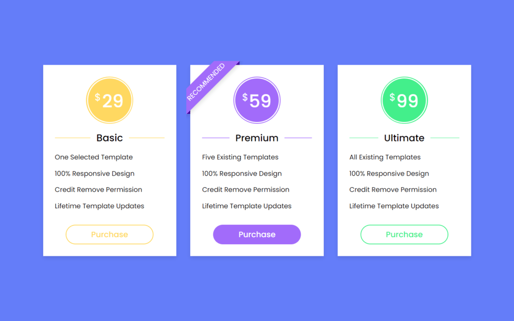
Customizing The Recommend Ribbon
::selection{
  color: #fff;
}
.table .ribbon{
  width: 150px;
  height: 150px;
  position: absolute;
  top: -10px;
  left: -10px;
  overflow: hidden;
}
.table .ribbon::before,
.table .ribbon::after{
  position: absolute;
  content: "";
  z-index: -1;
  display: block;
  border: 7px solid #4606ac;
  border-top-color: transparent;
  border-left-color: transparent;
}
.table .ribbon::before{
  top: 0px;
  right: 15px;
}
.table .ribbon::after{
  bottom: 15px;
  left: 0px;
}
.table .ribbon span{
  position: absolute;
  top: 30px;
  right: 0;
  transform: rotate(-45deg);
  width: 200px;
  background: #a26bfa;
  padding: 10px 0;
  color: #fff;
  text-align: center;
  font-size: 17px;
  text-transform: uppercase;
  box-shadow: 0 5px 10px rgba(0,0,0,0.12);
}
Now, we need to add the ribbon at the top of the premium table for that top and left to -10 also overflow to hidden with this area among the table will get hid, z-index to -1 with this ribbon will come over somewhat upper side basically, looks like 3D effect on ribbon, then we will rotate it to -45 degrees with this ribbon will looks like it wrapped at top left of the corner, after that we will give shadow to ribbon.

Making Page to Responsive
@media (max-width: 1020px) {
  .wrapper .table{
    width: calc(50% - 20px);
    margin-bottom: 40px;
  }
}
@media (max-width: 698px) {
  .wrapper .table{
    width: 100%;
  }
}
Full Source Code of Responsive Pricing Tables Using Only HTML & CSS
index.html
<!DOCTYPE html>
<html lang="en">
<head>
    <meta charset="UTF-8">
    <meta name="viewport" content="width=device-width, initial-scale=1.0">
    <title>Responsive Pricing Table Card</title>
    <link rel="stylesheet" href="style.css">
    <script src="https://kit.fontawesome.com/a076d05399.js"></script>
</head>
<body>
  <div class="wrapper">
    <div class="table basic">
      <div class="price-section">
        <div class="price-area">
          <div class="inner-area">
            <span class="text">$</span>
            <span class="price">29</span>
          </div>
        </div>
      </div>
      <div class="package-name"></div>
      <ul class="features">
        <li>
          <span class="list-name">One Selected Template</span>
          <span class="icon check"><i class="fas fa-check"></i></span>
        </li>
        <li>
          <span class="list-name">100% Responsive Design</span>
          <span class="icon check"><i class="fas fa-check"></i></span>
        </li>
        <li>
          <span class="list-name">Credit Remove Permission</span>
          <span class="icon cross"><i class="fas fa-times"></i></span>
        </li>
        <li>
          <span class="list-name">Lifetime Template Updates</span>
          <span class="icon cross"><i class="fas fa-times"></i></span>
        </li>
      </ul>
      <div class="btn"><button>Purchase</button></div>
    </div>
    <div class="table premium">
      <div class="ribbon"><span>Recommended</span></div>
      <div class="price-section">
        <div class="price-area">
          <div class="inner-area">
            <span class="text">$</span>
            <span class="price">59</span>
          </div>
        </div>
      </div>
      <div class="package-name"></div>
      <ul class="features">
        <li>
          <span class="list-name">Five Existing Templates</span>
          <span class="icon check"><i class="fas fa-check"></i></span>
        </li>
        <li>
          <span class="list-name">100% Responsive Design</span>
          <span class="icon check"><i class="fas fa-check"></i></span>
        </li>
        <li>
          <span class="list-name">Credit Remove Permission</span>
          <span class="icon check"><i class="fas fa-check"></i></span>
        </li>
        <li>
          <span class="list-name">Lifetime Template Updates</span>
          <span class="icon cross"><i class="fas fa-times"></i></span>
        </li>
      </ul>
      <div class="btn"><button>Purchase</button></div>
    </div>
    <div class="table ultimate">
      <div class="price-section">
        <div class="price-area">
          <div class="inner-area">
            <span class="text">$</span>
            <span class="price">99</span>
          </div>
        </div>
      </div>
      <div class="package-name"></div>
      <ul class="features">
        <li>
          <span class="list-name">All Existing Templates</span>
          <span class="icon check"><i class="fas fa-check"></i></span>
        </li>
        <li>
          <span class="list-name">100% Responsive Design</span>
          <span class="icon check"><i class="fas fa-check"></i></span>
        </li>
        <li>
          <span class="list-name">Credit Remove Permission</span>
          <span class="icon check"><i class="fas fa-check"></i></span>
        </li>
        <li>
          <span class="list-name">Lifetime Template Updates</span>
          <span class="icon check"><i class="fas fa-check"></i></span>
        </li>
      </ul>
      <div class="btn"><button>Purchase</button></div>
    </div>
  </div>

</body>
</html>
style.css
@import url('https://fonts.googleapis.com/css2?family=Poppins:wght@200;300;400;500;600;700&display=swap');
*{
  margin: 0;
  padding: 0;
  box-sizing: border-box;
  font-family: 'Poppins', sans-serif;
}
body{
  display: flex;
  align-items: center;
  justify-content: center;
  min-height: 100vh;
  padding: 20px;
  background: #647df9;
}
.wrapper{
  max-width: 1090px;
  width: 100%;
  margin: auto;
  display: flex;
  flex-wrap: wrap;
  justify-content: space-between;
}
.wrapper .table{
  background: #fff;
  width: calc(33% - 20px);
  padding: 30px 30px;
  position: relative;
  box-shadow: 0 5px 10px rgba(0,0,0,0.1);
}
.table .price-section{
  display: flex;
  justify-content: center;
}
.table .price-area{
  height: 120px;
  width: 120px;
  border-radius: 50%;
  padding: 2px;
}
.price-area .inner-area{
  height: 100%;
  width: 100%;
  border-radius: 50%;
  border: 3px solid #fff;
  line-height: 117px;
  text-align: center;
  color: #fff;
  background-color: rgb(167, 167, 22);
  position: relative;
}
.price-area .inner-area .text{
  font-size: 25px;
  font-weight: 400;
  position: absolute;
  top: -10px;
  left: 17px;
}
.price-area .inner-area .price{
  font-size: 45px;
  font-weight: 500;
  margin-left: 16px;
}
.table .package-name{
  width: 100%;
  height: 2px;
  margin: 35px 0;
  position: relative;
}
.table .package-name::before{
  position: absolute;
  top: 50%;
  left: 50%;
  font-size: 25px;
  font-weight: 500;
  background: #fff;
  padding: 0 15px;
  transform: translate(-50%, -50%);
}
.table .features li{
  margin-bottom: 15px;
  list-style: none;
  display: flex;
  justify-content: space-between;
}
.features li .list-name{
  font-size: 17px;
  font-weight: 400;
}
.features li .icon{
  font-size: 15px;
}
.features li .icon.check{
  color: #2db94d;
}
.features li .icon.cross{
  color: #cd3241;
}
.table .btn{
  width: 100%;
  display: flex;
  margin-top: 35px;
  justify-content: center;
}
.table .btn button{
  width: 80%;
  height: 50px;
  color: #fff;
  font-size: 20px;
  font-weight: 500;
  border: none;
  outline: none;
  border-radius: 25px;
  cursor: pointer;
  transition: all 0.3s ease;
}
.table .btn button:hover{
  border-radius: 5px;
}
.basic .features li::selection{
  background: #ffd861;
}
.basic ::selection,
.basic .price-area,
.basic .inner-area{
  background: #ffd861;
}
.basic .btn button{
  border: 2px solid #ffd861;
  background: #fff;
  color: #ffd861;
}
.basic .btn button:hover{
  background: #ffd861;
  color: #fff;
}
.premium ::selection,
.premium .price-area,
.premium .inner-area,
.premium .btn button{
  background: #a26bfa;
}
.premium .btn button:hover{
  background: #833af8;
}
.ultimate ::selection,
.ultimate .price-area,
.ultimate .inner-area{
  background: #43ef8b;
}
.ultimate .btn button{
  border: 2px solid #43ef8b;
  color: #43ef8b;
  background: #fff;
}
.ultimate .btn button:hover{
  background: #43ef8b;
  color: #fff;
}
.basic .package-name{
  background: #ffecb3;
}
.premium .package-name{
  background: #d0b3ff;
}
.ultimate .package-name{
  background: #baf8d4;
}
.basic .package-name::before{
  content: "Basic";
}
.premium .package-name::before{
  content: "Premium";
  font-size: 24px;
}
.ultimate .package-name::before{
  content: "Ultimate";
  font-size: 24px;
}
@media (max-width: 1020px) {
  .wrapper .table{
    width: calc(50% - 20px);
    margin-bottom: 40px;
  }
}
@media (max-width: 698px) {
  .wrapper .table{
    width: 100%;
  }
}
::selection{
  color: #fff;
}
.table .ribbon{
  width: 150px;
  height: 150px;
  position: absolute;
  top: -10px;
  left: -10px;
  overflow: hidden;
}
.table .ribbon::before,
.table .ribbon::after{
  position: absolute;
  content: "";
  z-index: -1;
  display: block;
  border: 7px solid #4606ac;
  border-top-color: transparent;
  border-left-color: transparent;
}
.table .ribbon::before{
  top: 0px;
  right: 15px;
}
.table .ribbon::after{
  bottom: 15px;
  left: 0px;
}
.table .ribbon span{
  position: absolute;
  top: 30px;
  right: 0;
  transform: rotate(-45deg);
  width: 200px;
  background: #a26bfa;
  padding: 10px 0;
  color: #fff;
  text-align: center;
  font-size: 17px;
  text-transform: uppercase;
  box-shadow: 0 5px 10px rgba(0,0,0,0.12);
}
Output
Check out Full Source Code On Github


