


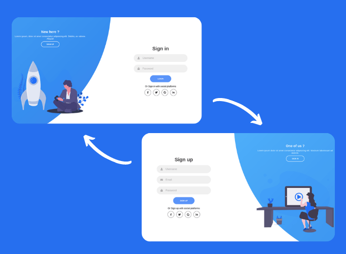
In this article, we are going to make responsive login & registration form in HTML, CSS & JS, so in this form we will have two sections one for login and second for signup, we will also add some animation while switching between these two. Basically, this is going to be a fun project to do.
you can see the demo here Sliding Login and Registration Form In HTML, CSS
Pre-requisites To Make Sliding Login & Registration Form in HTML, CSS & JS
- Good knowledge of HTML.
- Good knowledge of CSS & CSS3.
- Good knowledge of JavaScript.
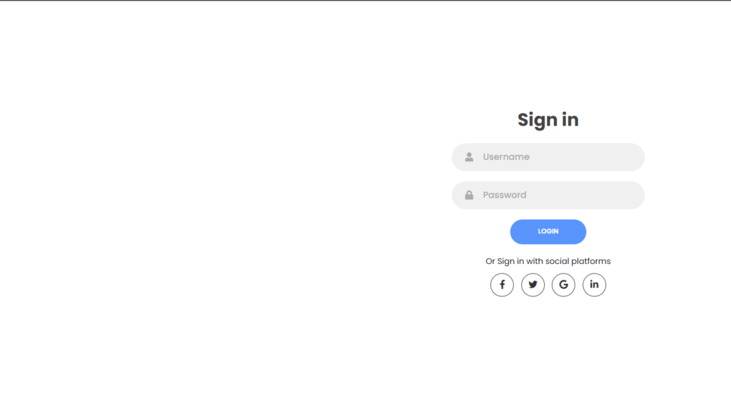
Creating Login Form
First of all we are going to use Font awesome for some icons like social platform and let’s link style.css.
<script
      src="<https://kit.fontawesome.com/64d58efce2.js>"
      crossorigin="anonymous"
    ></script>
    <link rel="stylesheet" href="style.css" />
<div class="container">
      <div class="forms-container">
        <div class="signin-signup">
          <form action="#" class="sign-in-form">
            <h2 class="title">Sign in</h2>
            <div class="input-field">
              <i class="fas fa-user"></i>
              <input type="text" placeholder="Username" />
            </div>
            <div class="input-field">
              <i class="fas fa-lock"></i>
              <input type="password" placeholder="Password" />
            </div>
            <input type="submit" value="Login" class="btn solid" />
            <p class="social-text">Or Sign in with social platforms</p>
            <div class="social-media">
              <a href="#" class="social-icon">
                <i class="fab fa-facebook-f"></i>
              </a>
              <a href="#" class="social-icon">
                <i class="fab fa-twitter"></i>
              </a>
              <a href="#" class="social-icon">
                <i class="fab fa-google"></i>
              </a>
              <a href="#" class="social-icon">
                <i class="fab fa-linkedin-in"></i>
              </a>
            </div>
          </form>
			</div>
	</div>
</div>
Now let’s start to create the login form, for that we will add user icon using fas fa-user this is font awesome icon which we have already included in script tag earlier, after that lets add input field with placeholder also for password we will add an icon and put placeholder password, then after we need a button, and some social platform with their icons again in here we will use font awesome, for Facebook we’ll use fab-facebook like this.

Setting up Default values
@import url("<https://fonts.googleapis.com/css2?family=Poppins:wght@200;300;400;500;600;700;800&display=swap>");

* {
  margin: 0;
  padding: 0;
  box-sizing: border-box;
}

body,
input {
  font-family: "Poppins", sans-serif;
}

.container {
  position: relative;
  width: 100%;
  background-color: #fff;
  min-height: 100vh;
  overflow: hidden;
}

.forms-container {
  position: absolute;
  width: 100%;
  height: 100%;
  top: 0;
  left: 0;
}

form {
  display: flex;
  align-items: center;
  justify-content: center;
  flex-direction: column;
  padding: 0rem 5rem;
  transition: all 0.2s 0.7s;
  overflow: hidden;
  grid-column: 1 / 2;
  grid-row: 1 / 2;
}
Now let’s move on CSS part, here we are going to use Poppins google font so for that we will import it using URL you can find out the url from google, after we will remove default margin, padding and set box-sizing to border-box.
Now we need to place the form in to the center so for that we will use display to flex, align-items to center and justify content to center as well. we used here flex direction to column so that our elements present in the form will set column wise, after that we also Use the grid-column **property to specify on which column-line to start the item, and which column-line to end the item, same for grid row.
Customizing The Form
.signin-signup {
  position: absolute;
  top: 50%;
  transform: translate(-50%, -50%);
  left: 75%;
  width: 50%;
  display: grid;
  grid-template-columns: 1fr;
  z-index: 5;
}

form.sign-up-form {
  opacity: 0;
  z-index: 1;
}

form.sign-in-form {
  z-index: 2;
}

.title {
  font-size: 2.2rem;
  color: #444;
  margin-bottom: 10px;
}
Now we need the form somewhat left side of the screen in middle, so for that first we will use translate to -50%, -50%, with this form will be set in center of the screen now let’s give left to 75% then after we used here grid-template-columns to 1fr with this form will be set in whole available space now we use z-index, so form won’t get hide behind background. we have given it to 5 so if we switch to signup form then it will give some cool effect.
.input-field {
  max-width: 380px;
  width: 100%;
  background-color: #f0f0f0;
  margin: 10px 0;
  height: 55px;
  border-radius: 55px;
  display: grid;
  grid-template-columns: 15% 85%;
  padding: 0 0.4rem;
  position: relative;
}

.input-field i {
  text-align: center;
  line-height: 55px;
  color: #acacac;
  transition: 0.5s;
  font-size: 1.1rem;
}

.input-field input {
  background: none;
  outline: none;
  border: none;
  line-height: 1;
  font-weight: 600;
  font-size: 1.1rem;
  color: #333;
}

.input-field input::placeholder {
  color: #aaa;
  font-weight: 500;
}
Now for input field we set background color of #f0f0f0, and we used here grid template columns to 15%, 85%. this means 15% of the input field assigned to icon and 85% for input field, for icons in input field we provide the color of grey type, and we add transition of 0.5 seconds.
for input field we gave background. outline and border to none after that, we want font weight of 600 and for placeholder we need font-weight of 500.
.social-text {
  padding: 0.7rem 0;
  font-size: 1rem;
}

.social-media {
  display: flex;
  justify-content: center;
}

.social-icon {
  height: 46px;
  width: 46px;
  display: flex;
  justify-content: center;
  align-items: center;
  margin: 0 0.45rem;
  color: #333;
  border-radius: 50%;
  border: 1px solid #333;
  text-decoration: none;
  font-size: 1.1rem;
  transition: 0.3s;
}

.social-icon:hover {
  color: #4481eb;
  border-color: #4481eb;
}
Now let’s place social icons to center with justify-content, align-items to center also we will add transition of 0.3 seconds, now let’s add hovering effect we’ll add color of #4491eb that means if we put our cursor on social-icons then color will change also we will add border color as well.
.btn {
  width: 150px;
  background-color: #5995fd;
  border: none;
  outline: none;
  height: 49px;
  border-radius: 49px;
  color: #fff;
  text-transform: uppercase;
  font-weight: 600;
  margin: 10px 0;
  cursor: pointer;
  transition: 0.5s;
}

.btn:hover {
  background-color: #4d84e2;
}
Now let’s customize the button, we need to clear the border and outline, so border will get removed around the button, also we add blueish type color to button and text transformation to uppercase, so the text in the button will be in uppercase format also we’ll add cursor as pointer with this if we hover on button then cursor will turn into pointer. after that we need some darker blueish color when hovering button.
Adding Signup form
<form action="#" class="sign-up-form">
            <h2 class="title">Sign up</h2>
            <div class="input-field">
              <i class="fas fa-user"></i>
              <input type="text" placeholder="Username" />
            </div>
            <div class="input-field">
              <i class="fas fa-envelope"></i>
              <input type="email" placeholder="Email" />
            </div>
            <div class="input-field">
              <i class="fas fa-lock"></i>
              <input type="password" placeholder="Password" />
            </div>
            <input type="submit" class="btn" value="Sign up" />
            <p class="social-text">Or Sign up with social platforms</p>
            <div class="social-media">
              <a href="#" class="social-icon">
                <i class="fab fa-facebook-f"></i>
              </a>
              <a href="#" class="social-icon">
                <i class="fab fa-twitter"></i>
              </a>
              <a href="#" class="social-icon">
                <i class="fab fa-google"></i>
              </a>
              <a href="#" class="social-icon">
                <i class="fab fa-linkedin-in"></i>
              </a>
            </div>
          </form>
Next, we will add signup form, this form will be same as login form we just need to add email field here, and we will add icon for email in here we don’t need to change any CSS because we already have customized it because all classes have same name as login form.
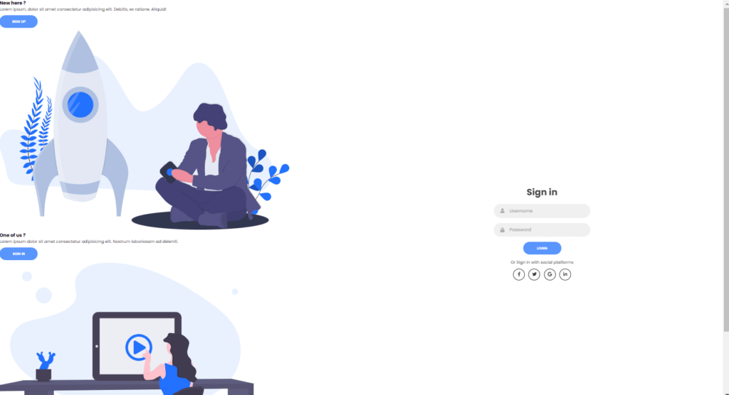
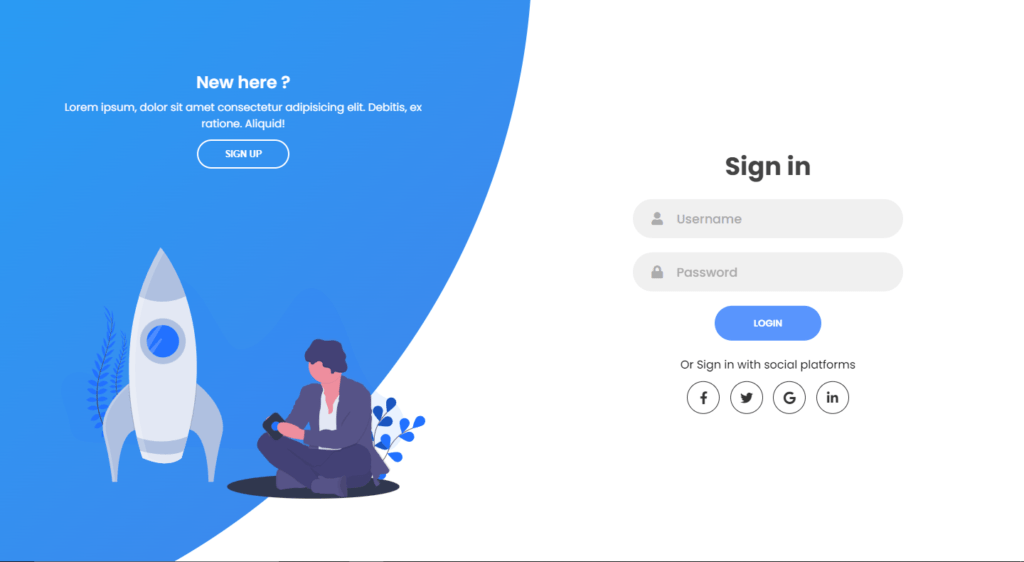
Creating Panels-Container
<div class="panels-container">
        <div class="panel left-panel">
          <div class="content">
            <h3>New here ?</h3>
            <p>
              Lorem ipsum, dolor sit amet consectetur adipisicing elit. Debitis,
              ex ratione. Aliquid!
            </p>
            <button class="btn transparent" id="sign-up-btn">
              Sign up
            </button>
          </div>
          <img src="img/log.svg" class="image" alt="" />
        </div>
        <div class="panel right-panel">
          <div class="content">
            <h3>One of us ?</h3>
            <p>
              Lorem ipsum dolor sit amet consectetur adipisicing elit. Nostrum
              laboriosam ad deleniti.
            </p>
            <button class="btn transparent" id="sign-in-btn">
              Sign in
            </button>
          </div>
          <img src="img/register.svg" class="image" alt="" />
        </div>
      </div>
    </div>
Now we’ll add panel container also we add the title and paragraph with some random text, then we will add sign up button, after that we will add the image here we used log.svg it is basically template file we just need to add here also this will be in left side.
For the right side panel, we add here title as “one of us?” and some random paragraph also let’s add transparent button named sign-in here we need register.svg file as image.
Customizing Panels-Container
.panels-container {
  position: absolute;
  height: 100%;
  width: 100%;
  top: 0;
  left: 0;
  display: grid;
  grid-template-columns: repeat(2, 1fr);
}

.container:before {
  content: "";
  position: absolute;
  height: 2000px;
  width: 2000px;
  top: -10%;
  right: 48%;
  transform: translateY(-50%);
  background-image: linear-gradient(-45deg, #4481eb 0%, #04befe 100%);
  transition: 1.8s ease-in-out;
  border-radius: 50%;
  z-index: 6;
}
Now we need to customize the panels, for that we set position to absolute also we need to repeat the panels into 2 parts for 1fr space, after that we will give height and weight of 2000px, so the container will be larger for 2000 pixels, we also set background image at -45 degrees, and also we will add color #4481eb at 0% and at 100% change color to #04befe, now we need transition of 1.8 seconds of ease-in-out type.
.image {
  width: 100%;
  transition-delay: 0.4s;
}

.panel {
  display: flex;
  flex-direction: column;
  align-items: flex-end;
  justify-content: space-around;
  text-align: center;
  z-index: 6;
}

.left-panel {
  pointer-events: all;
  padding: 3rem 17% 2rem 12%;
}

.right-panel {
  pointer-events: none;
  padding: 3rem 12% 2rem 17%;
}

.panel .content {
  color: #fff;
  transition-delay: 0.6s;
}

.panel h3 {
  font-weight: 600;
  line-height: 1;
  font-size: 1.5rem;
}

.panel p {
  font-size: 0.95rem;
  padding: 0.7rem 0;
}

.btn.transparent {
  margin: 0;
  background: none;
  border: 2px solid #fff;
  width: 130px;
  height: 41px;
  font-weight: 600;
  font-size: 0.8rem;
}

.right-panel .image,
.right-panel .content {
  transform: translateX(800px);
}
After that, let’s make panel of flex-direction of column and align-items to flex-end with this panel will get set to end of side of the screen and set z-index to 6, so the image will come up on the background, after that lets set pointer event to all with this cursor becomes pointer to all elements of panel.
Now for button, let’s set background to none ad border to 2px solid with color #fff and font-weight of 600, also translate it with X to 800px in right panel’s image and content.
Also, we will animate our panels and forms using below:
.container.sign-up-mode:before {
  transform: translate(100%, -50%);
  right: 52%;
}

.container.sign-up-mode .left-panel .image,
.container.sign-up-mode .left-panel .content {
  transform: translateX(-800px);
}

.container.sign-up-mode .signin-signup {
  left: 25%;
}

.container.sign-up-mode form.sign-up-form {
  opacity: 1;
  z-index: 2;
}

.container.sign-up-mode form.sign-in-form {
  opacity: 0;
  z-index: 1;
}

.container.sign-up-mode .right-panel .image,
.container.sign-up-mode .right-panel .content {
  transform: translateX(0%);
}

.container.sign-up-mode .left-panel {
  pointer-events: none;
}

.container.sign-up-mode .right-panel {
  pointer-events: all;
}
Making Form Responsive
With the following lines of the codes we can make our form to responsive:
@media(max-width: 870px){
	.container {
    min-height: 800px;
    height: 100vh;
  }
  .signin-signup {
    width: 100%;
    top: 95%;
    transform: translate(-50%, -100%);
    transition: 1s 0.8s ease-in-out;
  }

  .signin-signup,
  .container.sign-up-mode .signin-signup {
    left: 50%;
  }

  .panels-container {
    grid-template-columns: 1fr;
    grid-template-rows: 1fr 2fr 1fr;
  }

  .panel {
    flex-direction: row;
    justify-content: space-around;
    align-items: center;
    padding: 2.5rem 8%;
    grid-column: 1 / 2;
  }

  .right-panel {
    grid-row: 3 / 4;
  }

  .left-panel {
    grid-row: 1 / 2;
  }

  .image {
    width: 200px;
    transition: transform 0.9s ease-in-out;
    transition-delay: 0.6s;
  }

  .panel .content {
    padding-right: 15%;
    transition: transform 0.9s ease-in-out;
    transition-delay: 0.8s;
  }

  .panel h3 {
    font-size: 1.2rem;
  }

  .panel p {
    font-size: 0.7rem;
    padding: 0.5rem 0;
  }

  .btn.transparent {
    width: 110px;
    height: 35px;
    font-size: 0.7rem;
  }

  .container:before {
    width: 1500px;
    height: 1500px;
    transform: translateX(-50%);
    left: 30%;
    bottom: 68%;
    right: initial;
    top: initial;
    transition: 2s ease-in-out;
  }

  .container.sign-up-mode:before {
    transform: translate(-50%, 100%);
    bottom: 32%;
    right: initial;
  }

  .container.sign-up-mode .left-panel .image,
  .container.sign-up-mode .left-panel .content {
    transform: translateY(-300px);
  }

  .container.sign-up-mode .right-panel .image,
  .container.sign-up-mode .right-panel .content {
    transform: translateY(0px);
  }

  .right-panel .image,
  .right-panel .content {
    transform: translateY(300px);
  }

  .container.sign-up-mode .signin-signup {
    top: 5%;
    transform: translate(-50%, 0);
  }
}

@media (max-width: 570px) {
  form {
    padding: 0 1.5rem;
  }

  .image {
    display: none;
  }
  .panel .content {
    padding: 0.5rem 1rem;
  }
  .container {
    padding: 1.5rem;
  }

  .container:before {
    bottom: 72%;
    left: 50%;
  }

  .container.sign-up-mode:before {
    bottom: 28%;
    left: 50%;
  }
}
Adding Functionality To Form
const sign_in_btn = document.querySelector("#sign-in-btn");
const sign_up_btn = document.querySelector("#sign-up-btn");
const container = document.querySelector(".container");

sign_up_btn.addEventListener("click", () => {
  container.classList.add("sign-up-mode");
});

sign_in_btn.addEventListener("click", () => {
  container.classList.remove("sign-up-mode");
});
Now we need to add functionality to switch from login to signup form using JavaScript for that we will add event listener on click event we will add sign up mode, and for sign in button we will remove the signup mode.
Full Source Code For Sliding Login & Registration Form in HTML, CSS & JS
index.html
<!DOCTYPE html>
<html lang="en">
  <head>
    <meta charset="UTF-8" />
    <meta name="viewport" content="width=device-width, initial-scale=1.0" />
    <script
      src="<https://kit.fontawesome.com/64d58efce2.js>"
      crossorigin="anonymous"
    ></script>
    <link rel="stylesheet" href="style.css" />
    <title>Sign in & Sign up Form</title>
  </head>
  <body>
    <div class="container">
      <div class="forms-container">
        <div class="signin-signup">
          <form action="#" class="sign-in-form">
            <h2 class="title">Sign in</h2>
            <div class="input-field">
              <i class="fas fa-user"></i>
              <input type="text" placeholder="Username" />
            </div>
            <div class="input-field">
              <i class="fas fa-lock"></i>
              <input type="password" placeholder="Password" />
            </div>
            <input type="submit" value="Login" class="btn solid" />
            <p class="social-text">Or Sign in with social platforms</p>
            <div class="social-media">
              <a href="#" class="social-icon">
                <i class="fab fa-facebook-f"></i>
              </a>
              <a href="#" class="social-icon">
                <i class="fab fa-twitter"></i>
              </a>
              <a href="#" class="social-icon">
                <i class="fab fa-google"></i>
              </a>
              <a href="#" class="social-icon">
                <i class="fab fa-linkedin-in"></i>
              </a>
            </div>
          </form>
          <form action="#" class="sign-up-form">
            <h2 class="title">Sign up</h2>
            <div class="input-field">
              <i class="fas fa-user"></i>
              <input type="text" placeholder="Username" />
            </div>
            <div class="input-field">
              <i class="fas fa-envelope"></i>
              <input type="email" placeholder="Email" />
            </div>
            <div class="input-field">
              <i class="fas fa-lock"></i>
              <input type="password" placeholder="Password" />
            </div>
            <input type="submit" class="btn" value="Sign up" />
            <p class="social-text">Or Sign up with social platforms</p>
            <div class="social-media">
              <a href="#" class="social-icon">
                <i class="fab fa-facebook-f"></i>
              </a>
              <a href="#" class="social-icon">
                <i class="fab fa-twitter"></i>
              </a>
              <a href="#" class="social-icon">
                <i class="fab fa-google"></i>
              </a>
              <a href="#" class="social-icon">
                <i class="fab fa-linkedin-in"></i>
              </a>
            </div>
          </form>
        </div>
      </div>

     <div class="panels-container">
        <div class="panel left-panel">
          <div class="content">
            <h3>New here ?</h3>
            <p>
              Lorem ipsum, dolor sit amet consectetur adipisicing elit. Debitis,
              ex ratione. Aliquid!
            </p>
            <button class="btn transparent" id="sign-up-btn">
              Sign up
            </button>
          </div>
          <img src="img/log.svg" class="image" alt="" />
        </div>
        <div class="panel right-panel">
          <div class="content">
            <h3>One of us ?</h3>
            <p>
              Lorem ipsum dolor sit amet consectetur adipisicing elit. Nostrum
              laboriosam ad deleniti.
            </p>
            <button class="btn transparent" id="sign-in-btn">
              Sign in
            </button>
          </div>
          <img src="img/register.svg" class="image" alt="" />
        </div>
      </div>
    </div>

    <!-- <script src="app.js"></script> -->
  </body>
</html>
style.css
@import url("<https://fonts.googleapis.com/css2?family=Poppins:wght@200;300;400;500;600;700;800&display=swap>");

* {
  margin: 0;
  padding: 0;
  box-sizing: border-box;
}

body,
input {
  font-family: "Poppins", sans-serif;
}

.container {
  position: relative;
  width: 100%;
  background-color: #fff;
  min-height: 100vh;
  overflow: hidden;
}

.forms-container {
  position: absolute;
  width: 100%;
  height: 100%;
  top: 0;
  left: 0;
}

.signin-signup {
  position: absolute;
  top: 50%;
  transform: translate(-50%, -50%);
  left: 75%;
  width: 50%;
  transition: 1s 0.7s ease-in-out;
  display: grid;
  grid-template-columns: 1fr;
  z-index: 5;
}

form {
  display: flex;
  align-items: center;
  justify-content: center;
  flex-direction: column;
  padding: 0rem 5rem;
  transition: all 0.2s 0.7s;
  overflow: hidden;
  grid-column: 1 / 2;
  grid-row: 1 / 2;
}

form.sign-up-form {
  opacity: 0;
  z-index: 1;
}

form.sign-in-form {
  z-index: 2;
}

.title {
  font-size: 2.2rem;
  color: #444;
  margin-bottom: 10px;
}

.input-field {
  max-width: 380px;
  width: 100%;
  background-color: #f0f0f0;
  margin: 10px 0;
  height: 55px;
  border-radius: 55px;
  display: grid;
  grid-template-columns: 15% 85%;
  padding: 0 0.4rem;
  position: relative;
}

.input-field i {
  text-align: center;
  line-height: 55px;
  color: #acacac;
  transition: 0.5s;
  font-size: 1.1rem;
}

.input-field input {
  background: none;
  outline: none;
  border: none;
  line-height: 1;
  font-weight: 600;
  font-size: 1.1rem;
  color: #333;
}

.input-field input::placeholder {
  color: #aaa;
  font-weight: 500;
}

.social-text {
  padding: 0.7rem 0;
  font-size: 1rem;
}

.social-media {
  display: flex;
  justify-content: center;
}

.social-icon {
  height: 46px;
  width: 46px;
  display: flex;
  justify-content: center;
  align-items: center;
  margin: 0 0.45rem;
  color: #333;
  border-radius: 50%;
  border: 1px solid #333;
  text-decoration: none;
  font-size: 1.1rem;
  transition: 0.3s;
}

.social-icon:hover {
  color: #4481eb;
  border-color: #4481eb;
}

.btn {
  width: 150px;
  background-color: #5995fd;
  border: none;
  outline: none;
  height: 49px;
  border-radius: 49px;
  color: #fff;
  text-transform: uppercase;
  font-weight: 600;
  margin: 10px 0;
  cursor: pointer;
  transition: 0.5s;
}

.btn:hover {
  background-color: #4d84e2;
}

 .panels-container {
  position: absolute;
  height: 100%;
  width: 100%;
  top: 0;
  left: 0;
  display: grid;
  grid-template-columns: repeat(2, 1fr);
}

.container:before {
  content: "";
  position: absolute;
  height: 2000px;
  width: 2000px;
  top: -10%;
  right: 48%;
  transform: translateY(-50%);
  background-image: linear-gradient(-45deg, #4481eb 0%, #04befe 100%);
  transition: 1.8s ease-in-out;
  border-radius: 50%;
  z-index: 6;
}

.image {
  width: 100%;
  transition: transform 1.1s ease-in-out;
  transition-delay: 0.4s;
}

.panel {
  display: flex;
  flex-direction: column;
  align-items: flex-end;
  justify-content: space-around;
  text-align: center;
  z-index: 6;
}

.left-panel {
  pointer-events: all;
  padding: 3rem 17% 2rem 12%;
}

.right-panel {
  pointer-events: none;
  padding: 3rem 12% 2rem 17%;
}

.panel .content {
  color: #fff;
  transition: transform 0.9s ease-in-out;
  transition-delay: 0.6s;
}

.panel h3 {
  font-weight: 600;
  line-height: 1;
  font-size: 1.5rem;
}

.panel p {
  font-size: 0.95rem;
  padding: 0.7rem 0;
}

.btn.transparent {
  margin: 0;
  background: none;
  border: 2px solid #fff;
  width: 130px;
  height: 41px;
  font-weight: 600;
  font-size: 0.8rem;
}

.right-panel .image,
.right-panel .content {
  transform: translateX(800px);
}

/* ANIMATION */

.container.sign-up-mode:before {
  transform: translate(100%, -50%);
  right: 52%;
}

.container.sign-up-mode .left-panel .image,
.container.sign-up-mode .left-panel .content {
  transform: translateX(-800px);
}

.container.sign-up-mode .signin-signup {
  left: 25%;
}

.container.sign-up-mode form.sign-up-form {
  opacity: 1;
  z-index: 2;
}

.container.sign-up-mode form.sign-in-form {
  opacity: 0;
  z-index: 1;
}

.container.sign-up-mode .right-panel .image,
.container.sign-up-mode .right-panel .content {
  transform: translateX(0%);
}

.container.sign-up-mode .left-panel {
  pointer-events: none;
}

.container.sign-up-mode .right-panel {
  pointer-events: all;
}

@media (max-width: 870px) {
  .container {
    min-height: 800px;
    height: 100vh;
  }
  .signin-signup {
    width: 100%;
    top: 95%;
    transform: translate(-50%, -100%);
    transition: 1s 0.8s ease-in-out;
  }

  .signin-signup,
  .container.sign-up-mode .signin-signup {
    left: 50%;
  }

  .panels-container {
    grid-template-columns: 1fr;
    grid-template-rows: 1fr 2fr 1fr;
  }

  .panel {
    flex-direction: row;
    justify-content: space-around;
    align-items: center;
    padding: 2.5rem 8%;
    grid-column: 1 / 2;
  }

  .right-panel {
    grid-row: 3 / 4;
  }

  .left-panel {
    grid-row: 1 / 2;
  }

  .image {
    width: 200px;
    transition: transform 0.9s ease-in-out;
    transition-delay: 0.6s;
  }

  .panel .content {
    padding-right: 15%;
    transition: transform 0.9s ease-in-out;
    transition-delay: 0.8s;
  }

  .panel h3 {
    font-size: 1.2rem;
  }

  .panel p {
    font-size: 0.7rem;
    padding: 0.5rem 0;
  }

  .btn.transparent {
    width: 110px;
    height: 35px;
    font-size: 0.7rem;
  }

  .container:before {
    width: 1500px;
    height: 1500px;
    transform: translateX(-50%);
    left: 30%;
    bottom: 68%;
    right: initial;
    top: initial;
    transition: 2s ease-in-out;
  }

  .container.sign-up-mode:before {
    transform: translate(-50%, 100%);
    bottom: 32%;
    right: initial;
  }

  .container.sign-up-mode .left-panel .image,
  .container.sign-up-mode .left-panel .content {
    transform: translateY(-300px);
  }

  .container.sign-up-mode .right-panel .image,
  .container.sign-up-mode .right-panel .content {
    transform: translateY(0px);
  }

  .right-panel .image,
  .right-panel .content {
    transform: translateY(300px);
  }

  .container.sign-up-mode .signin-signup {
    top: 5%;
    transform: translate(-50%, 0);
  }
}

@media (max-width: 570px) {
  form {
    padding: 0 1.5rem;
  }

  .image {
    display: none;
  }
  .panel .content {
    padding: 0.5rem 1rem;
  }
  .container {
    padding: 1.5rem;
  }

  .container:before {
    bottom: 72%;
    left: 50%;
  }

  .container.sign-up-mode:before {
    bottom: 28%;
    left: 50%;
  }
}
app.js
const sign_in_btn = document.querySelector("#sign-in-btn");
const sign_up_btn = document.querySelector("#sign-up-btn");
const container = document.querySelector(".container");

sign_up_btn.addEventListener("click", () => {
  container.classList.add("sign-up-mode");
});

sign_in_btn.addEventListener("click", () => {
  container.classList.remove("sign-up-mode");
});
Output


Check out Full Source Code On Github


