


In this article, we are going to make a complete responsive login form in HTML & CSS. in this form we’ll have some input fields along with social media buttons to log in, this form is going to be completely responsive.
Pre-requisites To Make Complete Responsive Login Form In HTML & CSS
- Basic knowledge of HTML.
- Basic knowledge of CSS3.
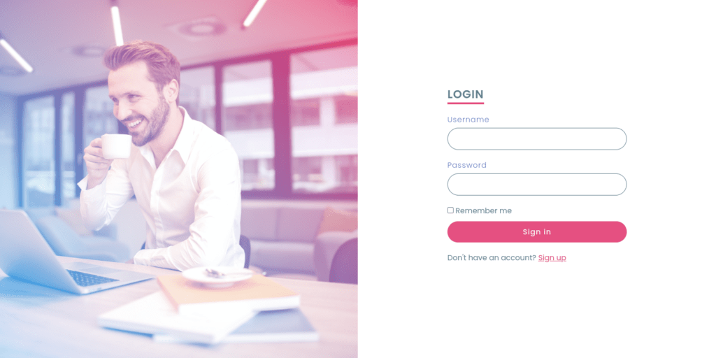
You can see the demo here responsive login form in HTML & CSS
Setting up Image & Default Values
<section>
        <div class="imgBx">
             <img src="images/login.jpg">
	</div>
        <div class="contentBx"></div>
</section>
First of all, Let’s make a section in which we will define 2 divs with a class name of imgBx in this we’ll add our image, and another one will be contentBx, we will modify and add some more HTML later.
@import url('https://fonts.googleapis.com/css?family=Poppins:200,300,400,500,600,700,800,900&display=swap');


*{
    margin: 0;
    padding: 0;
    box-sizing: border-box;
    font-family: 'Poppins', sans-serif;
}

section{
    position: relative;
    width: 100%;
    height: 100vh;
    display: flex;

}

section .imgBx{
    position: relative;
    width: 50%;
    height: 100%;
}

section .imgBx img{
    position: absolute;
    top: 0;
    left: 0;
    width: 100%;
    height: 100%;
    object-fit: cover;
}
Now let’s add a google font named Poppins with import, this is not necessary, but it will make the font very cool, after that select all elements with (*) let’s remove all default margins and padding, for that let’s give margin and padding to 0, box-sizing to border-box, and font-family to Poppins, sans serif.
now in the section let’s give the position to relative, width to 100%, height to 100vh, and display to flex. after that in the imgBx class, let’s set position to relative, width to 50%, and height to 100%. now let’s select an image, in this position will be absolute, top and left to 0, width and height let’s say 100%, and object-fit to cover with this property image will set in window size.

section .imgBx::before{
    content: '';
    position: absolute;
    top: 0;
    left: 0;
    width: 100%;
    height: 100%;
    background: linear-gradient(225deg, #e91e63, #03a9f4);
    z-index: 1;
    mix-blend-mode: screen;
}
after this, let’s make an image to look cool for that, here we will add the background as a linear gradient with color (#e91e63, #03a9f4) at 225 degrees.

Making Login Form
<div class="contentBx">
        <div class="formBx">
                <h2>Login</h2>
                <form>
                    <div class="inputBx">
                        <span>Username</span>
                        <input type="text" name="">
                    </div>
                    <div class="inputBx">
                        <span>Password</span>
                        <input type="password" name="">
                    </div>
                    <div class="remember">
                        <label><input type="checkbox" name=""> Remember me</label>
                    </div>
                    <div class="inputBx">
                        <input type="submit" value="Sign in" name="">
                    </div>
                    <div class="inputBx">
                        <p>Don't have an account? <a href="#">Sign up</a></p>
                    </div>
                </form>
				</div>
</div>
let’s back to HTML, here we will make another div with formBx class name and then add form, in this form let’s add an input field for username with class name inputBx. now let’s copy this code and change the input type to a password for the password field, after that let’s add another div with class remember here we will add a label with a checkbox, now we need to add a submit button, and a paragraph.
section .contentBx{
    display: flex;
    width: 50%;
    height: 100%;
    justify-content: center;
    align-items: center;
}

section .contentBx .formBx{
    width: 50%;
}

section .contentBx .formBx h2{
    color: #607d8b;
    font-weight: 600;
    font-size: 1.5em;
    text-transform: uppercase;
    margin-bottom: 20px;
    border-bottom: 4px solid #ff4584;
    display: inline-block;
    letter-spacing: 1px;
}

section .contentBx .formBx .inputBx{
    margin-bottom: 20px;
}

section .contentBx .formBx .inputBx span{
    font-size: 16px;
    margin-bottom: 5px;
    display: inline-block;
    color: #607db8;
    font-weight: 300;
    letter-spacing: 1px;

}

section .contentBx .formBx .inputBx input{
    width: 100%;
    padding: 10px 20px;
    outline: none;
    font-weight: 400;
    border: 1px solid #607d8b;
    font-size: 16px;
    letter-spacing: 1px;
    color: #607d8b;
    background: transparent;
    border-radius: 30px;
}

section .contentBx .formBx .inputBx input[type = "submit"]{
    background: #ff4584;
    color: #fff;
    outline: none;
    border: none;
    font-weight: 500;
    cursor: pointer;
}

section .contentBx .formBx .inputBx input[type = "submit"]:hover{
    background: #f53677;
}

section .contentBx .formBx .remember{
    margin-bottom: 10px;
    color: #607d8b;
    font-weight: 400;
    font-style: 14px;

}

section .contentBx .formBx .inputBx p{
    color: #607d8b;
}

section .contentBx .formBx .inputBx p a{
    color: #ff4584;
}
Now we need to target our contentBx in this let’s add display flex, width to 50%, and again height to 100%, now we need it to center so for that we will use justify-content to center and align-items to center now let’s set width to 50% to formBx class.
Now for h2, let’s give color to#607d8b, font-weight of 600, font-size of 1.5rem then text-transform to uppercase it will make the text to uppercase, now let’s give margin from bottom 20 pixels, let’s give border form bottom as well with letter-spacing of 1 pixel.
After that in span, let’s add font-size of 16px, margin-bottom of 5px, display block of inline-block, then give font-weight of 300 with 1px letter-space.
In input, let’s give 10px, 20px of padding with no outline with this the border around the input field will be hidden, then let’s add a font weight of 400, we’ll provide here 16px font size and the background will be transparent, and finally give border-radius of 50%, so it will provide circular edges.
Now for Submit, we just add a background of #ff4584 with no outline again and also border to none, after that let’s add a font-weight of 500 and cursor to a pointer then after providing color when hovering the button.
After that, let’s style remember class for that we’ll use margin-bottom 10px, the color of #607d8b with font-weight of 400.
Designing Social Media Buttons
<h3>Login with social media</h3>
<ul class="sci">
<li><img src="images/facebook.png"></li>
<li><img src="images/twitter.png"></li>
<li><img src="images/instagram.png"></li>
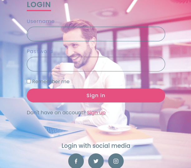
</ul>Now we need Social media button to log in with, so for that let’s back to HTML here let’s add h2 and put the text Login with social media after that let’s add an unordered list (ul) with class sci. then let’s add icons of social media we’ll use Facebook, Twitter, and Instagram.
section .contentBx .formBx h3{
    color: #607d8b;
    text-align: center;
    margin: 80px 0 10px;
    font-weight: 500;
}

section .contentBx .formBx .sci{
    display: flex;
    justify-content: center;
    align-items: center;
}

section .contentBx .formBx .sci li{
    list-style: none;
    width: 50px;
    height: 50px;
    display: flex;
    justify-content: center;
    align-items: center;
    background-color: #607d8b;
    border-radius: 50%;
    margin: 0 7px;
    cursor: pointer;
}

section .contentBx .formBx .sci li:hover{
    background-color: #ff4584;
}

section .contentBx .formBx .sci li img{
    transform: scale(0.5);
    filter: invert();
}
Let’s style H3 first, add color #607d8b, text alignment to center then we’ll provide margin 80px 0 10px and font weight to 500.
Now for sci class, display to flex, justify-content, and align items to center, after that let’s style social media images, add list style to none, width and height again 50px with the background color of #607d8b, now provide border-radius to 50%, so it will get round shape at edges then margin 0 7px and cursor to a pointer, again we’ll provide hovering effect on these icons with background color #ff4584, and little bit animation with a scale of 0.5 and filter invert.

Making Responsive Form
@media (max-width: 768px){
    section .imgBx{
        position: absolute;
        top: 0;
        left: 0;
        width: 100%;
        height: 100%;
    }
    section .contentBx{
        display: flex;
        justify-content: center;
        align-items: center;
        width: 100%;
        height: 100%;
        z-index: 1;
    }
    section .contentBx .formBx{
        width: 100%;
        padding: 40px;
        background: rgb(255, 255, 255 /0.9);
        margin: 50px;
    }
}
We have done our form now it’s time to make it responsive for that we will use @media, in this let’s give max-width of 768px, now let us be in imgBx position will be absolute, top and left will be 0, and height and width will be 100%.
After that, in contentBx display flex, justify-content, and align-items to center, width and height to 100%, and let’s give z index to 1, so if we make a smaller screen the content will come over the image.
then after in formBx, let width will be 100%, padding to 40px, and the background will be RGB (255, 255, 255/0.9), here we used 0.9 with this you can actually hide the form’s background white color if you don’t use this you will see the white background behind the form.
Full Source Code Of Complete Responsive Login Form Using HTML & CSS
index.html
<!DOCTYPE html>
<html lang="en">
<head>
    <meta charset="UTF-8">
    <meta http-equiv="X-UA-Compatible" content="IE=edge">
    <meta name="viewport" content="width=device-width, initial-scale=1.0">
    <title>Complete Responsive Log in Form Design From Scratch using Html & CSS | How To Create a Sign In Form</title>
    <link rel="stylesheet" href="style.css">
</head>
<body>
    <section>
        <div class="imgBx">
            <img src="images/login.jpg">
        </div>
        <div class="contentBx">
            <div class="formBx">
                <h2>Login</h2>
                <form>
                    <div class="inputBx">
                        <span>Username</span>
                        <input type="text" name="">
                    </div>
                    <div class="inputBx">
                        <span>Password</span>
                        <input type="password" name="">
                    </div>
                    <div class="remember">
                        <label><input type="checkbox" name=""> Remember me</label>
                    </div>
                    <div class="inputBx">
                        <input type="submit" value="Sign in" name="">
                    </div>
                    <div class="inputBx">
                        <p>Don't have an account? <a href="#">Sign up</a></p>
                    </div>
                </form>
                <h3>Login with social media</h3>
                <ul class="sci">
                    <li><img src="images/facebook.png"></li>
                    <li><img src="images/twitter.png"></li>
                    <li><img src="images/instagram.png"></li>
                </ul>
            </div>
        </div>
    </section>

</body>
</html>
style.css
@import url('https://fonts.googleapis.com/css?family=Poppins:200,300,400,500,600,700,800,900&display=swap');


*{
    margin: 0;
    padding: 0;
    box-sizing: border-box;
    font-family: 'Poppins', sans-serif;
}

section{
    position: relative;
    width: 100%;
    height: 100vh;
    display: flex;

}

section .imgBx{
    position: relative;
    width: 50%;
    height: 100%;
}
section .imgBx::before{
    content: '';
    position: absolute;
    top: 0;
    left: 0;
    width: 100%;
    height: 100%;
    background: linear-gradient(225deg, #e91e63, #03a9f4);
    z-index: 1;
    mix-blend-mode: screen;
}

section .imgBx img{
    position: absolute;
    top: 0;
    left: 0;
    width: 100%;
    height: 100%;
    object-fit: cover;
}

section .contentBx{
    display: flex;
    width: 50%;
    height: 100%;
    justify-content: center;
    align-items: center;
}

section .contentBx .formBx{
    width: 50%;
}

section .contentBx .formBx h2{
    color: #607d8b;
    font-weight: 600;
    font-size: 1.5em;
    text-transform: uppercase;
    margin-bottom: 20px;
    border-bottom: 4px solid #ff4584;
    display: inline-block;
    letter-spacing: 1px;
}

section .contentBx .formBx .inputBx{
    margin-bottom: 20px;
}

section .contentBx .formBx .inputBx span{
    font-size: 16px;
    margin-bottom: 5px;
    display: inline-block;
    color: #607db8;
    font-weight: 300;
    letter-spacing: 1px;

}

section .contentBx .formBx .inputBx input{
    width: 100%;
    padding: 10px 20px;
    outline: none;
    font-weight: 400;
    border: 1px solid #607d8b;
    font-size: 16px;
    letter-spacing: 1px;
    color: #607d8b;
    background: transparent;
    border-radius: 30px;
}

section .contentBx .formBx .inputBx input[type = "submit"]{
    background: #ff4584;
    color: #fff;
    outline: none;
    border: none;
    font-weight: 500;
    cursor: pointer;
}

section .contentBx .formBx .inputBx input[type = "submit"]:hover{
    background: #f53677;
}

section .contentBx .formBx .remember{
    margin-bottom: 10px;
    color: #607d8b;
    font-weight: 400;
    font-style: 14px;

}

section .contentBx .formBx .inputBx p{
    color: #607d8b;
}

section .contentBx .formBx .inputBx p a{
    color: #ff4584;
}

section .contentBx .formBx h3{
    color: #607d8b;
    text-align: center;
    margin: 80px 0 10px;
    font-weight: 500;
}

section .contentBx .formBx .sci{
    display: flex;
    justify-content: center;
    align-items: center;
}

section .contentBx .formBx .sci li{
    list-style: none;
    width: 50px;
    height: 50px;
    display: flex;
    justify-content: center;
    align-items: center;
    background-color: #607d8b;
    border-radius: 50%;
    margin: 0 7px;
    cursor: pointer;
}

section .contentBx .formBx .sci li:hover{
    background-color: #ff4584;
}

section .contentBx .formBx .sci li img{
    transform: scale(0.5);
    filter: invert();
}

@media (max-width: 768px){
    section .imgBx{
        position: absolute;
        top: 0;
        left: 0;
        width: 100%;
        height: 100%;
    }
    section .contentBx{
        display: flex;
        justify-content: center;
        align-items: center;
        width: 100%;
        height: 100%;
        z-index: 1;
    }
    section .contentBx .formBx{
        width: 100%;
        padding: 40px;
        background: rgb(255, 255, 255 /0.9);
        margin: 50px;
    }
}
Output:

Check out Full Source Code On Github
watch the full video about the complete responsive login form in HTML & CSS

