In this article, we’re going to be building a signup form in HTML, CSS, and Javascript, the project is going to be a kind of simple. We just need to create a simple signup form that has some buttons along with some fields for information filling.
Prerequisites to Create Signup Form in HTML, CSS, and JavaScript
- Basic knowledge of HTML.
- Good knowledge of CSS.
- Basic understanding of javascript.
Step to Build Signup Form in HTML, CSS And JS
- basic setup
- set default CSS
- Customizing the Background
- Setting up the Signup Button
- Customizing the Banner
- Customizing Signup Form
- Customizing Social Media Icons
- Customizing Input Groups
- Customizing Signup Form Button
- Add click event in Javascript
You can see the demo here Signup Form In HTML, CSS And JavaScript
Basic Setup Before Creating Signup Form
Firstly, open the index.html file and create a basic HTML document for that we just need to place here an exclamation(!) mark and then hit tab or enter, Then we need to link the CSS and Javascript files, Besides that we’re going to bring in a couple of more links the one for some icons and the second one for the google fonts.
<link rel="stylesheet" href="style.css" />
    <link
      rel="stylesheet"
      href="https://cdnjs.cloudflare.com/ajax/libs/font-awesome/6.0.0/css/all.min.css"
    />
    <link rel="preconnect" href="https://fonts.googleapis.com" />
    <link rel="preconnect" href="https://fonts.gstatic.com" crossorigin />
    <link
      href="https://fonts.googleapis.com/css2?family=Quicksand:wght@300;400;500;600;700&display=swap"
      rel="stylesheet"
    />
<script src="script.js"></script>
Implementation of Signup Form in HTML, CSS, and JavaScript
Let’s open the div tag with the class container then we need another div tag which is going to be the form wrapper. so this element will consist of three main parts we’ll have the banner which is displayed on the left side.
Then let’s an open the div tag with the class banner here we will have two different elements the first one is going to be H1 heading with the text hello friend and then we will have with a text enter your personal details, let’s an open div tag with the class green-bg and then insert here button element with the text sign up.
<div class="container">
      <div class="form-wrapper">
        <div class="banner">
          <h1>Hello, Friend!</h1>
          <p>Enter your personal details and start journey with us</p>
        </div>
        <div class="green-bg">
          <button type="button">Sign Up</button>
        </div>
        <form class="signup-form">
          <h1>Create Account</h1>
          <div class="social-media">
            <i class="fab fa-facebook-f"></i>
            <i class="fab fa-instagram"></i>
            <i class="fab fa-linkedin-in"></i>
          </div>
          <p>or use your email for registration</p>
          <div class="input-group">
            <i class="fas fa-user"></i>
            <input type="text" placeholder="Name" />
          </div>
          <div class="input-group">
            <i class="fas fa-envelope"></i>
            <input type="email" placeholder="Email" />
          </div>
          <div class="input-group">
            <i class="fas fa-lock"></i>
            <input type="password" placeholder="Password" />
          </div>
          <button type="button">Sign Up</button>
        </form>
      </div>
    </div>
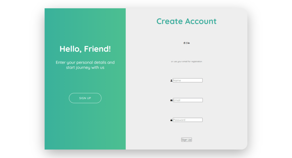
we need to create the form itself, we’re going to pass 3 different fonts and awesome icons. Let’s open <i> tag with the classes fab fa-facebook-f, Let’s duplicate this line of code twice and change the class the second one is going to be Instagram as for the third one it’s going to be LinkedIn. next, we’ll have the paragraph with the text or use your email for registration and after that, we’ll have a couple of input fields at first we’re going to open a div tag with the class input group it will include the font awesome icon and the input field itself.
Let’s open <i> tag with the classes fas fa-user then we will have input with type text and with a placeholder attribute with the value name let’s go ahead and duplicate this code twice and make some changes the second font awesome icon is going to be fas fa-envelope.
Then the type of the input element is going as email, and also we need to change the placeholder attribute it’s going to be emailed as well okay the third icon is going to be fas fa-log then the type is going to be password, and also we need to change the placeholder attribute it’s going to be password, and finally we need you to button with the text sign up alright so that’s it the HTML markup is ready.

Setting up Default Values for CSS
* {
  margin: 0;
  padding: 0;
  box-sizing: border-box;
  outline: none;
  font-family: Quicksand, sans-serif;
}

html {
  font-size: 62.5%;
}
.container {
  width: 100%;
  height: 100vh;
  display: flex;
  justify-content: center;
  align-items: center;
}
First of all, we’re going to create some reset and default styles, Let’s select every element using an (*). first of all default margin and padding let’s set both of them to 0, Then we’re going to set box-sizing to border-box also we’re going to get rid of the default outline from every element let’s set it to none, and finally, change the font family I’m going to use here the google font quicksand, san-serif, we want to convert one rem into 10 pixels and for that, we need to decrease the font size of the HTML element and we have to make it 62.5 percent.
To customize the container let’s select it and first of all define its width and height we’re going to set the width to 100 for the height let’s make it 100 for the viewport. next, we’re going to center the form wrapper on the page so for that let’s use flexbox, we’re going to set the display to flex then a justify-content center for horizontal centering and align item center for the vertical center.
Customizing the Background
.form-wrapper {
  width: 100rem;
  height: 70rem;
  background-color: #eee;
  border-radius: 3rem;
  box-shadow: 0 2rem 6rem rgba(0, 0, 0, 0.3);
  position:relative;
}
Next, we’re going to take care of the form wrapper, Change the background color make it #eee also we’re going to make the wrapper slightly round using border-radius with a value of 3 rem, and finally, let’s use some shadow effect with the values 0 2 rem 6 rem and the RGBA value with black color and with the opacity 0.3.
.green-bg {
  width: 40%;
  height: 100%;
  background: linear-gradient(to right, #3ab19b, #4cbf91);
  position: absolute;
  top: 0;
  left: 0;
}
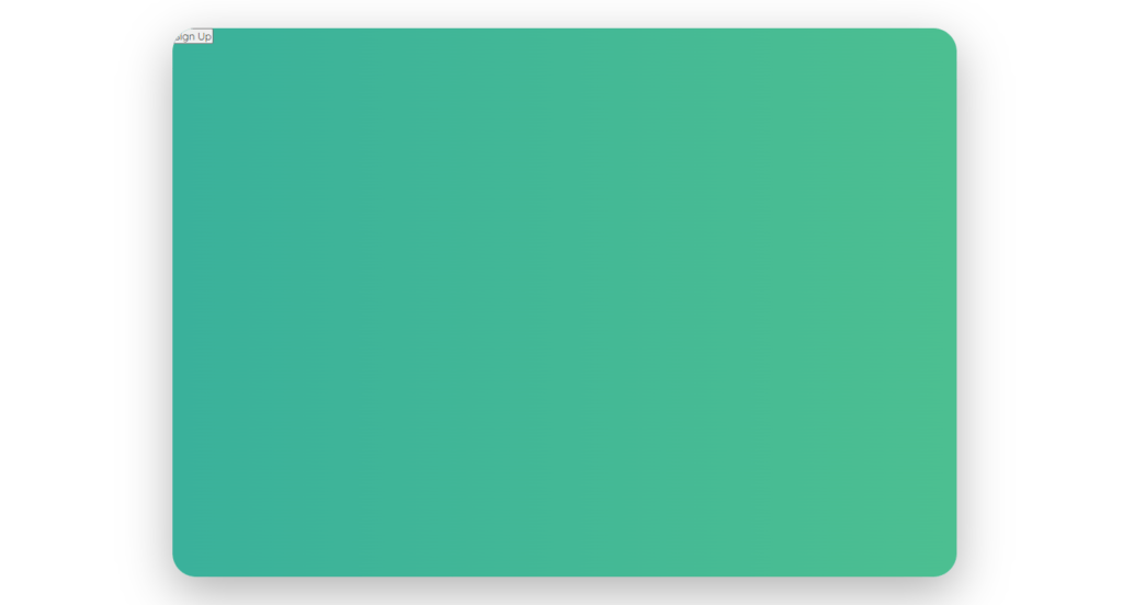
Next, we’re going to change the background color and we’re going to use here linear-gradient function the direction of the color transition is going to be from left to right as for the colors they will be 3ab19b. as for the second caller it’s going to be 4cbf91, Set its position to absolute, and then let’s define the top and left positions I’m going to make both of them 0.
Setting up the Signup Button
.green-bg button {
  position: absolute;
  top: 60%;
  left: 50%;
  transform: translateX(-50%);
  width: 16rem;
  height: 5rem;
  background-color: transparent;
  border: 0.1rem solid #fff;
  border-radius: 3rem;
  text-transform: uppercase;
  letter-spacing: 0.1rem;
  color: #fff;
  cursor: pointer;
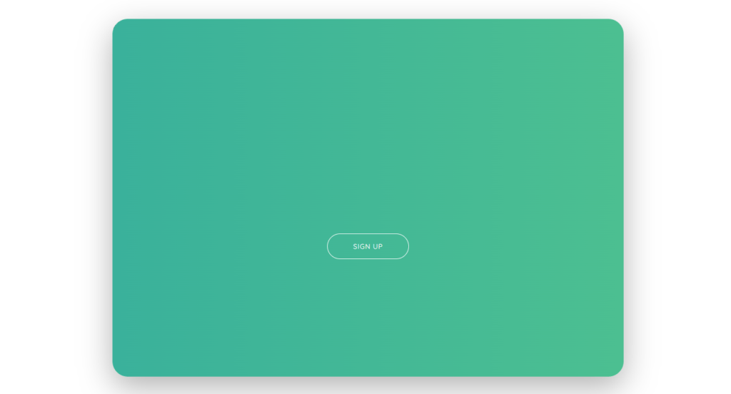
Let’s go ahead and style the signup button, First of all, let’s take care of its position let’s set its position to absolute, we’re going to place it a little bit down and in the center of the green background so we’re going to set-top position to 60 as for the left position it’s going to be 50 and then for centering we need to transform translate x with a value -50, we’re going to define a width and height.
The width is going to be 16 rem then the height will be 5 rem, we’re going to get rid of the default background color let’s make it transparent then we’re going to define the border it’s going to be 0.1 rem solid and the color is going to be white, also let’s make the button rounded using border-radius 3 rem. we’re going to make the text uppercase also create some space between the letters make it 0.1rem then change the color to make it white and also change the type of the cursor to make it a pointer.
Customizing the Banner
.banner {
  position: absolute;
  top: 25%;
  left: -30rem;
  text-align: center;
  color: #fff;
  width: 30rem;
  z-index: 100;
  transition: left 0.8s;
}

.banner h1 {
  font-size: 4rem;
  margin-bottom: 3rem;
}

.banner p {
  font-size: 2rem;
}
Next, we’re going to customize the banner, which right now is not visible because it ended up behind the background let’s go ahead and fix that we’re going to select the banner first of all let’s define its position and make it absolute, and then we need the index property with some higher value than 0 Let’s make it hundred,
The position we’re going to set-top position to 25 as for the left position it’s going to be -30 rem. also we’re going to place the text in the center using text-align center then change the color make it white and besides. that, we’re going to define the width for the banner let’s make it 30 rem and at last, we will use the transition effect for some smoothness let’s say from the left side for 0.8 seconds.
Next, let’s take care of the heading and the paragraph we’re going to select banner h1 to let’s increase the font size make it 4 rem, and also create space at the bottom using margin-bottom 3 rem. then let’s select a paragraph and increase its font size to make it 2 rem.

Customizing Signup Form
.signup-form {
  width: 60rem;
  height: 100%;
  position: absolute;
  top: 0;
  left: 40rem;
  display: flex;
  flex-direction: column;
  justify-content: space-around;
  align-items: center;
  padding: 10rem 0;
 }
.signup-form h1 {
  font-size: 4rem;
  color: #3aaf9f;
}
Let’s select from and define its width and height make it 60 and the height 100 also we’re going to define the position make it absolute then we need the top position to be 0 as for the left position it’s going to be 40 rem. next, we’re going to align the elements using flexbox we need to display flex, then we have to change the direction.
let’s make it a column then we’re going to create some space around the items using justify-content space around. and then let’s place the items in the center horizontally using the align-items center. and finally, let’s create some space at the top and bottom using padding. we’re going to make it 10 rem at the top and bottom and 0 on the left and right sides.
next, we’re going to customize the individual elements let’s go ahead and start with the h1 heading element. let’s select it and define its font size. we’re going to make it 4 rem as for the color let’s use here color 3aaf9f.

Customizing Social Media Icons
.social-media {
  display: flex;
}

.social-media i {
  width: 4rem;
  height: 4rem;
  border: 0.1rem solid #777;
  border-radius: 50%;
  display: flex;
  justify-content: center;
  align-items: center;
  margin-right: 2rem;
  font-size: 2rem;
  color: #555;
}
Let’s move on to the social media icons, let’s select the wrapper and align the elements using flexbox. we need to display flex then. we’re going to select the I elements first of all let’s define their width and height we’re going to set both properties to 4 rem, then we need to create the border let’s make it 0.1 rem solid, and at the color let’s use #777 and then make the element rounded using border-radius 50%.
next, we’re going to place the icons in the center of the circles using a flexbox. we need to display flex justify-content center and align item center, let’s create some space between the icons let’s do that using margin-right with value 2 rem. also, increase the font size make it 2 rem, and change the color used here #555. so that’s it about the social media icons.
Customizing Input Groups
.input-group {
  position: relative;
}

.input-group input {
  width: 28rem;
  height: 5rem;
  padding: 1rem 1rem 1rem 3rem;
  background-color: #ddd;
  border: none;
  border-radius: 0.5rem;
}

.input-group i {
  position: absolute;
  top: 50%;
  left: 1rem;
  transform: translateY(-50%);
  font-size: 1.2rem;
  color: #555;
}
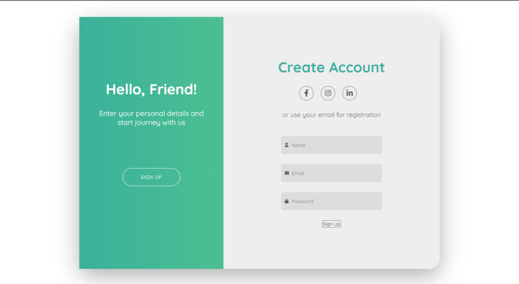
Let’s go ahead and select it and define its font size make it 1.8 rem then change the color make it #555 and. also create some space at the bottom using margin-bottom to run, after that we have to style the input fields let’s select inputs, first of all.
we’re going to define width and height the width is going to be 28 rem then the height is going to be 5 rem. also we’re going to create some space inside the input field using padding, Let’s make it 1 rem at the top then 1 rem on the right side 1 rem at the bottom and 3 rem on the left side, Next let’s change the background color used here color #ddd. also, get rid of the default border make it none and make the input fields slightly round using a border-radius with a value of 0.5 rem.
We have to take care of the fonts or some icons, let’s select them, and first of all, let’s define the position and make it absolute actually we have to position the icons according to the input groups so we need to position relative to the input group, then define the top and left properties for the icons the top position is going to be 50.
Then the left position is going to be 1 rem actually we need to center the icons vertically so we’re going to use your transform translate with y-direction and with the value -50 next let’s increase the font size make it 1.2 rem and also change the color make it #555.
Customizing Signup Form Button
.signup-form button {
  width: 16rem;
  height: 5rem;
  background-color: #3aaf9f;
  border: none;
  border-radius: 3rem;
  text-transform: uppercase;
  letter-spacing: 0.1rem;
  color: #fff;
  margin-top: 3rem;
  cursor: pointer;
}
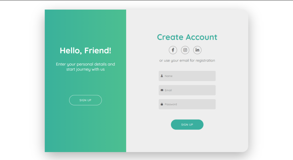
Now, customize the signup button let’s go ahead and select this element, first of all, let’s define it with the heights we’re going to set with to 16 rem then the height is going to be 5 rem. let’s change the background color used here color #3af9f, then we’re going to get rid of the border let’s make it none and also make the button rounded using border-radius 3 rem.
Let’s make the text uppercase, then we’re going to create some space between the letters let’s make it 0.1 rem change the color of the text make it white also we’re going to create some space at the top using margin-top 3 rem and lastly change the cursor make its pointer.
Setting up Javascript
const container = document.querySelector(".container");
const signUpBtn = document.querySelector(".green-bg button");

signUpBtn.addEventListener("click", () => {
  container.classList.toggle("change");
});
we’ll define new styles that should be applied to the elements. then on the next click, we should remove that newly edited class from the container. so we’re going to add an event listener to the assignment button with a click event and with a callback function which will be executed once we click the button as I said we need to add a class to the container.
so we need here container followed by the property called class list which gives us all the classes that the element has and then we’re going to use a toggle method. which allows us to add a new class to the element if it doesn’t have it and then remove it. if it does have it let’s call the class change okay so that’s it about the javascript.
Full Source Code for Signup Form in HTML, CSS and JavaScript
index.html
<!DOCTYPE html>
<html lang="en">
  <head>
    <meta charset="UTF-8" />
    <meta http-equiv="X-UA-Compatible" content="IE=edge" />
    <meta name="viewport" content="width=device-width, initial-scale=1.0" />
    <title>Sign Up Form</title>
    <link rel="stylesheet" href="style.css" />
    <link
      rel="stylesheet"
      href="https://cdnjs.cloudflare.com/ajax/libs/font-awesome/6.0.0/css/all.min.css"
    />
    <link rel="preconnect" href="https://fonts.googleapis.com" />
    <link rel="preconnect" href="https://fonts.gstatic.com" crossorigin />
    <link
      href="https://fonts.googleapis.com/css2?family=Quicksand:wght@300;400;500;600;700&display=swap"
      rel="stylesheet"
    />
  </head>
  <body>
    <div class="container">
      <div class="form-wrapper">
        <div class="banner">
          <h1>Hello, Friend!</h1>
          <p>Enter your personal details and start journey with us</p>
        </div>
        <div class="green-bg">
          <button type="button">Sign Up</button>
        </div>
        <form class="signup-form">
          <h1>Create Account</h1>
          <div class="social-media">
            <i class="fab fa-facebook-f"></i>
            <i class="fab fa-instagram"></i>
            <i class="fab fa-linkedin-in"></i>
          </div>
          <p>or use your email for registration</p>
          <div class="input-group">
            <i class="fas fa-user"></i>
            <input type="text" placeholder="Name" />
          </div>
          <div class="input-group">
            <i class="fas fa-envelope"></i>
            <input type="email" placeholder="Email" />
          </div>
          <div class="input-group">
            <i class="fas fa-lock"></i>
            <input type="password" placeholder="Password" />
          </div>
          <button type="button">Sign Up</button>
        </form>
      </div>
    </div>

    <script src="script.js"></script>
  </body>
</html>
style.css
* {
  margin: 0;
  padding: 0;
  box-sizing: border-box;
  outline: none;
  font-family: Quicksand, sans-serif;
}

html {
  font-size: 62.5%;
}

.container {
  width: 100%;
  height: 100vh;
  display: flex;
  justify-content: center;
  align-items: center;
}

.form-wrapper {
  width: 100rem;
  height: 70rem;
  background-color: #eee;
  border-radius: 3rem;
  box-shadow: 0 2rem 6rem rgba(0, 0, 0, 0.3);
  position: relative;
  overflow: hidden;
}

.banner {
  position: absolute;
  top: 25%;
  left: -30rem;
  text-align: center;
  color: #fff;
  width: 30rem;
  z-index: 100;
  transition: left 0.8s;
}

.container.change .banner {
  left: 5rem;
}

.banner h1 {
  font-size: 4rem;
  margin-bottom: 3rem;
}

.banner p {
  font-size: 2rem;
}

.green-bg {
  width: 100%;
  height: 100%;
  background: linear-gradient(to right, #3ab19b, #4cbf91);
  position: absolute;
  top: 0;
  left: 0;
  z-index: 50;
  transition: width 1.5s cubic-bezier(0.19, 1, 0.22, 1);
}

.container.change .green-bg {
  width: 40%;
}

.green-bg button {
  position: absolute;
  top: 60%;
  left: 50%;
  transform: translateX(-50%);
  width: 16rem;
  height: 5rem;
  background-color: transparent;
  border: 0.1rem solid #fff;
  border-radius: 3rem;
  text-transform: uppercase;
  letter-spacing: 0.1rem;
  color: #fff;
  cursor: pointer;
}

.signup-form {
  width: 60rem;
  height: 100%;
  position: absolute;
  top: 0;
  left: 0;
  display: flex;
  flex-direction: column;
  justify-content: space-around;
  align-items: center;
  padding: 10rem 0;
  transition: left 1.5s cubic-bezier(0.19, 1, 0.22, 1);
}

.container.change .signup-form {
  left: 40rem;
}

.signup-form h1 {
  font-size: 4rem;
  color: #3aaf9f;
}

.social-media {
  display: flex;
}

.social-media i {
  width: 4rem;
  height: 4rem;
  border: 0.1rem solid #777;
  border-radius: 50%;
  display: flex;
  justify-content: center;
  align-items: center;
  margin-right: 2rem;
  font-size: 2rem;
  color: #555;
}

.signup-form p {
  font-size: 1.8rem;
  color: #555;
  margin-bottom: 2rem;
}

.input-group {
  position: relative;
}

.input-group input {
  width: 28rem;
  height: 5rem;
  padding: 1rem 1rem 1rem 3rem;
  background-color: #ddd;
  border: none;
  border-radius: 0.5rem;
}

.input-group i {
  position: absolute;
  top: 50%;
  left: 1rem;
  transform: translateY(-50%);
  font-size: 1.2rem;
  color: #555;
}

.signup-form button {
  width: 16rem;
  height: 5rem;
  background-color: #3aaf9f;
  border: none;
  border-radius: 3rem;
  text-transform: uppercase;
  letter-spacing: 0.1rem;
  color: #fff;
  margin-top: 3rem;
  cursor: pointer;
}
script.js
const container = document.querySelector(".container");
const signUpBtn = document.querySelector(".green-bg button");

signUpBtn.addEventListener("click", () => {
  container.classList.toggle("change");
});
Final Output


And BOOM.. you have created a very cool signup form in HTML, CSS, and JAVASCRIPT, it actually looks awesome, to be honest, isn’t it?
watch the full video about How to create a Signup Form in HTML, CSS, and JavaScript
