


In this article, we will make clock loader using CSS. This is going to be a basic and beginner-friendly project, as all of our loader project are basic. So here, we will have a clock with two hands, and these hands spins infinitely. Adding this kind of loader will be very much cool if you’re planning to add loader in your website or something.
Pre-requisites to Make Clock Loader Using CSS
- Basic knowledge of HTML.
- Basic knowledge of CSS and CSS animations.
Creating HTML Markup
<!DOCTYPE html>
<html>
    <head>
        <title>Clock Loader</title>
        <link rel="stylesheet" href="style.css">
    </head>
    <body>
        <div class="clock">
            <div class="center"></div>
            <div class="hand1"></div>
            <div class="hand2"></div>
        </div>
    </body>

</html>
body{
margin: 0;
padding: 0;
background-color: #ffff4d;
}First of all in HTML, we have added a div for clock which have another three divs for center of clock and other twos for hands. Now in CSS, we have reset our default margin and padding to 0 with #ffff4dcolor.

Adding Center of Clock
.clock{
position: absolute;
top: 43%;
left: 43%;
height: 120px;
width: 120px;
background-color: white;
border-radius: 50%;
border: 6px solid #5c5c8a;
}
.center{
position: relative;
background-color: tomato;
height: 15px;
width: 15px;
border-radius: 50%;
top: 52px;
left: 52px;
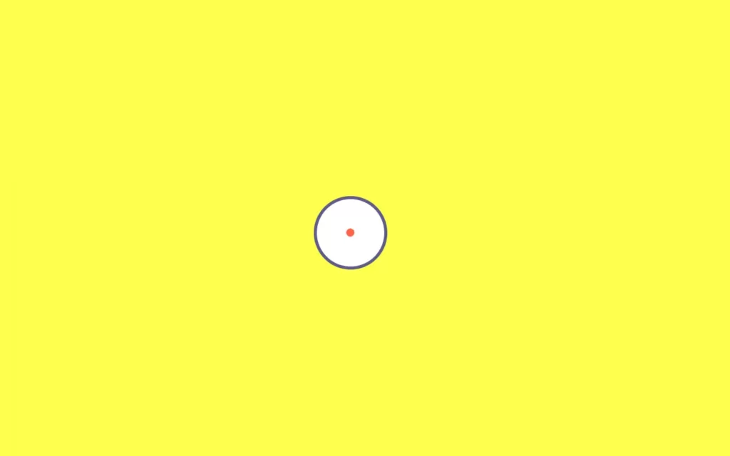
}Now let’s form the clock, and it’s center, for that we have added some height and width to the clock, and we have adjusted its position using top and left property. Then we have added absolute position so that it won’t get moved when we add something to it, and it will get fixed on that position. After that, we have gave white background to the clock, and also we gave it round shape using border-radius property. Finally, we have also added some border to it.
For the center, we have added some height and width with background color tomato. Also, we have it to the center of the clock with top and left property. And we have gave round shape again to it.
Adding Hands to Clock Center
.hand1{
position: relative;
background-color: tomato;
height: 55px;
width: 6px;
border-radius: 27px;
bottom: 7px;
left: 57px;
}
.hand2{
position: relative;
background-color: tomato;
height: 6px;
width: 35px;
border-radius: 15px;
left: 26px;
bottom: 13px;
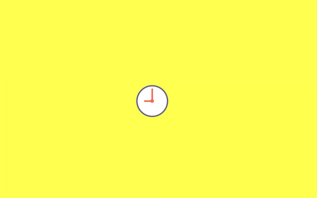
}Now for hand1, we have added some height and width to it also, we have added background color tomato. Now we want these hands having some curve at the edge of them, so for that we have added border radius with some pixels. Also, we have adjusted it using bottom and left property.
Same as hand1, we have done styling for hand2. We have just modified the height, width, and border-radius. Also, we have adjusted left and bottom position as well.
Adding Animation to Hands
.hand1{
position: relative;
background-color: tomato;
height: 55px;
width: 6px;
border-radius: 27px;
bottom: 7px;
left: 57px;
animation: spin-a 2s infinite;
transform-origin: bottom;
}
@keyframes spin-a{
100%{
transform: rotate(360deg);
}
}
.hand2{
position: relative;
background-color: tomato;
height: 6px;
width: 35px;
border-radius: 15px;
left: 26px;
bottom: 13px;
animation: spin-b 3s infinite;
transform-origin: right;
}
@keyframes spin-b{
100%{
transform: rotate(360deg);
}
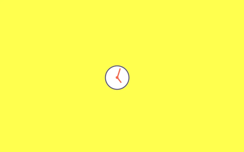
} To perform animation, we have add animation property which have name spin with 2s duration for infinity times. And also, we have added a transform-origin property, with this we can do animation with respect to it. Here we have gave bottom in hand1, so animation will perform assuming the bottom as center of the hand1.
For animation definition, we can use @keyframes for defining animation, here we have rotate hand1 for 360 degrees.
Same way, we have done for hand2 with some extra second of delay.
Full Source Code To Make Clock Loader Using CSS
index.html
<!DOCTYPE html>
<html>
<head>
<title>Clock Loader</title>
<link rel="stylesheet" href="style.css">
</head>
<body>
<div class="clock">
<div class="center"></div>
<div class="hand1"></div>
<div class="hand2"></div>
</div>
</body>
</html>style.css
body{
    margin: 0;
    padding: 0;
    background-color: #ffff4d;
}
.clock{
    position: absolute;
    top: 43%;
    left: 43%;
    height: 120px;
    width: 120px;
    background-color: white;
    border-radius: 50%;
    border: 6px solid #5c5c8a;
}

.center{
    position: relative;
    background-color: tomato;
    height: 15px;
    width: 15px;
    border-radius: 50%;
    top: 52px;
    left: 52px;
}
.hand1{
    position: relative;
    background-color: tomato;
    height: 55px;
    width: 6px;
    border-radius: 27px;
    bottom: 7px;
    left: 57px;
    animation: spin-a 2s infinite;
    transform-origin: bottom;
}
@keyframes spin-a{
    100%{
        transform: rotate(360deg);
    }
}
.hand2{
    position: relative;
    background-color: tomato;
    height: 6px;
    width: 35px;
    border-radius: 15px;
    left: 26px;
    bottom: 13px;
    animation: spin-b 3s infinite;
    transform-origin: right;
}
@keyframes spin-b{
    100%{
        transform: rotate(360deg);
    }
} Output
Check out video reference here:
You May Also Like:


