


In this article, we will make tabs with HTML, CSS, And JavaScript. In this, we will create skeleton with the help of HTML, and we will style it using CSS, Finally will add functionality using JavaScript. What we will do here is, we will add tab menu and if we click any of the tab element then content of that element should be displayed. This is going to be a very easy project, and we will use basic CSS and JavaScript, so it will be beginner-friendly as well. Let’s make this step-by-step.
Pre-requisites to Make Tabs With HTML, CSS, And JavaScript
- Basic knowledge of HTML.
- Basic knowledge of CSS.
- Good knowledge of JavaScript.
Creating HTML Skeleton
<!DOCTYPE html>
<html lang="en">
<head>
	<meta charset="UTF-8">
	<meta name="viewport" content="width=device-width, initial-scale=1.0">
	<link href='https://unpkg.com/boxicons@2.0.9/css/boxicons.min.css' rel='stylesheet'>
	<link rel="stylesheet" href="style.css">
	<title>Tabs</title>
</head>
<body>


    <script src="script.js"></script>

</body>
</html>
@import url('https://fonts.googleapis.com/css2?family=Poppins:wght@300;400;500;600;700&display=swap');
* {
margin: 0;
padding: 0;
box-sizing: border-box;
font-family: 'Poppins', sans-serif;
}
:root {
--dark: #444;
--grey: #aaa;
--primary: #805DCA;
--secondary: #E2A03F;
}
li {
list-style: none;
}
body {
background: #eee;
display: flex;
justify-content: center;
align-items: center;
min-height: 100vh;
padding: 0 16px;
}
In HTML, we need to first a box-icon CSS file, so that icons can be accessible in the project. Then we have added a CSS file, in which we will style these elements. And also, we will add our script file for JavaScript. In CSS, we have added Poppins font-family, it’s link we have copied from Google which is easily available.
After that, we have reset our default margin and padding to 0. We also have added colors to some variable. Then, after we have added the body part in the center using justify-content, align-items properties to center. We also gave minimum height to 100vh.
Adding The Tab Menu
<div class="container">
<ul class="tab-menu">
<li class="active" data-target="home"><i class='bx bx-home-alt'></i> Home</li>
<li class="dropdown-toggle">
<i class='bx bx-user-circle' ></i> Profile <i class='bx bx-chevron-down' ></i>
<ul class="dropdown">
<li data-target="action">Action</li>
<li data-target="link">Link here</li>
<li data-target="do-something">Do something</li>
</ul>
</li>
<li data-target="contact"><i class='bx bx-phone' ></i> Contact</li>
<li data-target="settings"><i class='bx bx-cog' ></i> Settings</li>
<span class="line"></span>
</ul>.container {
max-width: 600px;
width: 100%;
background: #fff;
padding: 28px;
border-radius: 16px;
box-shadow: 0 10px 30px rgba(0, 0, 0, .07);
}
.tab-menu {
display: flex;
grid-gap: 24px;
padding: 0 10px 10px;
border-bottom: 1px solid #ddd;
position: relative;
flex-wrap: wrap;
}
.tab-menu > li {
position: relative;
cursor: pointer;
color: var(--grey);
transition: all .3s ease;
white-space: nowrap;
}
.tab-menu > li:hover {
color: var(--dark);
}
.tab-menu > li.active {
color: var(--primary);
}
.dropdown {
position: absolute;
top: 130%;
right: 0;
width: 160px;
padding: 10px 0;
background: #fff;
box-shadow: 0 8px 16px rgba(0, 0, 0, .07);
border-radius: 10px;
opacity: 0;
visibility: hidden;
transition: all .3s ease;
z-index: 100;
}
.tab-menu > li:hover .dropdown {
opacity: 1;
visibility: visible;
top: 100%;
}
.dropdown li {
padding: 8px 16px;
transition: all .3s ease;
color: var(--grey);
}
.dropdown li:hover {
background: #eee;
color: var(--dark);
}
.dropdown li.active {
color: var(--primary);
}
.tab-menu .line {
position: absolute;
bottom: 0;
left: 10px;
height: 2px;
background: var(--primary);
transition: all .3s ease;
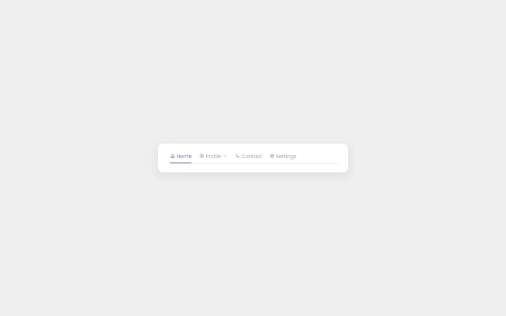
}Now we need to add our tab menu, in which we have added some elements to this menu. We have passed a list of the tabs like Home, Profile, Setting, Content etc. Then we have added a dropdown menu into the profile tab. Also, we have added icons for these tabs as well.
Now In CSS, we have added some basic customization to container div. We have some width, border-radius and some border as well. Now for tab menu div, we added some colors and customized using some basic CSS to tab-menu list. In these tabs, we have added a grey color by default, and we have added a blue type of color on hovering effect. Then we have customized the size of the dropdown menu, and also we have added hover effect to the elements of the dropdown menu. Lastly, we have added opacity to 0, and we added opacity to 1 on active class.
We also, added a line which will be show when the hover effect is active, we did some small transition on the line as well.
Adding Content to Tab menu
<div class="contents">
<div class="content active" id="home">
<h2>Home</h2>
<p>Lorem ipsum dolor sit amet, consectetur adipisicing elit. Eveniet, debitis id. Aliquam minus ut, officiis nihil. Est adipisci necessitatibus, minima.</p>
<p>Lorem ipsum dolor sit amet consectetur, adipisicing elit. Error voluptate alias aliquam ratione corrupti suscipit possimus molestias illum, quia fugit voluptatibus nostrum voluptas voluptates natus! Voluptas, vitae ullam, quis molestias ad ipsa a perferendis impedit sint.</p>
</div>
<div class="content" id="action">
<h2>Action</h2>
<p>Lorem ipsum dolor, sit amet consectetur adipisicing elit. Odit quos aspernatur numquam repudiandae non consectetur repellendus?</p>
<p>Lorem ipsum dolor sit amet consectetur, adipisicing elit. Error voluptate alias aliquam ratione corrupti suscipit possimus molestias illum, quia fugit voluptatibus nostrum voluptas voluptates natus! Voluptas, vitae ullam, quis molestias ad ipsa a perferendis impedit sint.</p>
</div>
<div class="content" id="link">
<h2>Link here</h2>
<p>Lorem ipsum dolor sit amet, consectetur adipisicing elit. Eveniet, debitis id. Aliquam minus ut, officiis nihil. Est adipisci necessitatibus, minima.</p>
<p>Lorem ipsum dolor sit amet, consectetur adipisicing elit. Unde maxime ea quibusdam libero sed animi repellat magni sit explicabo tenetur saepe porro quis aut molestias numquam nulla illo illum iste sequi eos dolores, et. Cum nihil consequatur voluptatum maiores quae! At a maxime nostrum mollitia qui aperiam delectus.</p>
</div>
<div class="content" id="do-something">
<h2>Do something</h2>
<p>Lorem ipsum dolor sit amet, consectetur adipisicing elit. Eveniet, debitis id. Aliquam minus ut, officiis nihil. Est adipisci necessitatibus, minima.</p>
<p>Lorem ipsum dolor sit amet consectetur adipisicing elit. Nesciunt necessitatibus ipsa animi rerum nostrum sapiente ducimus repudiandae aut minima voluptatibus.</p>
</div>
<div class="content" id="contact">
<h2>Contact</h2>
<p>Lorem ipsum dolor sit amet, consectetur adipisicing elit. Ad praesentium, maxime tempore nisi esse beatae harum, perspiciatis obcaecati corporis ipsum cupiditate a aperiam vero. Voluptas, ut nihil suscipit!</p>
<p>Lorem ipsum dolor sit amet consectetur, adipisicing elit. Error voluptate alias aliquam ratione corrupti suscipit possimus molestias illum, quia fugit voluptatibus nostrum voluptas voluptates natus! Voluptas, vitae ullam, quis molestias ad ipsa a perferendis impedit sint.</p>
</div>
<div class="content" id="settings">
<h2>Settings</h2>
<p>Lorem ipsum dolor sit amet, consectetur adipisicing elit. Eveniet, debitis id. Aliquam minus ut, officiis nihil. Est adipisci necessitatibus, minima.</p>
<p>Lorem ipsum dolor sit amet consectetur adipisicing elit. Amet, quisquam harum dolores accusantium temporibus, cumque maiores iusto tempore repellat dicta hic quidem illum ullam animi architecto eos ipsum tenetur sint.</p>
</div>
</div>
</div>.content {
padding: 24px 10px 0;
display: none;
}
.content.active {
display: block;
}
.content h2 {
font-size: 20px;
font-weight: 600;
color: var(--secondary);
margin-bottom: 10px;
}
.content p {
margin-bottom: 10px;
color: var(--dark);
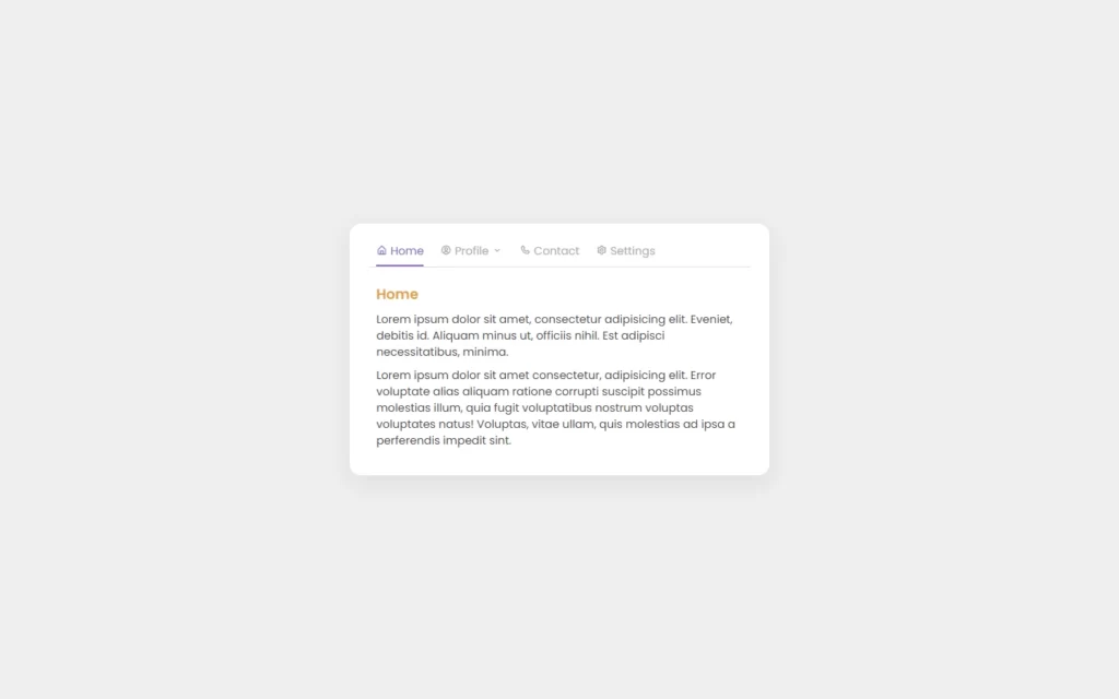
}Now we have added some of the content for each of the tab, we also added ID for each of the content. We added some random content, with some classes, which is usable to customize the content.
In CSS, we just did some basic CSS to customize the content like heading color. We also have hid the rest of the content, which will be accessible using JavaScript. Here, we have assigned active class to Home tab and since we have assigned the ID of the home. That will be shown by default.
Adding Functionalities to The Tabs
const allTabMenu = document.querySelectorAll('.tab-menu li');
const line = document.querySelector('.tab-menu .line');
const allContent = document.querySelectorAll('.content');
let width = allTabMenu[0].offsetWidth;
let left = allTabMenu[0].offsetLeft;
line.style.width = width + 'px';
line.style.left = left + 'px';
allTabMenu.forEach(item=> {
if(!item.classList.contains('dropdown-toggle')) {
item.addEventListener('click', function () {
allTabMenu.forEach(i=> {
i.classList.remove('active');
})
if(this.parentElement.classList.contains('dropdown')) {
width = this.parentElement.parentElement.offsetWidth;
left = this.parentElement.parentElement.offsetLeft;
this.parentElement.parentElement.classList.add('active');
this.classList.add('active');
} else {
width = this.offsetWidth;
left = this.offsetLeft;
this.classList.add('active');
}
line.style.width = width + 'px';
line.style.left = left + 'px';
allContent.forEach(content=> {
if(this.dataset.target === content.id) {
content.classList.add('active');
} else {
content.classList.remove('active');
}
})
})
}
})Now In JavaScript, we have accessed the tab menu div using querySelectorAll, then we have also accessed the line and content divs. After that, we have added an event listener of click event to the tabs. We will just simply add our active class to them, so the effect will be shown up on that tab and also the related content will be shown up.
After that, we have added a click event on dropdown as well. We will also provide the active class on these elements with click event on them. Also, we will remove the class when tabs are not clicked.

Full Source Code to Make Tabs With HTML, CSS, And JavaScript
index.html
<!DOCTYPE html>
<html lang="en">
<head>
<meta charset="UTF-8">
<meta name="viewport" content="width=device-width, initial-scale=1.0">
<link href='https://unpkg.com/boxicons@2.0.9/css/boxicons.min.css' rel='stylesheet'>
<link rel="stylesheet" href="style.css">
<title>Tabs</title>
</head>
<body>
<div class="container">
<ul class="tab-menu">
<li class="active" data-target="home"><i class='bx bx-home-alt'></i> Home</li>
<li class="dropdown-toggle">
<i class='bx bx-user-circle' ></i> Profile <i class='bx bx-chevron-down' ></i>
<ul class="dropdown">
<li data-target="action">Action</li>
<li data-target="link">Link here</li>
<li data-target="do-something">Do something</li>
</ul>
</li>
<li data-target="contact"><i class='bx bx-phone' ></i> Contact</li>
<li data-target="settings"><i class='bx bx-cog' ></i> Settings</li>
<span class="line"></span>
</ul>
<div class="contents">
<div class="content active" id="home">
<h2>Home</h2>
<p>Lorem ipsum dolor sit amet, consectetur adipisicing elit. Eveniet, debitis id. Aliquam minus ut, officiis nihil. Est adipisci necessitatibus, minima.</p>
<p>Lorem ipsum dolor sit amet consectetur, adipisicing elit. Error voluptate alias aliquam ratione corrupti suscipit possimus molestias illum, quia fugit voluptatibus nostrum voluptas voluptates natus! Voluptas, vitae ullam, quis molestias ad ipsa a perferendis impedit sint.</p>
</div>
<div class="content" id="action">
<h2>Action</h2>
<p>Lorem ipsum dolor, sit amet consectetur adipisicing elit. Odit quos aspernatur numquam repudiandae non consectetur repellendus?</p>
<p>Lorem ipsum dolor sit amet consectetur, adipisicing elit. Error voluptate alias aliquam ratione corrupti suscipit possimus molestias illum, quia fugit voluptatibus nostrum voluptas voluptates natus! Voluptas, vitae ullam, quis molestias ad ipsa a perferendis impedit sint.</p>
</div>
<div class="content" id="link">
<h2>Link here</h2>
<p>Lorem ipsum dolor sit amet, consectetur adipisicing elit. Eveniet, debitis id. Aliquam minus ut, officiis nihil. Est adipisci necessitatibus, minima.</p>
<p>Lorem ipsum dolor sit amet, consectetur adipisicing elit. Unde maxime ea quibusdam libero sed animi repellat magni sit explicabo tenetur saepe porro quis aut molestias numquam nulla illo illum iste sequi eos dolores, et. Cum nihil consequatur voluptatum maiores quae! At a maxime nostrum mollitia qui aperiam delectus.</p>
</div>
<div class="content" id="do-something">
<h2>Do something</h2>
<p>Lorem ipsum dolor sit amet, consectetur adipisicing elit. Eveniet, debitis id. Aliquam minus ut, officiis nihil. Est adipisci necessitatibus, minima.</p>
<p>Lorem ipsum dolor sit amet consectetur adipisicing elit. Nesciunt necessitatibus ipsa animi rerum nostrum sapiente ducimus repudiandae aut minima voluptatibus.</p>
</div>
<div class="content" id="contact">
<h2>Contact</h2>
<p>Lorem ipsum dolor sit amet, consectetur adipisicing elit. Ad praesentium, maxime tempore nisi esse beatae harum, perspiciatis obcaecati corporis ipsum cupiditate a aperiam vero. Voluptas, ut nihil suscipit!</p>
<p>Lorem ipsum dolor sit amet consectetur, adipisicing elit. Error voluptate alias aliquam ratione corrupti suscipit possimus molestias illum, quia fugit voluptatibus nostrum voluptas voluptates natus! Voluptas, vitae ullam, quis molestias ad ipsa a perferendis impedit sint.</p>
</div>
<div class="content" id="settings">
<h2>Settings</h2>
<p>Lorem ipsum dolor sit amet, consectetur adipisicing elit. Eveniet, debitis id. Aliquam minus ut, officiis nihil. Est adipisci necessitatibus, minima.</p>
<p>Lorem ipsum dolor sit amet consectetur adipisicing elit. Amet, quisquam harum dolores accusantium temporibus, cumque maiores iusto tempore repellat dicta hic quidem illum ullam animi architecto eos ipsum tenetur sint.</p>
</div>
</div>
</div>
<script src="script.js"></script>
</body>
</html>style.css
@import url('https://fonts.googleapis.com/css2?family=Poppins:wght@300;400;500;600;700&display=swap');

* {
	margin: 0;
	padding: 0;
	box-sizing: border-box;
	font-family: 'Poppins', sans-serif;
}

:root {
	--dark: #444;
	--grey: #aaa;
	--primary: #805DCA;
	--secondary: #E2A03F;
}

li {
	list-style: none;
}

body {
	background: #eee;
	display: flex;
	justify-content: center;
	align-items: center;
	min-height: 100vh;
	padding: 0 16px;
}
.container {
	max-width: 600px;
	width: 100%;
	background: #fff;
	padding: 28px;
	border-radius: 16px;
	box-shadow: 0 10px 30px rgba(0, 0, 0, .07);
}

.tab-menu {
	display: flex;
	grid-gap: 24px;
	padding: 0 10px 10px;
	border-bottom: 1px solid #ddd;
	position: relative;
	flex-wrap: wrap;
}

.tab-menu > li {
	position: relative;
	cursor: pointer;
	color: var(--grey);
	transition: all .3s ease;
	white-space: nowrap;
}

.tab-menu > li:hover {
	color: var(--dark);
}

.tab-menu > li.active {
	color: var(--primary);
}

.dropdown {
	position: absolute;
	top: 130%;
	right: 0;
	width: 160px;
	padding: 10px 0;
	background: #fff;
	box-shadow: 0 8px 16px rgba(0, 0, 0, .07);
	border-radius: 10px;
	opacity: 0;
	visibility: hidden;
	transition: all .3s ease;
	z-index: 100;
}

.tab-menu > li:hover .dropdown {
	opacity: 1;
	visibility: visible;
	top: 100%;
}

.dropdown li {
	padding: 8px 16px;
	transition: all .3s ease;
	color: var(--grey);
}

.dropdown li:hover {
	background: #eee;
	color: var(--dark);
}

.dropdown li.active {
	color: var(--primary);
}

.tab-menu .line {
	position: absolute;
	bottom: 0;
	left: 10px;
	height: 2px;
	background: var(--primary);
	transition: all .3s ease;
}
.content {
	padding: 24px 10px 0;
	display: none;
}

.content.active {
	display: block;
}

.content h2 {
	font-size: 20px;
	font-weight: 600;
	color: var(--secondary);
	margin-bottom: 10px;
}

.content p {
	margin-bottom: 10px;
	color: var(--dark);
}script.js
const allTabMenu = document.querySelectorAll('.tab-menu li');
const line = document.querySelector('.tab-menu .line');
const allContent = document.querySelectorAll('.content');

let width = allTabMenu[0].offsetWidth;
let left = allTabMenu[0].offsetLeft;
line.style.width = width + 'px';
line.style.left = left + 'px';

allTabMenu.forEach(item=> {
	if(!item.classList.contains('dropdown-toggle')) {
		item.addEventListener('click', function () {
			allTabMenu.forEach(i=> {
				i.classList.remove('active');
			})

			if(this.parentElement.classList.contains('dropdown')) {
				width = this.parentElement.parentElement.offsetWidth;
				left = this.parentElement.parentElement.offsetLeft;

				this.parentElement.parentElement.classList.add('active');
				this.classList.add('active');
			} else {
				width = this.offsetWidth;
				left = this.offsetLeft;

				this.classList.add('active');
			}

			line.style.width = width + 'px';
			line.style.left = left + 'px';

			allContent.forEach(content=> {
				if(this.dataset.target === content.id) {
					content.classList.add('active');
				} else {
					content.classList.remove('active');
				}
			})
		})
	}
})Output

Check out video reference here:


