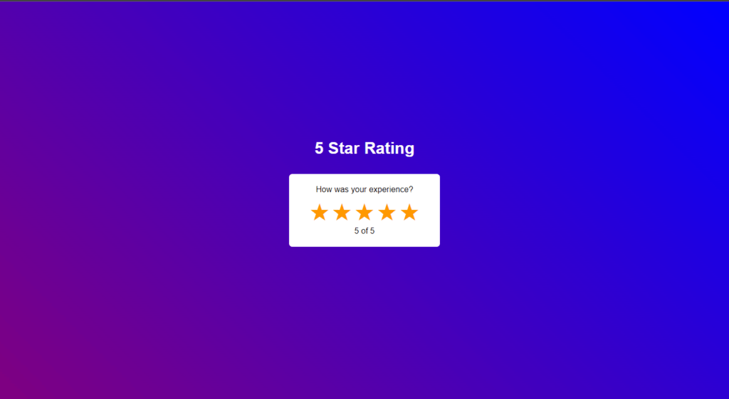
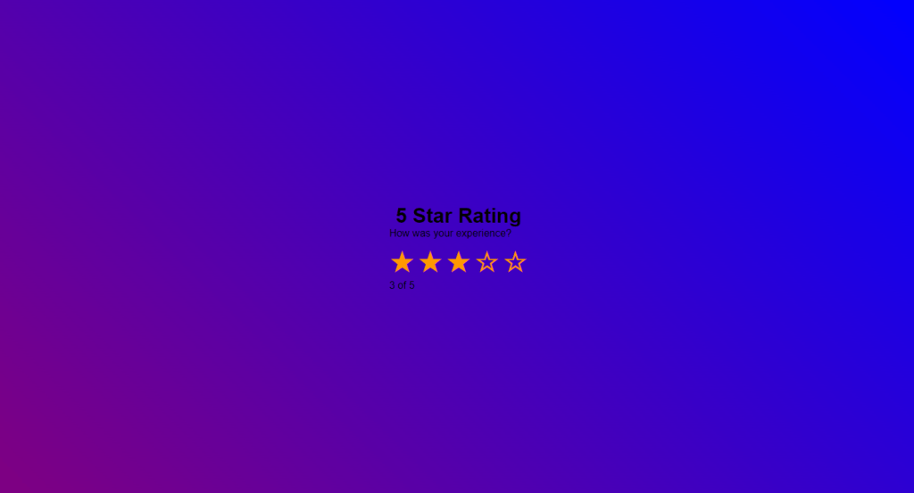
In this article, we’re going to create star rating using HTML, CSS & JavaScript, here we will make a simple star rating system where user can input preferred rating from 1 to 5.
You might have seen this kind of rating system almost everywhere, but today we will create it, so it’s going to be very easy.
Pre-requisites To Make Star Rating Using HTML, CSS & JavaScript
- Good knowledge of HTML.
- Basic knowledge of CSS & CSS3.
- Good knowledge of JavaScript.
Creating HTML Markup
<h1 class="rating_heading">5 Star Rating</h1>
    <div class="star_rating">
        <p style="color: black;">How was your experience?</p>
        <button class="star" type="button">☆</button>
        <button class="star" type="button">☆</button>
        <button class="star" type="button">☆</button>
        <button class="star" type="button">☆</button>
        <button class="star" type="button">☆</button>
        <p class="current_rating" style="color: black;">0 of 5</p>
    </div>
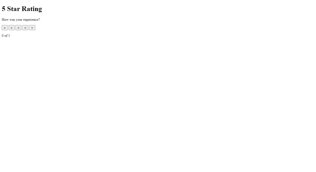
We’re creating index.html file. inside the body tag we’re creating a div with class name star_rating and inside that div we’re creating a button with class name star, and we’re giving this special character and this is what you call HTML entity, so this is also emit abbreviation, so we’re going to duplicate four times same code, after that we will add H1 tag with class rating_heading, and we will add 2 p tags.
Setting Up Default values
					*{
            margin: 0;
            padding: 0;
            box-sizing: border-box;
	        }

	        body{
            height: 100vh;
            display: flex;
            justify-content: center;
            align-items: center;
						font-family: Arial, Helvetica, sans-serif;
            background: linear-gradient(45deg, purple, blue);
	        }
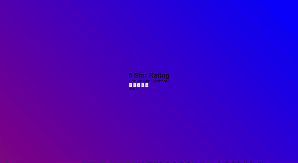
Here we’re using internal CSS, so for the universal selector we’re giving margin 0, padding 0, box-sizing to border-box, now let’s style the body tag for the body tag we’re giving height 100vh display will be flex, justify content to center, align-items to center.
Also, we will provide background as linear-gradient at 45-degree angle with purple and blue colors.
Customizing Stars
.star{
            font-size: 3rem;
            color: #ff9800;
            background-color: unset;
            border: none;
        }

        .star:hover{
            cursor: pointer;
        }
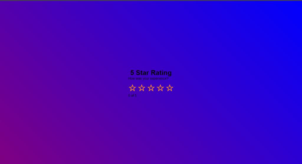
Now it’s time to style the star, so for this star we’re giving font size 3rem, for color we’re going to give orange color, so for the background color we’re giving unset and for the border none. Now, when you hover the star, let’s give cursor to pointer.
Setting up Star Rating System
const allstar = document.querySelectorAll(".star");
let current_star_level = document.querySelector('.current_rating');
allstar.forEach((star, i) => {
star.onclick = function() {
let current_star_level_value = i + 1;
current_star_level.innerText = `${current_star_level_value} of 5`;
allstar.forEach((star, j) => {
if( current_star_level_value >= j+1 )
{
star.innerHTML = '★';
}else{
star.innerHTML = '☆';
}
})
}
})
Now let’s jump into the JavaScript part, we’re writing constant all star with document.querySelectorAll (’.star’), So now after that we’ll use for Each loop with parameters of star and i, in this loop we’ll call a function which triggers when we click on stars.
So in the function, let’s declare current_star_level_value this will store index number of the clicked star, for now it will contain i+1. After that we will again loop the stars, in this loop we will check the condition where current_star_level_value is greater than j+1 or not.
If the condition becomes true, then we will color the star with #9733 color, if it’s false, then we’ll color it with #9734 color.
Customizing The Star Heading And Star Rating
.star_rating{
            user-select: none;
            color: white;
            background-color: white;
            padding: 1.4rem 2.5rem;
            margin: 2rem;
            border-radius: .4rem;
            text-align: center;
						animation: slide-up 1s ease;
        }

@keyframes slide-up{
            0%{
                opacity: 0;
                transform: scale(.5);
            }

            100%{
                opacity: 1;
                transform: scale(1);
            }
        }
        }

.rating_heading{
            color: white;
            animation: scale-up 1s ease;
        }

@keyframes scale-up{
            0%{
                opacity: 0;
                transform: translateY(50px);
            }

            100%{
                opacity: 1;
                transform: translateY(0px);
            }
        }
Now let’s change the rating headings color, we’re giving color white, let’s style the star rating for the star rating we’re giving background color white, and also we want to keep padding from top to bottom we want to give 1.4rem, for left to right we’re giving 2.5rem similarly let’s keep the margin of 2rem let’s keep the border radius of 0.4rem, let’s align the text to center.
Now let’s keep the animation for the rating heading, so we’re writing animation we’re giving animation name as scale-up for the duration we’re giving 1 second and for the timing function we’re giving ease, now let’s write add keyframe let’s keep the name scale-up at 0% we’re giving opacity 0 transform scale to 0.5 and at the 100% we’re giving opacity to 1 and transform to scale back to 1.
Now let’s copy this code let’s duplicate it and let’s take it to the star rating class, and we’ll to change the animation name to slide up and let’s keep for the0 portion we’re giving same opacity 0 for the transform we’re giving translateY and for the 0 portion we’re giving 50 pixels and for the100% we’re giving 0 pixels okay translate y to 0 pixels.
Full Source Code Of Star Rating Using HTML, CSS & JavaScript
index.html
<!DOCTYPE html>
<html lang="en">
<head>
<meta charset="UTF-8">
<meta http-equiv="X-UA-Compatible" content="IE=edge">
<meta name="viewport" content="width=device-width, initial-scale=1.0">
<title>Star Rating</title>
<style>
*{
margin: 0;
padding: 0;
box-sizing: border-box;
}
body{
height: 100vh;
display: flex;
flex-direction: column;
justify-content: center;
align-items: center;
font-family: Arial, Helvetica, sans-serif;
background: linear-gradient(45deg, purple, blue);
}
.star_rating{
user-select: none;
color: white;
background-color: white;
padding: 1.4rem 2.5rem;
margin: 2rem;
border-radius: .4rem;
text-align: center;
animation: slide-up 1s ease;
}
@keyframes slide-up{
0%{
opacity: 0;
transform: scale(.5);
}
100%{
opacity: 1;
transform: scale(1);
}
}
.rating_heading{
color: white;
animation: scale-up 1s ease;
}
@keyframes scale-up{
0%{
opacity: 0;
transform: translateY(50px);
}
100%{
opacity: 1;
transform: translateY(0px);
}
}
.star{
font-size: 3rem;
color: #ff9800;
background-color: unset;
border: none;
}
.star:hover{
cursor: pointer;
}
</style>
</head>
<body>
<h1 class="rating_heading">5 Star Rating</h1>
<div class="star_rating">
<p style="color: black;">How was your experience?</p>
<button class="star" type="button">☆</button>
<button class="star" type="button">☆</button>
<button class="star" type="button">☆</button>
<button class="star" type="button">☆</button>
<button class="star" type="button">☆</button>
<p class="current_rating" style="color: black;">0 of 5</p>
</div>
<script>
const allstar = document.querySelectorAll(".star");
let current_star_level = document.querySelector('.current_rating');
allstar.forEach((star, i) => {
star.onclick = function() {
let current_star_level_value = i + 1;
current_star_level.innerText = `${current_star_level_value} of 5`;
allstar.forEach((star, j) => {
if( current_star_level_value >= j+1 )
{
star.innerHTML = '★';
}else{
star.innerHTML = '☆';
}
})
}
})
</script>
</body>
</html>
Output
