In this article, we are going to learn how to make a custom cursor with HTML, CSS and JavaScript, it will have the all functionality that we can do with our default cursor, and also we have click effect whenever we’ll click in the window it will do animation and that’s what we are going to make today.
Pre-requisites to Make a custom cursor with HTML, CSS and JavaScript
- Basic knowledge of HTML.
- Good knowledge of CSS & CSS3.
- Good knowledge of JavaScript.
Creating HTML Markup
<section class="container">
    <h1>Hi there, How are you?</h1>
  </section>
  <section></section>
  <div class="cursor"></div>
  <script src="./main.js"></script>
First of all let’s get a layout here and in the body let’s get a section and in here we will have a class of something like container and also let’s have something like h1 in it “Hi there, How are you”. We will have a tip for our custom cursor so let’s have a div with a class of cursor and that’s all what we need for our this custom cursor, also let’s link our style sheet, and JS file.
Setting up Background
*{
    padding: 0;
    margin: 0;
    box-sizing: border-box;
  }

  body{
    overflow-x: hidden;
  }
  section{
    min-height: 100vh;
    background-color: rgb(41, 42, 46);
    width: 100%;
    display: flex;
    align-items: center;
    justify-content: center;
    color: white;
  }
In our style.css first of all let’s remove all the padding, and also we want the margin 0 and also box sizing will be in border box that’s it after that let’s have some basic style so what we will have is for our section we will have something like min-height of 100vh, and also we will have a background color which will be similar to black, and also width will be 100% and display is flex and align items will be center and justify content will be center and also make sure that the color of the text will be the white.

Setting up Cursor
.cursor{
    position: absolute;
    top: 0;
    left: 0;
    border: 2px solid white;
    background-color: rgba(255, 255, 255, 0.356);
    height: 30px;
    width: 30px;
    border-radius: 50px;
    transform: translate(-50%, -50%);

  }
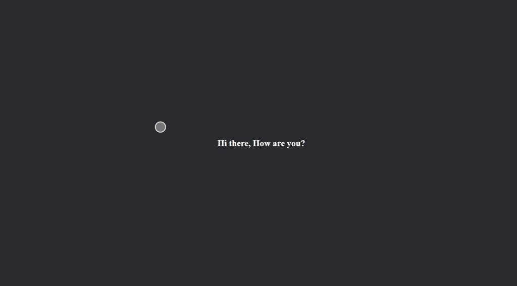
Let’s come to our cursor, so in the cursor div we want to make it position absolute and also say that left will be 0, and top will be 0. Let’s give it a border about 2 pixels solid and white make sure that you have a width of 30 pixels and height of 30 pixels also we have a border radius to make it rounded so for 50 pixels will be good, we will use transform: translate to -50% -50%. We will customize it later.

Adding mouse move and scroll events
const cursor = document.querySelector('.cursor');

window.addEventListener('mousemove', (e) => {
  cursor.style.left = e.pageX + 'px';
  cursor.style.top = e.pageY + 'px';
  cursor.setAttribute('data-fromTop', (cursor.offsetTop - scrollY));

});
window.addEventListener('scroll', () => {
  const fromTop = cursor.getAttribute('data-fromTop');
  cursor.style.top = scrollY + parseInt(fromTop) + 'px';
  console.log(scrollY);
});
In JavaScript let’s define cursor with query selector with class cursor, After that lets add event listener on mouse move, now we’ll add a function in that we will use pageX and pageY these things will give us position of cursor moved in terms of (x, y), after that lets add another listener scroll, now we want our cursor moves with the scroll, so we just need to change Y value.
so let’s say cursor.style.top to scrollY and add with parseInt(fromTop) value, after that lets set attribute named “data-fromTop” and as second parameter we’ll give cursor.offsetTop – scrollY now this parameter will give exact location after scroll. The offset Top property returns the top position (in pixels) relative to the parent window. Now we’ll get this data-fromTop attribute inside scroll event listener.
Adding animation to cursor
.cursor::after,.cursor::before{
    content: '';
    position: absolute;
    top: 50%;
    left: 50%;
    transform: translate(-50%, -50%);
    background-color: white;
    height: 10px;
    width: 10px;
    border-radius: 50px;
  }
  .cursor::before{
    background-color: rgb(255, 255, 255);
  }
  .cursor.click::before{
    animation: click 1s ease  forwards;
    background-color: rgb(255, 255, 255);
  }
  @keyframes click{
   0%{
      opacity: 1;
      transform:translate(-50%, -50%) scale(1);
   }
   100%{
      opacity: 0;
      transform: translate(-50%, -50%) scale(7);
   }
  }
window.addEventListener('click', () => {
  if (cursor.classList.contains('click')) {
    cursor.classList.remove("click");
    void cursor.offsetWidth;
    cursor.classList.add("click");
  } else {
    cursor.classList.add("click");
  }
});
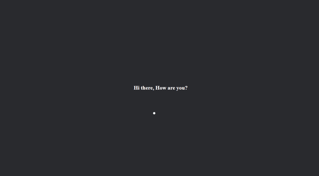
let’s get back to CSS part again now let’s add after and before effect in here, set position to absolute, top and left properties to 50%, to add cursor with default cursor let’s add transform to 50%, 50%. Background color will be white, height and width to 10 pixels, let’s give border radius to 50%.
Now again back to JavaScript, let’s add event listener for click now let’s add condition if class list contains click then we will remove it because we want every time we click animation should be run. Offset Width will trigger a DOM reflow.
Again, let’s add animation click with 1 second with ease. Now let’s add keyframe where we will define animation, so for 0% translate -50%, -50% with scale of 1 and for 100% translate -50%, -50% with scale of 7.
Full source to Make a custom cursor with HTML, CSS and JavaScript
index.html
<!DOCTYPE html>
<html lang="en">

<head>
  <meta charset="UTF-8">
  <meta name="viewport" content="width=device-width, initial-scale=1.0">
  <title>Document</title>
  <link rel="stylesheet" href="./style.css">
</head>

<body>
  <section class="container">
    <h1>Hi there, How are you?</h1>
  </section>
  <section></section>
  <div class="cursor"></div>
  <script src="./main.js"></script>
</body>

</html>
style.css
*{
    padding: 0;
    margin: 0;
    box-sizing: border-box;
 }
  body{
    overflow-x: hidden;
  }
  section{
    min-height: 100vh;
    background-color: rgb(41, 42, 46);
    width: 100%;
    display: flex;
    align-items: center;
    justify-content: center;
    color: white;
  }
 .cursor{
    position: absolute;
    top: 0;
    left: 0;
    height: 30px;
    width: 30px;
    border-radius: 50px;
    transform: translate(-50%, -50%);
    pointer-events: none;
  }
.cursor::after,.cursor::before{
    content: '';
    position: absolute;
    top: 50%;
    left: 50%;
    transform: translate(-50%, -50%);
    background-color: white;
    height: 10px;
    width: 10px;
    border-radius: 50px;
  }
  .cursor::before{
    background-color: rgb(255, 255, 255);
  }
  .cursor.click::before{
    animation: click 1s ease  forwards;
    background-color: rgb(255, 255, 255);
  }
  @keyframes click{
   0%{
      opacity: 1;
      transform:translate(-50%, -50%) scale(1);
   }
   100%{
      opacity: 0;
      transform: translate(-50%, -50%) scale(7);
   }
  }
main.js
const cursor = document.querySelector('.cursor');

window.addEventListener('mousemove', (e) => {
  cursor.style.left = e.pageX + 'px';
  cursor.style.top = e.pageY + 'px';
  cursor.setAttribute('data-fromTop', (cursor.offsetTop - scrollY));
  // console.log(e)
});
window.addEventListener('scroll', () => {
  const fromTop = cursor.getAttribute('data-fromTop');
  cursor.style.top = scrollY + parseInt(fromTop) + 'px';
  console.log(scrollY);
});
window.addEventListener('click', () => {
  if (cursor.classList.contains('click')) {
    cursor.classList.remove("click");
    void cursor.offsetWidth; // trigger a DOM reflow
    cursor.classList.add("click");
  } else {
    cursor.classList.add("click");
  }
});
Output


