


Hello friends, today in this blog you’ll learn to Create a Responsive Plants Website Design Using HTML CSS & JavaScript. We’ll use HTML CSS and JavaScript to create this awesome Plants Website Design. Build a complete responsive online Plants Website Design step by step.
Features of Responsive Plants Website Design
- Responsive Plants Website Design Using HTML CSS & JavaScript.
- Smooth scrolling in each section.
- Contains animations when scrolling.
- Includes a dark and light mode.
- Compatible with all mobile devices and with a beautiful and pleasant user interface.
What should you know before you start?
- HTML
- CSS
- JavaScript
Steps of Creating Plants Website Design
- Project Setup
- Variables CSS
- Reset HTML & Reusable CSS Classes
- Header & Nav Menu
- Home
- Buttons
- About Section
- Change Background Header
- Steps Section
- Products Section
- FAQ Section
- Contact Section
- Footer Section
- Scroll Sections Active Link
- Scroll Up
- Scroll Bar
- Dark/Light Theme
- Breakpoints
- ScrollReveal Animation
Plants Website Design

Now start the design. the first step is Project setup. So Create a folder Responsive Watches Website. You can see below, our project’s folder structure.

in index.html file link CSS and js file
<!DOCTYPE html>
    <html lang="en">
    <head>
        <meta charset="UTF-8">
        <meta name="viewport" content="width=device-width, initial-scale=1.0">

        <!--=============== FAVICON ===============-->
        <link rel="shortcut icon" href="assets/img/favicon.png" type="image/x-icon">

        <!--=============== REMIX ICONS ===============-->
        <link href="https://cdn.jsdelivr.net/npm/remixicon@2.5.0/fonts/remixicon.css" rel="stylesheet">

        <!--=============== CSS ===============-->
        <link rel="stylesheet" href="assets/css/styles.css">

        <title>Responsive plants website - Bedimcode</title>
    </head>
    <body>
        <!--==================== HEADER ====================-->
        <header class="header" id="header">

        </header>

        <main class="main">
            <!--==================== HOME ====================-->
            <section class="home" id="home">

            </section>

            <!--==================== ABOUT ====================-->
            <section class="about section container" id="about">

            </section>

            <!--==================== STEPS ====================-->
            <section class="steps section container">

            </section>

            <!--==================== PRODUCTS ====================-->
            <section class="product section container" id="products">

            </section>

            <!--==================== QUESTIONS ====================-->
            <section class="questions section" id="faqs">

            </section>

            <!--==================== CONTACT ====================-->
            <section class="contact section container" id="contact">

            </section>
        </main>

        <!--==================== FOOTER ====================-->
        <footer class="footer section">

        </footer>

        <!--=============== SCROLL UP ===============-->


        <!--=============== SCROLL REVEAL ===============-->
        <script src=""></script>

        <!--=============== MAIN JS ===============-->
        <script src="assets/js/main.js"></script>
    </body>
</html>
Now In the styles.css file, we need do to define some CSS Variables. A CSS Variables is Custom properties (sometimes referred to as CSS variables or cascading variables) are entities defined by CSS authors that contain specific values to be reused throughout a document.
/*=============== GOOGLE FONTS ===============*/
@import url('https://fonts.googleapis.com/css2?family=Poppins:wght@400;500;600;700&display=swap');

/*=============== VARIABLES CSS ===============*/
:root {
  --header-height: 3.5rem; /*56px*/

  /*========== Colors ==========*/
  /*Color mode HSL(hue, saturation, lightness)*/
  --hue: 152;
  --first-color: hsl(var(--hue), 24%, 32%);
  --first-color-alt: hsl(var(--hue), 24%, 28%);
  --first-color-light: hsl(var(--hue), 24%, 66%);
  --first-color-lighten: hsl(var(--hue), 24%, 92%);
  --title-color: hsl(var(--hue), 4%, 15%);
  --text-color: hsl(var(--hue), 4%, 35%);
  --text-color-light: hsl(var(--hue), 4%, 55%);
  --body-color: hsl(var(--hue), 0%, 100%);
  --container-color: #FFF;

  /*========== Font and typography ==========*/
  /*.5rem = 8px | 1rem = 16px ...*/
  --body-font: 'Poppins', sans-serif;
  --big-font-size: 2rem;
  --h1-font-size: 1.5rem;
  --h2-font-size: 1.25rem;
  --h3-font-size: 1rem;
  --normal-font-size: .938rem;
  --small-font-size: .813rem;
  --smaller-font-size: .75rem;

  /*========== Font weight ==========*/
  --font-medium: 500;
  --font-semi-bold: 600;

  /*========== Margenes Bottom ==========*/
  /*.5rem = 8px | 1rem = 16px ...*/
  --mb-0-5: .5rem;
  --mb-0-75: .75rem;
  --mb-1: 1rem;
  --mb-1-5: 1.5rem;
  --mb-2: 2rem;
  --mb-2-5: 2.5rem;

  /*========== z index ==========*/
  --z-tooltip: 10;
  --z-fixed: 100;
}

/* Responsive typography */
@media screen and (min-width: 968px) {
  :root {
    --big-font-size: 3.5rem;
    --h1-font-size: 2.25rem;
    --h2-font-size: 1.5rem;
    --h3-font-size: 1.25rem;
    --normal-font-size: 1rem;
    --small-font-size: .875rem;
    --smaller-font-size: .813rem;
  }
}
Reset HTML & Reusable CSS Classes
/*=============== BASE ===============*/
*{
  box-sizing: border-box;
  padding: 0;
  margin: 0;
}

html{
  scroll-behavior: smooth;
}

body,
button,
input,
textarea{
  font-family: var(--body-font);
  font-size: var(--normal-font-size);
}

body{
  margin: var(--header-height) 0 0 0;
  background-color: var(--body-color);
  color: var(--text-color);
  transition: .4s; /*For animation dark mode*/
}

button{
  cursor: pointer;
  border: none;
  outline: none;
}

h1,h2,h3{
  color: var(--title-color);
  font-weight: var(--font-semi-bold);
}

ul{
  list-style: none;
}

a{
  text-decoration: none;
}

img{
  max-width: 100%;
  height: auto;
}

/*=============== THEME ===============*/
/*========== Variables Dark theme ==========*/
body.dark-theme{
  --first-color-dark: hsl(var(--hue), 8%, 20%);
  --title-color: hsl(var(--hue), 4%, 95%);
  --text-color: hsl(var(--hue), 4%, 75%);
  --body-color: hsl(var(--hue), 8%, 12%);
  --container-color: hsl(var(--hue), 8%, 16%);
}

/*========== Button Dark/Light ==========*/
.change-theme{
  color: var(--title-color);
  font-size: 1.15rem;
  cursor: pointer;
}

.nav__btns{
  display: inline-flex;
  align-items: center;
  column-gap: 1rem;
}

/*==========
Color changes in some parts of
the website, in dark theme
==========*/

.dark-theme .steps__bg,
.dark-theme .questions{
  background-color: var(--first-color-dark);
}

.dark-theme .product__circle,
.dark-theme .footer__subscribe{
  background-color: var(--container-color);
}

.dark-theme .scroll-header{
  box-shadow: 0 1px 4px hsla(var(--hue), 4%, 4%, .3);
}

/*=============== REUSABLE CSS CLASSES ===============*/
.section{
  padding: 5.5rem 0 1rem;
}

.section__title,
.section__title-center{
  font-size: var(--h2-font-size);
  margin-bottom: var(--mb-2);
  line-height: 140%;
}

.section__title-center{
  text-align: center;
}

.container{
  max-width: 968px;
  margin-left: var(--mb-1-5);
  margin-right: var(--mb-1-5);
}

.grid{
  display: grid;
}

.main{
  overflow: hidden; /*For animation*/
}
Now we Create Header
<!--==================== HEADER ====================-->
        <header class="header" id="header">
            <nav class="nav container">
                <a href="#" class="nav__logo">
                    <i class="ri-leaf-line nav__logo-icon"></i> Plantex
                </a>

                <div class="nav__menu" id="nav-menu">
                    <ul class="nav__list">
                        <li class="nav__item">
                            <a href="#home" class="nav__link active-link">Home</a>
                        </li>
                        <li class="nav__item">
                            <a href="#about" class="nav__link">About</a>
                        </li>
                        <li class="nav__item">
                            <a href="#products" class="nav__link">Products</a>
                        </li>
                        <li class="nav__item">
                            <a href="#faqs" class="nav__link">FAQs</a>
                        </li>
                        <li class="nav__item">
                            <a href="#contact" class="nav__link">Contact Us</a>
                        </li>
                    </ul>

                    <div class="nav__close" id="nav-close">
                        <i class="ri-close-line"></i>
                    </div>
                </div>

                <div class="nav__btns">
                    <!-- Theme change button -->
                    <i class="ri-moon-line change-theme" id="theme-button"></i>

                    <div class="nav__toggle" id="nav-toggle">
                        <i class="ri-menu-line"></i>
                    </div>
                </div>
            </nav>
        </header>
/*=============== HEADER ===============*/
.header{
  width: 100%;
  background-color: var(--body-color);
  position: fixed;
  top: 0;
  left: 0;
  z-index: var(--z-fixed);
  transition: .4s; /*For animation dark mode*/
}

/*=============== NAV ===============*/
.nav{
  height: var(--header-height);
  display: flex;
  justify-content: space-between;
  align-items: center;
}

.nav__logo,
.nav__toggle,
.nav__close{
  color: var(--title-color);
}

.nav__logo{
  text-transform: uppercase;
  font-weight: 700;
  letter-spacing: -1px;
  display: inline-flex;
  align-items: center;
  column-gap: .5rem;
  transition: .3s;
}

.nav__logo-icon{
  font-size: 1.15rem;
  color: var(--first-color);
}

.nav__logo:hover{
  color: var(--first-color);
}

.nav__toggle{
  display: inline-flex;
  font-size: 1.25rem;
  cursor: pointer;
}

@media screen and (max-width: 767px){
  .nav__menu{
    position: fixed;
    background-color: var(--container-color);
    width: 80%;
    height: 100%;
    top: 0;
    right: -100%;
    box-shadow: -2px 0 4px hsla(var(--hue), 24%, 15%, .1);
    padding: 4rem 0 0 3rem;
    border-radius: 1rem 0 0 1rem;
    transition: .3s;
    z-index: var(--z-fixed);
  }
}

.nav__close{
  font-size: 1.5rem;
  position: absolute;
  top: 1rem;
  right: 1.25rem;
  cursor: pointer;
}

.nav__list{
  display: flex;
  flex-direction: column;
  row-gap: 1.5rem;
}

.nav__link{
  color: var(--title-color);
  font-weight: var(--font-medium);
  transition: .3s;
}

.nav__link:hover{
  color: var(--first-color);
}

/* Show menu */
.show-menu{
  right: 0;
}

/* Change background header */
.scroll-header{
  box-shadow: 0 1px 4px hsla(var(--hue), 4%, 15%, .1);
}

/* Active link */
.active-link{
  position: relative;
  color: var(--first-color);
}

.active-link::after{
  content: '';
  position: absolute;
  bottom: -.5rem;
  left: 0;
  width: 50%;
  height: 2px;
  background-color: var(--first-color);
}
Home Section
 <section class="home" id="home">
                <div class="home__container container grid">
                    <img src="assets/img/home.png" alt="" class="home__img">

                    <div class="home__data">
                        <h1 class="home__title">
                            Plants will make <br> your life better
                        </h1>
                        <p class="home__description">
                            Create incredible plant design for your offices or apastaments.
                            Add fresness to your new ideas.
                        </p>
                        <a href="#about" class="button button--flex">
                            Explore <i class="ri-arrow-right-down-line button__icon"></i>
                        </a>
                    </div>

                    <div class="home__social">
                        <span class="home__social-follow">Follow Us</span>

                        <div class="home__social-links">
                            <a href="https://www.facebook.com/" target="_blank" class="home__social-link">
                                <i class="ri-facebook-fill"></i>
                            </a>
                            <a href="https://www.instagram.com/" target="_blank" class="home__social-link">
                                <i class="ri-instagram-line"></i>
                            </a>
                            <a href="https://twitter.com/" target="_blank" class="home__social-link">
                                <i class="ri-twitter-fill"></i>
                            </a>
                        </div>
                    </div>
                </div>
            </section>
/*=============== HOME ===============*/
.home{
padding: 3.5rem 0 2rem;
}
.home__container{
position: relative;
row-gap: 2rem;
}
.home__img{
width: 200px;
justify-self: center;
}
.home__title{
font-size: var(--big-font-size);
line-height: 140%;
margin-bottom: var(--mb-1);
}
.home__description{
margin-bottom: var(--mb-2-5);
}
.home__social{
position: absolute;
top: 2rem;
right: -1rem;
display: grid;
justify-items: center;
row-gap: 3.5rem;
}
.home__social-follow{
font-weight: var(--font-medium);
font-size: var(--smaller-font-size);
color: var(--first-color);
position: relative;
transform: rotate(90deg);
}
.home__social-follow::after{
content: '';
position: absolute;
width: 1rem;
height: 2px;
background-color: var(--first-color);
right: -45%;
top: 50%;
}
.home__social-links{
display: inline-flex;
flex-direction: column;
row-gap: .25rem;
}
.home__social-link{
font-size: 1rem;
color: var(--first-color);
transition: .3s;
}
.home__social-link:hover{
transform: translateX(.25rem);
}
/*=============== BUTTONS ===============*/
.button{
display: inline-block;
background-color: var(--first-color);
color: #FFF;
padding: 1rem 1.75rem;
border-radius: .5rem;
font-weight: var(--font-medium);
transition: .3s;
}
.button:hover{
background-color: var(--first-color-alt);
}
.button__icon{
transition: .3s;
}
.button:hover .button__icon{
transform: translateX(.25rem);
}
.button--flex{
display: inline-flex;
align-items: center;
column-gap: .5rem;
}
.button--link{
color: var(--first-color);
font-weight: var(--font-medium);
}
.button--link:hover .button__icon{
transform: translateX(.25rem);
}

About Section
<!--==================== ABOUT ====================-->
            <section class="about section container" id="about">
                <div class="about__container grid">
                    <img src="assets/img/about.png" alt="" class="about__img">

                    <div class="about__data">
                        <h2 class="section__title about__title">
                            Who we really are & <br> why choose us
                        </h2>

                        <p class="about__description">
                            We have over 4000+ unbiased reviews and our customers
                            trust our plant process and delivery service every time
                        </p>

                        <div class="about__details">
                            <p class="about__details-description">
                                <i class="ri-checkbox-fill about__details-icon"></i>
                                We always deliver on time.
                            </p>
                            <p class="about__details-description">
                                <i class="ri-checkbox-fill about__details-icon"></i>
                                We give you guides to protect and care for your plants.
                            </p>
                            <p class="about__details-description">
                                <i class="ri-checkbox-fill about__details-icon"></i>
                                We always come over for a check-up after sale.
                            </p>
                            <p class="about__details-description">
                                <i class="ri-checkbox-fill about__details-icon"></i>
                                100% money back guaranteed.
                            </p>
                        </div>

                        <a href="#" class="button--link button--flex">
                            Shop Now <i class="ri-arrow-right-down-line button__icon"></i>
                        </a>
                    </div>
                </div>
            </section>
/*=============== ABOUT ===============*/
.about__container{
  row-gap: 2rem;
}

.about__img{
  width: 280px;
  justify-self: center;
}

.about__title{
  margin-bottom: var(--mb-1);
}

.about__description{
  margin-bottom: var(--mb-2);
}

.about__details{
  display: grid;
  row-gap: 1rem;
  margin-bottom: var(--mb-2-5);
}

.about__details-description{
  display: inline-flex;
  column-gap: .5rem;
  font-size: var(--small-font-size);
}

.about__details-icon{
  font-size: 1rem;
  color: var(--first-color);
  margin-top: .15rem;
}

Steps Section For Buy Plants
<!--==================== STEPS ====================-->
            <section class="steps section container">
                <div class="steps__bg">
                    <h2 class="section__title-center steps__title">
                        Steps to start your <br> plants off right
                    </h2>

                    <div class="steps__container grid">
                        <div class="steps__card">
                            <div class="steps__card-number">01</div>
                            <h3 class="steps__card-title">Choose Plant</h3>
                            <p class="steps__card-description">
                                We have several varieties plants you can choose from.
                            </p>
                        </div>

                        <div class="steps__card">
                            <div class="steps__card-number">02</div>
                            <h3 class="steps__card-title">Place an order</h3>
                            <p class="steps__card-description">
                                Once your order is set, we move to the next step which is the shipping.
                            </p>
                        </div>

                        <div class="steps__card">
                            <div class="steps__card-number">03</div>
                            <h3 class="steps__card-title">Get plants delivered</h3>
                            <p class="steps__card-description">
                                Our delivery process is easy, you receive the plant direct to your door.
                            </p>
                        </div>
                    </div>
                </div>
            </section>
/*=============== STEPS ===============*/
.steps__bg{
background-color: var(--first-color);
padding: 3rem 2rem 2rem;
border-radius: 1rem;
}
.steps__container{
gap: 2rem;
padding-top: 1rem;
}
.steps__title{
color: #FFF;
}
.steps__card{
background-color: var(--container-color);
padding: 2.5rem 3rem 2rem 1.5rem;
border-radius: 1rem;
}
.steps__card-number{
display: inline-block;
background-color: var(--first-color-alt);
color: #FFF;
padding: .5rem .75rem;
border-radius: .25rem;
font-size: var(--h2-font-size);
margin-bottom: var(--mb-1-5);
transition: .3s;
}
.steps__card-title{
font-size: var(--h3-font-size);
margin-bottom: var(--mb-0-5);
}
.steps__card-description{
font-size: var(--small-font-size);
}
.steps__card:hover .steps__card-number{
transform: translateY(-.25rem);
}

Product listing Section
<!--==================== PRODUCTS ====================-->
<section class="product section container" id="products">
<h2 class="section__title-center">
Check out our <br> products
</h2>
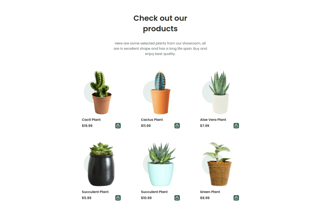
<p class="product__description">
Here are some selected plants from our showroom, all are in excellent
shape and has a long life span. Buy and enjoy best quality.
</p>
<div class="product__container grid">
<article class="product__card">
<div class="product__circle"></div>
<img src="assets/img/product1.png" alt="" class="product__img">
<h3 class="product__title">Cacti Plant</h3>
<span class="product__price">$19.99</span>
<button class="button--flex product__button">
<i class="ri-shopping-bag-line"></i>
</button>
</article>
<article class="product__card">
<div class="product__circle"></div>
<img src="assets/img/product2.png" alt="" class="product__img">
<h3 class="product__title">Cactus Plant</h3>
<span class="product__price">$11.99</span>
<button class="button--flex product__button">
<i class="ri-shopping-bag-line"></i>
</button>
</article>
<article class="product__card">
<div class="product__circle"></div>
<img src="assets/img/product3.png" alt="" class="product__img">
<h3 class="product__title">Aloe Vera Plant</h3>
<span class="product__price">$7.99</span>
<button class="button--flex product__button">
<i class="ri-shopping-bag-line"></i>
</button>
</article>
<article class="product__card">
<div class="product__circle"></div>
<img src="assets/img/product4.png" alt="" class="product__img">
<h3 class="product__title">Succulent Plant</h3>
<span class="product__price">$5.99</span>
<button class="button--flex product__button">
<i class="ri-shopping-bag-line"></i>
</button>
</article>
<article class="product__card">
<div class="product__circle"></div>
<img src="assets/img/product5.png" alt="" class="product__img">
<h3 class="product__title">Succulent Plant</h3>
<span class="product__price">$10.99</span>
<button class="button--flex product__button">
<i class="ri-shopping-bag-line"></i>
</button>
</article>
<article class="product__card">
<div class="product__circle"></div>
<img src="assets/img/product6.png" alt="" class="product__img">
<h3 class="product__title">Green Plant</h3>
<span class="product__price">$8.99</span>
<button class="button--flex product__button">
<i class="ri-shopping-bag-line"></i>
</button>
</article>
</div>
</section>
/*=============== PRODUCTS ===============*/
.product__description{
  text-align: center;
}

.product__container{
  padding: 3rem 0;
  grid-template-columns: repeat(2, 1fr);
  gap: 2.5rem 3rem;
}

.product__card{
  display: grid;
  position: relative;
}

.product__img{
  position: relative;
  width: 120px;
  justify-self: center;
  margin-bottom: var(--mb-0-75);
  transition: .3s;
}

.product__title,
.product__price{
  font-size: var(--small-font-size);
  font-weight: var(--font-semi-bold);
  color: var(--title-color);
}

.product__title{
  margin-bottom: .25rem;
}

.product__button{
  position: absolute;
  right: 0;
  bottom: 0;
  background-color: var(--first-color);
  color: #FFF;
  padding: .25rem;
  border-radius: .35rem;
  font-size: 1.15rem;
}

.product__button:hover{
  background-color: var(--first-color-alt);
}

.product__circle{
  width: 90px;
  height: 90px;
  background-color: var(--first-color-lighten);
  border-radius: 50%;
  position: absolute;
  top: 18%;
  left: 5%;
}

.product__card:hover .product__img{
  transform: translateY(-.5rem);
}
FAQ Sections
<!--==================== QUESTIONS ====================-->
            <section class="questions section" id="faqs">
                <h2 class="section__title-center questions__title container">
                    Some common questions <br> were often asked
                </h2>

                <div class="questions__container container grid">
                    <div class="questions__group">
                        <div class="questions__item">
                            <header class="questions__header">
                                <i class="ri-add-line questions__icon"></i>
                                <h3 class="questions__item-title">
                                    My flowers are falling off or dying?
                                </h3>
                            </header>

                            <div class="questions__content">
                                <p class="questions__description">
                                    Plants are easy way to add color energy and transform your
                                    space but which planet is for you. Choosing the right plant.
                                </p>
                            </div>
                        </div>

                        <div class="questions__item">
                            <header class="questions__header">
                                <i class="ri-add-line questions__icon"></i>
                                <h3 class="questions__item-title">
                                    What causes leaves to become pale?
                                </h3>
                            </header>

                            <div class="questions__content">
                                <p class="questions__description">
                                    Plants are easy way to add color energy and transform your
                                    space but which planet is for you. Choosing the right plant.
                                </p>
                            </div>
                        </div>

                        <div class="questions__item">
                            <header class="questions__header">
                                <i class="ri-add-line questions__icon"></i>
                                <h3 class="questions__item-title">
                                    What causes brown crispy leaves?
                                </h3>
                            </header>

                            <div class="questions__content">
                                <p class="questions__description">
                                    Plants are easy way to add color energy and transform your
                                    space but which planet is for you. Choosing the right plant.
                                </p>
                            </div>
                        </div>
                    </div>

                    <div class="questions__group">
                        <div class="questions__item">
                            <header class="questions__header">
                                <i class="ri-add-line questions__icon"></i>
                                <h3 class="questions__item-title">
                                    How do i choose a plant?
                                </h3>
                            </header>

                            <div class="questions__content">
                                <p class="questions__description">
                                    Plants are easy way to add color energy and transform your
                                    space but which planet is for you. Choosing the right plant.
                                </p>
                            </div>
                        </div>

                        <div class="questions__item">
                            <header class="questions__header">
                                <i class="ri-add-line questions__icon"></i>
                                <h3 class="questions__item-title">
                                    How do I change the pots?
                                </h3>
                            </header>

                            <div class="questions__content">
                                <p class="questions__description">
                                    Plants are easy way to add color energy and transform your
                                    space but which planet is for you. Choosing the right plant.
                                </p>
                            </div>
                        </div>

                        <div class="questions__item">
                            <header class="questions__header">
                                <i class="ri-add-line questions__icon"></i>
                                <h3 class="questions__item-title">
                                    Why are gnats flying around my plant?
                                </h3>
                            </header>

                            <div class="questions__content">
                                <p class="questions__description">
                                    Plants are easy way to add color energy and transform your
                                    space but which planet is for you. Choosing the right plant.
                                </p>
                            </div>
                        </div>
                    </div>
                </div>
            </section>
/*=============== QUESTIONS ===============*/
.questions{
background-color: var(--first-color-lighten);
}
.questions__container{
gap: 1.5rem;
padding: 1.5rem 0;
}
.questions__group{
display: grid;
row-gap: 1.5rem;
}
.questions__item{
background-color: var(--container-color);
border-radius: .25rem;
}
.questions__item-title{
font-size: var(--small-font-size);
font-weight: var(--font-medium);
}
.questions__icon{
font-size: 1.25rem;
color: var(--title-color);
}
.questions__description{
font-size: var(--smaller-font-size);
padding: 0 1.25rem 1.25rem 2.5rem;
}
.questions__header{
display: flex;
align-items: center;
column-gap: .5rem;
padding: .75rem .5rem;
cursor: pointer;
}
.questions__content{
overflow: hidden;
height: 0;
}
.questions__item,
.questions__header,
.questions__item-title,
.questions__icon,
.questions__description,
.questions__content{
transition: .3s;
}
.questions__item:hover{
box-shadow: 0 2px 8px hsla(var(--hue), 4%, 15%, .15);
}
/*Rotate icon, change color of titles and background*/
.accordion-open .questions__header,
.accordion-open .questions__content{
background-color: var(--first-color);
}
.accordion-open .questions__item-title,
.accordion-open .questions__description,
.accordion-open .questions__icon{
color: #FFF;
}
.accordion-open .questions__icon{
transform: rotate(45deg);
}

Contact Section
<!--==================== CONTACT ====================-->
            <section class="contact section container" id="contact">
                <div class="contact__container grid">
                    <div class="contact__box">
                        <h2 class="section__title">
                            Reach out to us today <br> via any of the given <br> information
                        </h2>

                        <div class="contact__data">
                            <div class="contact__information">
                                <h3 class="contact__subtitle">Call us for instant support</h3>
                                <span class="contact__description">
                                    <i class="ri-phone-line contact__icon"></i>
                                    +999 888 777
                                </span>
                            </div>

                            <div class="contact__information">
                                <h3 class="contact__subtitle">Write us by mail</h3>
                                <span class="contact__description">
                                    <i class="ri-mail-line contact__icon"></i>
                                    user@email.com
                                </span>
                            </div>
                        </div>
                    </div>

                    <form action="" class="contact__form">
                        <div class="contact__inputs">
                            <div class="contact__content">
                                <input type="email" placeholder=" " class="contact__input">
                                <label for="" class="contact__label">Email</label>
                            </div>

                            <div class="contact__content">
                                <input type="text" placeholder=" " class="contact__input">
                                <label for="" class="contact__label">Subject</label>
                            </div>

                            <div class="contact__content contact__area">
                                <textarea name="message" placeholder=" " class="contact__input"></textarea>
                                <label for="" class="contact__label">Message</label>
                            </div>
                        </div>

                        <button class="button button--flex">
                            Send Message
                            <i class="ri-arrow-right-up-line button__icon"></i>
                        </button>
                    </form>
                </div>
            </section>
/*=============== CONTACT ===============*/
.contact__container{
row-gap: 3.5rem;
}
.contact__data{
display: grid;
row-gap: 2rem;
}
.contact__subtitle{
font-size: var(--normal-font-size);
font-weight: var(--font-medium);
color: var(--text-color);
margin-bottom: var(--mb-0-5);
}
.contact__description{
display: inline-flex;
align-items: center;
column-gap: .5rem;
color: var(--title-color);
font-weight: var(--font-medium);
}
.contact__icon{
font-size: 1.25rem;
}
.contact__inputs{
display: grid;
row-gap: 2rem;
margin-bottom: var(--mb-2-5);
}
.contact__content{
position: relative;
height: 3rem;
border-bottom: 1px solid var(--text-color-light);
}
.contact__input{
position: absolute;
top: 0;
left: 0;
width: 100%;
height: 100%;
padding: 1rem 1rem 1rem 0;
background: none;
color: var(--text-color);
border: none;
outline: none;
z-index: 1;
}
.contact__label{
position: absolute;
top: .75rem;
width: 100%;
font-size: var(--small-font-size);
color: var(--text-color-light);
transition: .3s;
}
.contact__area{
height: 7rem;
}
.contact__area textarea{
resize: none;
}
/*Input focus move up label*/
.contact__input:focus + .contact__label{
top: -.75rem;
left: 0;
font-size: var(--smaller-font-size);
z-index: 10;
}
/*Input focus sticky top label*/
.contact__input:not(:placeholder-shown).contact__input:not(:focus) + .contact__label{
top: -.75rem;
font-size: var(--smaller-font-size);
z-index: 10;
}

Footer Section
<!--==================== FOOTER ====================-->
<footer class="footer section">
<div class="footer__container container grid">
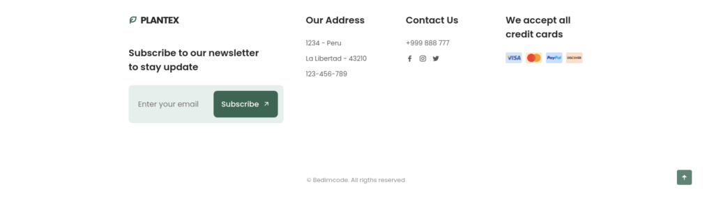
<div class="footer__content">
<a href="#" class="footer__logo">
<i class="ri-leaf-line footer__logo-icon"></i> Plantex
</a>
<h3 class="footer__title">
Subscribe to our newsletter <br> to stay update
</h3>
<div class="footer__subscribe">
<input type="email" placeholder="Enter your email" class="footer__input">
<button class="button button--flex footer__button">
Subscribe
<i class="ri-arrow-right-up-line button__icon"></i>
</button>
</div>
</div>
<div class="footer__content">
<h3 class="footer__title">Our Address</h3>
<ul class="footer__data">
<li class="footer__information">1234 - Peru</li>
<li class="footer__information">La Libertad - 43210</li>
<li class="footer__information">123-456-789</li>
</ul>
</div>
<div class="footer__content">
<h3 class="footer__title">Contact Us</h3>
<ul class="footer__data">
<li class="footer__information">+999 888 777</li>
<div class="footer__social">
<a href="https://www.facebook.com/" class="footer__social-link">
<i class="ri-facebook-fill"></i>
</a>
<a href="https://www.instagram.com/" class="footer__social-link">
<i class="ri-instagram-line"></i>
</a>
<a href="https://twitter.com/" class="footer__social-link">
<i class="ri-twitter-fill"></i>
</a>
</div>
</ul>
</div>
<div class="footer__content">
<h3 class="footer__title">
We accept all credit cards
</h3>
<div class="footer__cards">
<img src="assets/img/card1.png" alt="" class="footer__card">
<img src="assets/img/card2.png" alt="" class="footer__card">
<img src="assets/img/card3.png" alt="" class="footer__card">
<img src="assets/img/card4.png" alt="" class="footer__card">
</div>
</div>
</div>
<p class="footer__copy">© Bedimcode. All rigths reserved</p>
</footer>
/*=============== FOOTER ===============*/
.footer__container{
  row-gap: 3rem;
}

.footer__logo{
  display: inline-flex;
  align-items: center;
  column-gap: .5rem;
  color: var(--title-color);
  text-transform: uppercase;
  font-weight: 700;
  letter-spacing: -1px;
  margin-bottom: var(--mb-2-5);
  transition: .3s;
}

.footer__logo-icon{
  font-size: 1.15rem;
  color: var(--first-color);
}

.footer__logo:hover{
  color: var(--first-color);
}

.footer__title{
  font-size: var(--h3-font-size);
  margin-bottom: var(--mb-1-5);
}

.footer__subscribe{
  background-color: var(--first-color-lighten);
  padding: .75rem;
  display: flex;
  justify-content: space-between;
  border-radius: .5rem;
}

.footer__input{
  width: 70%;
  padding: 0 .5rem;
  background: none;
  color: var(--text-color);
  border: none;
  outline: none;
}

.footer__button{
  padding: 1rem;
}

.footer__data{
  display: grid;
  row-gap: .75rem;
}

.footer__information{
  font-size: var(--small-font-size);
}

.footer__social{
  display: inline-flex;
  column-gap: .75rem;
}

.footer__social-link{
  font-size: 1rem;
  color: var(--text-color);
  transition: .3s;
}

.footer__social-link:hover{
  transform: translateY(-.25rem);
}

.footer__cards{
  display: inline-flex;
  align-items: center;
  column-gap: .5rem;
}
.footer__card{
  width: 35px;
}

.footer__copy{
  text-align: center;
  font-size: var(--smaller-font-size);
  color: var(--text-color-light);
  margin: 5rem 0 1rem;
}
SCROLL UP
<!--=============== SCROLL UP ===============-->
        <a href="#" class="scrollup" id="scroll-up">
            <i class="ri-arrow-up-fill scrollup__icon"></i>
        </a>
/*=============== SCROLL UP ===============*/
.scrollup{
  position: fixed;
  background-color: var(--first-color);
  right: 1rem;
  bottom: -30%;
  display: inline-flex;
  padding: .5rem;
  border-radius: .25rem;
  z-index: var(--z-tooltip);
  opacity: .8;
  transition: .4s;
}

.scrollup__icon{
  font-size: 1rem;
  color: #FFF;
}

.scrollup:hover{
  background-color: var(--first-color-alt);
  opacity: 1;
}

/* Show Scroll Up*/
.show-scroll{
  bottom: 3rem;
}
main.js File
Inside Js File show menu & hide menu code below
/*=============== SHOW MENU ===============*/
const navMenu = document.getElementById('nav-menu'),
      navToggle = document.getElementById('nav-toggle'),
      navClose = document.getElementById('nav-close')

/*===== MENU SHOW =====*/
/* Validate if constant exists */
if(navToggle){
    navToggle.addEventListener('click', () =>{
        navMenu.classList.add('show-menu')
    })
}

/*===== MENU HIDDEN =====*/
/* Validate if constant exists */
if(navClose){
    navClose.addEventListener('click', () =>{
        navMenu.classList.remove('show-menu')
    })
}

/*=============== REMOVE MENU MOBILE ===============*/
const navLink = document.querySelectorAll('.nav__link')

function linkAction(){
    const navMenu = document.getElementById('nav-menu')
    // When we click on each nav__link, we remove the show-menu class
    navMenu.classList.remove('show-menu')
}
navLink.forEach(n => n.addEventListener('click', linkAction))
Change Background Header
/*=============== CHANGE BACKGROUND HEADER ===============*/
function scrollHeader(){
    const header = document.getElementById('header')
    // When the scroll is greater than 80 viewport height, add the scroll-header class to the header tag
    if(this.scrollY >= 80) header.classList.add('scroll-header'); else header.classList.remove('scroll-header')
}
window.addEventListener('scroll', scrollHeader)
FAQ Question Answer Toggle
const accordionItems = document.querySelectorAll('.questions__item')

accordionItems.forEach((item) =>{
    const accordionHeader = item.querySelector('.questions__header')

    accordionHeader.addEventListener('click', () =>{
        const openItem = document.querySelector('.accordion-open')

        toggleItem(item)

        if(openItem && openItem!== item){
            toggleItem(openItem)
        }
    })
})

const toggleItem = (item) =>{
    const accordionContent = item.querySelector('.questions__content')

    if(item.classList.contains('accordion-open')){
        accordionContent.removeAttribute('style')
        item.classList.remove('accordion-open')
    }else{
        accordionContent.style.height = accordionContent.scrollHeight + 'px'
        item.classList.add('accordion-open')
    }

}
Scroll Sections Active Links
/*=============== SCROLL SECTIONS ACTIVE LINK ===============*/
const sections = document.querySelectorAll('section[id]')

function scrollActive(){
    const scrollY = window.pageYOffset

    sections.forEach(current =>{
        const sectionHeight = current.offsetHeight,
              sectionTop = current.offsetTop - 58,
              sectionId = current.getAttribute('id')

        if(scrollY > sectionTop && scrollY <= sectionTop + sectionHeight){
            document.querySelector('.nav__menu a[href*=' + sectionId + ']').classList.add('active-link')
        }else{
            document.querySelector('.nav__menu a[href*=' + sectionId + ']').classList.remove('active-link')
        }
    })
}
window.addEventListener('scroll', scrollActive)

/*=============== SHOW SCROLL UP ===============*/
function scrollUp(){
    const scrollUp = document.getElementById('scroll-up');
    // When the scroll is higher than 400 viewport height, add the show-scroll class to the a tag with the scroll-top class
    if(this.scrollY >= 400) scrollUp.classList.add('show-scroll'); else scrollUp.classList.remove('show-scroll')
}
window.addEventListener('scroll', scrollUp)
DARK/LIGHT Theme
/*=============== DARK LIGHT THEME ===============*/
const themeButton = document.getElementById('theme-button')
const darkTheme = 'dark-theme'
const iconTheme = 'ri-sun-line'

// Previously selected topic (if user selected)
const selectedTheme = localStorage.getItem('selected-theme')
const selectedIcon = localStorage.getItem('selected-icon')

// We obtain the current theme that the interface has by validating the dark-theme class
const getCurrentTheme = () => document.body.classList.contains(darkTheme) ? 'dark' : 'light'
const getCurrentIcon = () => themeButton.classList.contains(iconTheme) ? 'ri-moon-line' : 'ri-sun-line'

// We validate if the user previously chose a topic
if (selectedTheme) {
  // If the validation is fulfilled, we ask what the issue was to know if we activated or deactivated the dark
  document.body.classList[selectedTheme === 'dark' ? 'add' : 'remove'](darkTheme)
  themeButton.classList[selectedIcon === 'ri-moon-line' ? 'add' : 'remove'](iconTheme)
}

// Activate / deactivate the theme manually with the button
themeButton.addEventListener('click', () => {
    // Add or remove the dark / icon theme
    document.body.classList.toggle(darkTheme)
    themeButton.classList.toggle(iconTheme)
    // We save the theme and the current icon that the user chose
    localStorage.setItem('selected-theme', getCurrentTheme())
    localStorage.setItem('selected-icon', getCurrentIcon())
})
Scroll Reveal Animation
/*=============== SCROLL REVEAL ANIMATION ===============*/
const sr = ScrollReveal({
    origin: 'top',
    distance: '60px',
    duration: 2500,
    delay: 400,
    // reset: true
})

sr.reveal(`.home__data`)
sr.reveal(`.home__img`, {delay: 500})
sr.reveal(`.home__social`, {delay: 600})
sr.reveal(`.about__img, .contact__box`,{origin: 'left'})
sr.reveal(`.about__data, .contact__form`,{origin: 'right'})
sr.reveal(`.steps__card, .product__card, .questions__group, .footer`,{interval: 100})
Watch The Video Create a Responsive Plants Website Design Using HTML CSS & JavaScript 🎍


