


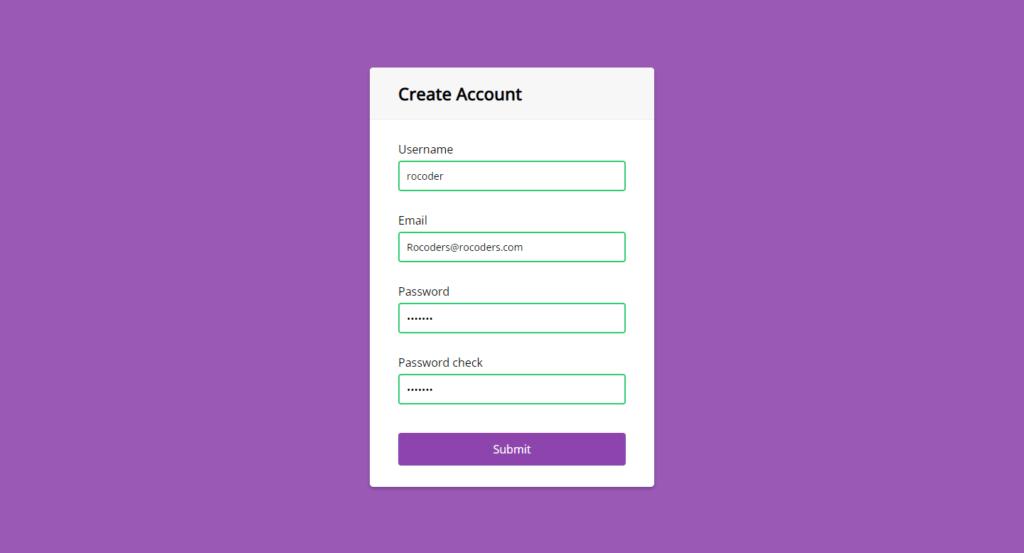
In this article, we’re going to see javascript form validation. This form has four input fields we have the username, email, password, and the password check and if we try to submit the form now we’ll get four error messages that the info fields are blank but if we add something let’s say username here for in the field, and we submit we can see that the input field turns green, and also we have the checkmark.
Here also for the email if we type something like some text it will say that it’s not a valid email also for the password we can type something it won’t be blank but if the password check is not the same it will say that they don’t match.
You can see the demo here javascript form validation
Pre-requisites To Make JavaScript Form Validation
- Basic knowledge of HTML.
- Good knowledge of CSS.
- Good knowledge of JavaScript.
Building HTML Markup
Let’s start implementing the HTML first, so we’ll have a container and here we’re going to have a header which is going to contain the page two elements and underneath we’re going to have a form which will have both classes of form, and here we’re going to have four inputs so all of them will be inside a div.
So for the label we’re going to say username also we’ll have a placeholder and an ID of username, now for the icons here we have two icons the check icon and the exclamation icon, and we’re going to show the check icon when the input is successful, and we’re going to show the exclamation icon when it’s an error and these are font awesome icons, and this small tag we’re going to use to show the error message to the user so let’s type here message so that’s it for one input field we have four so let’s copy these four times change it wisely.
<div class="container">
        <div class="header">
            <h2>Create Account</h2>
        </div>
        <form id="form" class="form">
            <div class="form-control">
                <label for="username">Username</label>
                <input type="text" placeholder="RoCoders" id="username" />
                <i class="fas fa-check-circle"></i>
                <i class="fas fa-exclamation-circle"></i>
                <small>Error message</small>
            </div>
            <div class="form-control">
                <label for="username">Email</label>
                <input type="email" placeholder="a@RoCoders.com" id="email" />
                <i class="fas fa-check-circle"></i>
                <i class="fas fa-exclamation-circle"></i>
                <small>Error message</small>
            </div>
            <div class="form-control">
                <label for="username">Password</label>
                <input type="password" placeholder="Password" id="password"/>
                <i class="fas fa-check-circle"></i>
                <i class="fas fa-exclamation-circle"></i>
                <small>Error message</small>
            </div>
            <div class="form-control">
                <label for="username">Password check</label>
                <input type="password" placeholder="Password two" id="password2"/>
                <i class="fas fa-check-circle"></i>
                <i class="fas fa-exclamation-circle"></i>
                <small>Error message</small>
            </div>
            <button>Submit</button>
        </form>
    </div>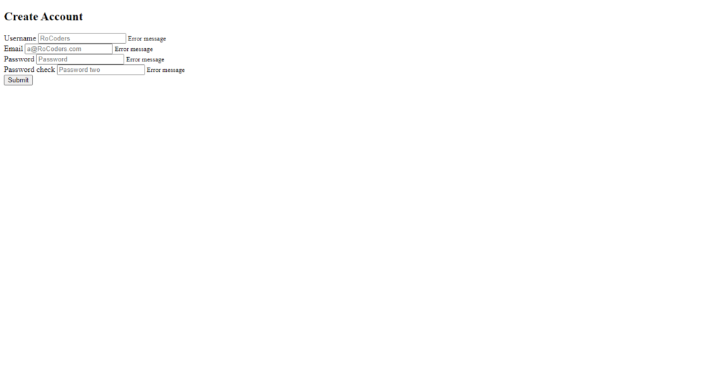
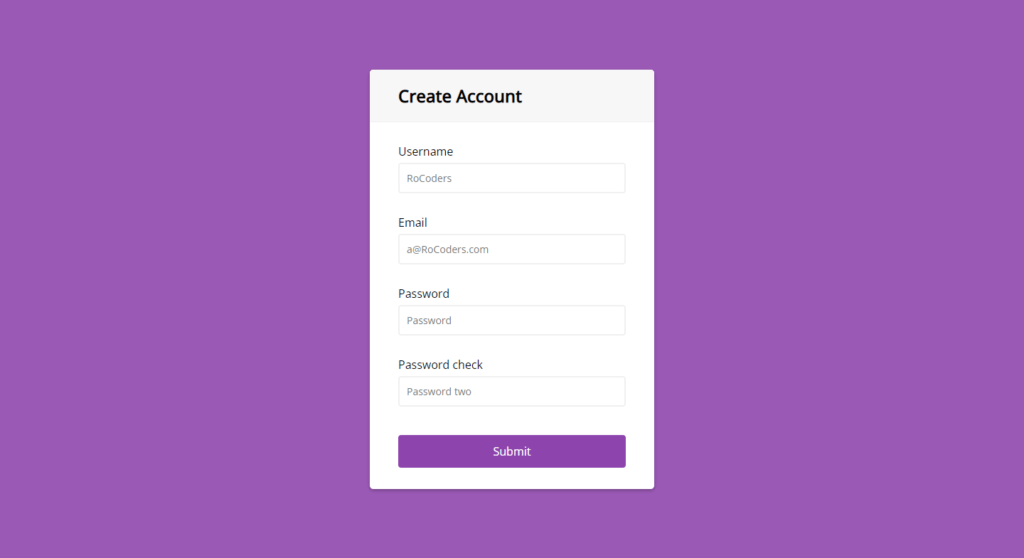
Setting up Default Values And Background
Let’s move on to the CSS first let’s add a box-sizing border-box to everything then change the background color of the body color here #9b59b6 like that it’s going to be a flex element, align-items to center, and justify content center, after that min-height 100vh, and margin:0, so now it’s in the middle and also let’s add a font.
Next will be the container it will be a white background color, for a radius of 5 pixels it will have a box-shadow 0 2 pixels 5 pixels with rgba(0,0,0,0.3), let’s add fixed width of 400px and the max weight to 100%, next let’s style the header will have a background color of #f7f7f7 will have padding 20 pixels 40 pixels, and also we could have a border-bottom of 1px solid with color #f0f0f0 then put a margin of 0, and we just add overflow: hidden on the container.
@import url('https://fonts.googleapis.com/css?family=Muli&display=swap');
@import url('https://fonts.googleapis.com/css?family=Open+Sans:400,500&display=swap');

* {
	box-sizing: border-box;
}

body {
	background-color: #9b59b6;
	font-family: 'Open Sans', sans-serif;
	display: flex;
	align-items: center;
	justify-content: center;
	min-height: 100vh;
	margin: 0;
}

.container {
	background-color: #fff;
	border-radius: 5px;
	box-shadow: 0 2px 5px rgba(0, 0, 0, 0.3);
	overflow: hidden;
	width: 400px;
	max-width: 100%;
}

.header {
	border-bottom: 1px solid #f0f0f0;
	background-color: #f7f7f7;
	padding: 20px 40px;
}

.header h2 {
	margin: 0;
}
Customizing Form Elements
Now let’s style everything here inside so the form control it will have a margin-bottom of 10 pixels and the padding-bottom 20 pixels it’s also going to be a positional relative because we’re going to have absolute positioned elements inside it, now let’s take its child element form control label display: inline-block and margin-bottom of 5 pixels if it wouldn’t be in inline-block then we couldn’t apply a fact pixel margin button, we have order 2 pixels solid #f0f0f0 absolute zero border-radius or pixels they block.
Now it’s in a separate line we have a width of my purse and adding a bigger font size of 40 pixels and let’s inherit the font family as by default, and now these icons and the error message will be absolutely positioned, so they won’t take up space so let’s position the icons first form control icon good position: absolute picked up 40 pixels and right 10 pixels, and also it will be hidden by default, and we only show it when the input is successful or if it’s an error and for the small tag. it’s also going to be position: absolute, also let’s hide the icons by default visibility: hidden alright.
.form {
	padding: 30px 40px;
}

.form-control {
	margin-bottom: 10px;
	padding-bottom: 20px;
	position: relative;
}

.form-control label {
	display: inline-block;
	margin-bottom: 5px;
}

.form-control input {
	border: 2px solid #f0f0f0;
	border-radius: 4px;
	display: block;
	font-family: inherit;
	font-size: 14px;
	padding: 10px;
	width: 100%;
}


.form-control i {
	visibility: hidden;
	position: absolute;
	top: 40px;
	right: 10px;
}

.form-control small {
	color: #e74c3c;
	position: absolute;
	bottom: 0;
	left: 0;
	visibility: hidden;
}

.form button {
	background-color: #8e44ad;
	border: 2px solid #8e44ad;
	border-radius: 4px;
	color: #fff;
	display: block;
	font-family: inherit;
	font-size: 16px;
	padding: 10px;
	margin-top: 20px;
	width: 100%;
}
.form-control input:focus {
	outline: 0;
	border-color: #777;
}

.form-control.success input {
	border-color: #2ecc71;
}

.form-control.error input {
	border-color: #e74c3c;
}

.form-control.success i.fa-check-circle {
	color: #2ecc71;
	visibility: visible;
}

.form-control.error i.fa-exclamation-circle {
	color: #e74c3c;
	visibility: visible;
}

.form-control.error small {
	visibility: visible;
}
Let’s tell button, now button will be background color #8e44ad, so it will have the same as the input but for the border, it’s a solid like that white display: block and as the inputs have padding 10 pixels bigger font size 16 pixel and font-family inherit like that and also lets it go radius or pixels all right so that’s it for the basic layout.
Adding JavaScript To Make It Functional
We’re going to add dynamically in the JavaScript, so let’s add nowhere the input border color will be green color, but if it is going to be an error it will be the red color also when we have success form control icon which is the fa-check-circle it’s going to be visible visibility: visible and its color going to be this green color and the same for the error, but now we target the exclamation one, and we’re going to add the red color.
We have to do is to implement the JavaScript so let’s do that, first thing we need to target all the elements we want to have event listener on them, or we want to check the values, so we’re going to listen to the submitted event listener.
Let’s do that for going to the document get element by ID or like that remember we added the form ID here, and also we have the ID’s on all the inputs, so we can target them, and change it quickly, so the first one is username then we have email then password and when the form is submitted we add an event listener to listen to that event listener submit.
Let’s have a function, in this function let’s define const values, so these values will contain trimmed input values with value. Trim(). Now for username, we will check where the field is empty or not if it’s empty then it will call setErrorFor function else setSuccessFor function, let’s copy it and paste for 4 times now for an email we will check 2 conditions first is for empty field and the second one for email is valid or not for that. we will call isEmail function. Again for a password, we will check whether the input field is empty or not, and lastly password2 we need 2 conditions, first for an empty field and second for matching with a password.
const form = document.getElementById('form');
const username = document.getElementById('username');
const email = document.getElementById('email');
const password = document.getElementById('password');
const password2 = document.getElementById('password2');

form.addEventListener('submit', e => {
	e.preventDefault();

	checkInputs();
});

function checkInputs() {
	// trim to remove the whitespaces
	const usernameValue = username.value.trim();
	const emailValue = email.value.trim();
	const passwordValue = password.value.trim();
	const password2Value = password2.value.trim();

	if(usernameValue === '') {
		setErrorFor(username, 'Username cannot be blank');
	} else {
		setSuccessFor(username);
	}

	if(emailValue === '') {
		setErrorFor(email, 'Email cannot be blank');
	} else if (!isEmail(emailValue)) {
		setErrorFor(email, 'Not a valid email');
	} else {
		setSuccessFor(email);
	}

	if(passwordValue === '') {
		setErrorFor(password, 'Password cannot be blank');
	} else {
		setSuccessFor(password);
	}

	if(password2Value === '') {
		setErrorFor(password2, 'Password2 cannot be blank');
	} else if(passwordValue !== password2Value) {
		setErrorFor(password2, 'Passwords does not match');
	} else{
		setSuccessFor(password2);
	}
}

function setErrorFor(input, message) {
	const formControl = input.parentElement;
	const small = formControl.querySelector('small');
	formControl.className = 'form-control error';
	small.innerText = message;
}

function setSuccessFor(input) {
	const formControl = input.parentElement;
	formControl.className = 'form-control success';
}

function isEmail(email) {
	return /^(([^<>()\[\]\\.,;:\s@"]+(\.[^<>()\[\]\\.,;:\s@"]+)*)|(".+"))@((\[[0-9]{1,3}\.[0-9]{1,3}\.[0-9]{1,3}\.[0-9]{1,3}])|(([a-zA-Z\-0-9]+\.)+[a-zA-Z]{2,}))$/.test(email);
}
Now let’s define the functions for validations isEmail here we will return pattern from here you can google it, this string used for email validation simply this is the pattern defined every time if you add a string in the field this pattern will get matched with it. For example, Rocoderes@hmail.com is the correct email because it is matching with a pattern.
Now for Function setErrorFor and setSuccessFor we need to inherit the parent element from the input field and for the error message let’s add a small tag with query selector then just add an inner text message.
Full Source Code For Javascript Form Validation
index.html
<!DOCTYPE html>
<html lang="en">
<head>
    <meta charset="UTF-8">
    <meta http-equiv="X-UA-Compatible" content="IE=edge">
    <meta name="viewport" content="width=device-width, initial-scale=1.0">
    <title>Form Validation</title>
    <link rel="stylesheet" href="style.css">
</head>
<body>
    <div class="container">
        <div class="header">
            <h2>Create Account</h2>
        </div>
        <form id="form" class="form">
            <div class="form-control">
                <label for="username">Username</label>
                <input type="text" placeholder="RoCoders" id="username" />
                <i class="fas fa-check-circle"></i>
                <i class="fas fa-exclamation-circle"></i>
                <small>Error message</small>
            </div>
            <div class="form-control">
                <label for="username">Email</label>
                <input type="email" placeholder="a@RoCoders.com" id="email" />
                <i class="fas fa-check-circle"></i>
                <i class="fas fa-exclamation-circle"></i>
                <small>Error message</small>
            </div>
            <div class="form-control">
                <label for="username">Password</label>
                <input type="password" placeholder="Password" id="password"/>
                <i class="fas fa-check-circle"></i>
                <i class="fas fa-exclamation-circle"></i>
                <small>Error message</small>
            </div>
            <div class="form-control">
                <label for="username">Password check</label>
                <input type="password" placeholder="Password two" id="password2"/>
                <i class="fas fa-check-circle"></i>
                <i class="fas fa-exclamation-circle"></i>
                <small>Error message</small>
            </div>
            <button>Submit</button>
        </form>
    </div>
    <script src="main.js"></script>
</body>
</html>
style.css
@import url('https://fonts.googleapis.com/css?family=Muli&display=swap');
@import url('https://fonts.googleapis.com/css?family=Open+Sans:400,500&display=swap');

* {
	box-sizing: border-box;
}

body {
	background-color: #9b59b6;
	font-family: 'Open Sans', sans-serif;
	display: flex;
	align-items: center;
	justify-content: center;
	min-height: 100vh;
	margin: 0;
}

.container {
	background-color: #fff;
	border-radius: 5px;
	box-shadow: 0 2px 5px rgba(0, 0, 0, 0.3);
	overflow: hidden;
	width: 400px;
	max-width: 100%;
}

.header {
	border-bottom: 1px solid #f0f0f0;
	background-color: #f7f7f7;
	padding: 20px 40px;
}

.header h2 {
	margin: 0;
}

.form {
	padding: 30px 40px;
}

.form-control {
	margin-bottom: 10px;
	padding-bottom: 20px;
	position: relative;
}

.form-control label {
	display: inline-block;
	margin-bottom: 5px;
}

.form-control input {
	border: 2px solid #f0f0f0;
	border-radius: 4px;
	display: block;
	font-family: inherit;
	font-size: 14px;
	padding: 10px;
	width: 100%;
}

.form-control input:focus {
	outline: 0;
	border-color: #777;
}

.form-control.success input {
	border-color: #2ecc71;
}

.form-control.error input {
	border-color: #e74c3c;
}

.form-control i {
	visibility: hidden;
	position: absolute;
	top: 40px;
	right: 10px;
}

.form-control.success i.fa-check-circle {
	color: #2ecc71;
	visibility: visible;
}

.form-control.error i.fa-exclamation-circle {
	color: #e74c3c;
	visibility: visible;
}

.form-control small {
	color: #e74c3c;
	position: absolute;
	bottom: 0;
	left: 0;
	visibility: hidden;
}

.form-control.error small {
	visibility: visible;
}

.form button {
	background-color: #8e44ad;
	border: 2px solid #8e44ad;
	border-radius: 4px;
	color: #fff;
	display: block;
	font-family: inherit;
	font-size: 16px;
	padding: 10px;
	margin-top: 20px;
	width: 100%;
}
main.js
const form = document.getElementById('form');
const username = document.getElementById('username');
const email = document.getElementById('email');
const password = document.getElementById('password');
const password2 = document.getElementById('password2');

form.addEventListener('submit', e => {
	e.preventDefault();

	checkInputs();
});

function checkInputs() {
	// trim to remove the whitespaces
	const usernameValue = username.value.trim();
	const emailValue = email.value.trim();
	const passwordValue = password.value.trim();
	const password2Value = password2.value.trim();

	if(usernameValue === '') {
		setErrorFor(username, 'Username cannot be blank');
	} else {
		setSuccessFor(username);
	}

	if(emailValue === '') {
		setErrorFor(email, 'Email cannot be blank');
	} else if (!isEmail(emailValue)) {
		setErrorFor(email, 'Not a valid email');
	} else {
		setSuccessFor(email);
	}

	if(passwordValue === '') {
		setErrorFor(password, 'Password cannot be blank');
	} else {
		setSuccessFor(password);
	}

	if(password2Value === '') {
		setErrorFor(password2, 'Password2 cannot be blank');
	} else if(passwordValue !== password2Value) {
		setErrorFor(password2, 'Passwords does not match');
	} else{
		setSuccessFor(password2);
	}
}

function setErrorFor(input, message) {
	const formControl = input.parentElement;
	const small = formControl.querySelector('small');
	formControl.className = 'form-control error';
	small.innerText = message;
}

function setSuccessFor(input) {
	const formControl = input.parentElement;
	formControl.className = 'form-control success';
}

function isEmail(email) {
	return /^(([^<>()\[\]\\.,;:\s@"]+(\.[^<>()\[\]\\.,;:\s@"]+)*)|(".+"))@((\[[0-9]{1,3}\.[0-9]{1,3}\.[0-9]{1,3}\.[0-9]{1,3}])|(([a-zA-Z\-0-9]+\.)+[a-zA-Z]{2,}))$/.test(email);
}
Output
watch the full video about javascript form validation


