In this article, we will make crawl loader using CSS. In this very small project, we will add a crawler which will move in certain area, we will make this project with basic CSS only. This will be pretty good to make, and you will learn much more about the power of CSS. It will be a beginner-friendly project, so it will consist of basic CSS code.
Pre-requisites to Make Crawl Loader Using CSS
- Basic knowledge of HTML.
- Basic knowledge of CSS.
Creating HTML Markup and Setting up Values
<!DOCTYPE html>
<html>
    <head>
        <title>Coffee Cup Filling</title>
        <link rel="stylesheet" href="style.css">
    </head>
    <body>
        <div class="container">
            <div class="loader"></div>
        </div>
    </body>
</html>
body{
background-color: #00002a;
padding: 0;
margin: 0;
height: 100vh;
width: 100vw;
display: flex;
justify-content: center;
align-items: center;
}
.container{
height: 300px;
width: 300px;
border: 2px solid white;
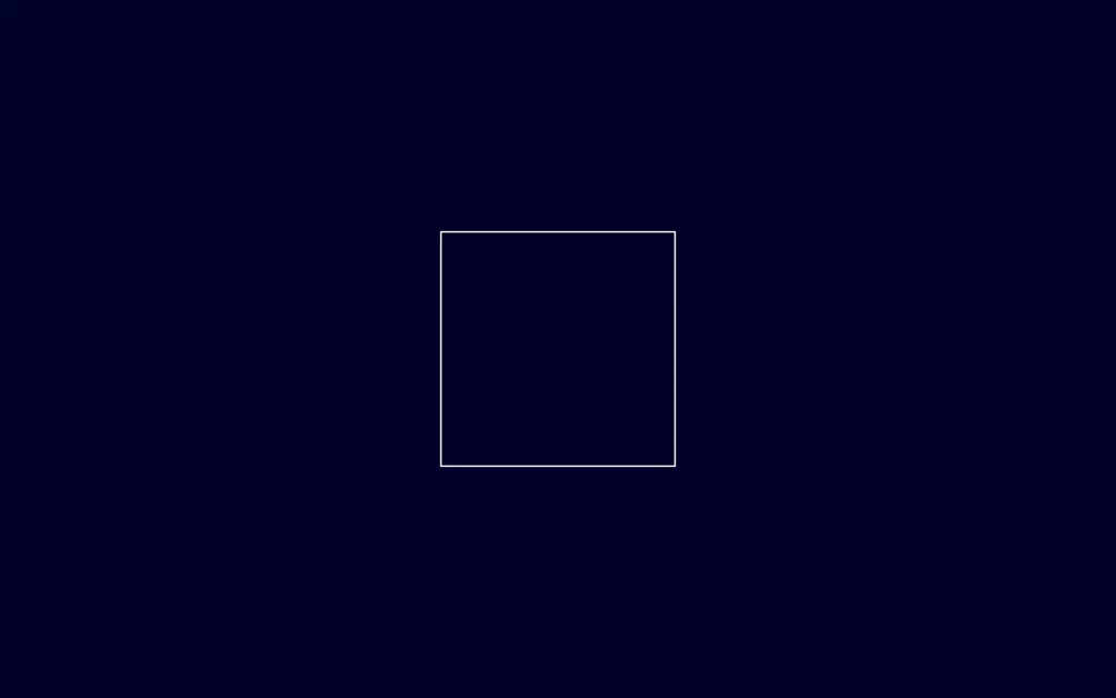
}Firstly, in HTML, we have created a div container which contains another div loader. This is what we need in our HTML file, Now let’s move on to the CSS part. We have here first customized our body which have background-color as #00002a, Also we have reset our default padding and margin. Here we have gave some specific area using height and width, and lastly, we have set it to the center of the screen using justify-content and align-items. After that, we have assigned some height and width to our container and to show the area we have gave a white border to the container which we will remove later on.

Creating Crawler
.loader{
height: 300px;
width: 80px;
background-image: linear-gradient(45deg,#00bbcc,#009cd4);
border-radius: 80px;
box-shadow: 0 0 22px 2px rgba(0, 187, 204, 0.25);
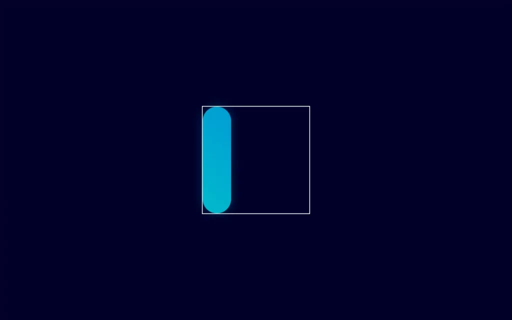
}Now let’s create our crawler, for that we have set the same height as the container height, also we have gave some width as well. We will add colors using background-image with linear-gradient which have 2 colors #00bbcc and #009cd4, these colors will be collapsed at 45 degrees. Also, we will add some border-radius to give round shape to the edges. Again, we have added some box-shadow to crawler.

Adding Animations to The Crawler
.loader{
height: 300px;
width: 80px;
background-image: linear-gradient(45deg,#00bbcc,#009cd4);
border-radius: 80px;
box-shadow: 0 0 22px 2px rgba(0, 187, 204, 0.25);
animation: crawl 3s infinite;
}
@keyframes crawl{
12.5%{
height: 80px;
width: 80px;
}
25%{
height: 80px;
width: 300px;
transform: translateX(0);
}
37.5%{
height: 80px;
width: 80px;
transform: translateX(220px);
}
50%{
height: 300px;
width: 80px;
transform: translateX(220px);
}
62.5%{
height: 80px;
width: 80px;
transform: translate(220px, 220px);
}
75%{
height: 80px;
width: 300px;
transform: translateY(220px);
}
87.5%{
height: 80px;
width: 80px;
transform: translateY(220px);
}
}Now, let’s add some animations to the crawler. For that, we have add animation with crawl name, for 3 second duration, and for infinite times. After that, we have used @keyframes to define the animations.
At 12.5% we have adjusted our height and width to 80px, at 25% we have stretched the width to 300 and also, we have translate to 0 on X-axis. At 37.5% we have again made height and width to 80px, and we have stretched in the X-axis by 220px. At 50% we have increased the height to 300px, and again we need to stretch X-axis by 220px again.
Now at 62.5%, we have reset the height and width to 80px, and also we have use transformation to 220px for both X-axis and Y-axis. At 75% we have stretched the width to 300px and also stretched at Y-axis by 220px, And last animation at 87.5% we have reset the height and width to 80px again and transformed Y-axis with 220px.

Full Source Code to Make Crawl Loader Using CSS
index.html
<!DOCTYPE html>
<html>
<head>
<title>Coffee Cup Filling</title>
<link rel="stylesheet" href="style.css">
</head>
<body>
<div class="container">
<div class="loader"></div>
</div>
</body>
</html>style.css
body{
    background-color: #00002a;
    padding: 0;
    margin: 0;
    height: 100vh;
    width: 100vw;
    display: flex;
    justify-content: center;
    align-items: center;
}

.container{
    height: 300px;
    width: 300px;

    border: 2px solid white;
}
.loader{
    height: 300px;
    width: 80px;
    background-image: linear-gradient(45deg,#00bbcc,#009cd4);
    border-radius: 80px;
    box-shadow: 0 0 22px 2px rgba(0, 187, 204, 0.25);
    animation: crawl 3s infinite;
}

@keyframes crawl{
    12.5%{
        height: 80px;
        width: 80px;
    }
    25%{
        height: 80px;
        width: 300px;
        transform: translateX(0);
    }
    37.5%{
        height: 80px;
        width: 80px;
        transform: translateX(220px);
    }
    50%{
        height: 300px;
        width: 80px;
        transform: translateX(220px);
    }
    62.5%{
        height: 80px;
        width: 80px;
        transform: translate(220px, 220px);
    }
    75%{
        height: 80px;
        width: 300px;
        transform: translateY(220px);
    }
    87.5%{
        height: 80px;
        width: 80px;
        transform: translateY(220px);
    }

} Output

Check out video reference here:
You May Also Like:


