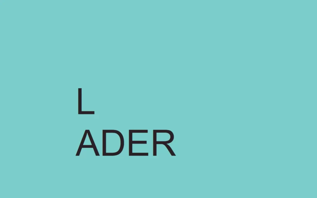
In this article, we will create a minimalist loader using CSS. In this small project, we will add some animation to loading text which has a spinning alphabet ‘o’. This is what we will do in this beginner-friendly project. Also, this will consist of very basic CSS styling, as we have done in previous loaders.
Pre-requisites to Create Minimalist Loader Using CSS
- Basic knowledge of HTML.
- Basic knowledge of CSS and CSS animations.
Creating Basic HTML and CSS Value
<html>
    <head>
        <title>Minimalist Loader</title>
        <link rel="stylesheet" href="style.css">
    </head>
    <body>
        <div class="loader">
            L <div class="spinner"></div>ADER
        </div>
    </body>
</html>
body{
margin: 0;
padding: 0;
background-color: #7acdca;
}
In HTML, we have just added a div with class name loader and this will be our area where we will display our text. Also, in this we have added text “Loader” but instead of letter ‘o’ we have added another div. We will add some kind of round shaped circle which will get animated.
Now for CSS, We have just removed the default of the values from the DOM using margin and padding to 0. Also, we have colored our background with #7acdca.

Customizing The Text
.loader{
height: 150px;
width: 685px;
position: absolute;
margin: auto;
top: 0;
bottom: 0;
left: 0;
right: 0;
font-size: 150px;
color: #291f24;
font-family: 'Raleway', sans-serif;
}
Now, we have just made our text pretty large area using height and width, also we have made position to absolute also provided some margin to auto, so some margin will be added automatically. Now we have increased font-size of 150px with the #291f24 color which is so much closer to black color. And finally we have added font-family of Raleway which is sans-serif type font.

Adding Spinner and Animations
.spinner{
display: inline-block;
height: 90px;
width: 90px;
border-radius: 50%;
border: 15px solid rgba(255,255,255,0.2);
border-top: 15px solid white;
animation: spin 2s infinite;
}
@keyframes spin{
100%{
transform: rotate(360deg);
}
}Now time to add spinner at the position of letter ‘o’. First, we have added display to inline-block with this all letters will come in one block, or you can say it will come together. Then we have added some height and width. Now, we have added a gray border which is 15px thick, then after, we have formed the border to round shape using border-radius to 50%. Now we have added white border on just one side, let’s say top-border.
Then after, we have added some animation named spin for 2 second duration and for infinite times. Now we will add @keyframe to define the animation, in this definition we have just rotated for 360 degrees at every 100%.

Full Source Code of Create A Minimalist Loader Using CSS
index.html
<html>
<head>
<title>Minimalist Loader</title>
<link rel="stylesheet" href="style.css">
</head>
<body>
<div class="loader">
L <div class="spinner"></div>ADER
</div>
</body>
</html>style.css
body{
    margin: 0;
    padding: 0;
    background-color: #7acdca;
}
.loader{
    height: 150px;
    width: 685px;
    position: absolute;
    margin: auto;
    top: 0;
    bottom: 0;
    left: 0;
    right: 0;
    font-size: 150px;
    color: #291f24;
    font-family: 'Raleway', sans-serif;
}
.spinner{
    display: inline-block;
    height: 90px;
    width: 90px;
    border-radius: 50%;
    border: 15px solid rgba(255,255,255,0.2);
    border-top: 15px solid white;
    animation: spin 2s infinite;
}
@keyframes spin{
    100%{
        transform: rotate(360deg);
    }
}Output

Check out video reference here:
You May Also Like:


