In this article, you will learn how to make 3D swing with HTML and CSS. With this creation you will master 3D effect creation in HTML and CSS, HTML and CSS are necessary to learn if you are interested in web development and want to become a good developer. you can take this project as collage project.
WHAT IS 3D SWING WITH HTML AND CSS
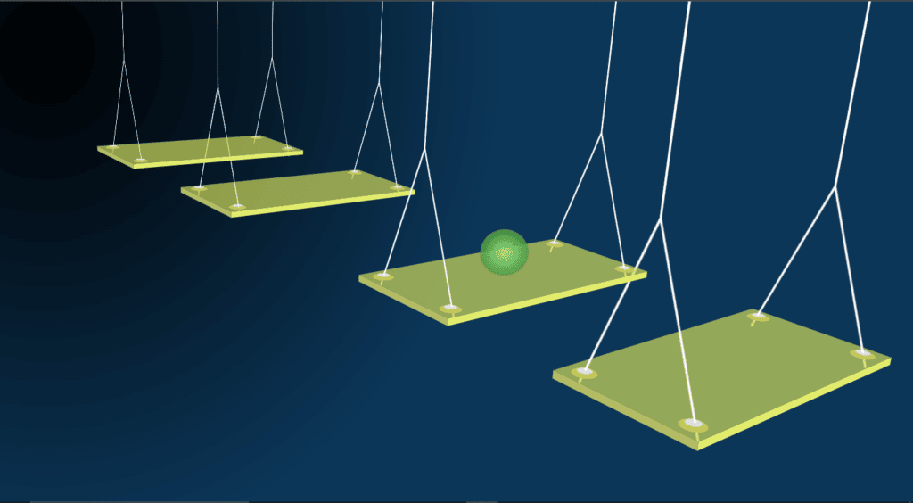
3D swing is a simulation in which you make swings along with a ball and ball moves from one swing to another swing which makes it pretty cool to see. We will make this effect using CSS animation and 3D transformation.
WHAT SHOULD YOU KNOW BEFORE CREATING 3D SWING WITH HTML AND CSS
- You must know basics of html
- A good knowledge of CSS or CSS3
IMPLEMENTATION OF 3D SWING WITH HTML AND CSS
Before going in deep and further code we need to create two files first one index.html and other one style.css, We will write code in these two files. You guys can name these files according to you.
First of all we need to make good looking background for this project so animation will be clearly visible to you. We will make a container in which we will add CSS styling.
<div class="container"></div>
.container {
  width: 100%;
  height: 100vh;
  background-image: radial-gradient(
    closest-side at 5% 10%,
    rgb(0, 0, 0),
    rgb(11, 54, 88) 1000%
  );
  display: flex;
  justify-content: center;
  align-items: center;
  perspective: 150rem;
  overflow: hidden;
}
We have created class container in index.html and we have styled this container with background image “radial-gradient()”. Which is actually a function in CSS, closet-side used to provide positions in the screen, Here we provided 5% with color “rgb(0,0,0)” which is black color and from 10% we provided “rgb(11,54,88)” which is blue. it’s used to give gradient look, you can change these color with other colors.

CREATION OF 3D SWING PLATFORM:
Now we have to start to make animation or you can say swing, We have to first make square and convert into the 3D swing.
<div class="swing swing-1">
</div>
.swing {
  width: 40rem;
  height: 20rem;
  background-color: rgba(206, 216, 91, 0.7);
  transform: rotateX(70deg) rotateZ(-40deg) rotateY(5deg);
  transform-style: preserve-3d;
  position: absolute;
  top: 50%;
  transform-origin: top;
}
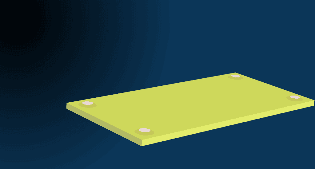
Here we will put our yellow rectangle into center of the screen, we provided width of 40rem and height of 20rem to form a rectangle, color of this rectangle will be yellow so we provide color “rgba(206 ,216, 91, 0.7)”, then after it need to get rotated and we provide “preserve-3d” transform-style so it gives 3D effect.

ADDING MORE DETAILS TO PLATFORM
Now we have a rectangle platform and it’s pretty good rotated but it doesn’t have that much good look because it does not contain borders like 3D models have, So we need to add some details so it looks good.
.swing::before {
  content: "";
  width: 1rem;
  height: 100%;
  background-color: #b4bb65;
  position: absolute;
  transform: rotateY(90deg);
  transform-origin: left;
}

.swing::after {
  content: "";
  height: 1rem;
  width: 100%;
  background-color: #e2ec6c;
  position: absolute;
  bottom: 0;
  transform: rotateX(90deg);
  transform-origin: bottom;
}
In swing::before we will change the width to 1rem so edge will looks somewhat thicker, and we transform it by rotate to Y-axis with 90 degree then we makes it transform origin from left because we just need left side vertex thick.
Then after we want to make bottom vertex thick so we need to change height to 1rem as you can see in swing::after. And we should rotate it from X-axis with 90 degree with bottom transform origin.
In case of changing left and right vortex we need to modify width and for up and bottom vertex we need to modify height.

ADDING CIRCLES AND ROPES TO 3D SWING
After making a good looking 3D platform we required to make circles and ropes connecting to each corner of platform, For that we need to style circle and rope classes.
<div class="circle circle-1"></div>
        <div class="circle circle-2"></div>
        <div class="circle circle-3"></div>
        <div class="circle circle-4"></div>
        <div class="rope rope-1"></div>
        <div class="rope rope-2"></div>
First we need to create classes named circle, circle-1, circle-2, circle-3, circle-4. Here circle class is used in every div so we can add some style once and will be added to every div. For rope we created rope, rope-1, rope-2 classes to style rope in animation.
For Circles
.circle {
  width: 3rem;
  height: 3rem;
  background-color: #c5c757;
  border-radius: 50%;
  position: absolute;
  display: grid;
  place-items: center;
  transform-style: preserve-3d;
}

.circle-1 {
  top: 1rem;
  left: 1rem;
}

.circle-2 {
  top: 1rem;
  right: 1rem;
}

.circle-3 {
  bottom: 1rem;
  right: 1rem;
}

.circle-4 {
  bottom: 1rem;
  left: 1rem;
}

.circle::before {
  content: "";
  width: 1.8rem;
  height: 1.8rem;
  background-color: #e9d8d8;
  position: absolute;
  border-radius: 50%;
  transform: translateZ(0.3rem);
}
In here, we determined the width and height with 3rem with background-color yellow. border radius is 50% so we can see the circle as its color also somewhat yellow so decreasing of border-radius helps us to see circles clearly. After that we need to place these circles at every corner of platform so we defined positions of each and every circle in class-1, class-2, class-3, and class-4.
with the help of class::before we create another circle on these 4 circles with width and height of 1.8 rem. These circle’s color is #e9d8d8 so it looks different from actual circle gives nice 3D effect.

For Ropes
.rope {
  height: 40rem;
  width: 0.3rem;
  background-color: #fff;
  position: absolute;
  transform: translateZ(20rem) rotateX(90deg) rotateY(90deg);
  transform-origin: top;
}

.rope-1 {
  top: 10rem;
  left: 2.5rem;
}

.rope-2 {
  top: 10rem;
  right: 2.5rem;
}

.rope::before {
  content: "";
  width: 0.3rem;
  height: 23rem;
  background-color: #fff;
  position: absolute;
  transform: translateY(-23rem) rotateZ(21deg);
  transform-origin: bottom;
}

.rope::after {
  content: "";
  width: 0.3rem;
  height: 23rem;
  background-color: #fff;
  position: absolute;
  transform: translateY(-23rem) rotateZ(-21deg);
  transform-origin: bottom;
}
Here we defined rope’s height 40rem and width 0.3rem with the white color as rope color. Now with you’ll get a line which will cross the platform vertically so to fix that we need to position it with the help of transform and rotate the rope by 90 degree form X and Y axis and make its origin from top.
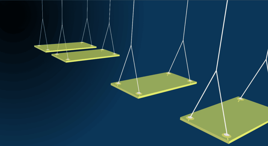
In rope-1 and rope-2 we have positioned our rope at both sides, To connect with every circle we determined the rope in rope::before and rope::after, Here we transform our ropes to bottom and rotate it from Z-axis in order to get all 4 ropes connected to circles.

CREATION OF MULTIPLE PLATEFORMS
We just made one platform so we need more in which ball will move. for that we just need to copy and paste first platform’s code.
<div class="container">
      <div class="swing swing-1">
        <div class="circle circle-1"></div>
        <div class="circle circle-2"></div>
        <div class="circle circle-3"></div>
        <div class="circle circle-4"></div>
        <div class="rope rope-1"></div>
        <div class="rope rope-2"></div>
      </div>
      <div class="swing swing-2">
        <div class="circle circle-1"></div>
        <div class="circle circle-2"></div>
        <div class="circle circle-3"></div>
        <div class="circle circle-4"></div>
        <div class="rope rope-1"></div>
        <div class="rope rope-2"></div>
      </div>
      <div class="swing swing-3">
        <div class="circle circle-1"></div>
        <div class="circle circle-2"></div>
        <div class="circle circle-3"></div>
        <div class="circle circle-4"></div>
        <div class="rope rope-1"></div>
        <div class="rope rope-2"></div>
      </div>
      <div class="swing swing-4">
        <div class="circle circle-1"></div>
        <div class="circle circle-2"></div>
        <div class="circle circle-3"></div>
        <div class="circle circle-4"></div>
        <div class="rope rope-1"></div>
        <div class="rope rope-2"></div>
      </div>
      <div class="swing swing-5">
        <div class="circle circle-1"></div>
        <div class="circle circle-2"></div>
        <div class="circle circle-3"></div>
        <div class="circle circle-4"></div>
        <div class="rope rope-1"></div>
        <div class="rope rope-2"></div>
      </div>
      <div class="swing swing-6">
        <div class="circle circle-1"></div>
        <div class="circle circle-2"></div>
        <div class="circle circle-3"></div>
        <div class="circle circle-4"></div>
        <div class="rope rope-1"></div>
        <div class="rope rope-2"></div>
      </div>
    </div>
Here we just copy and pasted swing-1 for 6 times because we need at least 6 platforms to complete the animation.
PUTTING ANIMATION TO PLATFORMS
We have multiple platforms now time to animate them, To animate platforms we will use animation and keyframes. animation will be used to move platform wisely and keyframe will used to animate and give it smoother animations.
.swing-1 {
  animation: swingAnim 20s infinite ease-in-out;
}

.swing-2 {
  animation: swingAnim 20s -4s infinite ease-in-out;
}

.swing-3 {
  animation: swingAnim 20s -8s infinite ease-in-out;
}

.swing-4 {
  animation: swingAnim 20s -12s infinite ease-in-out;
}

.swing-5 {
  animation: swingAnim 20s -16s infinite ease-in-out;
}

.swing-6 {
  animation: swing6Anim 4s -1s infinite ease-in-out;
  background-color: transparent;
}

.swing-6 div:not(.ball) {
  opacity: 0;
}

.swing-6::before,
.swing-6::after {
  opacity: 0;
}

@keyframes swingAnim {
  0% {
    transform: rotateX(70deg) rotateZ(-40deg) rotateY(5deg) translateY(100rem);
  }

  20% {
    transform: rotateX(70deg) rotateZ(-40deg) rotateY(5deg) translateY(21rem);
  }

  25% {
    transform: rotateX(70deg) rotateZ(-40deg) rotateY(5deg) translateY(27rem);
  }

  35%,
  40% {
    transform: rotateX(70deg) rotateZ(-40deg) rotateY(5deg) translateY(0);
  }

  50% {
    transform: rotateX(70deg) rotateZ(-40deg) rotateY(5deg) translateY(-60rem);
  }

  55% {
    transform: rotateX(70deg) rotateZ(-40deg) rotateY(5deg) translateY(-55rem);
  }

  65%,
  70% {
    transform: rotateX(70deg) rotateZ(-40deg) rotateY(5deg) translateY(-84rem);
  }

  100% {
    transform: rotateX(70deg) rotateZ(-40deg) rotateY(5deg) translateY(-800rem);
  }
}
Here we used animation with in out transition for infinite time and with swing animation for 20 seconds and then we used keyframe animations in which we will rotate the platform from X,Y, and Z-axis so platform animation looks realistic and smoother.

CREATION OF A BALL
Now we have multiple platform to move the ball among them, So next we will create a ball which will move among the platforms.
<div class="ball"></div>
.ball {
  width: 7rem;
  aspect-ratio: 1;
  background-image: radial-gradient(
    rgba(159, 238, 156, 0.9),
    rgba(30, 110, 6, 0.8)
  );
  position: relative;
  left: 15rem;
  top: 10rem;
  border-radius: 50%;
  transform: rotateX(90deg) rotateY(40deg);
  transform-origin: top;
  box-shadow: 0 0 0.2rem #333;
}
@keyframes swing6Anim {
  0% {
    transform: rotateX(70deg) rotateZ(-40deg) rotateY(5deg) translateY(0);
  }

  50% {
    transform: rotateX(70deg) rotateZ(-40deg) rotateY(5deg) translateY(30rem);
  }

  100% {
    transform: rotateX(70deg) rotateZ(-40deg) rotateY(5deg) translateY(0);
  }
}
Here, we made a ball which have 7rem width after applying color to ball it will be look like square so we need to form it in the circle for that we will put border radius to 50% and put its origin from top. after the setting up the ball we need to put animation in the ball for that we will use keyframes, we will rotate the ball at 0%, 50%, 100%. In these case we just need to change “translateY” only, We just need to rotate it form Y-axis.

FULL SOURCE CODE OF 3D SWING WITH HTML AND CSS
Index.html
<!DOCTYPE html>
<html lang="en">
  <head>
    <meta charset="UTF-8" />
    <meta http-equiv="X-UA-Compatible" content="IE=edge" />
    <meta name="viewport" content="width=device-width, initial-scale=1.0" />
    <title>3D Swing</title>
    <link rel="stylesheet" href="style.css" />
  </head>
  <body>
    <div class="container">
      <div class="swing swing-1">
        <div class="circle circle-1"></div>
        <div class="circle circle-2"></div>
        <div class="circle circle-3"></div>
        <div class="circle circle-4"></div>
        <div class="rope rope-1"></div>
        <div class="rope rope-2"></div>
      </div>
      <div class="swing swing-2">
        <div class="circle circle-1"></div>
        <div class="circle circle-2"></div>
        <div class="circle circle-3"></div>
        <div class="circle circle-4"></div>
        <div class="rope rope-1"></div>
        <div class="rope rope-2"></div>
      </div>
      <div class="swing swing-3">
        <div class="circle circle-1"></div>
        <div class="circle circle-2"></div>
        <div class="circle circle-3"></div>
        <div class="circle circle-4"></div>
        <div class="rope rope-1"></div>
        <div class="rope rope-2"></div>
      </div>
      <div class="swing swing-4">
        <div class="circle circle-1"></div>
        <div class="circle circle-2"></div>
        <div class="circle circle-3"></div>
        <div class="circle circle-4"></div>
        <div class="rope rope-1"></div>
        <div class="rope rope-2"></div>
      </div>
      <div class="swing swing-5">
        <div class="circle circle-1"></div>
        <div class="circle circle-2"></div>
        <div class="circle circle-3"></div>
        <div class="circle circle-4"></div>
        <div class="rope rope-1"></div>
        <div class="rope rope-2"></div>
      </div>
      <div class="swing swing-6">
        <div class="ball"></div>
        <div class="circle circle-1"></div>
        <div class="circle circle-2"></div>
        <div class="circle circle-3"></div>
        <div class="circle circle-4"></div>
        <div class="rope rope-1"></div>
        <div class="rope rope-2"></div>
      </div>
    </div>
  </body>
</html>
Style.css
* {
  margin: 0;
  padding: 0;
  box-sizing: border-box;
}

html {
  font-size: 62.5%;
}

.container {
  width: 100%;
  height: 100vh;
  background-image: radial-gradient(
    closest-side at 5% 10%,
    rgb(0, 0, 0),
    rgb(11, 54, 88) 1000%
  );
  display: flex;
  justify-content: center;
  align-items: center;
  perspective: 150rem;
  overflow: hidden;
}

.swing {
  width: 40rem;
  height: 20rem;
  background-color: rgba(206, 216, 91, 0.7);
  transform: rotateX(70deg) rotateZ(-40deg) rotateY(5deg);
  transform-style: preserve-3d;
  position: absolute;
  top: 50%;
  transform-origin: top;
}

.swing-1 {
  animation: swingAnim 20s infinite ease-in-out;
}

.swing-2 {
  animation: swingAnim 20s -4s infinite ease-in-out;
}

.swing-3 {
  animation: swingAnim 20s -8s infinite ease-in-out;
}

.swing-4 {
  animation: swingAnim 20s -12s infinite ease-in-out;
}

.swing-5 {
  animation: swingAnim 20s -16s infinite ease-in-out;
}

.swing-6 {
  animation: swing6Anim 4s -1s infinite ease-in-out;
  background-color: transparent;
}

.swing-6 div:not(.ball) {
  opacity: 0;
}

.swing-6::before,
.swing-6::after {
  opacity: 0;
}

@keyframes swingAnim {
  0% {
    transform: rotateX(70deg) rotateZ(-40deg) rotateY(5deg) translateY(100rem);
  }

  20% {
    transform: rotateX(70deg) rotateZ(-40deg) rotateY(5deg) translateY(21rem);
  }

  25% {
    transform: rotateX(70deg) rotateZ(-40deg) rotateY(5deg) translateY(27rem);
  }

  35%,
  40% {
    transform: rotateX(70deg) rotateZ(-40deg) rotateY(5deg) translateY(0);
  }

  50% {
    transform: rotateX(70deg) rotateZ(-40deg) rotateY(5deg) translateY(-60rem);
  }

  55% {
    transform: rotateX(70deg) rotateZ(-40deg) rotateY(5deg) translateY(-55rem);
  }

  65%,
  70% {
    transform: rotateX(70deg) rotateZ(-40deg) rotateY(5deg) translateY(-84rem);
  }

  100% {
    transform: rotateX(70deg) rotateZ(-40deg) rotateY(5deg) translateY(-800rem);
  }
}

@keyframes swing6Anim {
  0% {
    transform: rotateX(70deg) rotateZ(-40deg) rotateY(5deg) translateY(0);
  }

  50% {
    transform: rotateX(70deg) rotateZ(-40deg) rotateY(5deg) translateY(30rem);
  }

  100% {
    transform: rotateX(70deg) rotateZ(-40deg) rotateY(5deg) translateY(0);
  }
}

.swing::before {
  content: "";
  width: 1rem;
  height: 100%;
  background-color: #b4bb65;
  position: absolute;
  transform: rotateY(90deg);
  transform-origin: left;
}

.swing::after {
  content: "";
  height: 1rem;
  width: 100%;
  background-color: #e2ec6c;
  position: absolute;
  bottom: 0;
  transform: rotateX(90deg);
  transform-origin: bottom;
}

.circle {
  width: 3rem;
  height: 3rem;
  background-color: #c5c757;
  border-radius: 50%;
  position: absolute;
  display: grid;
  place-items: center;
  transform-style: preserve-3d;
}

.circle-1 {
  top: 1rem;
  left: 1rem;
}

.circle-2 {
  top: 1rem;
  right: 1rem;
}

.circle-3 {
  bottom: 1rem;
  right: 1rem;
}

.circle-4 {
  bottom: 1rem;
  left: 1rem;
}

.circle::before {
  content: "";
  width: 1.8rem;
  height: 1.8rem;
  background-color: #e9d8d8;
  position: absolute;
  border-radius: 50%;
  transform: translateZ(0.3rem);
}

.rope {
  height: 40rem;
  width: 0.3rem;
  background-color: #fff;
  position: absolute;
  transform: translateZ(20rem) rotateX(90deg) rotateY(90deg);
  transform-origin: top;
}

.rope-1 {
  top: 10rem;
  left: 2.5rem;
}

.rope-2 {
  top: 10rem;
  right: 2.5rem;
}

.rope::before {
  content: "";
  width: 0.3rem;
  height: 23rem;
  background-color: #fff;
  position: absolute;
  transform: translateY(-23rem) rotateZ(21deg);
  transform-origin: bottom;
}

.rope::after {
  content: "";
  width: 0.3rem;
  height: 23rem;
  background-color: #fff;
  position: absolute;
  transform: translateY(-23rem) rotateZ(-21deg);
  transform-origin: bottom;
}

 .ball {
  width: 7rem;
  aspect-ratio: 1;
  background-image: radial-gradient(
    rgba(159, 238, 156, 0.9),
    rgba(30, 110, 6, 0.8)
  );
  position: relative;
  left: 15rem;
  top: 10rem;
  border-radius: 50%;
  transform: rotateX(90deg) rotateY(40deg);
  transform-origin: top;
  box-shadow: 0 0 0.2rem #333;
}
Output

And this is how you can make 3D swing with HTML and CSS, We have purely used HTML and CSS to create this awesome project….


