In this article, We’re going to be building an iPhone 12 3D Cube with HTML CSS, and JavaScript, it’s going to be the 3d cube created based on HTML, CSS, and JavaScript we’re going to call it the cube actually in real math it is called cuboid but for simplicity, we’re going to call it the cube.
PREREQUISITES TO CREATE iPhone 12 3D Cube with HTML CSS and JavaScript
- Good knowledge of HTML.
- Knowledge of CSS and CSS3.
- Knowledge of JavaScript.
CREATION OF HTML FILE WITH LINKS
Let’s go ahead and create our working files for HTML, CSS, and JavaScript. Open the HTML file and create a basic HTML document for that we have to place here an exclamation(!) mark and then we have to press tab or enter, Then we’re going to link the CSS and JavaScript files.
Next, we’re going to bring in one more link for the font awesome icons, let’s go ahead and search for font awesome CDNJS then grab the link from here open the link tag in the head elements and paste the link as the value of the age reference attribute.
<link rel="stylesheet" href="style.css">
    <link rel="stylesheet" href="<https://cdnjs.cloudflare.com/ajax/libs/font-awesome/5.15.1/css/all.min.css>">
<script src="script.js"></script>
CREATING iPhone CUBE ELEMENTS
<div class="container center">
        <div class="cube-wrapper">
            <div class="cube">
                <div class="front-side">
                    <img src="images/iphone.png">
                </div>
                <div class="back-side center">
                    <i class="fab fa-apple"></i>
                </div>
            </div>
Let’s start to create the HTML markup of the cube, let’s go ahead and open a div tag which is going to be the container next open another developments which is going to be the wrapper of the cube so we’re going to assign to class cube wrapper then open again div tag with a class cube next we need another div which is going to be the front side of the cube and it will include an image of the iPhone 12.
so let’s assign to it class front side and then insert here image elements let’s specify here the path of the image okay next we need to create backside so let’s open div tag with the class backside and then we’re going to pass here font awesome icon so let’s assign to <i> element classes fab fa-apple.
STYLING iPhone CUBE BACKGROUND
.center {
  display: flex;
  justify-content: center;
  align-items: center;
}

.container {
  width: 100%;
  height: 100vh;
  background: url(images/bg.png) center no-repeat;
  background-size: cover;
}
Let’s go ahead and select the container we’re going to expand it to the entire page so let’s set width 100 percent as for the height we’re going to make it 100 of the viewport, and besides that we’re going to set image as the full screen background so let’s specify here the path of the image we need “bg.png” Then we’re going to define the position as center also we need no repeat and then we’re going to set the size of the background to cover.
Next we’re going to place the cube in the center and for that let’s use flexbox we’re going to set this plate to flex and then in order to center the element horizontally and vertically we’re going to use justify content center and align items center.

STYLING iPhone CUBE FRONTSIDE
.cube {
  width: 30rem;
  height: 55rem;
  transform-style: preserve-3d;
  background-color: red;
}
.cube-wrapper {
  perspective: 100rem;
}

.front-side{
 width: 100%;
 height: 100%;
 padding: 2.5rem;
 background-color: #fee;
 transform: translateZ(5rem);
 position: absolute;
}

.front-side img{
 width: 100%;
 height: 100%;
 object-fit: contain;
}
After that, we’re going to select the cube itself and define its width and height we’re going to set width to 30 rem as for the height let’s make it 55 rem and also we’re going to assign to it a temporary background color let’s set it to red.
We’re going to select the front side which is the parent element, Create some space inside of the front side let’s set padding to 2.5 rem after that we’re going to select the image. Besides that we’re going to use object fit with the value contain, next we’re going to take care of the front side let’s change its background color we’re going to make it #fee.
Now we’re going to create a 3d environment in order to see better how the cube is going to be built in order to create a 3d environment we have to use one of the properties called perspective and we have to assign it to the cube wrapper let’s select cube wrapper and assign to it perspective with value 100 rem.
Now we have to move the front side in a 3d environment and for that we need a 3d space for the front side as well and for that we have to use one of the properties called transform style with the value preserve 3d and we have to assign it to the cube so after that it will share the 3d environment for its child element.
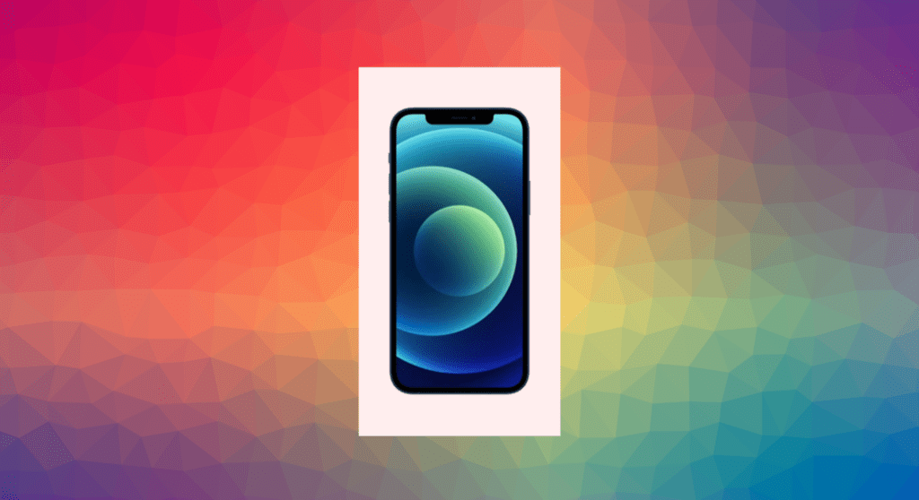
after that we have to move the front side a little bit to the front so for that let’s use transform and then we need translate function in this case with z direction let’s insert year 5 rem so right now nothing is visible here we have just a white background and in order to see clearly what’s going on we’re going to rotate the cube let’s rotate it according to the y axis and as the value let’s insert your 70 degrees.
STYLING iPhone CUBE BACKSIDE
.front-side,
.back-side {
  width: 100%;
  height: 100%;
  background-color: #fee;
  position: absolute;
  transform-style: preserve-3d;
  box-shadow: inset 0.1rem 0.1rem 0.1rem #ddd, inset -0.1rem -0.1rem 0.1rem #ddd;
}

.back-side {
  transform: translateZ(-5rem);
}
.back-side i {
  font-size: 12rem;
  color: #6edae6;
  text-shadow: 0.1rem 0.1rem 0.2rem #aaa, -0.1rem -0.1rem 0.2rem #aaa;
  transform: rotateY(180deg);
}
Let’s go ahead and take care of the back side, let’s select it and we’re going to move the back side using transform translate z with value -5 rem, let’s set the positions of both sides to absolute, after that let’s assign to it padding and transform properties as for the back side let’s leave here just transform property.
Move on to other sides, we’re going to customize the apple icon on the back side first of all let’s take care of the position of the icon we’re going to place it in the center of the back side for that we’re going to use flexbox actually we need to use the same properties and values that we use for the container so in order to avoid writing the same code over and over again.
Let’s change the value of the rotate function in order to see the icon better so we’re going to set it to 140 degrees and now let’s go ahead and style the icon select <i> element first of all let’s increase its font size make it 12 rem then change the color make it #6edae6.
And also use text shadow we’re going to create multi-level shadow so let’s institute 0.1 rem twice then point 2 rem and the color #aaa. we’re going to copy those values and paste them here we’re going to change the first two values, we’re going to insert here minus sign okay so the icon is styled, let’s use transform with the rotate function we need y direction and we have to rotate the icon by 180 degrees.

FILLING UP TOP AND BOTTOM SIDE
.front-side::before,
.front-side::after {
  content: "";
  width: 100%;
  height: 10rem;
  background-color: #fee;
  position: absolute;
}

.front-side::before {
  top: 0;
  left: 0;
  transform: rotateX(-90deg);
  transform-origin: top;
}

.front-side::after {
  bottom: 0;
  left: 0;
  transform: rotateX(90deg);
  transform-origin: bottom;
}
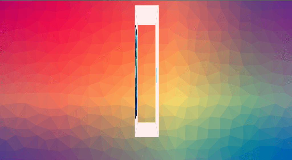
Next let’s take care of the top and bottom sides and we will create them using before and after elements, first of all we’re going to rotate the cube in a kind of different way in order to display both sides so let’s change rotate y into rotate x as for the value let’s insert here 91 degrees.
we’re going to take care of the top side we’ll create it using the before element so let’s select front side followed by the before pseudo element first of all we’re going to set width to 100 percent as for the height let’s make it 10 rem and also change the background color make it #fee. Let’s set position to absolute and then we’re going to set top and left properties both of them to 0, we have to use again transform style with the value preserve 3d and we have to assign it to the parent elements then down below rotate the element according to x-axis by minus 90 degrees.
Let’s move on and take care of the bottom side actually most of the properties and values will be the same for both sides so we’re going to add here after 0 elements then select the before pseudo-elements separately grab those four properties and paste them here then we’re going to duplicate this code change before into after and also instead of the top we need bottom besides that we need here 90 degrees instead of minus 90 degrees as for the transform origin it’s going to be bottom.
FILLING UP LEFT AND RIGHT SIDE
.back-side::before,
.back-side::after {
  content: "iPhone";
  width: 10rem;
  height: 100%;
  background-color: #fee;
  position: absolute;
  display: flex;
  justify-content: center;
  align-items: center;
  font-size: 2rem;
  color: #ec1919;
}

.back-side::before {
  top: 0;
  left: 0;
  transform: rotateY(-90deg);
  transform-origin: left;
}

.back-side::after {
  top: 0;
  right: 0;
  transform: rotateY(90deg);
  transform-origin: right;
}
let’s move on and take care of the left and right sides we’re going to create them using before and after elements of the back side so let’s rotate again the cube according to the y-axis with the value minus 91 degrees we will create those sides similarly. Let’s set position to absolute and then define top and left properties make both of them 0 and also we need transform rotate y minus 90 degree.
we have to change the origin of the transformation we need to set it to left alright so now the element is positioned and we have to take care of its content i mean the text iPhone. now we’re going to customize the text we’re going to place it in the center for that let’s use display= flex, justify-content= center and align-item= center. so in case of the before element, we cannot use physically the class center.
Next we’re going to change the font size make it 2 rem and also set color to #ec1919 all right that’s it about the left side now in the same way we have to create the right side which is going to be similar to the left one so we’re going to add here after element then select before see the element separately and grab those four lines from here then we’re going to duplicate this code change before into after then instead of left we need write also let’s get rid of minus sign from here and change the transform origin make it right.

CREATING CONTROL BUTTON HTML MARKUP
<div class="controls">
                <a href="#" class="top-x-control">
                    <i class="fas fa-arrow-up"></i>
                </a>
                <a href="#" class="bottom-x-control">
                    <i class="fas fa-arrow-down"></i>
                </a>
                <a href="#" class="left-y-control">
                    <i class="fas fa-arrow-left"></i>
                </a>
                <a href="#" class="right-y-control">
                    <i class="fas fa-arrow-right"></i>
                </a>
                <a href="#" class="top-z-control">
                    <i class="fas fa-arrow-down"></i>
                </a>
                <a href="#" class="bottom-z-control">
                    <i class="fas fa-arrow-up"></i>
                </a>
            </div>
        </div>
    </div>
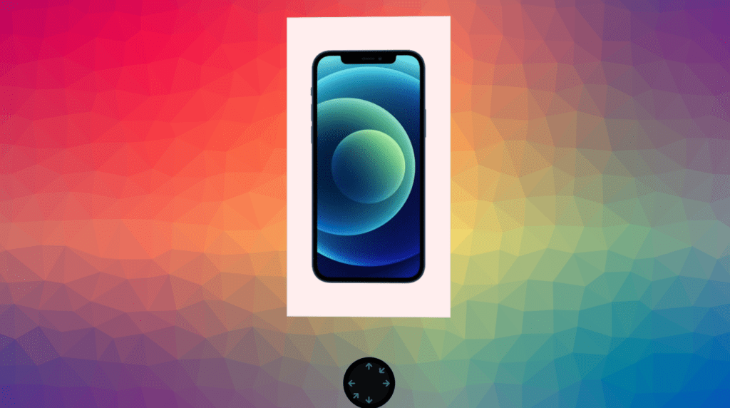
Now we’re going to take care of the controls, Let’s go ahead and create an HTML markup the controls will be a part of the cube wrapper so let’s open the div element with the class controls overall we will have six different controls they will be represented by the font awesome icons and they will be wrapped with the link elements. so, let’s open a tag and assign to it class top x control then insert your <i> element with the classes fas-fa-arrow-up, we will have six arrows.
so let’s duplicate the link element five times and then change the class names the second one is going to be bottom x control as for the font awesome icon we need arrow down then we will have left y control arrow left next one is going to be right y control and arrow right then we need top z control arrow down and the last one is going to be bottom z control arrow up okay so here we have our controls let’s go ahead and customize them let’s select the wrapper div element.
CUSTOMIZING CONTROL BUTTON
.controls {
  position: absolute;
  bottom: -15rem;
  left: 50%;
  transform: translateX(-50%);
  width: 10rem;
  height: 10rem;
  background-color: rgba(0, 0, 0, 0.9);
  border-radius: 50%;
  border: 1rem solid rgba(0, 0, 0, 0.8);
}

.controls a {
  position: absolute;
}

.controls a:nth-child(1) {
  top: 0;
  left: 50%;
  transform: translateX(-50%);
}

.controls a:nth-child(2) {
  bottom: 0;
  left: 50%;
  transform: translateX(-50%);
}

.controls a:nth-child(3) {
  top: 50%;
  left: 0;
  transform: translateY(-50%);
}

.controls a:nth-child(4) {
  top: 50%;
  right: 0;
  transform: translateY(-50%);
}

.controls a:nth-child(5) {
  top: 10%;
  right: 10%;
  transform: rotate(45deg);
}

.controls a:nth-child(6) {
  bottom: 10%;
  left: 10%;
  transform: rotate(45deg);
}

.controls i {
  font-size: 1.5rem;
  color: #6edae6;
  opacity: 0.5;
  transition: opacity 0.5s;
}

.controls a:hover i {
  opacity: 1;
}
First of all we’re going to take care of the position of controls, Let’s set its position to absolute actually the controls should be positioned according to the parent elements which in this case is a cube wrapper. So let’s set bottom position to -15 rem then we need left position let’s set it to 50% and then in order to center the element horizontally we need transform with translate x function and with the value -50, We’re going to set width and height both of them to 10 rem and then change the background color.
we’re going to use here rgba value let’s insert here black color with the opacity 0.9 okay after that we’re going to make the background rounded and also create the border let’s set border radius to 50 percent as for the border we’re going to make it 1rem solid and as the color let’s use again rgba value with the same color but with the opacity 0.8.
We need some space between the cube and controls so let’s go ahead and move the cube up we’re going to set its position to relative and then use top position make it -4 rem so in case of position relative the element will move up by 4 rem from its current position.
Let’s go ahead and customize the arrows, let’s start from the first link elements we’re going to select it using nth child selector we have to specify here one this arrow is going to be placed in the center at the top of the wrapper so let’s set its top position to 0 also we need left position let’s set it to 50% and in order to center the element let’s use transform translate x with value -50, we’re going to select <i> element let’s change the font size make it 1.5 rem then we’re going to change the color let’s set it to #6edae6 and also we’re going to decrease the opacity let’s make it 0.5.
Let’s position the second arrow it’s going to be placed in the center but at the bottom of the wrapper so duplicate this code we need here second arrow and we’re going to set bottom position to 0, let’s move on and position the third arrow it’s going to be placed in the center but on the left side of the wrapper so we need here third arrow then we’re going to set top position to 50%, left is going to be 0 and also we need here translate but with y direction and with the same value.
The next arrow will be placed in the center as well but on the right side we need 4th element and we have to set right position to 0, they’re left just two of them let’s move on and select the fifth arrow it’s going to be placed in the middle of those two arrows so we need top and right positions both of them set to 10% as for the transform property we need to use it with rotate function with the value 45 degrees okay so we need to position the last icon.
let’s duplicate this code here change top into bottom and also we need left instead of right all right. we need to do is to create a little hover effect we’re going to increase the opacity of the icons back to 1 so let’s select a with hover followed by the <i> element and set opacity to 1. besides that we’re going to use transition with opacity and the duration 0.5 second.
ROTATING CUBE WITH JAVASCRIPT
let x = 0
let y = 20
let z = 0
let bool = true
let interval

const cube = document.querySelector('.cube')

const playPause = () => {
    if(bool) {
        interval = setInterval(() => {
            cube.style.transform = `rotateX(${x}deg) rotateY(${y++}deg) rotateZ(${z}deg)`
        }, 100)
    } else {
        clearInterval(interval)
    }

}

playPause()

document.querySelector('.top-x-control').addEventListener('click', () => {
    cube.style.transform = `rotateX(${x += 20}deg) rotateY(${y}deg) rotateZ(${z}deg)`
})

document.querySelector('.bottom-x-control').addEventListener('click', () => {
    cube.style.transform = `rotateX(${x -= 20}deg) rotateY(${y}deg) rotateZ(${z}deg)`
})

document.querySelector('.left-y-control').addEventListener('click', () => {
    cube.style.transform = `rotateX(${x}deg) rotateY(${y -= 20}deg) rotateZ(${z}deg)`
})

document.querySelector('.right-y-control').addEventListener('click', () => {
    cube.style.transform = `rotateX(${x}deg) rotateY(${y += 20}deg) rotateZ(${z}deg)`
})

document.querySelector('.top-z-control').addEventListener('click', () => {
    cube.style.transform = `rotateX(${x}deg) rotateY(${y}deg) rotateZ(${z -= 20}deg)`
})

document.querySelector('.bottom-z-control').addEventListener('click', () => {
    cube.style.transform = `rotateX(${x}deg) rotateY(${y}deg) rotateZ(${z += 20}deg)`
})

document.querySelector('.controls').addEventListener('mouseover', () => {
    bool = false
    playPause()
})

document.querySelector('.controls').addEventListener('mouseout', () => {
    bool = true
    playPause()
})
We’re going to make the cube rotating automatically, go to the JavaScript file and select the cube we’re going to create new variable let’s call it cube and then select element using query selector method we have to specify the class name inside of the parenthesis so we will rotate the cube according to the y-axis by one degree and we will rotate it with very little intervals just 100 milliseconds so we’re going to create a new function.
let’s call it play pose then we need to use a method called set interval as you know it takes two arguments the first one is a callback function which will be executed with some intervals as for the second one it’s the amount of the interval itself so let’s pass here 100 as the second argument so now we have to rotate the cube according to the y-axis we need to use the style property followed by the transform.
Now we have to pass here rotate y function so after each interval we need to increase the values by one so we need here y with the increment operator which is expressed by ++ signs followed by the degrees now let’s call the function so as you can see the cube is rotating if we check the cube in the elements top you will see that after each 100 milliseconds the value of the rotate function increases by 1.
So let’s assign it to the cube with values transform and the duration 0.5 seconds, let’s select top-x control using query selector method and attach to it event listener with click event and also with the callback function which will be executed once we click the top control so once we click it we need to rotate the cube with x direction so we’re going to grab this line of code from here then change y into x, let’s go ahead and do the same for bottom control.
let’s duplicate this code then change the top into the bottom and also instead of the + sign we need here -. let’s move on and program the left control let’s duplicate this code once again we need here left y control also change the direction we need y axis.
We need to define all three directions no matter which direction we are changing so we need to add here rotate y with y degree and then we need the same for the z direction rotate z. for this z direction let’s set it to 0, let’s go ahead and take care of the rest of the controls let’s duplicate this code change left into right and also instead of the + sign. we need to rotate the cube with z direction so we’re going to leave here just y as for the rotate z function, we need here -=20. let’s move on and take care of the last one let’s duplicate this code change top into bottom and also instead of the – sign let’s insert here +.
we’re going to insert here rotate x and then rotate z, we’re going to do is to stop the cube from rotating once we hover over the controls, for that we need to create a new variable which will have the boolean value let’s call it bool and set it to true by default. so now we need to create an if-else statement inside of the function and as a condition we’re going to insert here bool so if this condition is true.
Then we have to run this function and if it is false we need an else statement in which we have to stop executing this function using the clear interval method so in order to clear the interval at first we need to store it into the variable and then we have to pass this variable into the clear interval function so let’s create a new variable in this case we’re going to declare it without any value then store set interval function into variable and let’s get back here transform rotate and add here rotate functions with x and z directions and also we’re going to make the value of the rotate y function 20 degrees.
FULL SOURCE CODE OF iPhone 12 3D Cube with HTML CSS, and JavaScript
index.html
<!DOCTYPE html>
<html lang="en">
<head>
    <meta charset="UTF-8">
    <meta name="viewport" content="width=device-width, initial-scale=1.0">
    <title>Cube</title>
    <link rel="stylesheet" href="style.css">
    <link rel="stylesheet" href="<https://cdnjs.cloudflare.com/ajax/libs/font-awesome/5.15.1/css/all.min.css>">
</head>
<body>

    <div class="container center">
        <div class="cube-wrapper">
            <div class="cube">
                <div class="front-side">
                    <img src="images/iphone.png">
                </div>
                <div class="back-side center">
                    <i class="fab fa-apple"></i>
                </div>
            </div>

            <div class="controls">
                <a href="#" class="top-x-control">
                    <i class="fas fa-arrow-up"></i>
                </a>
                <a href="#" class="bottom-x-control">
                    <i class="fas fa-arrow-down"></i>
                </a>
                <a href="#" class="left-y-control">
                    <i class="fas fa-arrow-left"></i>
                </a>
                <a href="#" class="right-y-control">
                    <i class="fas fa-arrow-right"></i>
                </a>
                <a href="#" class="top-z-control">
                    <i class="fas fa-arrow-down"></i>
                </a>
                <a href="#" class="bottom-z-control">
                    <i class="fas fa-arrow-up"></i>
                </a>
            </div>
        </div>
    </div>

    <script src="script.js"></script>
</body>
</html>
style.css
* {
  margin: 0;
  padding: 0;
  box-sizing: border-box;
  text-decoration: none;
  font-family: Arial, san-serif;
}

html {
  font-size: 62.5%;
}

.center {
  display: flex;
  justify-content: center;
  align-items: center;
}

.container {
  width: 100%;
  height: 100vh;
  background: url(images/bg.png) center no-repeat;
  background-size: cover;
}

.cube-wrapper {
  perspective: 100rem;
}

.cube {
  width: 30rem;
  height: 55rem;
  transform-style: preserve-3d;
  transform: rotateX(0) rotateY(20deg) rotateZ(0);
  position: relative;
  top: -4rem;
  transition: transform 0.5s;
}

.front-side,
.back-side {
  width: 100%;
  height: 100%;
  background-color: #fee;
  position: absolute;
  transform-style: preserve-3d;
  box-shadow: inset 0.1rem 0.1rem 0.1rem #ddd, inset -0.1rem -0.1rem 0.1rem #ddd;
}

.front-side {
  padding: 2.5rem;
  transform: translateZ(5rem);
}

.front-side::before,
.front-side::after {
  content: "";
  width: 100%;
  height: 10rem;
  background-color: #fee;
  position: absolute;
  box-shadow: inset 0.1rem 0.1rem 0.1rem #ddd, inset -0.1rem -0.1rem 0.1rem #ddd;
}

.front-side::before {
  top: 0;
  left: 0;
  transform: rotateX(-90deg);
  transform-origin: top;
}

.front-side::after {
  bottom: 0;
  left: 0;
  transform: rotateX(90deg);
  transform-origin: bottom;
}

.front-side img {
  width: 100%;
  height: 100%;
  object-fit: contain;
}

.back-side {
  transform: translateZ(-5rem);
}

.back-side::before,
.back-side::after {
  content: "iPhone";
  width: 10rem;
  height: 100%;
  background-color: #fee;
  position: absolute;
  display: flex;
  justify-content: center;
  align-items: center;
  font-size: 2rem;
  color: #ec1919;
}

.back-side::before {
  top: 0;
  left: 0;
  transform: rotateY(-90deg);
  transform-origin: left;
}

.back-side::after {
  top: 0;
  right: 0;
  transform: rotateY(90deg);
  transform-origin: right;
}

.back-side i {
  font-size: 12rem;
  color: #6edae6;
  text-shadow: 0.1rem 0.1rem 0.2rem #aaa, -0.1rem -0.1rem 0.2rem #aaa;
  transform: rotateY(180deg);
}

.controls {
  position: absolute;
  bottom: -15rem;
  left: 50%;
  transform: translateX(-50%);
  width: 10rem;
  height: 10rem;
  background-color: rgba(0, 0, 0, 0.9);
  border-radius: 50%;
  border: 1rem solid rgba(0, 0, 0, 0.8);
}

.controls a {
  position: absolute;
}

.controls a:nth-child(1) {
  top: 0;
  left: 50%;
  transform: translateX(-50%);
}

.controls a:nth-child(2) {
  bottom: 0;
  left: 50%;
  transform: translateX(-50%);
}

.controls a:nth-child(3) {
  top: 50%;
  left: 0;
  transform: translateY(-50%);
}

.controls a:nth-child(4) {
  top: 50%;
  right: 0;
  transform: translateY(-50%);
}

.controls a:nth-child(5) {
  top: 10%;
  right: 10%;
  transform: rotate(45deg);
}

.controls a:nth-child(6) {
  bottom: 10%;
  left: 10%;
  transform: rotate(45deg);
}

.controls i {
  font-size: 1.5rem;
  color: #6edae6;
  opacity: 0.5;
  transition: opacity 0.5s;
}

.controls a:hover i {
  opacity: 1;
}
script.js
let x = 0
let y = 20
let z = 0
let bool = true
let interval

const cube = document.querySelector('.cube')

const playPause = () => {
    if(bool) {
        interval = setInterval(() => {
            cube.style.transform = `rotateX(${x}deg) rotateY(${y++}deg) rotateZ(${z}deg)`
        }, 100)
    } else {
        clearInterval(interval)
    }

}

playPause()

document.querySelector('.top-x-control').addEventListener('click', () => {
    cube.style.transform = `rotateX(${x += 20}deg) rotateY(${y}deg) rotateZ(${z}deg)`
})

document.querySelector('.bottom-x-control').addEventListener('click', () => {
    cube.style.transform = `rotateX(${x -= 20}deg) rotateY(${y}deg) rotateZ(${z}deg)`
})

document.querySelector('.left-y-control').addEventListener('click', () => {
    cube.style.transform = `rotateX(${x}deg) rotateY(${y -= 20}deg) rotateZ(${z}deg)`
})

document.querySelector('.right-y-control').addEventListener('click', () => {
    cube.style.transform = `rotateX(${x}deg) rotateY(${y += 20}deg) rotateZ(${z}deg)`
})

document.querySelector('.top-z-control').addEventListener('click', () => {
    cube.style.transform = `rotateX(${x}deg) rotateY(${y}deg) rotateZ(${z -= 20}deg)`
})

document.querySelector('.bottom-z-control').addEventListener('click', () => {
    cube.style.transform = `rotateX(${x}deg) rotateY(${y}deg) rotateZ(${z += 20}deg)`
})

document.querySelector('.controls').addEventListener('mouseover', () => {
    bool = false
    playPause()
})

document.querySelector('.controls').addEventListener('mouseout', () => {
    bool = true
    playPause()
})
OUTPUT

And this is how you can make iPhone 12 3D Cube with HTML CSS and JavaScript.


