


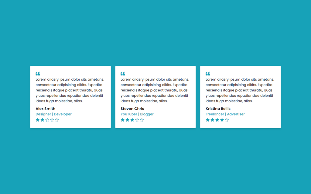
In this article, we will learn to make Responsive Testimonials Section using only HTML & CSS, In this program (Responsive Testimonials Section), there are three testimonials box or card on the webpage and inside each box, there is a quote, name, job, and stars rating of that person. This testimonial section is fully responsive for any devices like mobiles and tablets. On the PC, these boxes are shown in a horizontal line but on mobile devices, these boxes are shown vertically.
you can see the demo here Responsive Testimonials Section
Pre-requisites To Make Responsive Testimonials Section Using Only HTML & CSS
- Good knowledge of HTML.
- Good knowledge of CSS & CSS3.
Creating HTML Markup
<div class="wrapper">
    <div class="box">
      <i class="fas fa-quote-left quote"></i>
      <p>Lorem aliasry ipsum dolor sits ametans, consectetur adipisicing elitits. Expedita reiciendis itaque placeat thuratu, quasi yiuos repellendus repudiandae deleniti ideas fuga molestiae, alias.</p>
      <div class="content">
        <div class="info">
          <div class="name">Alex Smith</div>
          <div class="job">Designer | Developer</div>
          <div class="stars">
            <i class="fas fa-star"></i>
            <i class="fas fa-star"></i>
            <i class="far fa-star"></i>
            <i class="far fa-star"></i>
            <i class="far fa-star"></i>
          </div>
        </div>
      </div>
    </div>
    <div class="box">
      <i class="fas fa-quote-left quote"></i>
      <p>Lorem aliasry ipsum dolor sits ametans, consectetur adipisicing elitits. Expedita reiciendis itaque placeat thuratu, quasi yiuos repellendus repudiandae deleniti ideas fuga molestiae, alias.</p>
      <div class="content">
        <div class="info">
          <div class="name">Steven Chris</div>
          <div class="job">YouTuber | Blogger</div>
          <div class="stars">
            <i class="fas fa-star"></i>
            <i class="fas fa-star"></i>
            <i class="fas fa-star"></i>
            <i class="far fa-star"></i>
            <i class="far fa-star"></i>
          </div>
        </div>
      </div>
    </div>
    <div class="box">
      <i class="fas fa-quote-left  quote"></i>
      <p>Lorem aliasry ipsum dolor sits ametans, consectetur adipisicing elitits. Expedita reiciendis itaque placeat thuratu, quasi yiuos repellendus repudiandae deleniti ideas fuga molestiae, alias.</p>
      <div class="content">
        <div class="info">
          <div class="name">Kristina Bellis</div>
          <div class="job">Freelancer | Advertiser</div>
          <div class="stars">
            <i class="fas fa-star"></i>
            <i class="fas fa-star"></i>
            <i class="fas fa-star"></i>
            <i class="fas fa-star"></i>
            <i class="far fa-star"></i>
          </div>
        </div>
      </div>
    </div>
  </div>
First of all, we need to make skeleton for cards, in this skeleton we need here font-awesome to add icons here we need quote icon also we need paragraph with some random text, then after we need 5-star icons, and lastly we need an image we will do it later on. Now we just copy these lines of codes 2 more times.
Setting up Default Values
@import url('https://fonts.googleapis.com/css2?family=Poppins:wght@200;300;400;500;600;700&display=swap');
*{
  margin: 0;
  padding: 0;
  box-sizing: border-box;
  font-family: 'Poppins', sans-serif;
}
html,body{
  display: grid;
  height: 100%;
  place-items: center;
  background: #17a2b8;
}
Now let’s set our default values, first we need to add Google font named Poppins this is pretty good font type which we will use in this program. Then after, we will remove default margin and padding also we need to add Poppins in font-family, now we need all items in center for that display will grid, and we need to place items in the center also we will add background as color of #17a2b8.
.wrapper{
  max-width: 1200px;
  margin: auto;
  padding: 0 20px;
  display: flex;
  flex-wrap: wrap;
  align-items: center;
  justify-content: space-between;
}
Now for wrapper or card’s max-width will be 1200px with this if we shrink the window then wrapper will also shrink till 1200px, then after we need to align-items in center also space in between content for that justify content to space-between.

Customizing The Cards
.wrapper .box{
  background: #fff;
  width: calc(33% - 10px);
  padding: 25px;
  border-radius: 3px;
  box-shadow: 0px 4px 8px rgba(0,0,0,0.15);
}
.wrapper .box i.quote{
  font-size: 20px;
  color: #17a2b8;
}
.wrapper .box .content{
  display: flex;
  flex-wrap: wrap;
  align-items: center;
  justify-content: space-between;
  padding-top: 10px;
}
.box .info .name{
  font-weight: 600;
  font-size: 17px;
}
.box .info .job{
  font-size: 16px;
  font-weight: 500;
  color: #17a2b8;
}
.box .info .stars{
  margin-top: 2px;
}
.box .info .stars i{
  color: #17a2b8;
}
Now let’s customize the card for that, we will first separate it each card will have width of 33%-10px of wrapper, also for detailing we’ll use box-shadow with black color shadow around the cards. After that, for quote icon, we just need to add some size and color of #17a2b8.
Let’s just put content in the center of the card using align-items, and for name, job we add some size and font weight, then we need to color the stars to #17a2b8.
Adding & Customizing The Image
<div class="content">
 <div class="info">
  <div class="image">
   <img src="images/profile-1.jpeg" alt="">
  </div>
 </div>
</div>
<div class="content">
 <div class="info">
  <div class="image">
   <img src="images/profile-2.jpeg" alt="">
  </div>
 </div>
</div>
<div class="content">
 <div class="info">
  <div class="image">
   <img src="images/profile-3.jpeg" alt="">
  </div>
 </div>
</div>
.box .content .image{
height: 75px;
width: 75px;
padding: 3px;
background: #17a2b8;
border-radius: 50%;
}
.content .image img{
height: 100%;
width: 100%;
object-fit: cover;
border-radius: 50%;
border: 2px solid #fff;
}
.box:hover .content .image img{
border-color: #fff;
}Now here we need to add 3 images for each card as a profile pic, after that we have to make it smaller using height and width obviously, and also we need to set in the area for that we will use object-fit to cover and border radius to 50%, so image will be in circular form, again for detailing we’ll use some border as well.
Making Project Responsive
With the use of the following lines of codes, you can make a page responsive:
@media (max-width: 1045px) {
.wrapper .box{
width: calc(50% - 10px);
margin: 10px 0;
}
}
@media (max-width: 702px) {
.wrapper .box{
width: 100%;
}
}Full Source Code Of Responsive Testimonials Section Using Only HTML & CSS
index.html
<!DOCTYPE html>
<html lang="en">
<head>
<meta charset="UTF-8">
<meta name="viewport" content="width=device-width, initial-scale=1.0">
<title>Responsive Testimonials Section</title>
<link rel="stylesheet" href="style.css">
<script src="https://kit.fontawesome.com/a076d05399.js"></script>
</head>
<body>
<div class="wrapper">
<div class="box">
<i class="fas fa-quote-left quote"></i>
<p>Lorem aliasry ipsum dolor sits ametans, consectetur adipisicing elitits. Expedita reiciendis itaque placeat thuratu, quasi yiuos repellendus repudiandae deleniti ideas fuga molestiae, alias.</p>
<div class="content">
<div class="info">
<div class="name">Alex Smith</div>
<div class="job">Designer | Developer</div>
<div class="stars">
<i class="fas fa-star"></i>
<i class="fas fa-star"></i>
<i class="far fa-star"></i>
<i class="far fa-star"></i>
<i class="far fa-star"></i>
</div>
</div>
<div class="image">
<img src="images/profile-1.jpeg" alt="">
</div>
</div>
</div>
<div class="box">
<i class="fas fa-quote-left quote"></i>
<p>Lorem aliasry ipsum dolor sits ametans, consectetur adipisicing elitits. Expedita reiciendis itaque placeat thuratu, quasi yiuos repellendus repudiandae deleniti ideas fuga molestiae, alias.</p>
<div class="content">
<div class="info">
<div class="name">Steven Chris</div>
<div class="job">YouTuber | Blogger</div>
<div class="stars">
<i class="fas fa-star"></i>
<i class="fas fa-star"></i>
<i class="fas fa-star"></i>
<i class="far fa-star"></i>
<i class="far fa-star"></i>
</div>
</div>
<div class="image">
<img src="images/profile-2.jpeg" alt="">
</div>
</div>
</div>
<div class="box">
<i class="fas fa-quote-left quote"></i>
<p>Lorem aliasry ipsum dolor sits ametans, consectetur adipisicing elitits. Expedita reiciendis itaque placeat thuratu, quasi yiuos repellendus repudiandae deleniti ideas fuga molestiae, alias.</p>
<div class="content">
<div class="info">
<div class="name">Kristina Bellis</div>
<div class="job">Freelancer | Advertiser</div>
<div class="stars">
<i class="fas fa-star"></i>
<i class="fas fa-star"></i>
<i class="fas fa-star"></i>
<i class="fas fa-star"></i>
<i class="far fa-star"></i>
</div>
</div>
<div class="image">
<img src="images/profile-3.jpeg" alt="">
</div>
</div>
</div>
</div>
</body>
</html>
style.css
@import url('https://fonts.googleapis.com/css2?family=Poppins:wght@200;300;400;500;600;700&display=swap');
*{
margin: 0;
padding: 0;
box-sizing: border-box;
font-family: 'Poppins', sans-serif;
}
html,body{
display: grid;
height: 100%;
place-items: center;
background: #17a2b8;
}
::selection{
background: rgba(23,162,184,0.3);
}
.wrapper{
max-width: 1200px;
margin: auto;
padding: 0 20px;
display: flex;
flex-wrap: wrap;
align-items: center;
justify-content: space-between;
}
.wrapper .box{
background: #fff;
width: calc(33% - 10px);
padding: 25px;
border-radius: 3px;
box-shadow: 0px 4px 8px rgba(0,0,0,0.15);
}
.wrapper .box i.quote{
font-size: 20px;
color: #17a2b8;
}
.wrapper .box .content{
display: flex;
flex-wrap: wrap;
align-items: center;
justify-content: space-between;
padding-top: 10px;
}
.box .info .name{
font-weight: 600;
font-size: 17px;
}
.box .info .job{
font-size: 16px;
font-weight: 500;
color: #17a2b8;
}
.box .info .stars{
margin-top: 2px;
}
.box .info .stars i{
color: #17a2b8;
}
.box .content .image{
  height: 75px;
  width: 75px;
  padding: 3px;
  background: #17a2b8;
  border-radius: 50%;
}
.content .image img{
  height: 100%;
  width: 100%;
  object-fit: cover;
  border-radius: 50%;
  border: 2px solid #fff;
}
.box:hover .content .image img{
  border-color: #fff;
}
@media (max-width: 1045px) {
  .wrapper .box{
    width: calc(50% - 10px);
    margin: 10px 0;
  }
}
@media (max-width: 702px) {
  .wrapper .box{
    width: 100%;
  }
}
Output

Check out Full Source Code On Github


