


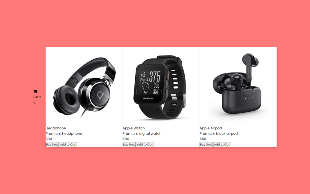
In this article, we’ll learn to make Product Card Hover Effect Using HTML CSS & jQuery, on the webpage, there are three product images and a cart box with an icon. When you hover on a particular image, then there is shown a details box with a sliding animation. In this box, there is a name, price, and buttons “to buy” and “add to cart” of the product. When you click on the particular card button, the product image of that card will duplicate or clone and move to the cart box with animation then invisible.
you can see the demo here Product Card Hover Effect
Pre-requisites To Make Product Card Hover Effect Using HTML CSS & jQuery
- Good knowledge of HTML.
- Good knowledge of CSS & CSS3.
- Good knowledge of jQuery.
Creating HTML Markup
    <link rel="stylesheet" href="style.css">
    <script src="https://kit.fontawesome.com/a076d05399.js"></script>
    <script src="https://code.jquery.com/jquery-3.5.1.min.js"></script>
    <script src="https://code.jquery.com/ui/1.12.1/jquery-ui.js"></script>
Before creating HTML markup, we need to add some file here like style.css where we will write code to style elements, two jQuery files you can add these from searching on Google and last one will be font awesome file to use icons in HTML.
<div class="wrapper">
      <div class="cart-nav">
        <div class="icon">
          <i class="fas fa-shopping-cart"></i>
          <span>Cart</span>
        </div>
        <div class="item-count">0</div>
      </div>
      <div class="card">
        <img src="images/headphone.png" alt="">
        <div class="content">
          <div class="row">
            <div class="details">
              <span>Headphone</span>
              <p>Premium headphone</p>
            </div>
            <div class="price">$30</div>
          </div>
          <div class="buttons">
            <button>Buy Now</button>
            <button class="cart-btn">Add to Cart</button>
          </div>
        </div>
      </div>
      <div class="card">
        <img src="images/watch.png" alt="">
        <div class="content">
          <div class="row">
            <div class="details">
              <span>Apple Watch</span>
              <p>Premium digital watch</p>
            </div>
            <div class="price">$80</div>
          </div>
          <div class="buttons">
            <button>Buy Now</button>
            <button class="cart-btn">Add to Cart</button>
          </div>
        </div>
      </div>
      <div class="card">
        <img src="images/airpods.png" alt="">
        <div class="content">
          <div class="row">
            <div class="details">
              <span>Apple Airpod</span>
              <p>Premium black airpod</p>
            </div>
            <div class="price">$50</div>
          </div>
          <div class="buttons">
            <button>Buy Now</button>
            <button class="cart-btn">Add to Cart</button>
          </div>
        </div>
      </div>
    </div>

    <script src="script.js"></script>
First we need here is to add one shopping cart icon, then after let’s add an image here also we will add text headphone and a paragraph for details with price. Now we need to buttons for Buy now and add to cart along with icons, after that we just need to copy these code and paste two times, one for watch and other one for AirPods.
Setting up Default Values
@import url('https://fonts.googleapis.com/css2?family=Poppins:wght@200;300;400;500;600;700&display=swap');
*{
  margin: 0;
  padding: 0;
  box-sizing: border-box;
  font-family: 'Poppins', sans-serif;
}
::selection{
  color: #fff;
  background: #ff7979;
}
body{
  display: flex;
  align-items: center;
  justify-content: center;
  min-height: 100vh;
  background: #ff7979;
  padding: 0 20px;
}
.wrapper{
  position: relative;
  max-width: 1130px;
  display: flex;
  align-items: center;
  justify-content: space-between;
}
.wrapper .card{
  position: relative;
  background: #fff;
  border-radius: 3px;
  width: calc(33% - 13px);
  overflow: hidden;
  box-shadow: 4px 4px 10px 0px rgba(0,0,0,0.15);
}
.wrapper .card img{
  width: 100%;
  border-radius: 3px;
  transition: all 0.3s ease;
}
Now in CSS part, First we need to add google font named Poppins, this font looks awesome, so we will use this in whole project, then after we’ll reset default margin and padding then add font family Poppins, now we need every element in the center of the screen for that we will use align-items and justify-content to center, with the help of min-height we can set minimum height of the wrapper, also we set here background as #ff7979 color.
Now, In wrapper class we have to add max-width to 1130px, so the maximum width will be set, again we need elements in the center of the wrapper for that display to flex and align-items to center, after we need space between elements for that justify content to space between.
Now we need to set image size use calc function here we used 33%-13px, also overflow to hidden so out of the wrapper will be hide, after that we’ll use box-shadow in here for some detailing, also we’ll transition for ease type.
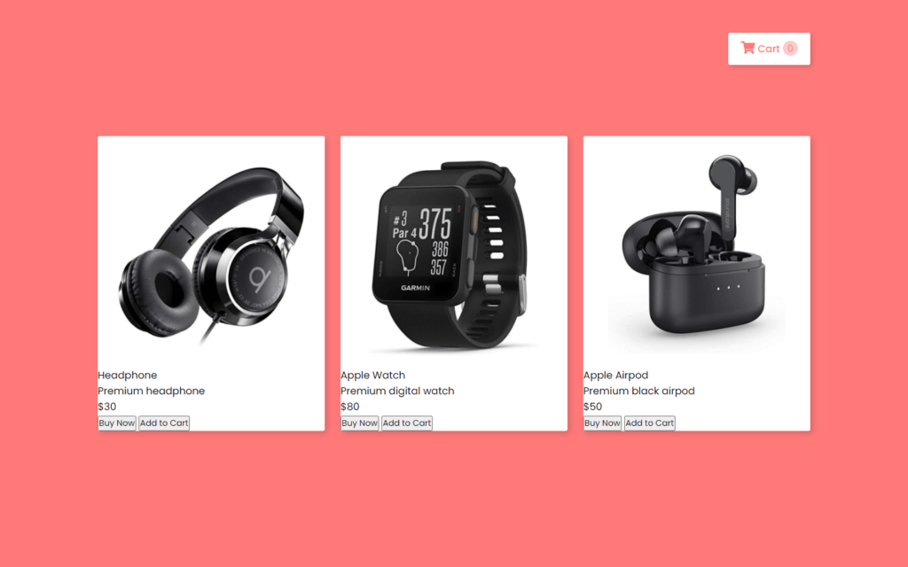
Customizing The Cart Icon
.wrapper .cart-nav{
  position: absolute;
  right: 0;
  top: -35%;
  width: 130px;
  background: #fff;
  padding: 13px 15px;
  border-radius: 3px;
  display: flex;
  cursor: pointer;
  justify-content: space-evenly;
  box-shadow: 3px 3px 8px 0px rgba(0,0,0,0.15);
}
.cart-nav .icon{
  color: #ff7979;
}
.cart-nav .icon i{
  font-size: 20px;
}
.cart-nav .icon span{
  font-weight: 500;
}
.cart-nav .item-count{
  font-size: 15px;
  height: 23px;
  width: 23px;
  color: #ff7979;
  background: #ffcccc;
  text-align: center;
  line-height: 22px;
  border: 1px solid #ffb3b3;
  border-radius: 50%;
}
For Cart icon we need to set its position to absolute here, and we need it at the top of the screen for that top to -35% then cursor to pointer with this if we hover the cart icon cursor becomes pointer again we need here box shadow for some detailing purpose, also we added justify content to space evenly with this space will be to distribute evenly among all elements. After that, we’ll color the icon with #ff7979, now we need to customize the counter for that we’ll add some height and width after that color will be same as background color and background of counter will be somewhat faded.
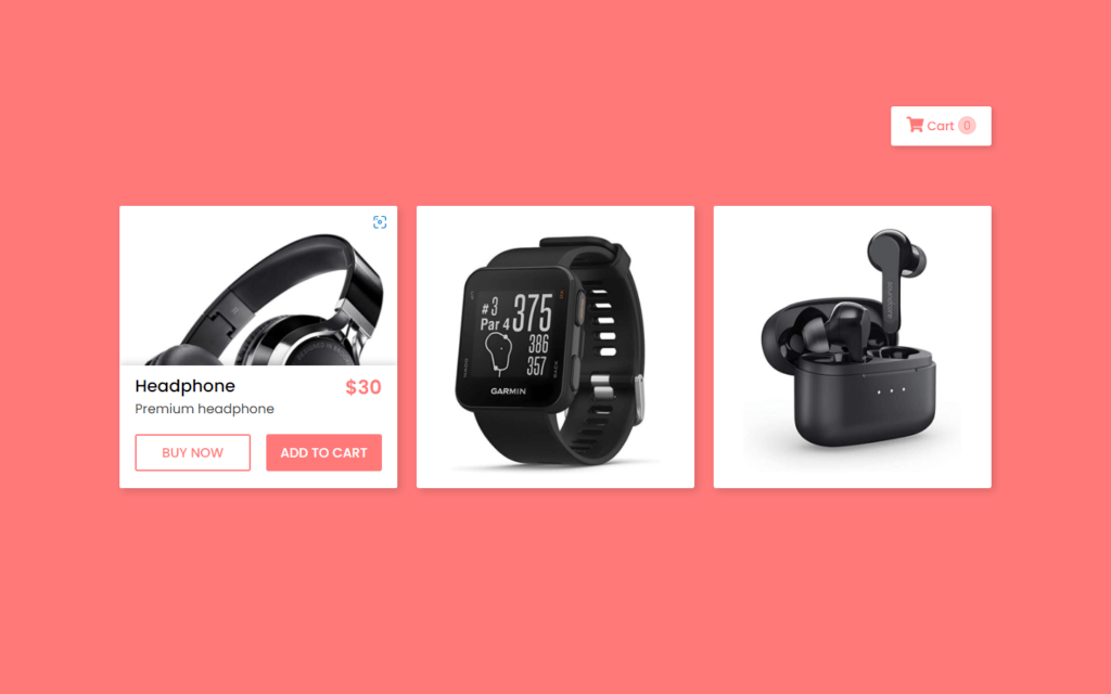
Customizing The Details
.wrapper .card .content{
  position: absolute;
  width: 100%;
  bottom: -50%;
  background: #fff;
  padding: 10px 20px 22px 20px;
  box-shadow: 0px -3px 10px 0px rgba(0,0,0,0.15);
  transition: all 0.3s ease;
}
.wrapper .card:hover .content{
  bottom: 0;
}
.card .content .row,
.content .buttons{
  display: flex;
  justify-content: space-between;
}
.content .row .details span{
  font-size: 22px;
  font-weight: 500;
}
.content .row .details p{
  color: #333;
  font-size: 17px;
  font-weight: 400;
}
.content .row .price{
  color: #ff7979;
  font-size: 25px;
  font-weight: 600;
}
For the content or details, we need its position absolute, and we will put it in the bottom to -50%, so initially content won’t show because already declared overflow hidden in wrapper class, then we need some transition in the content part for some smoother look, Now we need to show this content while hovering on image for that we just set bottom to 0. Then after we need some space in content, row and buttons etc.
Customizing The Buttons
.content .buttons{
  margin-top: 20px;
}
.content .buttons button{
  width: 100%;
  padding: 9px 0;
  outline: none;
  cursor: pointer;
  font-size: 17px;
  font-weight: 500;
  border-radius: 3px;
  border: 2px solid #ff7979;
  text-transform: uppercase;
  transition: all 0.3s ease;
}
.buttons button:first-child{
  color: #ff7979;
  margin-right: 10px;
  background: #fff;
}
button:first-child:hover{
  color: #fff;
  background: #ff7979;
}
.buttons button:last-child{
  color: #fff;
  margin-left: 10px;
  background: #ff7979;
}
button:last-child:hover{
  background: #ff6666;
  border-color: #ff6666;
}
For buttons, we need to remove outline, cursor to pointer again put some border-radius of 3px now finally we need transition for 0.3 seconds, now we need to put color on first button as #ff7979 and on hover we just add background color as #ff7979, and button text will be white. We just need to #ff7979 color by default for second button and if we hover on it then background color will be slightly darker.
Adding Fly to Cart Effect
let count = 0;
//if add to cart btn clicked
$('.cart-btn').on('click', function (){
  let cart = $('.cart-nav');
  // find the img of that card which button is clicked by user
  let imgtodrag = $(this).parent('.buttons').parent('.content').parent('.card').find("img").eq(0);
  if (imgtodrag) {
    // duplicate the img
    var imgclone = imgtodrag.clone().offset({
      top: imgtodrag.offset().top,
      left: imgtodrag.offset().left
    }).css({
      'opacity': '0.8',
      'position': 'absolute',
      'height': '150px',
      'width': '150px',
      'z-index': '100'
    }).appendTo($('body')).animate({
      'top': cart.offset().top + 20,
      'left': cart.offset().left + 30,
      'width': 75,
      'height': 75
    }, 1000, 'easeInOutExpo');

    setTimeout(function(){
      count++;
      $(".cart-nav .item-count").text(count);
    }, 1500);

    imgclone.animate({
      'width': 0,
      'height': 0
    }, function(){
      $(this).detach()
    });
  }
});
Now lastly we will add fly to cart effect with jQuery for that we add function when we click on add to cart button, in this function we will fetch the image of the item in the cart and we just duplicate it, in this schema we add some CSS like opacity of this duplicate image to 0.8 then after we’ll put animation for the smoother look for that we’ll move the image from top to cart icon we used here easeInOutExpo transition for 1000 milliseconds, now we just need to increase the counter of cart and we also add some timeout after image got disappear, then after we just need to hide the duplicate image using detach() function.
Full Source Code Of Product Card Hover Effect Using HTML CSS & jQuery
index.html
<!DOCTYPE html>
<html lang="en" dir="ltr">
  <head>
    <meta charset="utf-8">
    <title>Product Card with Fly Cart Animation </title>
    <link rel="stylesheet" href="style.css">
    <script src="https://kit.fontawesome.com/a076d05399.js"></script>
    <script src="https://code.jquery.com/jquery-3.5.1.min.js"></script>
    <script src="https://code.jquery.com/ui/1.12.1/jquery-ui.js"></script>
  </head>
  <body>
    <div class="wrapper">
      <div class="cart-nav">
        <div class="icon">
          <i class="fas fa-shopping-cart"></i>
          <span>Cart</span>
        </div>
        <div class="item-count">0</div>
      </div>
      <div class="card">
        <img src="images/headphone.png" alt="">
        <div class="content">
          <div class="row">
            <div class="details">
              <span>Headphone</span>
              <p>Premium headphone</p>
            </div>
            <div class="price">$30</div>
          </div>
          <div class="buttons">
            <button>Buy Now</button>
            <button class="cart-btn">Add to Cart</button>
          </div>
        </div>
      </div>
      <div class="card">
        <img src="images/watch.png" alt="">
        <div class="content">
          <div class="row">
            <div class="details">
              <span>Apple Watch</span>
              <p>Premium digital watch</p>
            </div>
            <div class="price">$80</div>
          </div>
          <div class="buttons">
            <button>Buy Now</button>
            <button class="cart-btn">Add to Cart</button>
          </div>
        </div>
      </div>
      <div class="card">
        <img src="images/airpods.png" alt="">
        <div class="content">
          <div class="row">
            <div class="details">
              <span>Apple Airpod</span>
              <p>Premium black airpod</p>
            </div>
            <div class="price">$50</div>
          </div>
          <div class="buttons">
            <button>Buy Now</button>
            <button class="cart-btn">Add to Cart</button>
          </div>
        </div>
      </div>
    </div>

    <script src="script.js"></script>

  </body>
</html>
style.css
@import url('https://fonts.googleapis.com/css2?family=Poppins:wght@200;300;400;500;600;700&display=swap');
*{
  margin: 0;
  padding: 0;
  box-sizing: border-box;
  font-family: 'Poppins', sans-serif;
}
::selection{
  color: #fff;
  background: #ff7979;
}
body{
  display: flex;
  align-items: center;
  justify-content: center;
  min-height: 100vh;
  background: #ff7979;
  padding: 0 20px;
}
.wrapper{
  position: relative;
  max-width: 1130px;
  display: flex;
  align-items: center;
  justify-content: space-between;
}
.wrapper .cart-nav{
  position: absolute;
  right: 0;
  top: -35%;
  width: 130px;
  background: #fff;
  padding: 13px 15px;
  border-radius: 3px;
  display: flex;
  cursor: pointer;
  justify-content: space-evenly;
  box-shadow: 3px 3px 8px 0px rgba(0,0,0,0.15);
}
.cart-nav .icon{
  color: #ff7979;
}
.cart-nav .icon i{
  font-size: 20px;
}
.cart-nav .icon span{
  font-weight: 500;
}
.cart-nav .item-count{
  font-size: 15px;
  height: 23px;
  width: 23px;
  color: #ff7979;
  background: #ffcccc;
  text-align: center;
  line-height: 22px;
  border: 1px solid #ffb3b3;
  border-radius: 50%;
}
.wrapper .card{
  position: relative;
  background: #fff;
  border-radius: 3px;
  width: calc(33% - 13px);
  overflow: hidden;
  box-shadow: 4px 4px 10px 0px rgba(0,0,0,0.15);
}
.wrapper .card img{
  width: 100%;
  border-radius: 3px;
  transition: all 0.3s ease;
}
.card:hover img{
  transform: scale(1.1);
}
.wrapper .card .content{
  position: absolute;
  width: 100%;
  bottom: -50%;
  background: #fff;
  padding: 10px 20px 22px 20px;
  box-shadow: 0px -3px 10px 0px rgba(0,0,0,0.15);
  transition: all 0.3s ease;
}
.wrapper .card:hover .content{
  bottom: 0;
}
.card .content .row,
.content .buttons{
  display: flex;
  justify-content: space-between;
}
.content .row .details span{
  font-size: 22px;
  font-weight: 500;
}
.content .row .details p{
  color: #333;
  font-size: 17px;
  font-weight: 400;
}
.content .row .price{
  color: #ff7979;
  font-size: 25px;
  font-weight: 600;
}

.content .buttons{
  margin-top: 20px;
}
.content .buttons button{
  width: 100%;
  padding: 9px 0;
  outline: none;
  cursor: pointer;
  font-size: 17px;
  font-weight: 500;
  border-radius: 3px;
  border: 2px solid #ff7979;
  text-transform: uppercase;
  transition: all 0.3s ease;
}
.buttons button:first-child{
  color: #ff7979;
  margin-right: 10px;
  background: #fff;
}
button:first-child:hover{
  color: #fff;
  background: #ff7979;
}
.buttons button:last-child{
  color: #fff;
  margin-left: 10px;
  background: #ff7979;
}
button:last-child:hover{
  background: #ff6666;
  border-color: #ff6666;
}
script.js
let count = 0;
//if add to cart btn clicked
$('.cart-btn').on('click', function (){
  let cart = $('.cart-nav');
  // find the img of that card which button is clicked by user
  let imgtodrag = $(this).parent('.buttons').parent('.content').parent('.card').find("img").eq(0);
  if (imgtodrag) {
    // duplicate the img
    var imgclone = imgtodrag.clone().offset({
      top: imgtodrag.offset().top,
      left: imgtodrag.offset().left
    }).css({
      'opacity': '0.8',
      'position': 'absolute',
      'height': '150px',
      'width': '150px',
      'z-index': '100'
    }).appendTo($('body')).animate({
      'top': cart.offset().top + 20,
      'left': cart.offset().left + 30,
      'width': 75,
      'height': 75
    }, 1000, 'easeInOutExpo');

    setTimeout(function(){
      count++;
      $(".cart-nav .item-count").text(count);
    }, 1500);

    imgclone.animate({
      'width': 0,
      'height': 0
    }, function(){
      $(this).detach()
    });
  }
});
Output

Check out Full Source Code On Github


