In this article, we’re going to build skeleton loading animation with CSS and JS. nowadays, you may have seen so many modern websites they do use this kind of effect this is what you called skeleton loading or the loader, so this effect is not only used by like a small website like the big brand names like YouTube, google, Facebook they do are using this kind of effect. so we’ll build this today with the help of HTML, CSS and JavaScript.
Prerequisites To Make Skeleton Loading Animation With CSS & JS
- Basic knowledge of HTML.
- Should have knowledge of CSS and its animations.
- Knowledge of JavaScript is required.
Creating HTML File
<div class="card">
        <figure class="card-banner loading">
            <img src="bg.jpg" alt="">
        </figure>

        <div class="card-header">
            <figure class="card-img loading">
                <img src="profile.png" alt="">
            </figure>

            <div class="card-details">
                <h1 class="name loading">RoCoders</h1>
                <small class="subs_no loading">100K Subscribers</small>
            </div>

        </div>

        <div class="card-description">
            <div class="line loading"></div>
            <div class="line loading"></div>
            <div class="line loading"></div>
            <div class="line loading"></div>
        </div>

        <div class="card-footer">
            <button class="subs_btn loading">Subscribe</button>
        </div>

    </div>

    <script src="script.js"></script>
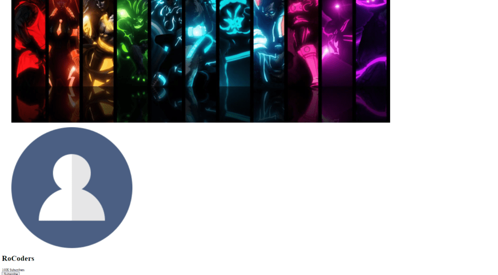
In the HTML file, inside body tag we’re writing div class name card and inside that we’re giving figure with class name card banner and inside that we’re writing image and giving source bc.jpg and next to that figure tag we’re creating another div with class name card header and inside that we’re giving another figure tag with class name card img and inside that we’re giving image with source profile.png.
next to figure tag we’re creating another div with class name card details and inside that we’re creating h1 heading with class name “name” and say that we’re writing RoCoders. next to that we’re creating another small tag with class name subs number and inside that we’re writing 100k subscribers and just outside that card header we’re creating another div with class name card description and inside that we’re giving four more div with class name line, next to that we’re creating another div with class name card footer and inside that we’re creating button tag with class name subs button and inside that we’re writing subscribe.
Setting Up Default values
:root {
    --body-bg : linear-gradient(45deg, #0e045d, #3302b6);
    --light-gray: #f5f5f5;
    --gray: #c0c0c0;
    --red: #d00;
    --white: #fff;
}

*,
*::before,
*::after {
    margin: 0;
    padding:0;
    box-sizing: border-box;
}

body {
    height: 100vh;
    background-image: var(--body-bg);
    font: 1rem sans-serif;

    display: flex;
    justify-content: center;
    align-items: center;
}
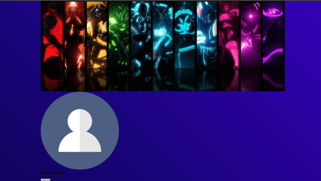
in the CSS file you can see body-bg for the variable we’re giving linear gradient, and we have kept two one dark and one light purple color, and we have created the custom color with its value, and in order to prevent the browser’s default margin and padding we have kept their margin 0 padding 0 as a value and also box size into border box.
now let’s style the body type, for the body tag we’re giving a height of 100vh, for the background image we’re using that body-bg variable, Let’s keep the font, for the font size we’re giving 1rem and for the font family we’re giving sans serif similarly lets keep this display flex by content center and also align items to center.
Setting Up Card Values
.card {
    width:45vw;
    height: 80vh;
    background-color: var(--white);
    border-radius: 10px;
    overflow: hidden;

    display: flex;
    flex-direction: column;
    justify-content: space-between;
}
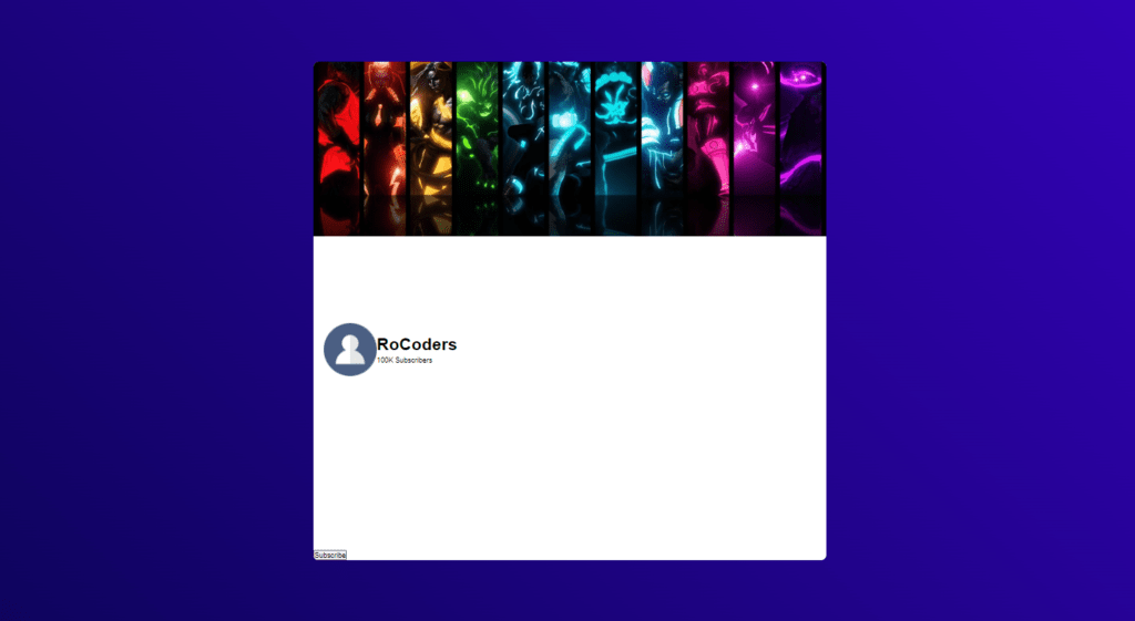
Now let’s style this class card, for the class card we’re giving width 45vw and for the height we’re giving 80vh similarly let’s keep background color of that white color, again we’re giving display flex for the card class and also flip direction to column and justify content space between.

Adjusting Card Banner, Header And Image
.card-banner {
    width: 100%;
    height: 35%;
}

.card figure img {
    width: 100%;
    height: 100%;
    object-fit: cover;

}

.card-header {
    width: 100%;
    display: flex;
    align-items: center;
    padding: 0 20px;
}

.card-img {
    width: 100px;
    height: 100px;
    border-radius: 50%;
}
Now let’s start this card banner class, so for the card banner class we’re giving width 100% and for the height we’re giving 35% and also let’s style this both images of figure tag so for the image we’re giving width and height 100%, also let’s give this object fit to cover.
now let’s install this card header class, for the card header class we’re giving width of 100% and let’s give display flex and also align items to center, and also we want to give some padding for the padding top and bottom we’re giving 0, and for the left and right we’re giving 20px.
now let’s give some round corners for the card so in the card class we’re giving border radius of 10px, for the card class overflow to hidden. for the class card-img we’re giving width of 100px and also height 100px, similarly let’s give some border radius of 50%.
Adding Card Details
.card-details > * {
    height: 15px;
    border-radius: 10px;
    margin-left: 15px;
}

.card-details .name {
    font-size: 1.4rem;
    margin-bottom: 15px;
}
for the class card details we want to apply the CSS property for all the children of that card details div so for that we’re giving greater than symbol and asterisk, so for that we’re giving height 15px and also for the border radius we’re giving 10px similarly we have keeping margin left 15px, now for the heading we’re giving font size of 1.4 rem similarly let’s give some margin bottom so for the margin button we’re giving 15px.
Adding Card Description
.card-description {
    padding: 0 20px;
}

.card-description .line {
    background-color: var(--gray);
    height: 13px;
    border-radius: 10px;
    margin: 14px 0;
}

.card-description .line:nth-child(1) {
    width: 90%;
}

.card-description .line:nth-child(3) {
    width: 80%;
}

.card-description .line:nth-child(4) {
    width: 40%;
}
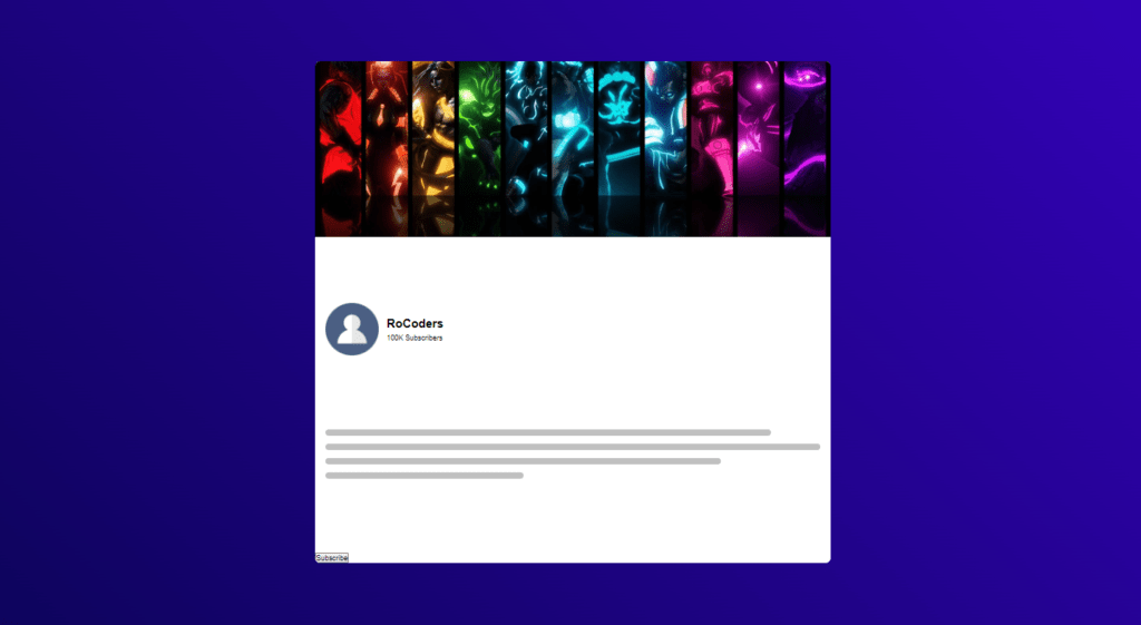
Let’s style this card description class, so for the card description class we’re giving padding for the top and bottom we’re giving 0 and for the left and right we’re giving 20px, now let’s style that line class, for the line class we’re giving background color of that gray color similarly let’s keep some border radius, for the body radius we’re giving 10px and also let’s keep some margin so for the margin top and bottom we’re giving 14px and for the left and right we’re giving 0.
Let’s target the first debate class name line so for that we’re giving nth child class so inside that we’re giving 1, so this 1 is targeting that first div class name line and for that we’re giving width 90%, now let’s duplicate this code, and we’re giving here 3, so that 3 will target the third div with class name line so for that we’re giving with 80%, let’s duplicate this code and also let’s change that 3 to 4 and for the fourth day with class name line we’re giving width of 40%.
Setting Up Card Footer And Button
.card-footer {
    padding: 20px;
    text-align: right;
    border-top: 1.2px solid var(--gray);
}

.subs_btn {
    width: 150px;
    height: 45px;
    background-color: var(--red);
    color: var(--white);
    font: 500 1.1rem sans-serif;
    border: none;
    outline: none;
    border-radius: 20px;
    cursor: pointer;
}
Now let’s customize card footer, for the class name card footer we’re giving padding 20px, and also let’s give text align to right, let’s keep some border top, for the border top width we’re giving 1.2px for the border style we’re giving solid and also for the border color we’re giving that gray color.
Now let’s customize subs_btn, we’re giving width of 150px and for the height we’re giving 45px similarly let’s give some background color to red, and also for the color we’re giving that white color now let’s give some font width we’re giving 500 and for the font size we’re giving 1.1rem and for the font family we’re giving sans serif, let’s remove that border, so we’re giving border none and also outline none, let’s give border radius to 20px, and also let’s give cursor to pointer.
Setting Up Loading Animation
.loading {
    background-color: var(--gray);
    color: transparent;
    background-image: linear-gradient(to right, transparent, #55555565, transparent);
    background-size: 200% 100%;
    animation: loading 1.6s linear infinite;
}

@keyframes loading {
    100% {
        background-position: -200% 0%;
    }
}
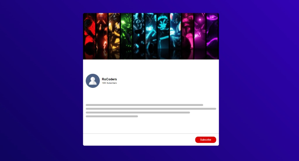
Now let’s customize loading, so for the class loading we’re giving background color of that gray color for the color we’re giving transparent, For the background image we’re giving linear-gradient we’re giving first parameter to right and transparent, and we’re giving dark gray that controls the transparency of that color, so that is the alpha value of that color so for the third color we’re giving transparent. similarly, let’s give background size to for the x-axis we’re giving 200% and for the y-axis we’re giving 100%.
Let’s give animation, for the animation we’re giving animation named loading for the animation duration we’re giving 1.6 second, for the timing function we’re giving linear as well as for the iteration count we’re giving infinite.
At 100% we’re giving background position for the x-axis, we’re giving -200% and for the y-axis we’re giving 0%.

Adding JavaScript To Card
const loadings = document.querySelectorAll('.loading');
const card_imgs = document.querySelectorAll('.card figure img');
const card_desp = document.querySelector(".card-description");

function renderCard() {

    for (loading of loadings) {
        loading.classList.remove('loading');
    }

    for (card_img of card_imgs) {
        card_img.style.visibility = 'visible';
    }

    card_desp.textContent = "Lorem ipsum dolor sit amet consectetur adipisicing elit. Laborum dolorem ullam non enim veniam, officia magnam expedita maiores saepe ea, praesentium quasi nobis explicabo ducimus hic exercitationem in tenetur aliquid?";
}

window.onload = () => {
    renderCard();
}
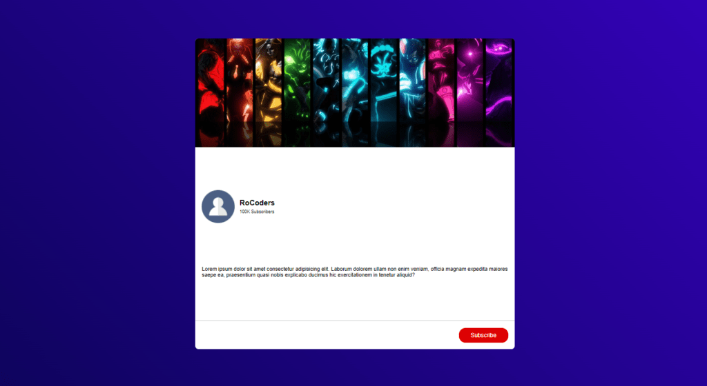
In the script.js file we want to target that loading class, for that we’re going to iterate loading class, card figure img, and card description, now we want to give loading.classlist.remove class name loading, so this code will help you to remove the class name loading from all the divs that has class name loading in the browser, we are iterating that card images so for that we’re writing card_img.style.visibility = visible. now for the card description we’re going to remove the line, and we’re going to give some paragraph some text, so for that we’re writing card_desp.textContent = some dummy text. now we want to create function name rendercard(), after that we’re writing window.onload inside that we’ll call the renderCard function.
Full Source Code Of Build Skeleton Loading Animation With CSS & JS
index.html
<!DOCTYPE html>
<html lang="en">

<head>
    <meta charset="UTF-8">
    <meta name="viewport" content="width=device-width, initial-scale=1.0">
    <meta http-equiv="X-UA-Compatible" content="ie=edge">
    <title>Skeleton Loader</title>
    <link rel="stylesheet" href="style.css">
</head>

<body>
    <div class="card">
        <figure class="card-banner loading">
            <img src="bg.jpg" alt="">
        </figure>

        <div class="card-header">
            <figure class="card-img loading">
                <img src="profile.png" alt="">
            </figure>

            <div class="card-details">
                <h1 class="name loading">RoCoders</h1>
                <small class="subs_no loading">100K Subscribers</small>
            </div>

        </div>

        <div class="card-description">
            <div class="line loading"></div>
            <div class="line loading"></div>
            <div class="line loading"></div>
            <div class="line loading"></div>
        </div>

        <div class="card-footer">
            <button class="subs_btn loading">Subscribe</button>
        </div>

    </div>

    <script src="script.js"></script>
</body>

</html>
style.css
:root {
    --body-bg : linear-gradient(45deg, #0e045d, #3302b6);
    --light-gray: #f5f5f5;
    --gray: #c0c0c0;
    --red: #d00;
    --white: #fff;
}

*,
*::before,
*::after {
    margin: 0;
    padding:0;
    box-sizing: border-box;
}

body {
    height: 100vh;
    background-image: var(--body-bg);
    font: 1rem sans-serif;

    display: flex;
    justify-content: center;
    align-items: center;
}

.card {
    width:45vw;
    height: 80vh;
    background-color: var(--white);
    border-radius: 10px;
    overflow: hidden;

    display: flex;
    flex-direction: column;
    justify-content: space-between;
}

.card-banner {
    width: 100%;
    height: 35%;
}

.card figure img {
    width: 100%;
    height: 100%;
    object-fit: cover;
    visibility: hidden;
}

.card-header {
    width: 100%;
    display: flex;
    align-items: center;
    padding: 0 20px;
}

.card-img {
    width: 100px;
    height: 100px;
    border-radius: 50%;
}

.card-details > * {
    height: 15px;
    border-radius: 10px;
    margin-left: 15px;
}

.card-details .name {
    font-size: 1.4rem;
    margin-bottom: 15px;
}

.card-description {
    padding: 0 20px;
}

.card-description .line {
    background-color: var(--gray);
    height: 13px;
    border-radius: 10px;
    margin: 14px 0;
}

.card-description .line:nth-child(1) {
    width: 90%;
}

.card-description .line:nth-child(3) {
    width: 80%;
}

.card-description .line:nth-child(4) {
    width: 40%;
}

.card-footer {
    padding: 20px;
    text-align: right;
    border-top: 1.2px solid var(--gray);
}

.subs_btn {
    width: 150px;
    height: 45px;
    background-color: var(--red);
    color: var(--white);
    font: 500 1.1rem sans-serif;
    border: none;
    outline: none;
    border-radius: 20px;
    cursor: pointer;
}

.loading {
    background-color: var(--gray);
    color: transparent;
    background-image: linear-gradient(to right, transparent, #55555565, transparent);
    background-size: 200% 100%;
    animation: loading 1.6s linear infinite;
}

@keyframes loading {
    100% {
        background-position: -200% 0%;
    }
}
script.js
const loadings = document.querySelectorAll('.loading');
const card_imgs = document.querySelectorAll('.card figure img');
const card_desp = document.querySelector(".card-description");

function renderCard() {

    for (loading of loadings) {
        loading.classList.remove('loading');
    }

    for (card_img of card_imgs) {
        card_img.style.visibility = 'visible';
    }

    card_desp.textContent = "Lorem ipsum dolor sit amet consectetur adipisicing elit. Laborum dolorem ullam non enim veniam, officia magnam expedita maiores saepe ea, praesentium quasi nobis explicabo ducimus hic exercitationem in tenetur aliquid?";
}

window.onload = () => {
    renderCard();
}
Output
And this is how you can Build Skeleton Loading Animation With CSS & JS.


