


Pre-requisites to Make Responsive Accordion UI Design Using HTML CSS & JavaScript
Setting up The Project
<!DOCTYPE html>
    <html lang="en">
    <head>
        <meta charset="UTF-8">
        <meta name="viewport" content="width=device-width, initial-scale=1.0">

        <!--=============== BOXICONS ===============-->
        <link rel="stylesheet" href="https://cdn.jsdelivr.net/npm/boxicons@latest/css/boxicons.min.css">

        <!--=============== CSS ===============-->
        <link rel="stylesheet" href="assets/css/styles.css">

        <title>Accordion</title>
    </head>
    <body>


        <!--=============== MAIN JS ===============-->
        <script src="assets/js/main.js"></script>
    </body>
</html>
Now, after the basic setup of HTML, we will add our accordions and the detailed content for them. For this, we have added a <div> for accordion, in this we will add a bunch of accordion items. Here, we will add a bx-plus for each of the accordion item, and then we will add a heading for them. After that, we will another div for the details of the accordion, in which we have added some random text. Like this, we have added a total of three accordion items and all have their individual detail <div>.
<section class="accordion container">
            <div class="accordion__container">
                <div class="accordion__item">
                    <header class="accordion__header">
                        <i class='bx bx-plus accordion__icon'></i>
                        <h3 class="accordion__title">What's an accordion?</h3>
                    </header>

                    <div class="accordion__content">
                        <p class="accordion__description">
                            An accordion always contains the category title, an expanded and a collapsed state,
                            an icon indicating expansion, and the spacing between them.
                        </p>
                    </div>
                </div>

                <div class="accordion__item">
                    <header class="accordion__header">
                        <i class='bx bx-plus accordion__icon'></i>
                        <h3 class="accordion__title">When and how should it be used?</h3>
                    </header>

                    <div class="accordion__content">
                        <p class="accordion__description">
                            It should be used when users only need a few key concepts or descriptions
                            of the content on a single page.
                        </p>
                    </div>
                </div>

                <div class="accordion__item">
                    <header class="accordion__header">
                        <i class='bx bx-plus accordion__icon'></i>
                        <h3 class="accordion__title">What happens if the user clicks on a collapsed card while another card is open?</h3>
                    </header>

                    <div class="accordion__content">
                        <p class="accordion__description">
                            It happens that the open card was closed, to give way to the information of the next
                            open card, but there are different designs that prefer it the other way around.
                        </p>
                    </div>
                </div>

                <div class="accordion__item">
                    <header class="accordion__header">
                        <i class='bx bx-plus accordion__icon'></i>
                        <h3 class="accordion__title">How to choose an icon to indicate expansion?</h3>
                    </header>

                    <div class="accordion__content">
                        <p class="accordion__description">
                            You must choose a different icon to open and close, so that the user
                            understands what action he took.
                        </p>
                    </div>
                </div>
            </div>
        </section>
Designing Accordion Items
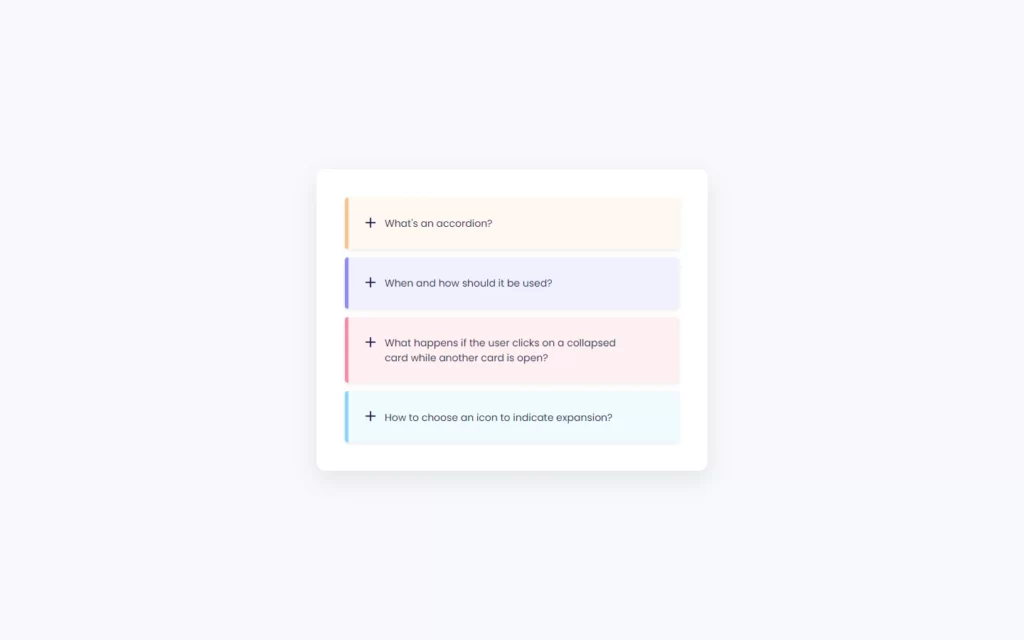
As we can see here, the output of our HTML is straight-forward, but it doesn’t look so good. So we will add our custom designs to these elements to make the output very attractive and good. Since this project mainly depends on JavaScript, and designing is purely depending on the user that how does user need this form to look a like, so we don’t get so much in the deep in CSS. You can also apply this below code to make this project similar. Also, we will provide the full source code for this, so you can easily download and use it.
But here let me point out one thing, we have added media query to add responsiveness to this accordion. Also, we have added overflow hidden, so that details of accordion items won’t show up. We have also added expansion size and colors after plus icon gets clicked.
/*=============== GOOGLE FONTS ===============*/
@import url("https://fonts.googleapis.com/css2?family=Poppins:wght@400;500;600&display=swap");
/*=============== VARIABLES CSS ===============*/
:root {
  /*========== Colors ==========*/
  --hue-color: 225;
  --first-color: hsl(var(--hue-color), 48%, 35%);
  --title-color: hsl(var(--hue-color), 48%, 22%);
  --text-color: hsl(var(--hue-color), 12%, 35%);
  --body-color: hsl(var(--hue-color), 49%, 98%);
  --container-color: #FFF;
  /*========== Font and typography ==========*/
  --body-font: 'Poppins', sans-serif;
  --normal-font-size: .938rem;
  --small-font-size: .813rem;
  --smaller-font-size: .75rem;
}

@media screen and (min-width: 968px) {
  :root {
    --normal-font-size: 1rem;
    --small-font-size: .875rem;
    --smaller-font-size: .813rem;
  }
}

/*=============== BASE ===============*/
* {
  box-sizing: border-box;
  padding: 0;
  margin: 0;
}

body {
  font-family: var(--body-font);
  font-size: var(--normal-font-size);
  background-color: var(--body-color);
  color: var(--text-color);
}

/*=============== LAYOUT ===============*/
.container {
  max-width: 968px;
  margin-left: 1rem;
  margin-right: 1rem;
}

/*=============== ACCORDION ===============*/
.accordion {
  display: grid;
  align-content: center;
  height: 100vh;
}

.accordion__container {
  display: grid;
  row-gap: .75rem;
  padding: 2rem 1rem;
  background-color: var(--container-color);
  border-radius: .5rem;
  box-shadow: 0 12px 32px rgba(51, 51, 51, 0.1);
}

.accordion__title {
  font-size: var(--small-font-size);
  color: var(--title-color);
  font-weight: 400;
  margin-top: .15rem;
  transition: .2s;
}

.accordion__header {
  display: flex;
  column-gap: .5rem;
  padding: 1.25rem 1.25rem 1.25rem 1rem;
  cursor: pointer;
}

.accordion__description {
  padding: 0 1.25rem 1.25rem 3rem;
  font-size: var(--smaller-font-size);
}

.accordion__icon {
  font-size: 1.5rem;
  height: max-content;
  color: var(--title-color);
  transition: .3s;
}

.accordion__item {
  box-shadow: 0 2px 6px rgba(38, 38, 38, 0.1);
  background-color: var(--container-color);
  border-radius: .25rem;
  position: relative;
  transition: all .25s ease;
}

.accordion__item::after {
  content: '';
  background-color: var(--first-color);
  width: 5px;
  height: 100%;
  position: absolute;
  top: 0;
  left: 0;
  border-radius: .25rem 0 0 .25rem;
}

.accordion__item:nth-child(1) {
  background-color: #fff7f0;
}

.accordion__item:nth-child(1)::after {
  background-color: #ffc08a;
}

.accordion__item:nth-child(2) {
  background-color: #f0f0ff;
}

.accordion__item:nth-child(2)::after {
  background-color: #8a8aff;
}

.accordion__item:nth-child(3) {
  background-color: #fff0f3;
}

.accordion__item:nth-child(3)::after {
  background-color: #ff8aa1;
}

.accordion__item:nth-child(4) {
  background-color: #f0faff;
}

.accordion__item:nth-child(4)::after {
  background-color: #8ad8ff;
}

.accordion__content {
  overflow: hidden;
  height: 0;
  transition: all .25s ease;
}

/*Rotate icon and add font weight to titles*/
.accordion-open .accordion__icon {
  transform: rotate(45deg);
}

.accordion-open .accordion__title {
  font-weight: 600;
}

/*=============== MEDIA QUERIES ===============*/
/* For medium devices */
@media screen and (min-width: 576px) {
  .accordion__container {
    width: 550px;
    padding: 2.5rem;
    justify-self: center;
    border-radius: .75rem;
  }
  .accordion__header {
    padding: 1.5rem;
  }
  .accordion__title {
    padding-right: 3.5rem;
  }
  .accordion__description {
    padding: 0 4rem 1.25rem 3.5rem;
  }
}

/* For large devices */
@media screen and (min-width: 968px) {
  .container {
    margin-left: auto;
    margin-right: auto;
  }
}
Setting up Click Events in JavaScript
Since our project looks cool and attractive, let’s add our functionalities using JavaScript. In JavaScript, we have declared a constant, in which we are fetching the all accordion classes using document.querySelectorAll('.accordion__item') method. With this method, we are targeting all the accordion_item classes.
const accordionItems = document.querySelectorAll('.accordion__item')Now after this, we are looping all the accordion_items one by one. In this loop, we have added a constant in which we will be fetching accordion_header class. Here, we have used item.querySelector('.accordion__header') the method to fetch the header class, since every accordion_item class has only one header class, so we can use querySelector() the method.
In the Header class, we had added a plus icon in our HTML. So we will add an event listener for click event. We have added an arrow function which will be called as soon as the icon gets clicked. In this event, we have added another constant, in which we have fetched accordion-open class, this class we have added in our CSS file.
After this, we have called a function named toggleItem which we will define later, and we will add the functionality to add expansion in this function later. Once the function, will be called we need to check where the openItem exist and also, where the openItem is not equal to item them we will again call the toggleItem function with openItem constant.
accordionItems.forEach((item) =>{
    const accordionHeader = item.querySelector('.accordion__header')


    accordionHeader.addEventListener('click', () =>{

        const openItem = document.querySelector('.accordion-open')

        toggleItem(item)

        if(openItem && openItem!== item){
            toggleItem(openItem)
        }
    })
})
Adding Function For Expansion
Now, after this, we just need to define our function toggleItem. In this function, we will fetch the accordion_content class, in which we have added our details for the content. Then we will check where the item contains the accordion-open class using item.classList.contains('accordion-open'). If it does contain the class, then we collapse this content back. And we will remove whichever styles are applied to expand the class. By the way, if accordion-class is added, that means accordion item is expanded.
And if the condition is false, then we just add some additional height, so that content description will show up. As we can see in the above CSS, we have added overflow to hidden, so that out of the accordion item won’t be shown up. And adding additional height to the accordion_content, which means we are providing some space to the accordion_content class and allowing the items to gain and show the content in that space. We have here used this accordionContent.style.height = accordionContent.scrollHeight + 'px' to increase the height of the accordion_content class. Also, we will add the accordion-open class which presents the content.
const toggleItem = (item) =>{

    const accordionContent = item.querySelector('.accordion__content')


    if(item.classList.contains('accordion-open')){
        accordionContent.removeAttribute('style')
        item.classList.remove('accordion-open')
    }else{

        accordionContent.style.height = accordionContent.scrollHeight + 'px'
        item.classList.add('accordion-open')
    }
}
Full Source Code to Make Responsive Accordion UI Design Using HTML CSS & JavaScript
index.html
<!DOCTYPE html>
    <html lang="en">
    <head>
        <meta charset="UTF-8">
        <meta name="viewport" content="width=device-width, initial-scale=1.0">

        <!--=============== BOXICONS ===============-->
        <link rel="stylesheet" href="https://cdn.jsdelivr.net/npm/boxicons@latest/css/boxicons.min.css">

        <!--=============== CSS ===============-->
        <link rel="stylesheet" href="assets/css/styles.css">

        <title>Accordion</title>
    </head>
    <body>
        <section class="accordion container">
            <div class="accordion__container">
                <div class="accordion__item">
                    <header class="accordion__header">
                        <i class='bx bx-plus accordion__icon'></i>
                        <h3 class="accordion__title">What's an accordion?</h3>
                    </header>

                    <div class="accordion__content">
                        <p class="accordion__description">
                            An accordion always contains the category title, an expanded and a collapsed state,
                            an icon indicating expansion, and the spacing between them.
                        </p>
                    </div>
                </div>

                <div class="accordion__item">
                    <header class="accordion__header">
                        <i class='bx bx-plus accordion__icon'></i>
                        <h3 class="accordion__title">When and how should it be used?</h3>
                    </header>

                    <div class="accordion__content">
                        <p class="accordion__description">
                            It should be used when users only need a few key concepts or descriptions
                            of the content on a single page.
                        </p>
                    </div>
                </div>

                <div class="accordion__item">
                    <header class="accordion__header">
                        <i class='bx bx-plus accordion__icon'></i>
                        <h3 class="accordion__title">What happens if the user clicks on a collapsed card while another card is open?</h3>
                    </header>

                    <div class="accordion__content">
                        <p class="accordion__description">
                            It happens that the open card was closed, to give way to the information of the next
                            open card, but there are different designs that prefer it the other way around.
                        </p>
                    </div>
                </div>

                <div class="accordion__item">
                    <header class="accordion__header">
                        <i class='bx bx-plus accordion__icon'></i>
                        <h3 class="accordion__title">How to choose an icon to indicate expansion?</h3>
                    </header>

                    <div class="accordion__content">
                        <p class="accordion__description">
                            You must choose a different icon to open and close, so that the user
                            understands what action he took.
                        </p>
                    </div>
                </div>
            </div>
        </section>

        <!--=============== MAIN JS ===============-->
        <script src="assets/js/main.js"></script>
    </body>
</html>
style.css
/*=============== GOOGLE FONTS ===============*/
@import url("https://fonts.googleapis.com/css2?family=Poppins:wght@400;500;600&display=swap");
/*=============== VARIABLES CSS ===============*/
:root {
  /*========== Colors ==========*/
  --hue-color: 225;
  --first-color: hsl(var(--hue-color), 48%, 35%);
  --title-color: hsl(var(--hue-color), 48%, 22%);
  --text-color: hsl(var(--hue-color), 12%, 35%);
  --body-color: hsl(var(--hue-color), 49%, 98%);
  --container-color: #FFF;
  /*========== Font and typography ==========*/
  --body-font: 'Poppins', sans-serif;
  --normal-font-size: .938rem;
  --small-font-size: .813rem;
  --smaller-font-size: .75rem;
}

@media screen and (min-width: 968px) {
  :root {
    --normal-font-size: 1rem;
    --small-font-size: .875rem;
    --smaller-font-size: .813rem;
  }
}

/*=============== BASE ===============*/
* {
  box-sizing: border-box;
  padding: 0;
  margin: 0;
}

body {
  font-family: var(--body-font);
  font-size: var(--normal-font-size);
  background-color: var(--body-color);
  color: var(--text-color);
}

/*=============== LAYOUT ===============*/
.container {
  max-width: 968px;
  margin-left: 1rem;
  margin-right: 1rem;
}

/*=============== ACCORDION ===============*/
.accordion {
  display: grid;
  align-content: center;
  height: 100vh;
}

.accordion__container {
  display: grid;
  row-gap: .75rem;
  padding: 2rem 1rem;
  background-color: var(--container-color);
  border-radius: .5rem;
  box-shadow: 0 12px 32px rgba(51, 51, 51, 0.1);
}

.accordion__title {
  font-size: var(--small-font-size);
  color: var(--title-color);
  font-weight: 400;
  margin-top: .15rem;
  transition: .2s;
}

.accordion__header {
  display: flex;
  column-gap: .5rem;
  padding: 1.25rem 1.25rem 1.25rem 1rem;
  cursor: pointer;
}

.accordion__description {
  padding: 0 1.25rem 1.25rem 3rem;
  font-size: var(--smaller-font-size);
}

.accordion__icon {
  font-size: 1.5rem;
  height: max-content;
  color: var(--title-color);
  transition: .3s;
}

.accordion__item {
  box-shadow: 0 2px 6px rgba(38, 38, 38, 0.1);
  background-color: var(--container-color);
  border-radius: .25rem;
  position: relative;
  transition: all .25s ease;
}

.accordion__item::after {
  content: '';
  background-color: var(--first-color);
  width: 5px;
  height: 100%;
  position: absolute;
  top: 0;
  left: 0;
  border-radius: .25rem 0 0 .25rem;
}

.accordion__item:nth-child(1) {
  background-color: #fff7f0;
}

.accordion__item:nth-child(1)::after {
  background-color: #ffc08a;
}

.accordion__item:nth-child(2) {
  background-color: #f0f0ff;
}

.accordion__item:nth-child(2)::after {
  background-color: #8a8aff;
}

.accordion__item:nth-child(3) {
  background-color: #fff0f3;
}

.accordion__item:nth-child(3)::after {
  background-color: #ff8aa1;
}

.accordion__item:nth-child(4) {
  background-color: #f0faff;
}

.accordion__item:nth-child(4)::after {
  background-color: #8ad8ff;
}

.accordion__content {
  overflow: hidden;
  height: 0;
  transition: all .25s ease;
}

/*Rotate icon and add font weight to titles*/
.accordion-open .accordion__icon {
  transform: rotate(45deg);
}

.accordion-open .accordion__title {
  font-weight: 600;
}

/*=============== MEDIA QUERIES ===============*/
/* For medium devices */
@media screen and (min-width: 576px) {
  .accordion__container {
    width: 550px;
    padding: 2.5rem;
    justify-self: center;
    border-radius: .75rem;
  }
  .accordion__header {
    padding: 1.5rem;
  }
  .accordion__title {
    padding-right: 3.5rem;
  }
  .accordion__description {
    padding: 0 4rem 1.25rem 3.5rem;
  }
}

/* For large devices */
@media screen and (min-width: 968px) {
  .container {
    margin-left: auto;
    margin-right: auto;
  }
}
main.js
/*=============== ACCORDION ===============*/
const accordionItems = document.querySelectorAll('.accordion__item')

// 1. Selecionar cada item
accordionItems.forEach((item) =>{
    const accordionHeader = item.querySelector('.accordion__header')

    // 2. Seleccionar cada click del header
    accordionHeader.addEventListener('click', () =>{
        // 7. Crear la variable
        const openItem = document.querySelector('.accordion-open')

        // 5. Llamar a la funcion toggle item
        toggleItem(item)

        // 8. Validar si existe la clase
        if(openItem && openItem!== item){
            toggleItem(openItem)
        }
    })
})

// 3. Crear una funcion tipo constante
const toggleItem = (item) =>{
    // 3.1 Crear la variable
    const accordionContent = item.querySelector('.accordion__content')

    // 6. Si existe otro elemento que contenga la clase accorion-open que remueva su clase
    if(item.classList.contains('accordion-open')){
        accordionContent.removeAttribute('style')
        item.classList.remove('accordion-open')
    }else{
        // 4. Agregar el height maximo del content
        accordionContent.style.height = accordionContent.scrollHeight + 'px'
        item.classList.add('accordion-open')
    }
}
Output
Check out video reference here:


