In this article, We are going to create jumping square animation with HTML and CSS. We have here a square that is jumping on something like the rubber it changes its shape and also those sticks are skewing in order to create the natural effect. Again, this project going to be based on purely HTML and CSS.
PREREQUISITES OF JUMPING SQUARE ANIMATION USING HTML AND CSS
- Basic knowledge of HTML.
- You must be aware with basic CSS and animation based CSS.
IMPLEMENTATION OF JUMPING SQUARE ANIMATION WITH HTML AND CSS
Let’s go ahead and get started, Open the index.html file and create a basic HTML document, let’s place here an exclamation mark (!) and then hit tab or enter, okay first of all let’s go ahead and change the title it’s going to be jumping square and then link the CSS file let’s specify here style.css.
 <div class="container">
      <div class="wrapper">
        <div class="rubber"></div>
        <div class="stick left-stick"></div>
        <div class="stick right-stick"></div>
        <div class="square"></div>
      </div>
    </div>
First we’re going to create the html markup, Let’s open the <div> tag which is going to be the container then we’re going to open another <div> tag which will wrap the entire animation it’s going to be wrapper so inside the wrapper we will have a couple of different elements the first one is going to be the rubber then we will have two sticks let’s use here classes stick and left stick then duplicate this code and change left into right and finally let’s create another div tag which is going to be the square.
SETTING UP DEFAULT VALUES
* {
  margin: 0;
  padding: 0;
  box-sizing: border-box;
}

html {
  font-size: 62.5%;
}
.container {
  width: 100%;
  height: 100vh;
  display: grid;
  place-items: center;
}
We’re going to create some reset and default styles for every element, Let’s select them using an asterisk (*). we’re going to get rid of default margin and padding let’s set both properties to 0 and also set box sizing to border box, So throughout this project we’re going to use rem as a measurement unit right now one ram equals 16 pixels by default and we need to convert one rem into 10 pixels for that we have to decrease the font size of the html element and we have to make it 62.5 percent.
Next container, Let’s define its width and height the width is going to be 100 as for the height we’re going to make it 100 of the viewport that’s it about the container and we will divide this container a grid, After that we want to place every element in center.
SETTING UP BACKGROUND FOR JUMPING SQUARE
.wrapper {
  width: 100rem;
  height: 80rem;
  background-color: #1f5050;
  border-radius: 5rem;
  box-shadow: 2rem 2rem 6rem #888;
  position: relative;
  overflow: hidden;
}
.wrapper div {
  position: absolute;
}
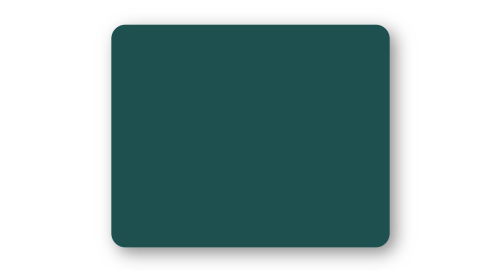
Now we’re going to customize the wrapper, first of all let’s define width and height the width is going to be 100 rem as for the height we’re going to make it 80 rem and also change the background color let’s make it #1f5050, Next we’re going to make it a little bit rounded so let’s use border radius with a value 5 rem and also create some shadow effect let’s place here 2 rem 2 rem 6 rem and as the color we’re going to use #888.
We need to set position of every wrapper element absolute.
SETTING UP THE STICKS
.stick {
  width: 3rem;
  height: 40rem;
  background-color: coral;
  border-radius: 1rem 1rem 0 0;
  bottom: 0;
  transform-origin: bottom center;
}

.left-stick {
  left: 15rem;
  box-shadow: 0.2rem 0 0.5rem #555;
  animation: leftStickAnim 2s infinite linear;
}
.right-stick {
  right: 15rem;
  box-shadow: -0.2rem 0 0.5rem #555;
  animation: rightStickAnim 2s infinite linear;
}
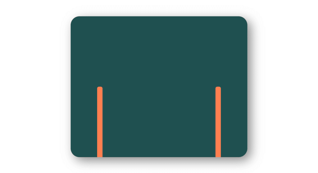
Let’s move on and start to work on the sticks, Change the background color we’re going to use here color called coral so here we have both sticks let’s make their top sides slightly rounded use border radius with the values 1rem 1rem and for those are the top sides and then we need 0 and 0. After that let’s take care of the positions of the sticks both of them will have bottom 0.
Next we’re going to define the positions for the sticks separately, let’s select left stick and set the left position to 15 rem let’s duplicate this code change left to right also we need here right with the same value, Besides that we’re going to add a little shadow effect to both sticks let’s start with the left stick the values will be 0.2 rem 0.5 rem and the color #555. as for the right stick we will need a similar shadow effect but the first value will be negative.
SETTING UP THE RUBBER
.rubber {
  width: 67rem;
  height: 50rem;
  left: 16.5rem;
  bottom: 24rem;
  border-bottom: 1rem solid coral;
  box-shadow: 0 1rem 0 #ddd;
  animation: rubberAnim 2s infinite linear;
}
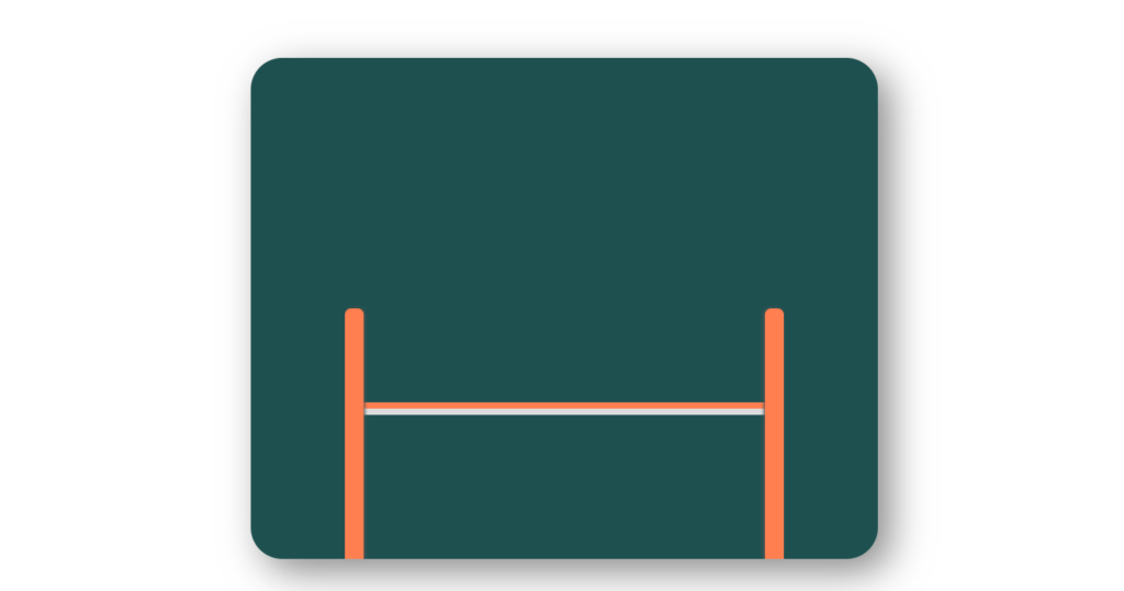
Let’s take care of the rubber, Let’s define left position it’s going to be 16.5 rem as for the bottom it’s going to be 24 rem besides that we’re going to add to it border at the bottom and also a shadow so the border bottom is going to be 1rem solid and the color is going to be coral as for the box shadow we need here 0 1rem 0 and the color is going to be #ddd, And for animation we will use keyframe “rubberAnim” for 2 second duration for infinite time with linear animation.
SETTING UP THE SQUARE
.square {
  width: 14rem;
  aspect-ratio: 1;
  background-color: #fff;
  border-radius: 2rem;
  left: 44rem;
  box-shadow: 0 0 0.2rem #555;
  animation: squareAnim 2s infinite linear;
}
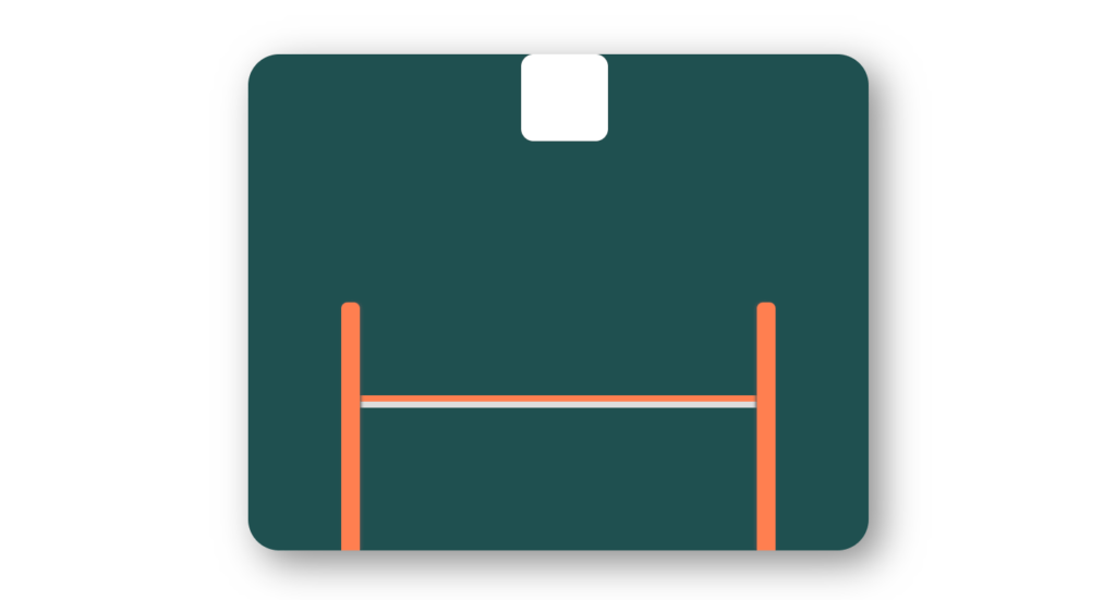
Next we’re going to take care of the square, Let’s change the background color make it white and also we’re going to make the square rounded using border radius 2 rem, next Let’s change the position of the square let’s define left position make it 44 rem and also we’re going to add to the square a little shadow let’s insert here 0 0 0.2rem and the color #555 after that for animation purpose we will use keyframe let’s say “squareAnim” with 2 seconds duration for infinite time.
ADDING ANIMATIONS AND DEFINING KEYFRAMES
@keyframes rubberAnim {
  0%,
  20% {
    border-radius: 0;
    transform: translateY(0);
  }

  50%,
  60% {
    border-radius: 0 0 35rem 35rem;
    transform: translateY(23rem);
  }

  65%,
  100% {
    border-radius: 0;
    transform: translateY(0);
  }
}

@keyframes leftStickAnim {
  0%,
  30% {
    transform: rotateZ(0);
  }

  50%,
  65% {
    transform: rotateZ(2deg);
  }

  80%,
  100% {
    transform: rotateZ(0);
  }
}

@keyframes rightStickAnim {
  0%,
  30% {
    transform: rotateZ(0);
  }

  50%,
  65% {
    transform: rotateZ(-2deg);
  }

  80%,
  100% {
    transform: rotateZ(0);
  }
}

@keyframes squareAnim {
  0% {
    transform: translateY(5rem);
  }

  20% {
    transform: translateY(40rem);
  }

  50%,
  60% {
    transform: translateY(64.5rem);
  }

  62% {
    transform: translateY(45rem);
  }

  80% {
    transform: translateY(10rem) rotateZ(90deg);
  }

  100% {
    transform: translateY(5rem) rotateZ(90deg);
  }
}
So everything is ready to start to work on the animations, Let’s start with the rubber so throughout the animation we will change the border radius and also we will move down the rubber itself so we will have a couple of different steps at 0% and 20%, here the border radius is going to be 0 and then we need transform translate with y direction and with value 0 next we’ll have 50% and 60% percent on those steps we’ll change the border radius and move the rubber down so the border radius is going to be 0 0 35 rem and 35 rem again as for the transform translate y it’s going to be 23 rem and finally the last two steps will be 65% and 100% here we will change the border radius and move the element to its default place.
Next we have to create the animation for the square we should match the movements of the square, So from 0% to 20% we should move the square a little bit down so at 0% we need transform translate y with the value 5%, Then from 20% to 50% we have to move the square down again so the value is going to be 40 rem, Then at 50% and 60% will move the element down but with a different speed so the value is going to be 64.5 round,
next comes 62 percent where we have to move square up the value is going to be 45 rem, after that we’ll have 80 or we have to move the element up and also rotate it so the value is going to be 10 rem and also we need to add here rotate z 90 degrees and finally at 100 we need to move again the element up and rotate so the value is going to be 5 rem.
We have to do is to create the animations for the sticks they should skew once the square hits the rubber, Animation we should rotate the stick according to the z-axis at 0 and 30 we won’t rotate the element yet so we need transform rotate z with value 0, then at 50 and 65 percent will rotate the stick slightly so the value is going to be 2 degrees and finally at 80 and 100 will rotate the stick back to its default position so the value is going to be 0. For the right stick as well, we’re going to copy this code and paste it down, We need to change the value of the rotate z function it should be -2 degrees.
FULL SOURCE CODE JUMPING SQUARE ANIMATION WITH HML AND CSS
index.html
<!DOCTYPE html>
<html lang="en">
  <head>
    <meta charset="UTF-8" />
    <meta http-equiv="X-UA-Compatible" content="IE=edge" />
    <meta name="viewport" content="width=device-width, initial-scale=1.0" />
    <title>Jumping Square</title>
    <link rel="stylesheet" href="style.css" />
  </head>
  <body>
    <div class="container">
      <div class="wrapper">
        <div class="rubber"></div>
        <div class="stick left-stick"></div>
        <div class="stick right-stick"></div>
        <div class="square"></div>
      </div>
    </div>
  </body>
</html>
STYLE.CSS
* {
  margin: 0;
  padding: 0;
  box-sizing: border-box;
}

html {
  font-size: 62.5%;
}

.container {
  width: 100%;
  height: 100vh;
  display: grid;
  place-items: center;
}

.wrapper {
  width: 100rem;
  height: 80rem;
  background-color: #1f5050;
  border-radius: 5rem;
  box-shadow: 2rem 2rem 6rem #888;
  position: relative;
  overflow: hidden;
}

.wrapper div {
  position: absolute;
}

.rubber {
  width: 67rem;
  height: 50rem;
  left: 16.5rem;
  bottom: 24rem;
  border-bottom: 1rem solid coral;
  box-shadow: 0 1rem 0 #ddd;
  animation: rubberAnim 2s infinite linear;
}

@keyframes rubberAnim {
  0%,
  20% {
    border-radius: 0;
    transform: translateY(0);
  }

  50%,
  60% {
    border-radius: 0 0 35rem 35rem;
    transform: translateY(23rem);
  }

  65%,
  100% {
    border-radius: 0;
    transform: translateY(0);
  }
}

.stick {
  width: 3rem;
  height: 40rem;
  background-color: coral;
  border-radius: 1rem 1rem 0 0;
  bottom: 0;
  transform-origin: bottom center;
}

.left-stick {
  left: 15rem;
  box-shadow: 0.2rem 0 0.5rem #555;
  animation: leftStickAnim 2s infinite linear;
}

@keyframes leftStickAnim {
  0%,
  30% {
    transform: rotateZ(0);
  }

  50%,
  65% {
    transform: rotateZ(2deg);
  }

  80%,
  100% {
    transform: rotateZ(0);
  }
}

.right-stick {
  right: 15rem;
  box-shadow: -0.2rem 0 0.5rem #555;
  animation: rightStickAnim 2s infinite linear;
}

@keyframes rightStickAnim {
  0%,
  30% {
    transform: rotateZ(0);
  }

  50%,
  65% {
    transform: rotateZ(-2deg);
  }

  80%,
  100% {
    transform: rotateZ(0);
  }
}

.square {
  width: 14rem;
  aspect-ratio: 1;
  background-color: #fff;
  border-radius: 2rem;
  left: 44rem;
  box-shadow: 0 0 0.2rem #555;
  animation: squareAnim 2s infinite linear;
}

@keyframes squareAnim {
  0% {
    transform: translateY(5rem);
  }

  20% {
    transform: translateY(40rem);
  }

  50%,
  60% {
    transform: translateY(64.5rem);
  }

  62% {
    transform: translateY(45rem);
  }

  80% {
    transform: translateY(10rem) rotateZ(90deg);
  }

  100% {
    transform: translateY(5rem) rotateZ(90deg);
  }
}
OUTPUT
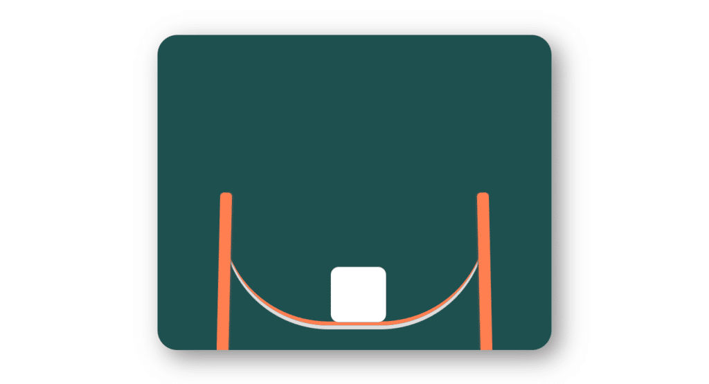
And BOOM…. you have made amazing looking jumping square animation with HTML and CSS only.


