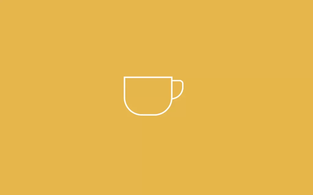
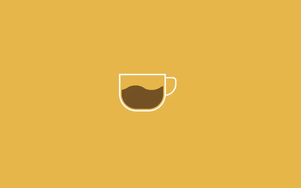
In this article, we are going to make Coffee Cup Loading Animation In CSS, or you can say CSS animations. So in here we will have a cup of a coffee, and also an image of coffee. We will just animate the coffee image, which looks like filling the cup. This is going to be so simple project, and you will learn animations in CSS with this project.
Pre-requisites To Make Coffee Cup Loading Animation In CSS
- Basic knowledge of HTML.
- Basic knowledge of CSS.
Creating HTML Markup and Setting up The Value
<!DOCTYPE html>
<html>
    <head>
        <title>Coffee Cup Filling</title>
        <link rel="stylesheet" href="style.css">
    </head>
    <body>
        <div class="cup">
            <div class="handle"></div>
        </div>
    </body>
</html>
body{
background-color: #e6b54a;
margin: 0px;
padding: 0px;
}In the HTML part, we have just added a div with class cup which will have another div with class handle, and lastly we have linked our CSS file.
Now we have done with HTML part, time to move on our main part which is our CSS. We have reset default HTML values with margin and padding to 0px, also we have colored our screen with #e6b54a, which is somewhat orange color.

Creating The Cup
.cup{
height: 140px;
width: 180px;
border: 6px solid #e6b54a;
position: absolute;
top: 40%;
left: 40%;
border-radius: 0px 0px 70px 70px;
box-shadow: 0px 0px 0px 6px white;
}
.handle{
height: 70px;
width: 40px;
background-color: transparent;
border: 6px solid white;
position: relative;
left: 186px;
top: 2px;
border-radius: 0px 25px 80px 0px;
}Now let’s create our cup, first we have set some height and width then we have gave some border, also adjusted our cup from top and left. After that, we have added radius to the border of 70px, so it forms some round shape. Also, we have added some shadow to the cup.
After that let’s add the handle, we have added some height and width, also background we need here transparent for handle. Here we have added position to relative, so this handle won’t get collapsed to our cup, we require it outside the cup. Now we have adjusted with left and top property. And lastly, we have gave some round shape to our handle as well.

Adding Coffee and Animations
.cup{
height: 140px;
width: 180px;
border: 6px solid #e6b54a;
position: absolute;
top: 40%;
left: 40%;
border-radius: 0px 0px 70px 70px;
background: url(coffee.png);
box-shadow: 0px 0px 0px 6px white;
background-repeat: repeat-x;
background-position: 0px 140px;
animation: fill 5s infinite;
}
@keyframes fill{
0%{
background-position: 0px 140px;
}
20%
{
background-position: -450px 100px;
}
40%{
background-position: -900px 50px;
}
80%{
background-position: -1350px -40px;
}
100%{
background-position: 0px 140px;;
}
}Now for animations, we need to add a coffee image here, also we have set it to repetition in X co-ordinates which means our image will get repeated column wise, or you can say horizontally. We have added our image into the cup using background position which specific.
Now we have our coffee in the cup, after this we want to give animation which should look like getting filled. For that, we have added animation fill for 5 second time duration, and it runs for infinite times. Now to define fill we use @keyframes in CSS, we will add conditions like when we reach to 0% of our time which 5 seconds then we need our image position at 0px 140px. Here, 0px will be horizontal position and 140px will be vertical position. Like wise, we have adjusted all the positions, so it looks smoother animation.

Full Source Code of Coffee Cup Loading Animation In CSS
index.html
<!DOCTYPE html>
<html>
<head>
<title>Coffee Cup Filling</title>
<link rel="stylesheet" href="style.css">
</head>
<body>
<div class="cup">
<div class="handle"></div>
</div>
</body>
</html>style.css
body{
    background-color: #e6b54a;
    margin: 0px;
    padding: 0px;
}
.cup{
height: 140px;
width: 180px;
border: 6px solid #e6b54a;
position: absolute;
top: 40%;
left: 40%;
border-radius: 0px 0px 70px 70px;
background: url(coffee.png);
box-shadow: 0px 0px 0px 6px white;
background-repeat: repeat-x;
background-position: 0px 140px;
animation: fill 5s infinite;
}
.handle{
height: 70px;
width: 40px;
background-color: transparent;
border: 6px solid white;
position: relative;
left: 186px;
top: 2px;
border-radius: 0px 25px 80px 0px;
}
@keyframes fill{
0%{
background-position: 0px 140px;
}
20%
{
background-position: -450px 100px;
}
40%{
background-position: -900px 50px;
}
80%{
background-position: -1350px -40px;
}
100%{
background-position: 0px 140px;;
}
}Output


