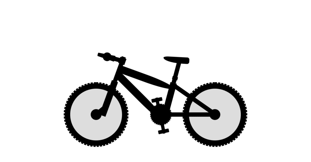
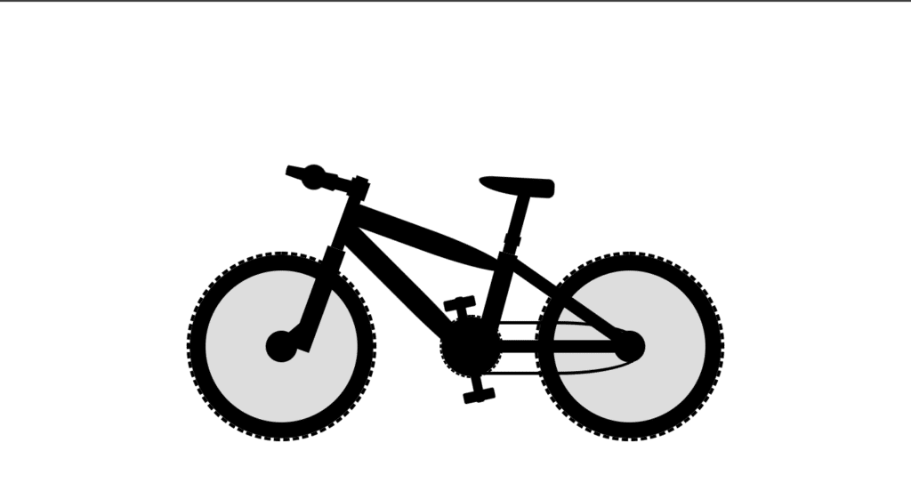
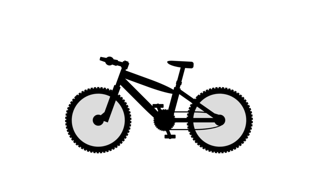
In this article, we’re going to build a bicycle using HTML and CSS. We have here a typical bicycle, Which is moving using CSS animations all the parts are created using HTML so we don’t use here any of the images.
PREREQUISITES OF MOVING BICYCLE USING HTML AND CSS
- Basic knowledge of HTML.
- Should be aware with CSS and CSS3 Animations.
IMPLEMENTATION OF MOVING BICYCLE USING HTML AND CSS
Let’s go ahead and start to build the project, we have to create our working files for HTML and CSS. So first of all link the style.css file. Then let’s open the div tag with the class bicycle it will include all the different parts of the bicycle.
<div class="bicycle">
      <div class="wheel front-wheel"></div>
      <div class="front-fork">
        <div class="tube"></div>
      </div>
Let’s start with the front wheel of a div tag this element will have two different classes one for the common styles and the next one for the individual styles we need wheel and front wheel also we’ll have back wheel so let’s duplicate this line of code and change the class name next comes the front fork this element will include tube.
CREATION OF PARTS OF MOVING BICYCLE
Now we created wheels and tube for bicycle now we will create other parts.
<div class="handlebars"></div>
      <div class="crossbar"></div>
      <div class="frame-1"></div>
      <div class="frame-2"></div>
      <div class="seat-tube">
        <div class="seat"></div>
      </div>
      <div class="crank"></div>
      <div class="chain"></div>
      <div class="pedals"></div>
      <div class="back-fork"></div>
      <div class="wheel back-wheel"></div>
    </div>
next we’ll have handlebars then crossbar after that we’ll have frames, The next part is going to be seed tube which will include another development seed then we’ll have crank then chain pedals and back-fork so that’s it all the parts are created.
DEFAULT SETTINGS TO MOVE BICYCLE IN CENTER
We have now created every parts of bicycle which won’t be look good and pretty so we need to style our bicycle.
* {
  margin: 0;
  padding: 0;
  box-sizing: border-box;
}

html {
  font-size: 62.5%;
}

body {
  width: 100%;
  height: 100vh;
  display: grid;
  place-items: center;
}
.bicycle {
  width: 85rem;
  height: 60rem;
  position: relative;
}
Let’s create some reset and default styles we’re going to select every element using an asterisk(*). We will use rem as the measurement unit by default one rem equals 16 pixels. We have to decrease the font size of the html element let’s set it to 62.5 percent, let’s move on and start to work on the body elements we’re going to define its width and height the width is going to be 100 as for the height we’re going to make it 100 of the viewport, Next we’ll going to customize the bicycle let’s define its width and height the width is going to be 85 rem then the height will be 60 rem.
CUSTOMIZING WHEELS FOR BICYCLE
.wheel {
  width: 30rem;
  aspect-ratio: 1;
  background-color: #000;
  border-radius: 50%;
  bottom: 0;
  border: 0.5rem dashed #000;
  background-clip: content-box;
  display: grid;
  place-items: center;
  animation: bicycleAnim 5s infinite linear;
}

.wheel::after {
  content: "";
  width: 24rem;
  aspect-ratio: 1;
  position: absolute;
  border-radius: 50%;
  border: 9.5rem solid #ddd;
  box-sizing: border-box;
}

.back-wheel {
  right: 0;
}
Let’s define width it’s going to be 30 rem then we’re going to set height to the same value and therefore we’re going to use one of the properties called aspect ratio and we have to set it to 1. also we’re going to make the element rounded using border radius 50, We need to position absolute for every element inside the bicycle therefore let’s select every development and assign to them position absolute besides that we have to position elements according to the bicycle, The parent element so let’s assign to it position relative, Bottom position for the wheels we’re going to set it to 0.
we’re going to use aspect ratio with the value 1 then use some temporary background color let’s say red and also set position to absolute next we’re going to make the element rounded using border radius 50 percent and also we’re going to place it in the center of the wheel for that we can use CSS grid, finally we’re going to get rid of this red background color okay so now both wheels are placed together and we’re going to move the back wheel to the right side, so select back wheel and set its right position to zero.
In back-wheel, We need to change the left and top positions the left position is going to be 60 rem and the top property is going to be 26 rem and also we need to rotate the elements let’s use transform rotate z with the value minus 55 degrees, We need to use again the z index property let’s set it to 10.

CUSTOMIZING FORK FOR BICYCLE
.front-fork {
  width: 3rem;
  height: 17rem;
  background-color: #000;
  bottom: 15rem;
  left: 16.5rem;
  transform: rotateZ(20deg);
  transform-origin: left bottom;
}

.front-fork::before {
  content: "";
  width: 2rem;
  height: 5rem;
  background-color: #000;
  position: absolute;
  bottom: 0;
  left: 0.5rem;
  transform: rotateZ(30deg) translateX(-1rem);
}

.back-fork {
  width: 2rem;
  height: 25rem;
  background-color: #000;
  left: 60rem;
  top: 26rem;
  transform: rotateZ(-55deg);
  z-index: 10;
}
To style the front fork, Let’s define the position of the elements let’s set bottom property to 15 rem as for the left position it’s going to be 16.5 rem, We need transform rotate z with the value 20 degrees, We need to change transform origin and we have to make it left bottom.
In front-fork::before, Set bottom property to zero and then let’s define left position make it point five round all right finally we need to rotate the elements and also we have to move it a little bit to the left side let’s use transform then rotate Z 30 degrees and also we have to use translate x function with a value -1 ram.

CUSTOMIZING TUBE FOR BICYCLE
.tube {
  width: 2rem;
  height: 12rem;
  background-color: #000;
  left: 0.5rem;
  top: -12rem;
}

.tube::before {
  content: "";
  width: 3rem;
  height: 3rem;
  background-color: #000;
  position: absolute;
  left: -0.5rem;
  top: 0.5rem;
}
The next part that we’re going to customize is going to be a tube, define left and top properties the left position is going to be 0.5 ram as for the top position we’re going to make it minus 12 rem.
In tube::before, We’re going to set width and height both of them to three rem change the background color make it black then we’re going to change the position of the element let’s set position to absolute and then use left and top properties the left position is going to be minus 0.5 rem as for the top position we’re going to make it 0.5 round.

CUSTOMIZING HANDLEBARS FOR BICYCLE
.handlebars {
  width: 8rem;
  height: 2rem;
  background-color: #000;
  top: 18rem;
  left: 19rem;
  transform: rotateZ(15deg);
  perspective: 50rem;
}

.handlebars::before {
  content: "";
  width: 4rem;
  aspect-ratio: 1;
  background-color: #000;
  position: absolute;
  top: -1rem;
  left: -1rem;
  border-radius: 50%;
}

.handlebars::after {
  content: "";
  width: 30rem;
  height: 2rem;
  background-color: #000;
  position: absolute;
  left: -15.5rem;
  transform: rotateY(-70deg);
  border-radius: 2rem;
}
The next part of the bicycle which will be the handlebars, We’re going to define the top and left positions the top property is going to be 18 rem as for the left position we’re going to make it 19 rem, let’s rotate the element use transform rotate z function with value 15 degrees.
In handlebars::before, we’re going to set top property to -1 rem, Then the left position is going to be -1 rem and also we need here border radius with the value 50.
Select handlebars followed by the after. Let’s define left position and make it minus 15.5 ram after that we need to rotate the element according to the y-axis the value is going to be minus 70 degrees and also “perspective” it allows us to create the 3d environment let’s set this property to 50 rem.

CUSTOMIZING CROSSBARS FOR BICYCLE
.crossbar {
  width: 27rem;
  height: 3.5rem;
  background-color: #000;
  top: 22rem;
  left: 26rem;
  transform: rotateZ(20deg);
  transform-origin: left top;
  border-radius: 0 50% 50% 0;
}
next we’re going to take care of the crossbar, We need to rotate the elements let’s use transform rotate z with the value 20 degrees so again the element is rotated from the center and we have to change the transform origin in this case we have to make it left top, we’re going to use border radius the values will be the following we need 0 50% 50% and again 0.

CUSTOMIZING FRAMES FOR BICYCLE
.frame-1 {
  width: 32rem;
  height: 3.5rem;
  background-color: #000;
  top: 25rem;
  left: 26rem;
  transform: rotateZ(45deg);
  transform-origin: left top;
  border-radius: 0 50% 50% 0;
}

.frame-2 {
  width: 25rem;
  height: 2rem;
  background-color: #000;
  top: 44rem;
  left: 45rem;
  z-index: 10;
}
Let’s select the frame one and define the positions the top property is going to be 25 rem as for the left position let’s make it 26 rem next we’re going to rotate the element let’s use transform rotate z and the value is going to be 45 degrees. Let’s use transform origin and make it left top. The shape of the elements use again for the radius with the values 0 50% 50% and again 0.
Select frame two and define top and left positions, The top property is going to be 44 rem as for the left position we’re going to make it 45 rem, Set z-index to some higher value than 0 let’s say 10.

CUSTOMIZING SEAT-TUBE FOR BICYCLE
.seat-tube {
  width: 3rem;
  height: 18.5rem;
  background-color: #000;
  top: 30rem;
  left: 47rem;
  transform: rotateZ(15deg);
}

.seat-tube::before {
  content: "";
  width: 2rem;
  height: 11rem;
  position: absolute;
  background-color: #000;
  top: -11rem;
  left: 0.5rem;
}

.seat-tube::after {
  content: "";
  width: 2.5rem;
  height: 1.5rem;
  position: absolute;
  background-color: #000;
  top: -3rem;
  left: 0.25rem;
}
the next part which is going to be a seat tube, Change the positions of the element the top property is going to be 30 rem then we need left position it’s going to be 47 rem and also rotate the element let’s use transform rotate z with value 15 degrees.
In seat-tube::before let’s define top and left positions the top property is going to be -11 rem as for the left position i’m going to make it 0.5 rem.
let’s change top and left positions the top position is going to be -3 ram as for the left position.

CUSTOMIZING SEAT FOR BICYCLE
.seat {
  width: 12rem;
  height: 3rem;
  background-color: #000;
  top: -12rem;
  left: -6rem;
  transform: rotateZ(-12deg);
  border-radius: 20% 1rem 1rem 80%;
}
Let’s define the top position is going to be minus 12 ram then the left position will be -6 ram next we’re going to rotate the seat, let’s use transform rotate z with the value minus 12 degrees and also we need to change the shape of the seed let’s use border radius with the values 20 percent then 1 rem twice and 80%.

CUSTOMIZING CRANK FOR BICYCLE
.crank {
  width: 10rem;
  height: 10rem;
  background-color: #000;
  border-radius: 50%;
  top: 40rem;
  left: 40rem;
  border: 0.3rem dashed #000;
  background-clip: content-box;
  animation: bicycleAnim 10s infinite linear;
}
next we need to take care of the crank, Let’s add the border to the crank the width is going to be 0.3 ram the border will be dashed and we need to use again background clip with value content box, We also require to add animation with the help of keyframe named “bicycleAnim” for infinite time.

CUSTOMIZING PEDALS FOR BICYCLE
.pedals {
  width: 1.5rem;
  height: 17rem;
  background-color: #000;
  top: 37rem;
  left: 44rem;
  transform: rotateZ(-12deg);
  border-radius: 0.5rem;
  animation: bicycleAnim 10s infinite linear;
}

.pedals::before,
.pedals::after {
  content: "";
  width: 5rem;
  height: 1.7rem;
  background-color: #000;
  position: absolute;
  left: -1.8rem;
  border-radius: 0.3rem;
  animation: bicycleAnim 10s infinite linear reverse;
}

.pedals::before {
  top: 0.2rem;
}

.pedals::after {
  bottom: 0.2rem;
}
Let’s move on and take care of the pedals, top position is going to be 37 rem as for the left position we’re going to make it 44 rem, next let’s rotate the element and also we’re going to make it slightly rounded let’s use transform rotate z with a value minus 12 degrees and also we need to put a radius 0.5 rem.
we need to add here the actual pedals, We need to set position to absolute and then let’s define the left position it’s going to be minus 1.8 rem and lastly we’re going to make the elements rounded use border radius with the value 0.3 rem, so right now both elements are placed together so we need to define the positions separately let’s select pedals before and define top position make it 0.2 ram.

CUSTOMIZING CHAIN FOR BICYCLE
.chain {
  width: 31.5rem;
  height: 8.5rem;
  border: 0.5rem solid #000;
  top: 41rem;
  left: 40.5rem;
  border-radius: 5rem 50% 50% 5rem;
  z-index: 10;
}
The last part that we need to customize is a chain, We need border let’s make it 0.5 rem solid and black and then define the position of the chain the top position is going to be 41 rem as for the left position we’re going to make it 40.5 rem, next we need to make the chain rounded so let’s use border radius with the values 5 rem 50% 50% 5 rem with the index with the value 10.

ADDING ANIMATION TO BICYCLE
@keyframes bicycleAnim {
  0% {
    transform: rotateZ(0);
  }

  100% {
    transform: rotateZ(-360deg);
  }
}
we have finished building the bicycle and now we have to take care of the animations let’s go ahead and start with the wheels we need to rotate them by 360 degrees let’s create this is keyframes we’re going to call it “bicycleAnim” actually we will need the same keyframes for all the parts that will move so in this case we will have two steps at 0% and we need to rotate the element by minus 360 degrees.
FULL SOURCE OF BICYCLE USING HTML AND CSS
index.html
<!DOCTYPE html>
<html lang="en">
  <head>
    <meta charset="UTF-8" />
    <meta http-equiv="X-UA-Compatible" content="IE=edge" />
    <meta name="viewport" content="width=device-width, initial-scale=1.0" />
    <title>Bicycle</title>
    <link rel="stylesheet" href="style.css" />
  </head>
  <body>
    <div class="bicycle">
      <div class="wheel front-wheel"></div>
      <div class="front-fork">
        <div class="tube"></div>
      </div>
      <div class="handlebars"></div>
      <div class="crossbar"></div>
      <div class="frame-1"></div>
      <div class="frame-2"></div>
      <div class="seat-tube">
        <div class="seat"></div>
      </div>
      <div class="crank"></div>
      <div class="chain"></div>
      <div class="pedals"></div>
      <div class="back-fork"></div>
      <div class="wheel back-wheel"></div>
    </div>
  </body>
</html>
style.css
* {
    margin: 0;
    padding: 0;
    box-sizing: border-box;
  }

  html {
    font-size: 62.5%;
  }

  body {
    width: 100%;
    height: 100vh;
    display: grid;
    place-items: center;
  }

  .bicycle {
    width: 85rem;
    height: 60rem;
    position: relative;
  }

  @keyframes bicycleAnim {
    0% {
      transform: rotateZ(0);
    }

    100% {
      transform: rotateZ(-360deg);
    }
  }

  .bicycle div {
    position: absolute;
  }

  .wheel {
    width: 30rem;
    aspect-ratio: 1;
    background-color: #000;
    border-radius: 50%;
    bottom: 0;
    border: 0.5rem dashed #000;
    background-clip: content-box;
    display: grid;
    place-items: center;
    animation: bicycleAnim 5s infinite linear;
  }

  .wheel::after {
    content: "";
    width: 24rem;
    aspect-ratio: 1;
    position: absolute;
    border-radius: 50%;
    border: 9.5rem solid #ddd;
    box-sizing: border-box;
  }

  .back-wheel {
    right: 0;
  }

  .front-fork {
    width: 3rem;
    height: 17rem;
    background-color: #000;
    bottom: 15rem;
    left: 16.5rem;
    transform: rotateZ(20deg);
    transform-origin: left bottom;
  }

  .front-fork::before {
    content: "";
    width: 2rem;
    height: 5rem;
    background-color: #000;
    position: absolute;
    bottom: 0;
    left: 0.5rem;
    transform: rotateZ(30deg) translateX(-1rem);
  }

  .tube {
    width: 2rem;
    height: 12rem;
    background-color: #000;
    left: 0.5rem;
    top: -12rem;
  }

  .tube::before {
    content: "";
    width: 3rem;
    height: 3rem;
    background-color: #000;
    position: absolute;
    left: -0.5rem;
    top: 0.5rem;
  }

  .handlebars {
    width: 8rem;
    height: 2rem;
    background-color: #000;
    top: 18rem;
    left: 19rem;
    transform: rotateZ(15deg);
    perspective: 50rem;
  }

  .handlebars::before {
    content: "";
    width: 4rem;
    aspect-ratio: 1;
    background-color: #000;
    position: absolute;
    top: -1rem;
    left: -1rem;
    border-radius: 50%;
  }

  .handlebars::after {
    content: "";
    width: 30rem;
    height: 2rem;
    background-color: #000;
    position: absolute;
    left: -15.5rem;
    transform: rotateY(-70deg);
    border-radius: 2rem;
  }

  .crossbar {
    width: 27rem;
    height: 3.5rem;
    background-color: #000;
    top: 22rem;
    left: 26rem;
    transform: rotateZ(20deg);
    transform-origin: left top;
    border-radius: 0 50% 50% 0;
  }

  .frame-1 {
    width: 32rem;
    height: 3.5rem;
    background-color: #000;
    top: 25rem;
    left: 26rem;
    transform: rotateZ(45deg);
    transform-origin: left top;
    border-radius: 0 50% 50% 0;
  }

  .frame-2 {
    width: 25rem;
    height: 2rem;
    background-color: #000;
    top: 44rem;
    left: 45rem;
    z-index: 10;
  }

  .seat-tube {
    width: 3rem;
    height: 18.5rem;
    background-color: #000;
    top: 30rem;
    left: 47rem;
    transform: rotateZ(15deg);
  }

  .seat-tube::before {
    content: "";
    width: 2rem;
    height: 11rem;
    position: absolute;
    background-color: #000;
    top: -11rem;
    left: 0.5rem;
  }

  .seat-tube::after {
    content: "";
    width: 2.5rem;
    height: 1.5rem;
    position: absolute;
    background-color: #000;
    top: -3rem;
    left: 0.25rem;
  }

  .seat {
    width: 12rem;
    height: 3rem;
    background-color: #000;
    top: -12rem;
    left: -6rem;
    transform: rotateZ(-12deg);
    border-radius: 20% 1rem 1rem 80%;
  }

  .back-fork {
    width: 2rem;
    height: 25rem;
    background-color: #000;
    left: 60rem;
    top: 26rem;
    transform: rotateZ(-55deg);
    z-index: 10;
  }

  .crank {
    width: 10rem;
    height: 10rem;
    background-color: #000;
    border-radius: 50%;
    top: 40rem;
    left: 40rem;
    border: 0.3rem dashed #000;
    background-clip: content-box;
    animation: bicycleAnim 10s infinite linear;
  }

  .pedals {
    width: 1.5rem;
    height: 17rem;
    background-color: #000;
    top: 37rem;
    left: 44rem;
    transform: rotateZ(-12deg);
    border-radius: 0.5rem;
    animation: bicycleAnim 10s infinite linear;
  }

  .pedals::before,
  .pedals::after {
    content: "";
    width: 5rem;
    height: 1.7rem;
    background-color: #000;
    position: absolute;
    left: -1.8rem;
    border-radius: 0.3rem;
    animation: bicycleAnim 10s infinite linear reverse;
  }

  .pedals::before {
    top: 0.2rem;
  }

  .pedals::after {
    bottom: 0.2rem;
  }

  .chain {
    width: 31.5rem;
    height: 8.5rem;
    border: 0.5rem solid #000;
    top: 41rem;
    left: 40.5rem;
    border-radius: 5rem 50% 50% 5rem;
    z-index: 10;
  }
OUTPUT

And BOOM… this is how you can make an animated bicycle using HTML and CSS.


