In this article, we’re going to be creating Ball Animation With CSS project, the project we have here an animated ball that is moving up and down it’s hitting the squares which are coming from the left and right sides also we have here a moving background which makes an illusion that the ball moves up.
PREREQUISITES OF CREATE A BALL ANIMATION WITH CSS KEYFRAMES
- Basic knowledge of HTML.
- Should be aware with CSS animations.
IMPLEMENTING BASIC HTML FILE
<div class="wrapper">
      <div class="block block-1"></div>
      <div class="block block-2"></div>
      <div class="ball"></div>
    </div>
Create our working files we will have just two files index.html and style.css, Let’s open the index.html file and create a basic html document we’re going to use an exclamation(!) mark, and then we have to hit top or enter, we’re going to insert here ball animation after that we’re going to link the CSS file.
We’re going to create a html markup, let’s open div tag with the class wrapper it will include the entire content so inside the wrapper we’re going to have three different <div> elements the first two <div> elements will be for squares as for the third div element it’s going to be the ball so let’s open div tag with the class block it will be the common class name but besides that we need individual class let’s say block one let’s duplicate this line of code and change the class name we need block two okay let’s open another div tag with the class ball.
SETTING UP DEFAULT VALUES
* {
  margin: 0;
  padding: 0;
  box-sizing: border-box;
}

html {
  font-size: 62.5%;
}

body {
  width: 100%;
  height: 100vh;

}
Let’s create some default and common styles for every element let’s select an asterisk(*), we’re going to get rid of default margin and padding let’s set both properties to 0, and also we’re going to set box sizing to border box, we have to decrease the font size of the html element we need to set it to 62.5 percent, Let’s go ahead and style the body elements we’re going to define width and height let’s set width to 100% as for the height we’re going to make it 100 of the viewport so let’s set it to 100vh.
SETTING UP BACKGROUND IMAGE
body {
  width: 100%;
  height: 100vh;
  display: grid;
  place-items: center;
}
.wrapper {
  width: 70rem;
  aspect-ratio: 1;
  background-image: url(images/bg.png);
}
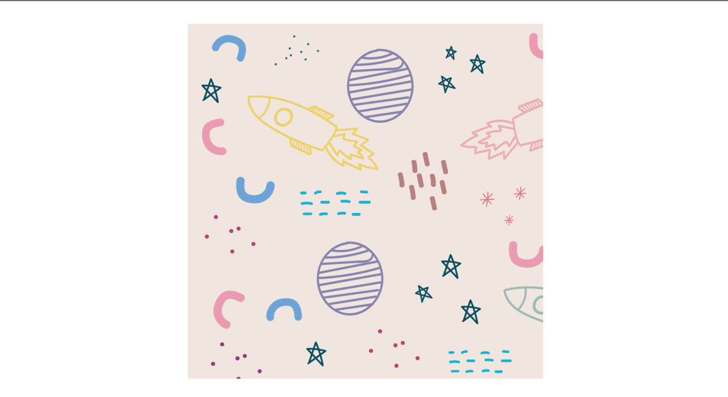
Next we’re going to take care of the wrapper, define width we’re going to set width to 70rem, we will use one of the CSS properties called aspect ratio if we set it to 1 then it will mean that the wrapper will get a height equal to 70rem as well, let’s go ahead and define the background let’s set background image to URL, and we need the path of the image we have folder called images, and we have to select pg.png.
Before we move on we just need to place the wrapper in the center of the page for that let’s use CSS grid we’re going to set display to grid and then in order to place the element in the center we need place items center.
SETTING UP THE BLOCKS
.wrapper {
  width: 70rem;
  aspect-ratio: 1;
  background-image: url(images/bg.png);
  position: relative;
}

.block {
  width: 18rem;
  aspect-ratio: 1;
  background-color: rgb(51, 184, 184);
  position: absolute;

}

.block-1 {
  top: 16rem;
  right: 44rem;

}

.block-2 {
  top: 16rem;
  right: 8rem;
 }
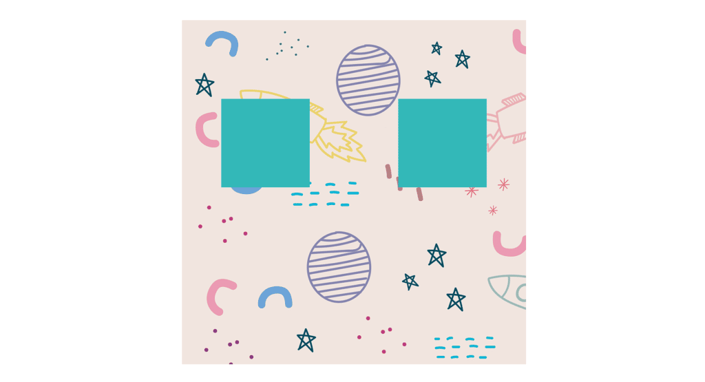
Let’s move on and so to work on the boxes, as you know they have a common class block so let’s go ahead and select it and define the width we’re going to set width to 18rem we need those elements to be squares so let’s use again aspect ratio with value 1 and also change the background color we’re going to use your rgb(51,184,184). let’s go ahead and define the positions we’re going to set the position to absolute, and then in order to position the element according to the wrapper let’s set the wrapper’s position to a relative.
Let’s select block-1 and define top and right properties we’re going to set top position to 16rem as for the right position it’s going to be 44rem then we’re going to duplicate this code let’s change the class name we need block-2 the top position is going to be the same as for the right position we’re going to set it to 8rem.
SETTING UP THE BALL
.ball {
  width: 12rem;
  aspect-ratio: 1;
  background-color: rgb(255, 118, 118);
  border-radius: 50%;
  position: absolute;
  left: 29rem;
  top: 22rem;

}
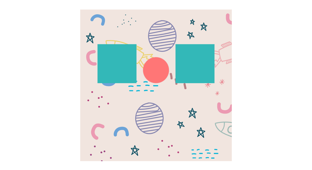
Now it’s time to take care of the ball, We’re going to define the width let’s set it to 12rem we need the same height for the ball, so we’re going to use again property called aspect ratio with the value 1 and then let’s change the background color let’s use rgb(255,118,118). let’s make this element rounded using border radius with the value 50% and then let’s take care of its position we’re going to set position to absolute, and then we’re going to define left-hand top properties left position is going to be 29rem as for the top position it’s going to be 22rem.
ANIMATING THE SQUARES
.wrapper {
  width: 70rem;
  aspect-ratio: 1;
  background-image: url(images/bg.png);
  position: relative;
  overflow: hidden;
}

.block-1 {
  top: 16rem;
  right: 44rem;
  transform-origin: bottom right;
  animation: block1Anim 5s infinite linear;
}

@keyframes block1Anim {
  0% {
    transform: translateY(-38rem) rotateZ(0);
    opacity: 0.5;
  }

  30% {
    transform: translateY(0) rotateZ(0);
  }

  40%,
  45% {
    transform: translateY(0) rotateZ(-180deg);
    opacity: 1;
  }

  55%,
  100% {
    transform: translateY(38rem) rotateZ(-180deg);
    opacity: 0.5;
  }
}

.block-2 {
  top: 16rem;
  right: 8rem;
  transform-origin: bottom left;
  animation: block2Anim 5s 2.5s infinite linear;
}

@keyframes block2Anim {
  0% {
    transform: translateY(-38rem) rotateZ(0);
    opacity: 0.5;
  }

  30% {
    transform: translateY(0) rotateZ(0);
  }

  40%,
  45% {
    transform: translateY(0) rotateZ(180deg);
    opacity: 1;
  }

  55%,
  100% {
    transform: translateY(38rem) rotateZ(180deg);
    opacity: 0.5;
  }
}
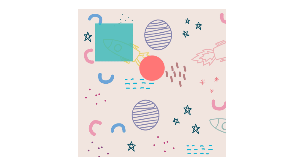
Let’s start with the square’s animation, let’s go ahead and create the CSS keyframes in which we have to define the CSS rules that will be applied to these squares during the animation so the keyframes will consist of different steps we’re going to call it block1Anim so from 0% to 30% we have to change its opacity so at 0%.
we’re going to use transform with the function translate y as the value we’re going to use here -38rem, and also we have to define here rotate z function with 0 degree. and we need opacity to be 0.5, at 30% the element moves down at its default position still without rotation.
So we need here transform translate y with 0 and again rotate z with 0, we will increase the opacity so at 40% we need transform translate y with 0 and rotate z with the value -180 degrees, and also we need to increase the opacity let’s make it 1, from 40 to 45 we need these same styles.
So place with comma 45%, next step is going to be 55 at this step we need transform translate y with the value 38rem, and also we need the rotation rotate z -180 degrees, and also we need to decrease the opacity let’s set it to 0.5. we need the same styles from 55% to 100% so let’s add here 100 then we have to define the name of the animation block1Anim the next value is going to be the duration 5s next we have to insert your infinite, and we’re going to make the animation linear.
we need to make transform-origin to bottom right, we have to assign overflow hidden to the wrapper okay so that’s it about the first square we need the same for the second one as well actually we’re going to duplicate the entire keyframes, let’s change the name we need block2Anim next we need to get rid of the ‘-’ signs from here because we need to rotate the second square to the opposite direction and besides that we have to change the origin of the transformation in this case we need bottom left, we need here a delay time for the second square let’s make it 2.5 seconds.
ANIMATING THE BALL
.block-2 {
  top: 16rem;
  right: 8rem;
  transform-origin: bottom left;
  animation: block2Anim 5s -2.5s infinite linear;
}

.ball {
  width: 12rem;
  aspect-ratio: 1;
  background-color: rgb(255, 118, 118);
  border-radius: 50%;
  position: absolute;
  left: 29rem;
  top: 22rem;
  animation: ballAnim 2.5s -1.5s infinite linear;
}

@keyframes ballAnim {
  0% {
    transform: translateY(-20rem) scale(0.8, 1);
  }

  45% {
    transform: translateY(0) scale(0.9, 1);
  }

  50% {
    transform: translateY(2rem) scale(1, 0.7);
  }

  60% {
    transform: translateY(-10rem) scale(0.9, 1);
  }

  100% {
    transform: translateY(-20rem) scale(0.8, 1);
  }
}
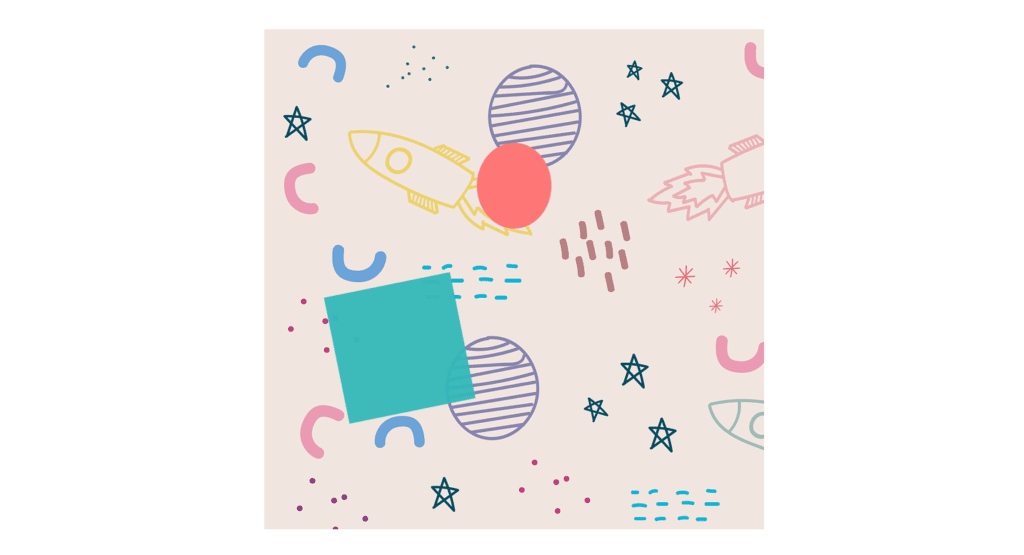
Let’s go ahead and start to work on ball, create CSS keyframes for the ball we’re going to call it ballAnim, so in the ball animation we’ll have five different steps from 0% to 45 the ball will move up, and also it will shrink slightly so at 0% we’re going to use transform translate y with the value -20rem and also in order to shrink the element slightly we’re going to use scale function we need here to pass 0.8 as the value of the x direction as for the y direction is going to be 1.
at 45 we need transform translate y with value 0, and also we need to change the scale it’s going to be 0.9 and one the next step is going to be 50% we need to transform translate y with value 2rem and the scale is going to be 1 and 0.7, at 60 percent we’re going to use transform translate y with the value -10rem as for the scale it’s going to be 0.9 and 1. at 100% when you transform translate y with the value -20rem as for the scale it’s going to be 0.8 and 1.
let’s use animation property we need the name of the animation ballAnim then the duration is going to be 2.5 seconds also the animation should run infinitely, and it’s going to be linear, we need to change the delay times for the second square it’s going to be minus 2.5 seconds, we’re going to increase the delay time let’s set it to 1.5 seconds.
ANIMATING THE BACKGROUND
.wrapper {
  width: 70rem;
  aspect-ratio: 1;
  background-image: url(images/bg.png);
  background-size: auto 70rem;
  background-repeat: repeat-y;
  position: relative;
  overflow: hidden;
  animation: bgAnim 5s infinite linear;
}

@keyframes bgAnim {
  0% {
    background-position: center 0;
  }

  100% {
    background-position: center 70rem;
  }
}

.block {
  width: 18rem;
  aspect-ratio: 1;
  background-color: rgb(51, 184, 184);
  position: absolute;
  box-shadow: 0.2rem 0.2rem 0.4rem #aaa inset, -0.2rem -0.2rem 0.4rem #aaa inset;
}
Now we have to take care of the background before we start to work on the animation we’re going to add a couple of background styles to the wrapper we need to define the size of the background this property will take two values the width of the background will be auto as for the height we’re going to set it to 70rem, we’re going to define background repeat with the value repeat Y, now we need to animate the background during the animation we need to move the entire background down, and we’re going to do that using the property called background position,
Let’s create keyframes with the name bgAnim so at 0% we’re going to set background position to center and 0 that’s for the 100 the background position is going to be center and 70rem, let’s apply these rules to the wrapper use animation property with the name bgAnim then the duration is going to be 5 seconds, and also we need here infinite and linear.
also we need to add one little thing to the squares let’s add to them a little shadow effect. let’s use box shadow with the values 0.2rem 0.2rem then 0.4rem as the color we’re going to use #aaa actually the shadow is going to be inside the element, so we need here inset, and we want the shadow all around the square, so we need here other values as well -0.2 rem -0.2 rem 0.4 m then the color #aaa and again inset.
FULL SOURCE CODE OF CREATE A BALL ANIMATION WITH CSS KEYFRAMES
index.html
<!DOCTYPE html>
<html lang="en">
  <head>
    <meta charset="UTF-8" />
    <meta http-equiv="X-UA-Compatible" content="IE=edge" />
    <meta name="viewport" content="width=device-width, initial-scale=1.0" />
    <title>Ball Animation</title>
    <link rel="stylesheet" href="style.css" />
  </head>
  <body>
    <div class="wrapper">
      <div class="block block-1"></div>
      <div class="block block-2"></div>
      <div class="ball"></div>
    </div>
  </body>
</html>
style.css
* {
  margin: 0;
  padding: 0;
  box-sizing: border-box;
}

html {
  font-size: 62.5%;
}

body {
  width: 100%;
  height: 100vh;
  display: grid;
  place-items: center;
}

.wrapper {
  width: 70rem;
  aspect-ratio: 1;
  background-image: url(images/bg.png);
  background-size: auto 70rem;
  background-repeat: repeat-y;
  position: relative;
  overflow: hidden;
  animation: bgAnim 5s infinite linear;
}

@keyframes bgAnim {
  0% {
    background-position: center 0;
  }

  100% {
    background-position: center 70rem;
  }
}

.block {
  width: 18rem;
  aspect-ratio: 1;
  background-color: rgb(51, 184, 184);
  position: absolute;
  box-shadow: 0.2rem 0.2rem 0.4rem #aaa inset, -0.2rem -0.2rem 0.4rem #aaa inset;
}

.block-1 {
  top: 16rem;
  right: 44rem;
  transform-origin: bottom right;
  animation: block1Anim 5s infinite linear;
}

@keyframes block1Anim {
  0% {
    transform: translateY(-38rem) rotateZ(0);
    opacity: 0.5;
  }

  30% {
    transform: translateY(0) rotateZ(0);
  }

  40%,
  45% {
    transform: translateY(0) rotateZ(-180deg);
    opacity: 1;
  }

  55%,
  100% {
    transform: translateY(38rem) rotateZ(-180deg);
    opacity: 0.5;
  }
}

.block-2 {
  top: 16rem;
  right: 8rem;
  transform-origin: bottom left;
  animation: block2Anim 5s -2.5s infinite linear;
}

@keyframes block2Anim {
  0% {
    transform: translateY(-38rem) rotateZ(0);
    opacity: 0.5;
  }

  30% {
    transform: translateY(0) rotateZ(0);
  }

  40%,
  45% {
    transform: translateY(0) rotateZ(180deg);
    opacity: 1;
  }

  55%,
  100% {
    transform: translateY(38rem) rotateZ(180deg);
    opacity: 0.5;
  }
}

.ball {
  width: 12rem;
  aspect-ratio: 1;
  background-color: rgb(255, 118, 118);
  border-radius: 50%;
  position: absolute;
  left: 29rem;
  top: 22rem;
  animation: ballAnim 2.5s -1.5s infinite linear;
}

@keyframes ballAnim {
  0% {
    transform: translateY(-20rem) scale(0.8, 1);
  }

  45% {
    transform: translateY(0) scale(0.9, 1);
  }

  50% {
    transform: translateY(2rem) scale(1, 0.7);
  }

  60% {
    transform: translateY(-10rem) scale(0.9, 1);
  }

  100% {
    transform: translateY(-20rem) scale(0.8, 1);
  }
}
OUTPUT
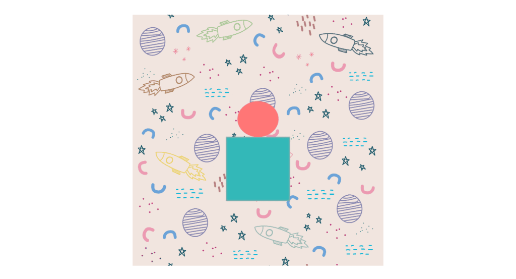
And this is how you can make a simple “create a ball animation with CSS keyframes” project.


