By using this site, you agree to the Privacy Policy and Terms of Use.
Accept
rocoderesrocoderes
  • Home
  • HTML & CSS
    • Login and Registration Form
    • Card Design
    • Loader
  • JavaScript
  • Python
  • Internet
  • Landing Pages
  • Tools
    • Google Drive Direct Download Link Generator
    • Word Count
  • Games
    • House Painter
Notification Show More
Latest News
How to set the dropdown value by clicking on a table row
Javascript – How to set the dropdown value by clicking on a table row
JavaScript
Attempting to increase the counter, when the object's tag exist
Javascript – Attempting to increase the counter, when the object’s tag exist
JavaScript
Cycle2 JS center active slide
Javascript – Cycle2 JS center active slide
JavaScript
Can import all THREE.js post processing modules as ES6 modules except OutputPass
Javascript – Can import all THREE.js post processing modules as ES6 modules except OutputPass
JavaScript
How to return closest match for an array in Google Sheets Appscript
Javascript – How to return closest match for an array in Google Sheets Appscript
JavaScript
Aa
Aa
rocoderesrocoderes
Search
  • Home
  • HTML & CSS
    • Login and Registration Form
    • Card Design
    • Loader
  • JavaScript
  • Python
  • Internet
  • Landing Pages
  • Tools
    • Google Drive Direct Download Link Generator
    • Word Count
  • Games
    • House Painter
Follow US
High Quality Design Resources for Free.
rocoderes > JavaScript > How to Make Full Screen Image Slider in JavaScript
JavaScript

How to Make Full Screen Image Slider in JavaScript

Admin
Last updated: 2022/12/03 at 4:35 AM
Admin
Share
12 Min Read
Full Screen Image Slider

In this article, we will make full screen image slider in JavaScript with owl carousel. In this, we will have an image and some information in the different slides, and these slides we are going to control with the help of owl carousel and JavaScript. We will autoplay these slides on some certain amount of time, and these also, going to be controlled with mouse as well. Owl carousel will make this thing very easy. This is going to be very easy and beginner-friendly project, let’s just make this step-by-step.

Contents
Pre-requisites to Make Full Screen Image Slider in JavaScript with owl carouselCreating HTML SkeletonAdding Styles to All ElementsAdding Functionality to SlidesFull Source Code of Full Screen Image Slider in JavaScript with owl carouselOutputYou may also like:
Demo

Pre-requisites to Make Full Screen Image Slider in JavaScript with owl carousel

  • Basic knowledge of HTML.
  • Good knowledge of CSS.
  • Good knowledge of JavaScript.
  • Basic knowledge of jQuery and Owl Carousel.

Creating HTML Skeleton

 <!DOCTYPE html>
 <html lang="en">
 <head>
     <meta charset="UTF-8">
     <title>two way slider with owl</title>
     
     <link rel="stylesheet" href="https://cdnjs.cloudflare.com/ajax/libs/font-awesome/4.7.0/css/font-awesome.min.css">
     
     
     <link rel="stylesheet" href="https://maxcdn.bootstrapcdn.com/bootstrap/3.3.7/css/bootstrap.min.css">

     <link rel="stylesheet" href="owl.carousel.min.css">
     
    <script src="https://ajax.googleapis.com/ajax/libs/jquery/3.3.1/jquery.min.js"></script>

    <script src="owl.carousel.min.js"></script>

    <script src="https://maxcdn.bootstrapcdn.com/bootstrap/3.3.7/js/bootstrap.min.js"></script>
</head>
<body>
     
     <br><br><br><br>
     
     <section class="hero">
         <div class="container">
             <div class="row">
                 <div class="col-md-5">
                     <div class="hero-img">
                         <img src="huk4.jpg" alt="" class="img-responsive">
                         
                     </div>
                 </div>
                 <br><br>
                 
                 <div class="col-md-7">
                     
                         
                         <div class="content">
                             <h3><b>About Me</b></h3>
                             <br>
                             <span class="sub-title">
                                 UI/UX Designer & Web Developer
                             </span>
                             <p class="pb-10">
                              Lorem ipsum dolor sit amet, consectetur adipisicing elit. Ipsa facere adipisci architecto eligendi ratione optio molestiae amet unde eius impedit?
                                 
                                       
                             </p>
                             <br>
                             <p>
                                 Lorem ipsum dolor sit amet, consectetur adipisicing elit. Eaque explicabo inventore eligendi earum debitis natus.
                             </p>
                             <br><br><br>
                             
                             <div class="info">
                                 <ul>
                                     <li>
                                         <span class="title">Name</span>
                                         <span class="value">Jerry Kon</span>
                                     </li>
                                     
                                     <li>
                                         <span class="title">Email</span>
                                         <span class="value">whoweare@gm.com</span>
                                     </li>
                                     
                                     <li>
                                         <span class="title">Cell</span>
                                         <span class="value">9988999999</span>
                                     </li>
                                      
                                       <li>
                                         <span class="title">Phone</span>
                                         <span class="value">9988999999</span>
                                     </li>
                                     
                                     <li>
                                         <span class="title">Age</span>
                                         <span class="value">29Yrs</span>
                                     </li>
                                 
                                 </ul>
                                 
                               <div class="social-icon">
                                   <a href="">
                                       <span><i class="fa fa-facebook"></i></span>
                                  
                                   </a> 
                                      
                                  <a href="">
                                       <span><i class="fa fa-twitter"></i></span>
                                  
                                   </a>
                                   
                                           
                                  <a href="">
                                       <span><i class="fa fa-linkedin"></i></span>
                                  
                                   </a>
                                   
                                  <a href="">
                                       <span><i class="fa fa-behance"></i></span>
                                  
                                   </a>
                                      
                                  <a href="">
                                       <span><i class="fa fa-youtube"></i></span>
                                  
                                   </a>
                             
                               </div>  
                           
                             </div>
                        
                         </div>
                         
                         
                 <div class="content">
                     <h3>About My Skills</h3>
                     <br>
                     <span class="sub-title">UI/UX Designer, Photographer & Developer</span>
                     
                     <p>
                         Lorem ipsum dolor sit amet, consectetur adipisicing elit. Hic optio, aperiam! Provident quis enim nemo earum unde ducimus culpa quidem.
                     </p>
                     
                     
                     <br><br>
                     <div class="row">
                         <div class="col-md-6">
                             <div class="feature-box">
                                 <i class="fa fa-android"></i>
                                 <div class="feature-content">
                                     <h5>Graphic</h5>
                                     <p>
                                         Lorem ipsum dolor sit amet, consectetur adipisicing elit. Voluptatibus nulla ipsum eaque optio consequuntur sequi.
                                     </p>
                                 </div>
                             </div>
                         </div> 
                            
                        <div class="col-md-6">
                             <div class="feature-box">
                                 <i class="fa fa-edit"></i>
                                 <div class="feature-content">
                                     <h5>Web Design</h5>
                                     <p>
                                         Lorem ipsum dolor sit amet, consectetur adipisicing elit. Voluptatibus nulla ipsum eaque optio consequuntur sequi.
                                     </p>
                                 </div>
                             </div>
                         </div>
                            
                    <div class="col-md-6">
                             <div class="feature-box">
                                 <i class="fa fa-camera-retro"></i>
                                 <div class="feature-content">
                                     <h5>Photography</h5>
                                     <p>
                                         Lorem ipsum dolor sit amet, consectetur adipisicing elit. Voluptatibus nulla ipsum eaque optio consequuntur sequi.
                                     </p>
                                 </div>
                             </div>
                         </div>  
                            
                            
                        <div class="col-md-6">
                             <div class="feature-box">
                                 <i class="fa fa-code"></i>
                                 <div class="feature-content">
                                     <h5>Development</h5>
                                     <p>
                                         Lorem ipsum dolor sit amet, consectetur adipisicing elit. Voluptatibus nulla ipsum eaque optio consequuntur sequi.
                                     </p>
                                 </div>
                             </div>
                         </div>
                         
                     </div>
                     
                     <div style="margin-top: 10px;"></div>
                     <div class="mt-10">
                         <a href="">
                             <span class="btn btn-danger">Contact me</span>
                         </a>
                     </div>
                     
                 </div>        
                         
                     
                     </div>
                 </div>


             </div>
         </div>


     </section>
</body>
</html>

In the HTML, firstly, we have added required files and CDNs. We added bootstrap CDN to make our responsive, then we have added font-awesome CDN, so that we can use icons from the library. After that, we have added jQuery, which is required when we are going to use JavaScript. And lastly, we have added our owl carousel file, with which we are going to add slides.

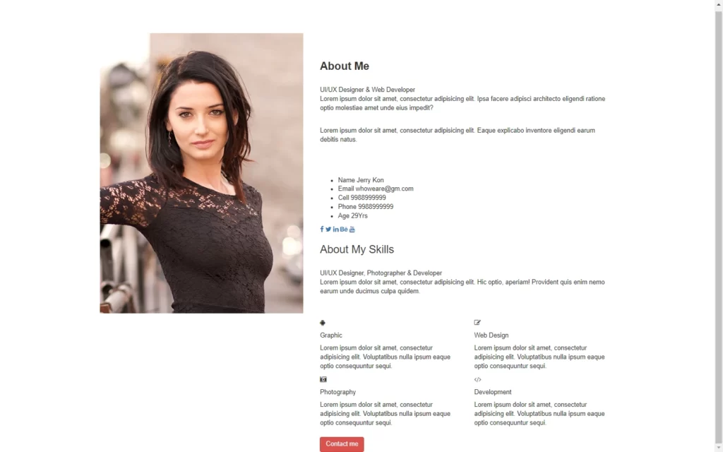
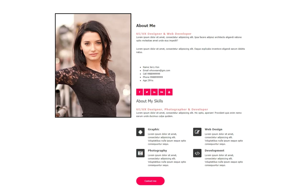
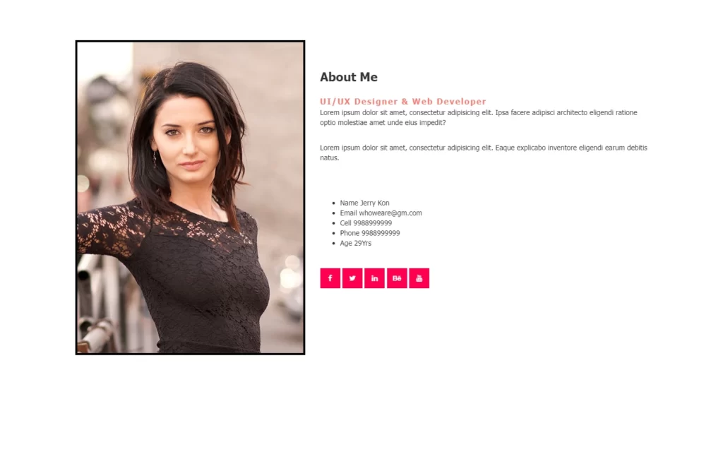
Now let’s make our content, for this we have added a div, in this we have an image. After that we have added a section in which we have added some headings and paragraph with some information. Then in this section, we have added some social media icons and basic information as a list.

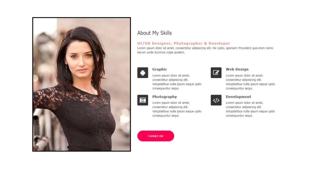
Now we have added another div for another section, in this we have again added some heading and information, and also we have added some icons for android, camera icon, pencil icon etc. using font-awesome library. After that, we have added some more details with these icons, and lastly, we have added a button for contact us.

Here we don’t need to resize the image, because we use bootstrap, so the image will be adjusted automatically.

Full Screen Image Slider

Adding Styles to All Elements

<style>
     
     
        body{
            font-family: tahoma;
        }


        .hero-img img{
            border: 4px solid black;
        }


        .hero .content h3{
            font-size: 800;
            margin-bottom: 5px;
        }
     
     
        .hero .content .sub-title{
           color: rgba(244,67,54,0.7);
            letter-spacing: 2px;
            font-size: 16px;
            font-weight: bold;
            margin-bottom: 20px;
        
        }
     
     
        .hero-content .info li{
            width: 48%;
            display: inline-block;
            margin-bottom: 15px;
            margin-left: -35px;
            
        }
     
        .hero .feature-box{
            position: relative;
            padding-left: 70px;
            margin: 10px 0;
            
        }
        
         .hero .feature-box i{
             font-size: 28px;
             position: absolute;
             left: 0;
             width: 50px;
             height: 50px;
             text-align: center;
             border-radius: 4px;
             line-height: 50px;
             color: white;
             background: #343434;
          
        }
        
        .hero .feature-box h5{
            color: #343434;
            font-size: 16px;
            font-weight: 600;
            letter-spacing: 1px;
            margin: 0 0 10px;
            display: inline-block;
            vertical-align: top;
            width: 100%;
        }
        
     
        .social-icon .fa{
            background: #ff004e;
            color: white;
            width: 40px;
            height: 40px;
            line-height: 40px;
            text-align: center;
            margin-top: 30px;
            border-image: 50px;
        }
        
        .btn{
            padding: 15px 50px;
            border: 0;
            margin-top: 40px;
            background-color: #ff004e;
            border: 0;
            border-radius: 50px;
        }


     </style>

Now we need to add some basic styles to these elements. Firstly, we have added font-family as Tahoma, then we have added a border around the image. After that, we have added some margin and font-size to heading. Then we have colored the subtitle and added some letter-spacing. Then added some basic styles to font, and also we have added some basic style to the icons like color, positioning etc. Lastly, we have added some color to the button as well.

Full Screen Image Slider

Adding Functionality to Slides

<script>
     jQuery(document).ready(function(){
         
       $('.hero .owl-carousel').owlCarousel({
           items:1,
           loop:true,
           autoplay:true,
           smartSpeed:500,
           dots:false
           
           
       });
         
     });
     </script>

Before jumping into the JavaScript, we need to hide our second section so that we can display these sections using JavaScript. For that, we have to add this <div class="owl-carousel owl-theme"> tag on the main section in which we have added both section. Using these classes, we will hide the content.

Now in the JavaScript part, we will use jQuery and Owl carousel for functionalities. With the help of jQuery(document).ready() the function, we can fetch the status of the current window. If the window is ready, then we will call a function, in which we have here fetched the hero class and owl-carousel class. In this we have added items, and we have turned on loop, with autoplay on. Now we have added a duration for each section of 5 seconds.

Full Screen Image Slider

Full Source Code of Full Screen Image Slider in JavaScript with owl carousel

index.html

 <!DOCTYPE html>
 <html lang="en">
 <head>
     <meta charset="UTF-8">
     <title>two way slider with owl</title>
     
     <link rel="stylesheet" href="https://cdnjs.cloudflare.com/ajax/libs/font-awesome/4.7.0/css/font-awesome.min.css">
     
     
     <link rel="stylesheet" href="https://maxcdn.bootstrapcdn.com/bootstrap/3.3.7/css/bootstrap.min.css">

     <link rel="stylesheet" href="owl.carousel.min.css">
     
    <script src="https://ajax.googleapis.com/ajax/libs/jquery/3.3.1/jquery.min.js"></script>

    <script src="https://maxcdn.bootstrapcdn.com/bootstrap/3.3.7/js/bootstrap.min.js"></script>
    
    <script src="owl.carousel.min.js"></script>
    
    <style>
     
     
        body{
            font-family: tahoma;
        }


        .hero-img img{
            border: 4px solid black;
        }


        .hero .content h3{
            font-size: 800;
            margin-bottom: 5px;
        }
     
     
        .hero .content .sub-title{
           color: rgba(244,67,54,0.7);
            letter-spacing: 2px;
            font-size: 16px;
            font-weight: bold;
            margin-bottom: 20px;
        
        }
     
     
        .hero-content .info li{
            width: 48%;
            display: inline-block;
            margin-bottom: 15px;
            margin-left: -35px;
            
        }
     
        .hero .feature-box{
            position: relative;
            padding-left: 70px;
            margin: 10px 0;
            
        }
        
         .hero .feature-box i{
             font-size: 28px;
             position: absolute;
             left: 0;
             width: 50px;
             height: 50px;
             text-align: center;
             border-radius: 4px;
             line-height: 50px;
             color: white;
             background: #343434;
          
        }
        
        .hero .feature-box h5{
            color: #343434;
            font-size: 16px;
            font-weight: 600;
            letter-spacing: 1px;
            margin: 0 0 10px;
            display: inline-block;
            vertical-align: top;
            width: 100%;
        }
        
     
        .social-icon .fa{
            background: #ff004e;
            color: white;
            width: 40px;
            height: 40px;
            line-height: 40px;
            text-align: center;
            margin-top: 30px;
            border-image: 50px;
        }
        
        .btn{
            padding: 15px 50px;
            border: 0;
            margin-top: 40px;
            background-color: #ff004e;
            border: 0;
            border-radius: 50px;
        }


     </style>
    
    
 </head>
 <body>
     
     <br><br><br><br>
     
     <section class="hero">
         <div class="container">
             <div class="row">
                 <div class="col-md-5">
                     <div class="hero-img">
                         <img src="huk4.jpg" alt="" class="img-responsive">
                         
                     </div>
                 </div>
                 <br><br>
                 
                 <div class="col-md-7">
                     <div class="owl-carousel owl-theme">
                         
                         <div class="content">
                             <h3><b>About Me</b></h3>
                             <br>
                             <span class="sub-title">
                                 UI/UX Designer & Web Developer
                             </span>
                             <p class="pb-10">
                              Lorem ipsum dolor sit amet, consectetur adipisicing elit. Ipsa facere adipisci architecto eligendi ratione optio molestiae amet unde eius impedit?
                                 
                                       
                             </p>
                             <br>
                             <p>
                                 Lorem ipsum dolor sit amet, consectetur adipisicing elit. Eaque explicabo inventore eligendi earum debitis natus.
                             </p>
                             <br><br><br>
                             
                             <div class="info">
                                 <ul>
                                     <li>
                                         <span class="title">Name</span>
                                         <span class="value">Jerry Kon</span>
                                     </li>
                                     
                                     <li>
                                         <span class="title">Email</span>
                                         <span class="value">whoweare@gm.com</span>
                                     </li>
                                     
                                     <li>
                                         <span class="title">Cell</span>
                                         <span class="value">9988999999</span>
                                     </li>
                                      
                                       <li>
                                         <span class="title">Phone</span>
                                         <span class="value">9988999999</span>
                                     </li>
                                     
                                     <li>
                                         <span class="title">Age</span>
                                         <span class="value">29Yrs</span>
                                     </li>
                                 
                                 </ul>
                                 
                               <div class="social-icon">
                                   <a href="">
                                       <span><i class="fa fa-facebook"></i></span>
                                  
                                   </a> 
                                      
                                  <a href="">
                                       <span><i class="fa fa-twitter"></i></span>
                                  
                                   </a>
                                   
                                           
                                  <a href="">
                                       <span><i class="fa fa-linkedin"></i></span>
                                  
                                   </a>
                                   
                                  <a href="">
                                       <span><i class="fa fa-behance"></i></span>
                                  
                                   </a>
                                      
                                  <a href="">
                                       <span><i class="fa fa-youtube"></i></span>
                                  
                                   </a>
                             
                               </div>  
                           
                             </div>
                        
                         </div>
                         
                         
                 <div class="content">
                     <h3>About My Skills</h3>
                     <br>
                     <span class="sub-title">UI/UX Designer, Photographer & Developer</span>
                     
                     <p>
                         Lorem ipsum dolor sit amet, consectetur adipisicing elit. Hic optio, aperiam! Provident quis enim nemo earum unde ducimus culpa quidem.
                     </p>
                     
                     
                     <br><br>
                     <div class="row">
                         <div class="col-md-6">
                             <div class="feature-box">
                                 <i class="fa fa-android"></i>
                                 <div class="feature-content">
                                     <h5>Graphic</h5>
                                     <p>
                                         Lorem ipsum dolor sit amet, consectetur adipisicing elit. Voluptatibus nulla ipsum eaque optio consequuntur sequi.
                                     </p>
                                 </div>
                             </div>
                         </div> 
                            
                        <div class="col-md-6">
                             <div class="feature-box">
                                 <i class="fa fa-edit"></i>
                                 <div class="feature-content">
                                     <h5>Web Design</h5>
                                     <p>
                                         Lorem ipsum dolor sit amet, consectetur adipisicing elit. Voluptatibus nulla ipsum eaque optio consequuntur sequi.
                                     </p>
                                 </div>
                             </div>
                         </div>
                            
                    <div class="col-md-6">
                             <div class="feature-box">
                                 <i class="fa fa-camera-retro"></i>
                                 <div class="feature-content">
                                     <h5>Photography</h5>
                                     <p>
                                         Lorem ipsum dolor sit amet, consectetur adipisicing elit. Voluptatibus nulla ipsum eaque optio consequuntur sequi.
                                     </p>
                                 </div>
                             </div>
                         </div>  
                            
                            
                        <div class="col-md-6">
                             <div class="feature-box">
                                 <i class="fa fa-code"></i>
                                 <div class="feature-content">
                                     <h5>Development</h5>
                                     <p>
                                         Lorem ipsum dolor sit amet, consectetur adipisicing elit. Voluptatibus nulla ipsum eaque optio consequuntur sequi.
                                     </p>
                                 </div>
                             </div>
                         </div>
                         
                     </div>
                     
                     <div style="margin-top: 10px;"></div>
                     <div class="mt-10">
                         <a href="">
                             <span class="btn btn-danger">Contact me</span>
                         </a>
                     </div>
                     
                 </div>        
                         
                     
                     </div>
                 </div>


             </div>
         </div>


     </section>
     
     <script>
     jQuery(document).ready(function(){
         
       $('.hero .owl-carousel').owlCarousel({
           items:1,
           loop:true,
           autoplay:true,
           smartSpeed:500,
           dots:false
           
           
       });
         
     });


     </script>


 </body>
 </html>

Output

Full Screen Image Slider
Demo
Download Code

You may also like:

  • How To Build a Quiz App With HTML CSS and JavaScript
  • How To Make Slide Puzzle Game in HTML CSS and JavaScript
  • How To Make Space War Game Using HTML, CSS & JavaScript

Related

Subscribe to Our Newsletter

Subscribe to our newsletter to get our newest articles instantly!

TAGGED: Animation, Full Screen Image Slider, javascript, UI Design, UX Design
Share this Article
Facebook Twitter Email Print
What do you think?
Love0
Sad0
Happy0
Sleepy0
Angry0
Dead0
Wink0
Posted by Admin
Follow:
Rocoderes is a blog you can learn HTML, CSS, JavaScript, React Js and Python along with creative coding stuff and free source code files.
Previous Article Expanding Cards How to Make Expanding Cards In HTML, CSS, and JavaScript
Next Article How to Make Tabs With HTML, CSS, And JavaScript How to Make Tabs With HTML, CSS, And JavaScript
Leave a comment Leave a comment

Leave a Reply Cancel reply

Your email address will not be published. Required fields are marked *

- Advertisement -

You Might Also Like

How to set the dropdown value by clicking on a table row

Javascript – How to set the dropdown value by clicking on a table row

February 11, 2024
Attempting to increase the counter, when the object's tag exist

Javascript – Attempting to increase the counter, when the object’s tag exist

February 11, 2024
Cycle2 JS center active slide

Javascript – Cycle2 JS center active slide

February 10, 2024
Can import all THREE.js post processing modules as ES6 modules except OutputPass

Javascript – Can import all THREE.js post processing modules as ES6 modules except OutputPass

February 10, 2024
rocoderesrocoderes
Follow US

Copyright © 2022 All Right Reserved By Rocoderes

  • Home
  • About us
  • Contact us
  • Disclaimer
Join Us!

Subscribe to our newsletter and never miss our latest news, podcasts etc.

Zero spam, Unsubscribe at any time.
Welcome Back!

Sign in to your account

Lost your password?