


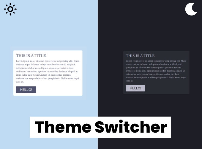
In this article, we are going to make a dark/light theme switcher using HTML, CSS & JavaScript, so we have here one switch button if we click on that then the window theme should be changed.
Pre-requisites To Make Dark/Light Theme Switcher Using HTML, CSS & JavaScript
- Basic knowledge of HTML.
- Good knowledge of CSS & CSS3.
- Good knowledge of JavaScript.
Creating HTML Markup
<section>
    <div class="container">
      <h1>This is a title</h1>
      <p>Lorem ipsum dolor sit amet consectetur adipisicing elit. Quos maiores atque dolorum voluptatum laudantium id
        adipisci quisquam ea laborum sed ipsam quam aspernatur ratione architecto numquam, aperiam recusandae ducimus
        aliquid ut enim culpa quis minus! Autem id, recusandae incidunt maiores non saepe dolor ullam perspiciatis!
        Nulla nemo sequi vero et.</p>
      <button>Hello!</button>
    </div>
  </section>
  <div class="theme-switcher">
    <input type="checkbox" id="switcher">
    <label for=switcher>switch</label>
  </div>
in our html first of all, let’s get the section and inside the section we’ll have a div with the class of container, so here in this div let’s have a h1, so basically we’re making a card for the layout only so for this one let’s have a paragraph and also let’s have a button, and we will have div with a class of theme switcher switch, and here we will have an input and the input type will be the checkbox, and also we will have id which is the switcher and let’s have a level here after the input and for the label and in the for we will use switch.

Setting up Default Values
*{
    padding: 0;
    margin: 0;
    box-sizing: border-box;
}

body{
    font-family: 'Montserrat';
    color: var(--color-4);
}
body[data-theme="light"]{
    --color-1:rgb(196, 220, 241);
    --color-2: white;
    --color-3: white;
    --color-4: rgb(80, 82, 110);
}
body[data-theme="dark"]{
    --color-1:#1E1F26;
    --color-2: #292c33;
    --color-3: rgb(39, 40, 42);
    --color-4: rgb(186, 186, 202);
}
So in our style, let’s have a basic style for universal selector, so padding and margin will be 0, and box sizing will be the border box. after that we will have our colors, so we will have something like two kinds of color for our two themes first one will be the light themes and second one will be the dark themes, so let’s say that light theme color and here we will have our light theme color, let’s take color-1, so we will have four colors so let me just copy and paste the variables, and for the same color variable when we are in the dark theme we will use these colors which is our dark colors so that’s what we need for this color scheme and let’s style our body, we will have font-family as Montserrat, and color as color-4.
Customizing Card
section{
    background-color: var(--color-1);
    min-height: 100vh;
    width: 100%;
    display: flex;
    justify-content: center;
    align-items: center;
}
.container{
    width: 90%;
    margin: 0 auto;
    background-color: var(--color-2);
    border-radius: 8px;
    padding: 20px;
    max-width: 500px;
}
h1{
    font-size: 30px;
    font-weight: 500;
    text-transform: uppercase;
}
p{
    margin-top: 10px;
    font-size: 16px;
    font-weight: 500;
    letter-spacing: 1px;
    line-height: 25px;
}
button{
    background-color: var(--color-4);
    padding: 10px 30px;
    border: none;
    font-size: 24px;
    text-transform: uppercase;
    color: var(--color-3);
    border-radius:4px ;
    margin-top: 20px;
    cursor: pointer;
}
Let’s come to the section, so in our section let’s have something like background color will be color-1 and min height actually 100vh and width will be 100%, and display is flex and align items center, justify content also center, after that let’s come to the container and say that here the width will be about 90% and margin 0, auto and also background color will be the color-2, let’s have a border radius of about 8 pixels, and also padding something like 20 pixels that makes with give it a max width of something 500 pixels.
Let’s style the h1 which is the title, so font size will be something like 30 pixels and also font weight 500 and make the text transform uppercase, after that let’s style the paragraph and margin top will be something like 10 pixel and font size will be something 16 pixels, and font weight 500, letter spacing will be 1 pixel about and line height 25 pixels.
after that let’s come to the button we will have background color which is the color-4, so we have this blackish color for the background and let’s have padding 10 pixels and also 30 pixels, border none and font size 24 pixel and text transform will be uppercase, and the color will be color-3, after that let’s have our border radius here and 4 pixels, and margin top something like 20 pixels make sure that you have the cursor pointer.

Customizing Switcher Switch
.theme-switcher{
    position: absolute;
    right: 30px;
    top: 10px;
}
input{
    width: 0;
    height: 0;
    display: none;
    visibility: hidden;
}
label{
    cursor: pointer;
    display: block;
    text-indent: -9999px;
    height: 30px;
    width: 60px;
    border-radius: 50px;
    background-color: rgb(255, 255, 255);
    transition: .5s ease background-color;
}
label::after{
    position: absolute;
    content: '';
    width: 20px;
    height: 20px;
    border-radius: 50px;
    top: 50%;
    left: 5px;
    transform: translateY( -50%);
    background-color: rgb(46, 42, 68);
    transition: .5s ease;
}
input:checked + label::after{
    /* left: calc(100% - 2.5px); */
    left: calc(100% - 25px);
    background-color: aliceblue;
}
input:checked + label{
    background-color: rgb(25, 26, 37);
    border: 2px solid whitesmoke;
}
now let’s make the theme switcher here let’s say that position will be absolute and let’s say that from the right it will be 30 pixels and from the top it will be 10 pixels, now in input width and height will be 0 and also say that visibility will be hidden.
let’s say that for we can say display it will block, and we can use text indent we need to make a very large number, something like 9099 pixels. let’s have our height will be 30 pixels and width will be about 60 pixels and let’s give it a background color which will be a white color, after that lets have a border radius 50 pixels and.
after that, let’s have the ball for our theme switcher, let’s say that position will be absolute and let’s make the width will be 20 pixels and height also 20 pixels and border radius will be 50 pixels we can’t see it because we don’t have any background color so let’s keep it a background color, let the top will be 50%, and we want this in the left 5 pixels, now transform here translate y -50%, let’s make the pointer cursor, here let’s say that input if it is checked i want to grab the level and say that background color will be something blackish, also let’s have a border here in our this level, so it will be 2 pixel solid and white.
now we want to make the position left in 100% so now if we do this as you can see that we moved 100%, but it is out of the box, so we need to make a simple calculation here which will be 100% – 25 pixels, so the width is actually 30 pixels, and we are having 5 pixels left, last thing that we need is the transition so let’s have the transition so i will have something like transition here in our level after so transition will be 0.5 second and ease.
Adding Functionality To Button
const input = document.querySelector('.theme-switcher input');

input.addEventListener('change', (e) => {
  if (e.target.checked) {
    document.body.setAttribute('data-theme', 'dark');
  } else {
    document.body.setAttribute('data-theme', 'light');
  }
})
Last thing is we need to make the change of this light to dark with our JavaScript, first of all let’s grab the input so constant input will be so basically the themes which are that i want so document.queryselector, after that we want to add even listener in our input so add even listener, and we want to see the change so whenever we have any change of the value in our input we will call a function which is this one and here what we will do actually we will check the status of the checkbox so how can we check, so we will check this with our if statement.
so if our target means this input is checked already checked so if it is checked we need to move our theme to the dark so for that we need to change this data theme to the dark, lets say that document.body.set attribute so we have something like in JavaScript set attribute and the name of the attribute is the data theme and the value that i want is the dark yeah and if it is not checked what i want is i want to have the light thin so just copy and paste and make the dark to light.
Full Source Code of Dark/Light Theme Switcher Using HTML, CSS & JavaScript
index.html
<!DOCTYPE html>
<html lang="en">

<head>
  <meta charset="UTF-8">
  <meta name="viewport" content="width=device-width, initial-scale=1.0">
  <title>Document</title>
  <link rel="stylesheet" href="./style.css">
</head>

<body data-theme="light">
  <section>
    <div class="container">
      <h1>This is a title</h1>
      <p>Lorem ipsum dolor sit amet consectetur adipisicing elit. Quos maiores atque dolorum voluptatum laudantium id
        adipisci quisquam ea laborum sed ipsam quam aspernatur ratione architecto numquam, aperiam recusandae ducimus
        aliquid ut enim culpa quis minus! Autem id, recusandae incidunt maiores non saepe dolor ullam perspiciatis!
        Nulla nemo sequi vero et.</p>
      <button>Hello!</button>
    </div>
  </section>
  <div class="theme-switcher">
    <input type="checkbox" id="switcher">
    <label for=switcher>switch</label>
  </div>
  <script src="./main.js"></script>
</body>

</html>
style.css
*{
    padding: 0;
    margin: 0;
    box-sizing: border-box;
}

body{
    font-family: 'Montserrat';
    color: var(--color-4);
}
body[data-theme="light"]{
    --color-1:rgb(196, 220, 241);
    --color-2: white;
    --color-3: white;
    --color-4: rgb(80, 82, 110);
}
body[data-theme="dark"]{
    --color-1:#1E1F26;
    --color-2: #292c33;
    --color-3: rgb(39, 40, 42);
    --color-4: rgb(186, 186, 202);
}

section{
    background-color: var(--color-1);
    min-height: 100vh;
    width: 100%;
    display: flex;
    justify-content: center;
    align-items: center;
}
.container{
    width: 90%;
    margin: 0 auto;
    background-color: var(--color-2);
    border-radius: 8px;
    padding: 20px;
    max-width: 500px;
}
h1{
    font-size: 30px;
    font-weight: 500;
    text-transform: uppercase;
}
p{
    margin-top: 10px;
    font-size: 16px;
    font-weight: 500;
    letter-spacing: 1px;
    line-height: 25px;
}
button{
    background-color: var(--color-4);
    padding: 10px 30px;
    border: none;
    font-size: 24px;
    text-transform: uppercase;
    color: var(--color-3);
    border-radius:4px ;
    margin-top: 20px;
    cursor: pointer;
}
.theme-switcher{
    position: absolute;
    right: 30px;
    top: 10px;
}
input{
    width: 0;
    height: 0;
    display: none;
    visibility: hidden;
}
label{
    cursor: pointer;
    display: block;
    text-indent: -9999px;
    height: 30px;
    width: 60px;
    border-radius: 50px;
    background-color: rgb(255, 255, 255);
    transition: .5s ease background-color;
}
label::after{
    position: absolute;
    content: '';
    width: 20px;
    height: 20px;
    border-radius: 50px;
    top: 50%;
    left: 5px;
    transform: translateY( -50%);
    background-color: rgb(46, 42, 68);
    transition: .5s ease;
}
input:checked + label::after{
    /* left: calc(100% - 2.5px); */
    left: calc(100% - 25px);
    background-color: aliceblue;
}
input:checked + label{
    background-color: rgb(25, 26, 37);
    border: 2px solid whitesmoke;
}
main.js
const input = document.querySelector('.theme-switcher input');

input.addEventListener('change', (e) => {
  if (e.target.checked) {
    document.body.setAttribute('data-theme', 'dark');
  } else {
    document.body.setAttribute('data-theme', 'light');
  }
})
Output


