


In this article, we will learn to make a Personal Blog Website Using HTML, CSS, and JavaScript. This website will have simple UI, but has massive things in it. We will create it by using only HTML, CSS and little bit JavaScript to make it more cool. It will be completely responsive like any other website does. Let’s create it step by step.
Pre-requisites to Make Personal Blog Website Using HTML, CSS, and JavaScript
- Good knowledge of HTML.
- Good knowledge of CSS.
- Good knowledge of JavaScript.
Steps of Personal Blog Website Using HTML, CSS, and JavaScript
- Basic structure of HTML and CSS
- Reset HTML & Reusable CSS Classes
- Header Section
- Hero Section
- Blog Section
- Aside Section
- Footer Section
- Navbar JavaScript
- Light/Dark Mode
- Media queries
- Scroll Sections Active Link
Creating HTML Markup and File Structure
First of all, we have added favicon, google font and lastly our CSS file in our HTML. And in CSS, we have added required colors and set up all needed styling. Also, we have added all the required styles for our whole projects like font sizes, colors, card styles etc. And we have defined some other styles which are going to be reused in the entire project. Also, we have added colors for light and for dark themes.
<!DOCTYPE html>
<html lang="en">

<head>
  <meta charset="UTF-8">
  <meta http-equiv="X-UA-Compatible" content="IE=edge">
  <meta name="viewport" content="width=device-width, initial-scale=1.0">
  <title>DevBlog - Julia Walker's Personal Blog</title>

  <!--
    - favicon
  -->
  <link rel="shortcut icon" href="./assets/images/favicon.ico" type="image/x-icon">

  <!--
    - custom css link
  -->
  <link rel="stylesheet" href="./assets/css/style.min.css">

  <!--
    - google font link
  -->
  <link rel="preconnect" href="https://fonts.googleapis.com">
  <link rel="preconnect" href="https://fonts.gstatic.com" crossorigin>
  <link href="https://fonts.googleapis.com/css2?family=Inter:wght@400;500;600;700;900&display=swap" rel="stylesheet">
</head>
/*-----------------------------------*\
  #CUSTOM PROPERTY
\*-----------------------------------*/

.light-theme {

  /**
   * light theme colors
   */

  --background-primary: hsl(0, 0%, 100%);
  --background-secondary: hsl(0, 0%, 97%);

  --action-primary: hsl(214, 32%, 91%);
  --action-secondary: hsl(210, 38%, 95%);

  --foreground-primary: hsl(218, 23%, 23%);
  --foreground-secondary: hsl(216, 15%, 52%);
  --foreground-tertiary: hsl(214, 20%, 69%);

  --accent: hsl(229, 76%, 66%);

}

.dark-theme {

  /**
   * dark theme colors
   */

  --background-primary: hsl(218, 23%, 23%);
  --background-secondary: hsl(220, 26%, 14%);

  --action-primary: hsl(216, 15%, 52%);
  --action-secondary: hsl(218, 23%, 23%);

  --foreground-primary: hsl(210, 38%, 95%);
  --foreground-secondary: hsl(211, 25%, 84%);
  --foreground-tertiary: hsl(214, 20%, 69%);

  --accent: hsl(229, 76%, 66%);

}

:root {

  /**
   * color
   */

  --white: hsl(0, 0%, 100%);

  /**
   * typography
   */

  --fs-base: 0.85rem;
  --fs-1: 1.875rem;
  --fs-2: 1.5rem;
  --fs-3: 1.25rem;
  --fs-4: 0.875rem;
  --fs-5: 0.75rem;

  /**
   * spacing
   */

  --py: 5rem;

}


/*-----------------------------------*\
  #RESET
\*-----------------------------------*/

*, *::before, *::after {
  margin:  0;
  padding: 0;
  box-sizing: border-box;
}

a { text-decoration: none; }

li { list-style: none; }

img, button { display: block; }

a, span { display: inline-block; }

button {
  font: inherit;
  border: none;
  background: none;
  cursor: pointer;
}

html {
  font-family: "Inter", sans-serif;
  font-size: var(--fs-base); /* base font-size (0.85rem = 13.6px) */
  line-height: 1.8;
}

:focus { outline-offset: 4px; }


/**
 * scrollbar style
 */

::-webkit-scrollbar { width: 16px; }


::-webkit-scrollbar-thumb {
  background: var(--accent);
  border-radius: 20px;
  border: 4px solid;
}

.light-theme::-webkit-scrollbar-thumb { border-color: hsl(0, 0%, 90%); }

.dark-theme::-webkit-scrollbar-thumb { border-color: hsl(219, 27%, 20%); }

.light-theme::-webkit-scrollbar-track { background: hsl(0, 0%, 90%); }

.dark-theme::-webkit-scrollbar-track { background: hsl(219, 27%, 20%); }


/*-----------------------------------*\
  #BASE STYLE
\*-----------------------------------*/

.h1,
.h2,
.h3,
.h4 {
  display: block;
  color: var(--foreground-primary);
}

.h1 {
  font-size: var(--fs-1);
  font-weight: 900;
}

.h2 {
  font-size: var(--fs-2);
  font-weight: 700;
}

.h3 {
  font-size: var(--fs-3);
  font-weight: 700;
}

.h4 {
  font-size: var(--fs-4);
  font-weight: 700;
}

.text-sm { font-size: var(--fs-4); }

.text-tiny { font-size: var(--fs-5); }


/*-----------------------------------*\
  #REUSED STYLE
\*-----------------------------------*/

.container {
  margin-inline: auto;
  margin: auto; /* fallback for margin-inline */
  padding: 0 15px;
}

.btn {
  min-width: 10rem;
  border-radius: 100px;
}

.btn-primary {
  background: var(--accent);
  color: var(--white);
  padding: 0.6875rem 1.1875rem;
}

.btn-primary:hover {
  background: var(--foreground-secondary);
  color: var(--action-primary);
}

.btn-secondary {
  background: var(--action-secondary);
  color: var(--foreground-secondary);
  padding: 0.5rem 1rem;
  border: 3px solid var(--foreground-tertiary);
}

.btn-secondary:hover { border-color: var(--accent); }
Adding The Header Section
In header section, we have added a div for header, in which we have added a logo for our website using SVG file. Then we have added a navbar in which we have a list of home, contact and about pages as a list with some link. Then after we added a switch type button for light and dark mode.
After that we have added menu button in which again we have added home, contact and about pages and some other additional pages. We will currently hide them wit the help of CSS and later on we will access this when we add responsiveness.
Now in CSS, we have adjusted the size of the header and imgae size. Then we added some more basic CSS style to add some styling to the header elements. After that, we have added the icons to the switch buttons as a indication of light and dark mode.
<body class="light-theme">

  <!--
    - #HEADER
  -->

  <header>

    <div class="container">

      <nav class="navbar">

        <a href="#">
          <img src="./assets/images/logo-light.svg" alt="Devblog's logo" width="150" height="40" class="logo-light">
          <img src="./assets/images/logo-dark.svg" alt="Devblog's logo" width="150" height="40" class="logo-dark">
        </a>

        <div class="btn-group">

          <button class="theme-btn theme-btn-mobile light">
            <ion-icon name="moon" class="moon"></ion-icon>
            <ion-icon name="sunny" class="sun"></ion-icon>
          </button>

          <button class="nav-menu-btn">
            <ion-icon name="menu-outline"></ion-icon>
          </button>

        </div>

        <div class="flex-wrapper">

          <ul class="desktop-nav">

            <li>
              <a href="#" class="nav-link">Home</a>
            </li>

            <li>
              <a href="#" class="nav-link">About Me</a>
            </li>

            <li>
              <a href="#" class="nav-link">Contact</a>
            </li>

          </ul>

          <button class="theme-btn theme-btn-desktop light">
            <ion-icon name="moon" class="moon"></ion-icon>
            <ion-icon name="sunny" class="sun"></ion-icon>
          </button>

        </div>

        <div class="mobile-nav">

          <button class="nav-close-btn">
            <ion-icon name="close-outline"></ion-icon>
          </button>

          <div class="wrapper">

            <p class="h3 nav-title">Main Menu</p>

            <ul>
              <li class="nav-item">
                <a href="#" class="nav-link">Home</a>
              </li>

              <li class="nav-item">
                <a href="#" class="nav-link">About Me</a>
              </li>

              <li class="nav-item">
                <a href="#" class="nav-link">Contact</a>
              </li>
            </ul>

          </div>

          <div>

            <p class="h3 nav-title">Topics</p>

            <ul>
              <li class="nav-item">
                <a href="#" class="nav-link">Database</a>
              </li>

              <li class="nav-item">
                <a href="#" class="nav-link">Accessibility</a>
              </li>

              <li class="nav-item">
                <a href="#" class="nav-link">Web Performance</a>
              </li>
            </ul>

          </div>

        </div>

      </nav>

    </div>

  </header>
/*-----------------------------------*\
#HEADER
\*-----------------------------------*/
header { background: var(--background-primary); }
header .flex-wrapper { display: none; }
.navbar {
display: flex;
justify-content: space-between;
align-items: center;
gap: 15px;
padding: 15px 0;
}
.logo-light,
.logo-dark { display: none; }
.light-theme .logo-light,
.dark-theme .logo-dark { display: block; }
header .btn-group {
display: flex;
align-items: center;
gap: 15px;
}
.theme-btn-mobile,
.nav-menu-btn,
.nav-close-btn {
background: var(--action-secondary);
color: var(--foreground-tertiary);
width: 40px;
height: 40px;
display: flex;
justify-content: center;
align-items: center;
border-radius: 50%;
font-size: 25px;
}
:is(.theme-btn-mobile,
.nav-menu-btn,
.nav-close-btn):hover {
background: var(--accent);
color: var(--white);
}
.theme-btn-mobile ion-icon { display: none; }
.theme-btn-mobile.light .sun,
.theme-btn-mobile.dark .moon { display: block; }
.mobile-nav {
position: fixed;
inset: 0;
background: var(--background-primary);
padding: 70px 20px;
overflow: auto;
overscroll-behavior: contain;
transform: translateX(100%);
visibility: hidden;
transition: 0.5s cubic-bezier(1, 0, 0.30, 0.70);
z-index: 10;
}
.mobile-nav.active {
transform: translateX(0);
visibility: visible;
}
.nav-close-btn {
position: absolute;
top: 20px;
right: 20px;
}
.mobile-nav .wrapper {
padding-bottom: 1.25rem;
margin-bottom: 1.25rem;
border-bottom: 1px solid var(--action-primary);
}
.mobile-nav .nav-title { margin-bottom: 1rem; }
.mobile-nav .nav-item { margin-bottom: 0.5rem; }
.mobile-nav .nav-link {
font-size: var(--fs-3);
color: var(--foreground-secondary);
}
.mobile-nav .nav-link:hover { color: var(--accent); }
Adding Hero Section
Now in hero section, we need to add a banner for that we have added a div then we have added an image, in which we have added some text and two buttons for contact and for about section.
In CSS, we have adjusted image size and also, we have added some styling on the text. Then we have styled the buttons and some hovering effect.
<div class="hero">
<div class="container">
<div class="left">
<h1 class="h1">
Hi, I'm <b>Julia Walker</b>.
<br>Web Developer
</h1>
<p class="h3">
Specialized in <abbr title="Accessibility">a11y</abbr>
and Core Web Vitals
</p>
<div class="btn-group">
<a href="#" class="btn btn-primary">Contact Me</a>
<a href="#" class="btn btn-secondary">About Me</a>
</div>
</div>
<div class="right">
<div class="pattern-bg"></div>
<div class="img-box">
<img src="./assets/images/hero.png" alt="Julia Walker" class="hero-img">
<div class="shape shape-1"></div>
<div class="shape shape-2"></div>
</div>
</div>
</div>
</div>/*-----------------------------------*\
#HERO SECTION
\*-----------------------------------*/
.hero {
background: var(--background-primary);
padding-top: 2rem;
padding-bottom: var(--py);
text-align: center;
}
.hero .h1 {
margin-bottom: 1rem;
line-height: 1.6;
}
.hero b {
color: var(--accent);
font-weight: inherit;
}
.hero .h3 {
color: var(--foreground-secondary);
margin-bottom: 2rem;
}
.hero .btn-group {
display: flex;
justify-content: center;
flex-wrap: wrap;
gap: 15px;
text-align: center;
}
.hero .right { display: none; }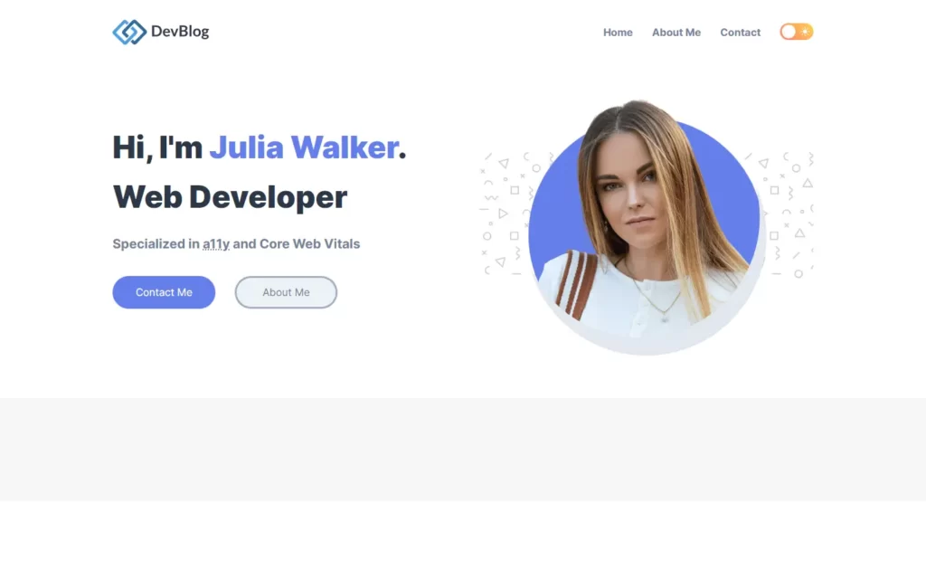
Adding Blog Section
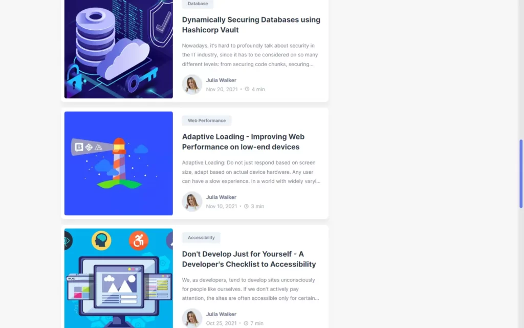
In Blog section, we have added a div for blog section, in which we have some post as cards. Then we have added some information in each card and also, we have added images as well. Also, we have added category for each of the card, and we have added one more image for the author with the information, and lastly we have added date for each of the card.
In CSS, we have adjusted the images for each card and also, we have added hovering effect on the title, and categories. Then after, we have adjusted the image size of the author and added some basic styles on the remaining text.
<div class="blog">
<h2 class="h2">Latest Blog Post</h2>
<div class="blog-card-group">
<div class="blog-card">
<div class="blog-card-banner">
<img src="./assets/images/blog-1.png" alt="Building microservices with Dropwizard, MongoDB & Docker"
width="250" class="blog-banner-img">
</div>
<div class="blog-content-wrapper">
<button class="blog-topic text-tiny">Database</button>
<h3>
<a href="#" class="h3">
Building microservices with Dropwizard, MongoDB & Docker
</a>
</h3>
<p class="blog-text">
This NoSQL database oriented to documents (by documents like JSON) combines some of the features from
relational
databases, easy to use and the multi-platform is the best option for scale up and have fault
tolerance, load balancing,
map reduce, etc.
</p>
<div class="wrapper-flex">
<div class="profile-wrapper">
<img src="./assets/images/author.png" alt="Julia Walker" width="50">
</div>
<div class="wrapper">
<a href="#" class="h4">Julia Walker</a>
<p class="text-sm">
<time datetime="2022-01-17">Jan 17, 2022</time>
<span class="separator"></span>
<ion-icon name="time-outline"></ion-icon>
<time datetime="PT3M">3 min</time>
</p>
</div>
</div>
</div>
</div>
<div class="blog-card">
<div class="blog-card-banner">
<img src="./assets/images/blog-2.png" alt="Fast web page loading on a $20 feature phone" width="250"
class="blog-banner-img">
</div>
<div class="blog-content-wrapper">
<button class="blog-topic text-tiny">Web Performance</button>
<h3><a href="" class="h3">Fast web page loading on a $20 feature phone</a></h3>
<p class="blog-text">
Feature phones are affordable (under $20-25), low-end devices enabling 100s of millions of users in
developing countries
to leverage the web. Think of them as a light version of a smart phone.
</p>
<div class="wrapper-flex">
<div class="profile-wrapper">
<img src="./assets/images/author.png" alt="Julia walker" width="50">
</div>
<div class="wrapper">
<a href="#" class="h4">Julia Walker</a>
<p class="text-sm">
<time datetime="2021-12-10">Dec 10, 2021</time>
<span class="separator"></span>
<ion-icon name="time-outline"></ion-icon>
<time datetime="PT2M">2 min</time>
</p>
</div>
</div>
</div>
</div>
<div class="blog-card">
<div class="blog-card-banner">
<img src="./assets/images/blog-3.png" alt="Accessibility Tips for Web Developers" width="250"
class="blog-banner-img">
</div>
<div class="blog-content-wrapper">
<button class="blog-topic text-tiny">Accessibility</button>
<h3><a href="" class="h3">Accessibility Tips for Web Developers</a></h3>
<p class="blog-text">
It's awesome to build sites that are inclusive and accessible to everyone. There are at least six key
areas of
disability we can optimize for: visual, hearing, mobility, cognition, speech and neural. Many tools
and resources can
help here, even if you're totally new to web accessibility.
</p>
<div class="wrapper-flex">
<div class="profile-wrapper">
<img src="./assets/images/author.png" alt="Julia walker" width="50">
</div>
<div class="wrapper">
<a href="#" class="h4">Julia Walker</a>
<p class="text-sm">
<time datetime="2021-11-28">Nov 28, 2021</time>
<span class="separator"></span>
<ion-icon name="time-outline"></ion-icon>
<time datetime="PT4M">4 min</time>
</p>
</div>
</div>
</div>
</div>
<div class="blog-card">
<div class="blog-card-banner">
<img src="./assets/images/blog-4.png" alt="Dynamically Securing Databases using Hashicorp Vault"
width="250" class="blog-banner-img">
</div>
<div class="blog-content-wrapper">
<button class="blog-topic text-tiny">Database</button>
<h3><a href="" class="h3">Dynamically Securing Databases using Hashicorp Vault</a></h3>
<p class="blog-text">
Nowadays, it's hard to profoundly talk about security in the IT industry, since it has to be
considered on so many
different levels: from securing code chunks, securing containers, up to securing complex
infrastructures and defining
strong authorization and authentication policies across the enterprise.
</p>
<div class="wrapper-flex">
<div class="profile-wrapper">
<img src="./assets/images/author.png" alt="Julia walker" width="50">
</div>
<div class="wrapper">
<a href="#" class="h4">Julia Walker</a>
<p class="text-sm">
<time datetime="2021-11-20">Nov 20, 2021</time>
<span class="separator"></span>
<ion-icon name="time-outline"></ion-icon>
<time datetime="PT4M">4 min</time>
</p>
</div>
</div>
</div>
</div>
<div class="blog-card">
<div class="blog-card-banner">
<img src="./assets/images/blog-5.png"
alt="Adaptive Loading - Improving Web Performance on low-end devices" width="250"
class="blog-banner-img">
</div>
<div class="blog-content-wrapper">
<button class="blog-topic text-tiny">Web Performance</button>
<h3><a href="" class="h3">Adaptive Loading - Improving Web Performance on low-end devices</a></h3>
<p class="blog-text">
Adaptive Loading: Do not just respond based on screen size, adapt based on actual device hardware.
Any user can have a slow experience. In a world with widely varying device capabilities, a "one-size"
fits all
experience may not always work. Sites that delight users on high-end devices can be unusable on
low-end ones,
particularly on median mobile and desktop hardware and in emerging markets.
</p>
<div class="wrapper-flex">
<div class="profile-wrapper">
<img src="./assets/images/author.png" alt="Julia walker" width="50">
</div>
<div class="wrapper">
<a href="#" class="h4">Julia Walker</a>
<p class="text-sm">
<time datetime="2021-11-10">Nov 10, 2021</time>
<span class="separator"></span>
<ion-icon name="time-outline"></ion-icon>
<time datetime="PT3M">3 min</time>
</p>
</div>
</div>
</div>
</div>
<div class="blog-card">
<div class="blog-card-banner">
<img src="./assets/images/blog-6.png"
alt="Don't Develop Just for Yourself - A Developer's Checklist to Accessibility" width="250"
class="blog-banner-img">
</div>
<div class="blog-content-wrapper">
<button class="blog-topic text-tiny">Accessibility</button>
<h3><a href="" class="h3">Don't Develop Just for Yourself - A Developer's Checklist to Accessibility</a>
</h3>
<p class="blog-text">
We, as developers, tend to develop sites unconsciously for people like ourselves. If we don't actively
pay attention,
the sites are often accessible only for certain types of people: Sighted mouse-users, who have good
fine motor skills
and are good at using computers.
</p>
<div class="wrapper-flex">
<div class="profile-wrapper">
<img src="./assets/images/author.png" alt="Julia walker" width="50">
</div>
<div class="wrapper">
<a href="#" class="h4">Julia Walker</a>
<p class="text-sm">
<time datetime="2021-10-25">Oct 25, 2021</time>
<span class="separator"></span>
<ion-icon name="time-outline"></ion-icon>
<time datetime="PT7M">7 min</time>
</p>
</div>
</div>
</div>
</div>
<div class="blog-card">
<div class="blog-card-banner">
<img src="./assets/images/blog-7.png"
alt="Building a Restful CRUD API with Node JS, Express, and MongoDB" width="250"
class="blog-banner-img">
</div>
<div class="blog-content-wrapper">
<button class="blog-topic text-tiny">Database</button>
<h3><a href="" class="h3">Building a Restful CRUD API with Node JS, Express, and MongoDB</a></h3>
<p class="blog-text">
Application Programming Interface is the abbreviation for API. An API is a software interface that
enables two apps to
communicate with one another. In other words, an API is a messenger that sends your request to the
provider and then
returns the response to you.
</p>
<div class="wrapper-flex">
<div class="profile-wrapper">
<img src="./assets/images/author.png" alt="Julia walker" width="50">
</div>
<div class="wrapper">
<a href="#" class="h4">Julia Walker</a>
<p class="text-sm">
<time datetime="2021-10-15">Oct 15, 2021</time>
<span class="separator"></span>
<ion-icon name="time-outline"></ion-icon>
<time datetime="PT5M">5 min</time>
</p>
</div>
</div>
</div>
</div>
<div class="blog-card">
<div class="blog-card-banner">
<img src="./assets/images/blog-8.png" alt="Monitoring Performance with the PageSpeed Insights API"
width="250" class="blog-banner-img">
</div>
<div class="blog-content-wrapper">
<button class="blog-topic text-tiny">Web Performance</button>
<h3><a href="" class="h3">Monitoring Performance with the PageSpeed Insights API</a></h3>
<p class="blog-text">
The PageSpeed Insights API provides free access to performance monitoring for web pages and returns
data with
suggestions for how to improve. The V5 API includes lab data from Lighthouse and real-world data from
the Chrome User
Experience Report (CrUX).
</p>
<div class="wrapper-flex">
<div class="profile-wrapper">
<img src="./assets/images/author.png" alt="Julia walker" width="50">
</div>
<div class="wrapper">
<a href="#" class="h4">Julia Walker</a>
<p class="text-sm">
<time datetime="2021-10-03">Oct 3, 2021</time>
<span class="separator"></span>
<ion-icon name="time-outline"></ion-icon>
<time datetime="PT5M">5 min</time>
</p>
</div>
</div>
</div>
</div>
<div class="blog-card">
<div class="blog-card-banner">
<img src="./assets/images/blog-9.png" alt="The best web accessibility tools for developers in 2021"
width="250" class="blog-banner-img">
</div>
<div class="blog-content-wrapper">
<button class="blog-topic text-tiny">Accessibility</button>
<h3><a href="" class="h3">The best web accessibility tools for developers in 2021</a>
</h3>
<p class="blog-text">
The quality of the tools you use defines the speed with which you can diagnose and resolve problems.
Each year the landscape changes dramatically in web technologies, and of late the tooling for
accessibility is no
exception.
</p>
<div class="wrapper-flex">
<div class="profile-wrapper">
<img src="./assets/images/author.png" alt="Julia walker" width="50">
</div>
<div class="wrapper">
<a href="#" class="h4">Julia Walker</a>
<p class="text-sm">
<time datetime="2021-09-13">Sep 13, 2021</time>
<span class="separator"></span>
<ion-icon name="time-outline"></ion-icon>
<time datetime="PT7M">7 min</time>
</p>
</div>
</div>
</div>
</div>
<div class="blog-card">
<div class="blog-card-banner">
<img src="./assets/images/blog-10.png"
alt="How to connect a React frontend with a NodeJS/Express backend" width="250"
class="blog-banner-img">
</div>
<div class="blog-content-wrapper">
<button class="blog-topic text-tiny">Database</button>
<h3><a href="" class="h3">How to connect a React frontend with a NodeJS/Express backend</a></h3>
<p class="blog-text">
The MERN (MongoDB, Express, React, NodeJS) stack is very popular for making full stack applications,
utilizing
Javascript for both the backend and frontend as well as a document-oriented or non relational database
(MongoDB),
meaning that it's structured like JSON rather than a large excel sheet like SQL databases are.
</p>
<div class="wrapper-flex">
<div class="profile-wrapper">
<img src="./assets/images/author.png" alt="Julia walker" width="50">
</div>
<div class="wrapper">
<a href="#" class="h4">Julia Walker</a>
<p class="text-sm">
<time datetime="2021-09-21">Sep 21, 2021</time>
<span class="separator"></span>
<ion-icon name="time-outline"></ion-icon>
<time datetime="PT4M">4 min</time>
</p>
</div>
</div>
</div>
</div>
</div>
<button class="btn load-more">Load More</button>
</div>/*-----------------------------------*\
#BLOG SECTION
\*-----------------------------------*/
.main {
background: var(--background-secondary);
padding: var(--py) 0;
}
.blog .h2 {
line-height: 1.3;
margin-bottom: 3rem;
text-align: center;
}
.blog-card-group { margin-bottom: 3rem; }
.blog-card {
background: var(--background-primary);
padding: 10px;
margin-bottom: 1rem;
border-radius: 10px;
box-shadow: 0 10px 10px hsla(0, 0%, 0%, 0.05);
transition: 0.25s ease;
}
.blog-card:hover {
transform: translateY(-2px);
box-shadow: 0 10px 10px hsla(0, 0%, 0%, 0.1);
}
.blog-card-banner { display: none; }
.blog-content-wrapper { padding: 10px 5px; }
.blog-topic {
background: var(--action-secondary);
color: var(--foreground-secondary);
font-weight: 600;
padding: 0.25rem 1rem;
border-radius: 5px;
margin-bottom: 1rem;
}
.blog-topic:hover {
background: var(--foreground-secondary);
color: var(--action-secondary);
}
.blog-card .h3 {
line-height: 1.4;
margin-bottom: 1rem;
}
.blog-card .h3:hover {
text-decoration: underline;
text-decoration-thickness: 2px;
}
.blog-text,
.profile-wrapper { display: none; }
.blog .wrapper {
display: flex;
justify-content: space-between;
align-items: center;
flex-wrap: wrap;
gap: 15px;
}
.blog .h4 { color: var(--foreground-secondary); }
.blog .h4:hover { color: var(--accent); }
.blog .text-sm {
display: flex;
align-items: center;
gap: 5px;
color: var(--foreground-tertiary);
}
.blog .separator {
background: var(--foreground-tertiary);
margin-inline: 3px;
margin: 0 3px; /* fallback for margin-inline */
width: 3px;
height: 3px;
border-radius: 3px;
}
.blog ion-icon { --ionicon-stroke-width: 50px; }
.load-more {
margin-inline: auto;
margin: auto; /* fallback for margin-inline */
background: var(--foreground-secondary);
color: var(--background-secondary);
padding: 0.6875rem 1.1875rem;
}
.load-more:hover { background: var(--accent); }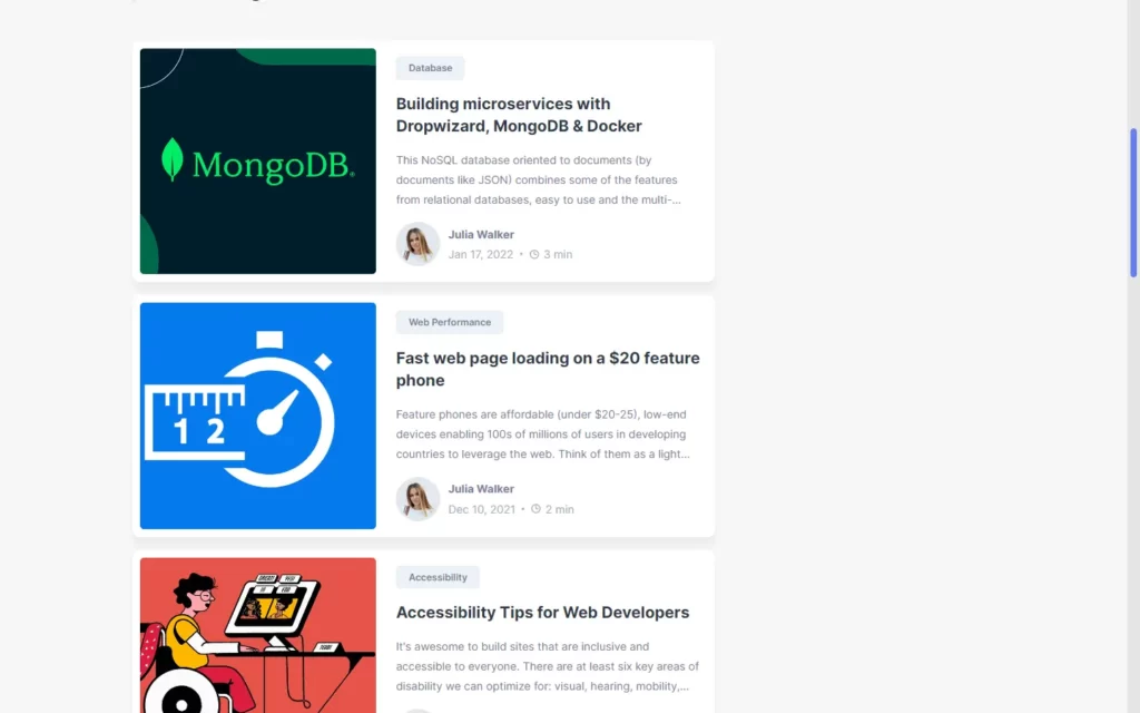
Adding Aside Section
In the aside section, we have added a div in which we will add some elements to show up in the sidebar. Now we have added a div for topics, in which we have added icons and paragraphs for database, Accessibility, and web performance. Then in next div for tags, we have added some buttons to form tags. Then after, we have added lets talk about section, in which we added paragraph and also, some social media icons. Lastly, we have added a newsletter, in which we have added an input field and a button for subscription.
In CSS, we have added adjusted size of the div, and text. Then after, we have adjusted the size of the icon and separated the divs area using basic CSS.
<div class="aside">
<div class="topics">
<h2 class="h2">Topics</h2>
<a href="#" class="topic-btn">
<div class="icon-box">
<ion-icon name="server-outline"></ion-icon>
</div>
<p>Database</p>
</a>
<a href="#" class="topic-btn">
<div class="icon-box">
<ion-icon name="accessibility-outline"></ion-icon>
</div>
<p>Accessibility</p>
</a>
<a href="#" class="topic-btn">
<div class="icon-box">
<ion-icon name="rocket-outline"></ion-icon>
</div>
<p>Web Performance</p>
</a>
</div>
<div class="tags">
<h2 class="h2">Tags</h2>
<div class="wrapper">
<button class="hashtag">#mongodb</button>
<button class="hashtag">#nodejs</button>
<button class="hashtag">#a11y</button>
<button class="hashtag">#mobility</button>
<button class="hashtag">#inclusion</button>
<button class="hashtag">#webperf</button>
<button class="hashtag">#optimize</button>
<button class="hashtag">#performance</button>
</div>
</div>
<div class="contact">
<h2 class="h2">Let's Talk</h2>
<div class="wrapper">
<p>
Do you want to learn more about how I can help your company overcome problems? Let us have a
conversation.
</p>
<ul class="social-link">
<li>
<a href="#" class="icon-box discord">
<ion-icon name="logo-discord"></ion-icon>
</a>
</li>
<li>
<a href="#" class="icon-box twitter">
<ion-icon name="logo-twitter"></ion-icon>
</a>
</li>
<li>
<a href="#" class="icon-box facebook">
<ion-icon name="logo-facebook"></ion-icon>
</a>
</li>
</ul>
</div>
</div>
<div class="newsletter">
<h2 class="h2">Newsletter</h2>
<div class="wrapper">
<p>
Subscribe to our newsletter to be among the first to keep up with the latest updates.
</p>
<form action="#">
<input type="email" name="email" placeholder="Email Address" required>
<button type="submit" class="btn btn-primary">Subscribe</button>
</form>
</div>
</div>
</div>
</div>
</div>
</main>/*-----------------------------------*\
#ASIDE
\*-----------------------------------*/
.aside { display: none; }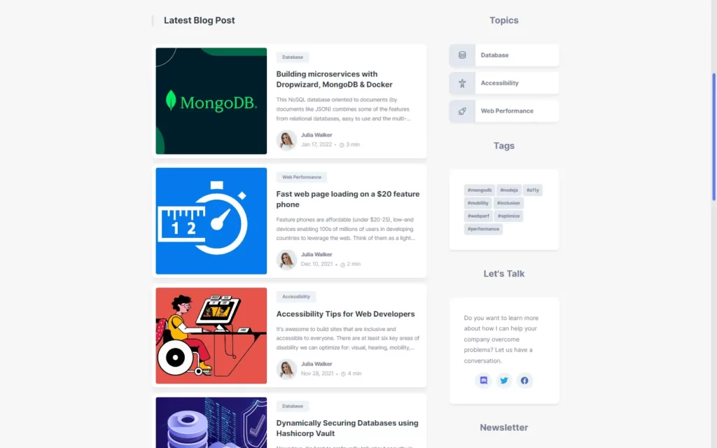
Adding Footer Section
In footer section, we have added a div for footer section. In this we have added a logo, again the same SVG file we have used for the main logo. Then we have added some description, and we have added a list of quick links, Also we have added a list of privacy policy, terms, and conditions as a list. Lastly, we have added copyright with the icon.
In the CSS part, we have just added some basic styles on the text and resized the image for the logo.
<footer>
<div class="container">
<div class="wrapper">
<a href="#" class="footer-logo">
<img src="./assets/images/logo-light.svg" alt="DevBlog's Logo" width="150" height="40" class="logo-light">
<img src="./assets/images/logo-dark.svg" alt="DevBlog's Logo" width="150" height="40" class="logo-dark">
</a>
<p class="footer-text">
Learn about Web accessibility, Web performance, and Database management.
</p>
</div>
<div class="wrapper">
<p class="footer-title">Quick Links</p>
<ul>
<li>
<a href="#" class="footer-link">Advertise with us</a>
</li>
<li>
<a href="#" class="footer-link">About Us</a>
</li>
<li>
<a href="#" class="footer-link">Contact Us</a>
</li>
</ul>
</div>
<div class="wrapper">
<p class="footer-title">Legal Stuff</p>
<ul>
<li>
<a href="#" class="footer-link">Privacy Notice</a>
</li>
<li>
<a href="#" class="footer-link">Cookie Policy</a>
</li>
<li>
<a href="#" class="footer-link">Terms Of Use</a>
</li>
</ul>
</div>
</div>
<p class="copyright">
© Copyright 2022 <a href="#">codewithsadee</a>
</p>
</footer>/*-----------------------------------*\
#FOOTER
\*-----------------------------------*/
footer { background: var(--background-primary); }
footer .container {
padding: var(--py) 15px;
display: grid;
grid-template-columns: 1fr;
gap: 30px;
}
footer .wrapper { text-align: center; }
.footer-logo { margin-bottom: 10px; }
.footer-text {
color: var(--foreground-secondary);
max-width: 300px;
margin-inline: auto;
margin: auto; /* fallback for margin-inline */
}
.footer-title {
color: var(--foreground-primary);
font-weight: 700;
margin-bottom: 0.4rem;
}
.footer-link { color: var(--foreground-secondary); }
.footer-link:hover { color: var(--accent); }
.copyright {
color: var(--foreground-secondary);
font-size: var(--fs-4);
text-align: center;
padding: 1rem;
border-top: 1px solid var(--action-primary);
}
.copyright a {
color: var(--accent);
font-weight: 500;
}
.copyright a:hover { text-decoration: underline; }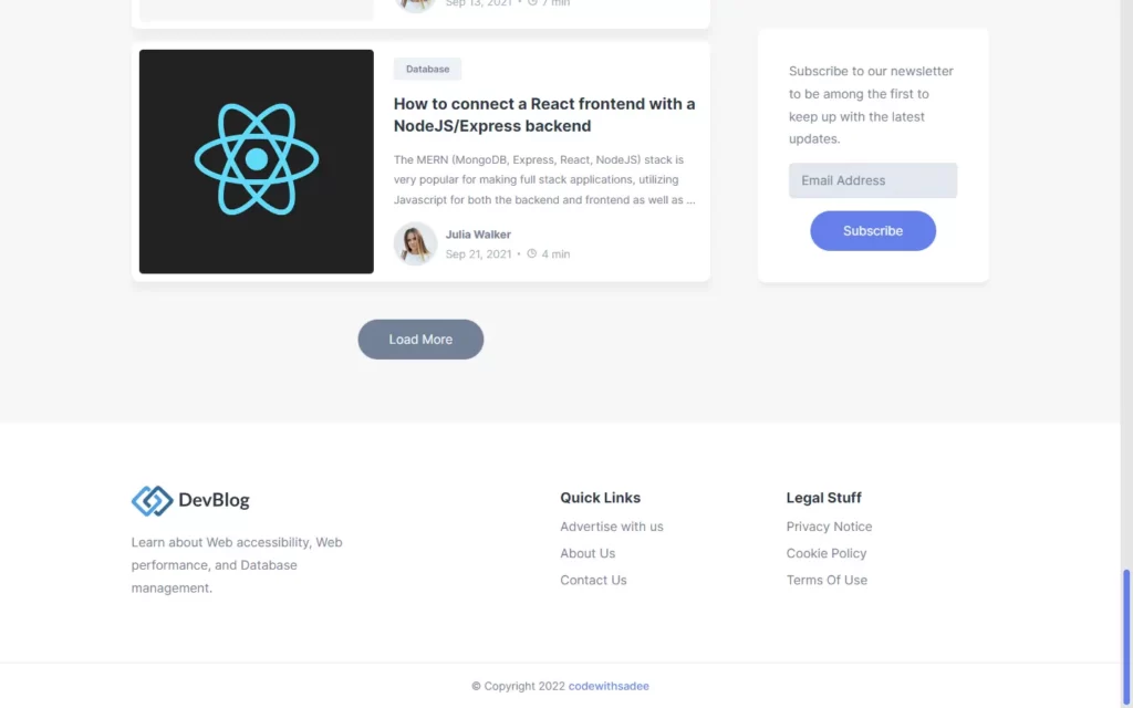
Adding Responsiveness
For every screen resolution, we have added every element here. We used @media element to add every resolution, in this we have just adjusted every element size.
/*-----------------------------------*\
#MEDIA QUERIES
\*-----------------------------------*/
/**
* responsive for larger than 550px screen
*/
@media (min-width: 550px) {
:root {
/**
* typography
*/
--fs-base: 0.90rem;
}
/**
* BLOG
*/
.blog-card {
display: grid;
grid-template-columns: 3fr 4fr;
gap: 20px;
}
.blog-card-banner {
display: block;
overflow: hidden;
border-radius: 5px;
}
.blog-banner-img {
width: 100%;
height: 100%;
object-fit: cover;
}
}
/**
* responsive for larger than 650px screen
*/
@media (min-width: 650px) {
:root {
/**
* typography
*/
--fs-1: 2.25rem;
}
/**
* REUSED STYLE
*/
.container { padding: 0 30px; }
/**
* HEADER
*/
.navbar { padding: 30px 0; }
/**
* BLOG
*/
.blog .h2 {
position: relative;
text-align: left;
padding-left: 2rem;
}
.blog .h2::before {
content: '';
position: absolute;
top: 0;
left: 0;
background: var(--action-primary);
width: 5px;
height: 100%;
border-radius: 5px;
}
.blog-text,
.profile-wrapper { display: block; }
.blog-text {
color: var(--foreground-secondary);
font-size: var(--fs-4);
display: -webkit-box;
line-clamp: 3;
-webkit-line-clamp: 3;
-webkit-box-orient: vertical;
overflow: hidden;
margin-bottom: 1rem;
}
.blog .wrapper-flex {
display: flex;
justify-content: start;
align-items: center;
gap: 10px;
}
.profile-wrapper {
width: 56px;
height: 56px;
background: var(--action-primary);
padding: 3px;
border-radius: 50%;
}
.profile-wrapper img { border-radius: 50%; }
.blog .wrapper {
flex-direction: column;
align-items: start;
gap: 0;
}
/**
* FOOTER
*/
footer .container {
padding: var(--py) 30px;
grid-template-columns: 2fr 1fr 1fr;
}
footer .wrapper { text-align: left; }
.footer-text { margin: 0; }
}
/**
* responsive for larger than 768px screen
*/
@media (min-width: 768px) {
/**
* REUSED STYLE
*/
.container { max-width: 800px; }
}
/**
* responsive for larger than 1024px screen
*/
@media (min-width: 1024px) {
:root {
/**
* typography
*/
--fs-base: 1rem;
--fs-1: 3rem;
}
/**
* REUSED STYLE
*/
.container { max-width: 1150px; }
/**
* HEADER
*/
header .btn-group { display: none; }
header .flex-wrapper {
display: flex;
gap: 30px;
}
.desktop-nav {
display: flex;
align-items: center;
gap: 30px;
}
.desktop-nav .nav-link {
color: var(--foreground-secondary);
font-weight: 700;
}
.desktop-nav .nav-link:hover { color: var(--accent); }
.theme-btn-desktop {
position: relative;
background: var(--background-secondary);
color: var(--white);
width: 52px;
height: 26px;
display: flex;
justify-content: center;
align-items: center;
gap: 10px;
border-radius: 100px;
}
.theme-btn-desktop.light {
background: linear-gradient(45deg, hsl(7, 100%, 71%), hsl(46, 100%, 65%));
}
.theme-btn-desktop.dark {
background: linear-gradient(45deg, hsl(225, 100%, 60%), hsl(296, 80%, 40%));
}
.theme-btn-desktop::before {
content: '';
position: absolute;
background: var(--white);
width: 21px;
height: 21px;
border-radius: 30px;
top: 50%;
left: 3px;
transform: translateY(-50%);
box-shadow: 0 2px 10px -2px hsla(0, 0%, 0%, 0.05);
z-index: 2;
}
.theme-btn-desktop.dark::before { left: calc(100% - 24px); }
/**
* HERO
*/
.hero { text-align: left; }
.hero .container {
display: grid;
grid-template-columns: 1fr 1fr;
align-items: center;
gap: 50px;
}
.hero .btn-group {
justify-content: start;
gap: 30px;
}
.hero .right {
position: relative;
display: flex;
justify-content: center;
align-items: center;
}
.hero .pattern-bg {
position: absolute;
top: 50%;
transform: translateY(-50%);
width: 100%;
height: 200px;
background: url(../images/pattern.png);
background-size: contain;
opacity: 0.2;
}
.hero .img-box {
position: relative;
z-index: 2;
}
.hero-img {
width: 100%;
height: 100%;
object-fit: contain;
border-radius: 0 0 280px 230px;
transform: translate(10px, -10px);
}
.hero .shape {
position: absolute;
top: 50%;
left: 50%;
border-radius: 50%;
transform: translate(-50%, -42%) rotate(-20deg);
}
.hero .shape-1 {
background: var(--accent);
width: 90%;
height: 90%;
z-index: -1;
}
.hero .shape-2 {
width: 92%;
height: 92%;
box-shadow: inset 0 -30px 0 var(--action-primary);
z-index: 2;
}
/**
* MAIN
*/
.main .container {
display: grid;
grid-template-columns: 5fr 2fr;
gap: 60px;
}
/**
* ASIDE
*/
.aside {
display: block;
align-self: stretch;
}
.aside .h2 {
color: var(--foreground-secondary);
margin-bottom: 3rem;
text-align: center;
line-height: 1.3;
}
.aside .wrapper {
background: var(--background-primary);
border-radius: 10px;
padding: 40px;
box-shadow: 0 5px 5px hsla(0, 0%, 0%, 0.05);
}
.topics { margin-bottom: 3rem; }
.topic-btn {
display: flex;
align-items: stretch;
background: var(--background-primary);
border-radius: 10px;
box-shadow: 0 5px 5px hsla(0, 0%, 0%, 0.05);
overflow: hidden;
}
.topic-btn:not(:last-child) { margin-bottom: 1rem; }
.topic-btn .icon-box {
font-size: 22px;
width: 70px;
display: flex;
justify-content: center;
align-items: center;
background: var(--action-primary);
color: var(--foreground-secondary);
}
.topic-btn:hover .icon-box {
background: var(--accent);
color: var(--white);
}
.topic-btn ion-icon { --ionicon-stroke-width: 40px; }
.topic-btn p {
padding: 15px;
color: var(--foreground-secondary);
font-weight: 700;
}
.tags { margin-bottom: 3rem; }
.tags .wrapper {
display: flex;
flex-wrap: wrap;
gap: 0.2rem;
}
.tags .hashtag {
background: var(--action-primary);
color: var(--foreground-secondary);
padding: 5px 10px;
font-size: var(--fs-5);
font-weight: 700;
border-radius: 5px;
}
.tags .hashtag:hover {
background: var(--foreground-secondary);
color: var(--action-primary);
}
.contact { margin-bottom: 3rem; }
.contact p {
color: var(--foreground-secondary);
margin-bottom: 1rem;
}
.social-link {
display: flex;
justify-content: center;
align-items: center;
gap: 10px;
}
.social-link .icon-box {
width: 45px;
height: 45px;
background: var(--action-secondary);
border-radius: 50%;
display: flex;
justify-content: center;
align-items: center;
font-size: 22px;
}
.social-link .discord { color: hsl(235, 86%, 65%); }
.social-link .twitter { color: hsl(203, 89%, 53%); }
.social-link .facebook { color: hsl(220, 46%, 48%); }
.social-link .icon-box:hover {
background: var(--accent);
color: var(--white);
}
.newsletter {
position: sticky;
top: 3rem;
margin-bottom: 98px;
}
.newsletter p {
color: var(--foreground-secondary);
margin-bottom: 1rem;
}
.newsletter input {
border: none;
background: var(--action-primary);
display: block;
width: 100%;
padding: 0.5rem 1rem;
font: inherit;
color: var(--foreground-secondary);
border-radius: 5px;
margin-bottom: 1rem;
}
.newsletter input::placeholder { color: inherit; }
.newsletter input:focus {
outline: 2px solid;
outline-offset: 0;
}
.newsletter .btn-primary {
margin-inline: auto;
margin: auto; /* fallback for margin-inline */
}
/**
* FOOTER
*/
.footer-title { font-size: 1.125rem; }
.footer-link { margin-bottom: 0.3rem; }
}Adding Functionality to Menu Button and Dark mode
'use strict';
// navbar variables
const nav = document.querySelector('.mobile-nav');
const navMenuBtn = document.querySelector('.nav-menu-btn');
const navCloseBtn = document.querySelector('.nav-close-btn');
// navToggle function
const navToggleFunc = function () { nav.classList.toggle('active'); }
navMenuBtn.addEventListener('click', navToggleFunc);
navCloseBtn.addEventListener('click', navToggleFunc);
// theme toggle variables
const themeBtn = document.querySelectorAll('.theme-btn');
for (let i = 0; i < themeBtn.length; i++) {
themeBtn[i].addEventListener('click', function () {
// toggle `light-theme` & `dark-theme` class from `body`
// when clicked `theme-btn`
document.body.classList.toggle('light-theme');
document.body.classList.toggle('dark-theme');
for (let i = 0; i < themeBtn.length; i++) {
// When the `theme-btn` is clicked,
// it toggles classes between `light` & `dark` for all `theme-btn`.
themeBtn[i].classList.toggle('light');
themeBtn[i].classList.toggle('dark');
}
})
}Full Source Code to Make Personal Blog Website Using HTML, CSS, and JavaScript
index.html
<!DOCTYPE html>
<html lang="en">
<head>
<meta charset="UTF-8">
<meta http-equiv="X-UA-Compatible" content="IE=edge">
<meta name="viewport" content="width=device-width, initial-scale=1.0">
<title>DevBlog - Julia Walker's Personal Blog</title>
<!--
- favicon
-->
<link rel="shortcut icon" href="./assets/images/favicon.ico" type="image/x-icon">
<!--
- custom css link
-->
<link rel="stylesheet" href="./assets/css/style.min.css">
<!--
- google font link
-->
<link rel="preconnect" href="https://fonts.googleapis.com">
<link rel="preconnect" href="https://fonts.gstatic.com" crossorigin>
<link href="https://fonts.googleapis.com/css2?family=Inter:wght@400;500;600;700;900&display=swap" rel="stylesheet">
</head>
<body class="light-theme">
<!--
- #HEADER
-->
<header>
<div class="container">
<nav class="navbar">
<a href="#">
<img src="./assets/images/logo-light.svg" alt="Devblog's logo" width="150" height="40" class="logo-light">
<img src="./assets/images/logo-dark.svg" alt="Devblog's logo" width="150" height="40" class="logo-dark">
</a>
<div class="btn-group">
<button class="theme-btn theme-btn-mobile light">
<ion-icon name="moon" class="moon"></ion-icon>
<ion-icon name="sunny" class="sun"></ion-icon>
</button>
<button class="nav-menu-btn">
<ion-icon name="menu-outline"></ion-icon>
</button>
</div>
<div class="flex-wrapper">
<ul class="desktop-nav">
<li>
<a href="#" class="nav-link">Home</a>
</li>
<li>
<a href="#" class="nav-link">About Me</a>
</li>
<li>
<a href="#" class="nav-link">Contact</a>
</li>
</ul>
<button class="theme-btn theme-btn-desktop light">
<ion-icon name="moon" class="moon"></ion-icon>
<ion-icon name="sunny" class="sun"></ion-icon>
</button>
</div>
<div class="mobile-nav">
<button class="nav-close-btn">
<ion-icon name="close-outline"></ion-icon>
</button>
<div class="wrapper">
<p class="h3 nav-title">Main Menu</p>
<ul>
<li class="nav-item">
<a href="#" class="nav-link">Home</a>
</li>
<li class="nav-item">
<a href="#" class="nav-link">About Me</a>
</li>
<li class="nav-item">
<a href="#" class="nav-link">Contact</a>
</li>
</ul>
</div>
<div>
<p class="h3 nav-title">Topics</p>
<ul>
<li class="nav-item">
<a href="#" class="nav-link">Database</a>
</li>
<li class="nav-item">
<a href="#" class="nav-link">Accessibility</a>
</li>
<li class="nav-item">
<a href="#" class="nav-link">Web Performance</a>
</li>
</ul>
</div>
</div>
</nav>
</div>
</header>
<main>
<!--
- #HERO SECTION
-->
<div class="hero">
<div class="container">
<div class="left">
<h1 class="h1">
Hi, I'm <b>Julia Walker</b>.
<br>Web Developer
</h1>
<p class="h3">
Specialized in <abbr title="Accessibility">a11y</abbr>
and Core Web Vitals
</p>
<div class="btn-group">
<a href="#" class="btn btn-primary">Contact Me</a>
<a href="#" class="btn btn-secondary">About Me</a>
</div>
</div>
<div class="right">
<div class="pattern-bg"></div>
<div class="img-box">
<img src="./assets/images/hero.png" alt="Julia Walker" class="hero-img">
<div class="shape shape-1"></div>
<div class="shape shape-2"></div>
</div>
</div>
</div>
</div>
<div class="main">
<div class="container">
<!--
- BLOG SECTION
-->
<div class="blog">
<h2 class="h2">Latest Blog Post</h2>
<div class="blog-card-group">
<div class="blog-card">
<div class="blog-card-banner">
<img src="./assets/images/blog-1.png" alt="Building microservices with Dropwizard, MongoDB & Docker"
width="250" class="blog-banner-img">
</div>
<div class="blog-content-wrapper">
<button class="blog-topic text-tiny">Database</button>
<h3>
<a href="#" class="h3">
Building microservices with Dropwizard, MongoDB & Docker
</a>
</h3>
<p class="blog-text">
This NoSQL database oriented to documents (by documents like JSON) combines some of the features from
relational
databases, easy to use and the multi-platform is the best option for scale up and have fault
tolerance, load balancing,
map reduce, etc.
</p>
<div class="wrapper-flex">
<div class="profile-wrapper">
<img src="./assets/images/author.png" alt="Julia Walker" width="50">
</div>
<div class="wrapper">
<a href="#" class="h4">Julia Walker</a>
<p class="text-sm">
<time datetime="2022-01-17">Jan 17, 2022</time>
<span class="separator"></span>
<ion-icon name="time-outline"></ion-icon>
<time datetime="PT3M">3 min</time>
</p>
</div>
</div>
</div>
</div>
<div class="blog-card">
<div class="blog-card-banner">
<img src="./assets/images/blog-2.png" alt="Fast web page loading on a $20 feature phone" width="250"
class="blog-banner-img">
</div>
<div class="blog-content-wrapper">
<button class="blog-topic text-tiny">Web Performance</button>
<h3><a href="" class="h3">Fast web page loading on a $20 feature phone</a></h3>
<p class="blog-text">
Feature phones are affordable (under $20-25), low-end devices enabling 100s of millions of users in
developing countries
to leverage the web. Think of them as a light version of a smart phone.
</p>
<div class="wrapper-flex">
<div class="profile-wrapper">
<img src="./assets/images/author.png" alt="Julia walker" width="50">
</div>
<div class="wrapper">
<a href="#" class="h4">Julia Walker</a>
<p class="text-sm">
<time datetime="2021-12-10">Dec 10, 2021</time>
<span class="separator"></span>
<ion-icon name="time-outline"></ion-icon>
<time datetime="PT2M">2 min</time>
</p>
</div>
</div>
</div>
</div>
<div class="blog-card">
<div class="blog-card-banner">
<img src="./assets/images/blog-3.png" alt="Accessibility Tips for Web Developers" width="250"
class="blog-banner-img">
</div>
<div class="blog-content-wrapper">
<button class="blog-topic text-tiny">Accessibility</button>
<h3><a href="" class="h3">Accessibility Tips for Web Developers</a></h3>
<p class="blog-text">
It's awesome to build sites that are inclusive and accessible to everyone. There are at least six key
areas of
disability we can optimize for: visual, hearing, mobility, cognition, speech and neural. Many tools
and resources can
help here, even if you're totally new to web accessibility.
</p>
<div class="wrapper-flex">
<div class="profile-wrapper">
<img src="./assets/images/author.png" alt="Julia walker" width="50">
</div>
<div class="wrapper">
<a href="#" class="h4">Julia Walker</a>
<p class="text-sm">
<time datetime="2021-11-28">Nov 28, 2021</time>
<span class="separator"></span>
<ion-icon name="time-outline"></ion-icon>
<time datetime="PT4M">4 min</time>
</p>
</div>
</div>
</div>
</div>
<div class="blog-card">
<div class="blog-card-banner">
<img src="./assets/images/blog-4.png" alt="Dynamically Securing Databases using Hashicorp Vault"
width="250" class="blog-banner-img">
</div>
<div class="blog-content-wrapper">
<button class="blog-topic text-tiny">Database</button>
<h3><a href="" class="h3">Dynamically Securing Databases using Hashicorp Vault</a></h3>
<p class="blog-text">
Nowadays, it's hard to profoundly talk about security in the IT industry, since it has to be
considered on so many
different levels: from securing code chunks, securing containers, up to securing complex
infrastructures and defining
strong authorization and authentication policies across the enterprise.
</p>
<div class="wrapper-flex">
<div class="profile-wrapper">
<img src="./assets/images/author.png" alt="Julia walker" width="50">
</div>
<div class="wrapper">
<a href="#" class="h4">Julia Walker</a>
<p class="text-sm">
<time datetime="2021-11-20">Nov 20, 2021</time>
<span class="separator"></span>
<ion-icon name="time-outline"></ion-icon>
<time datetime="PT4M">4 min</time>
</p>
</div>
</div>
</div>
</div>
<div class="blog-card">
<div class="blog-card-banner">
<img src="./assets/images/blog-5.png"
alt="Adaptive Loading - Improving Web Performance on low-end devices" width="250"
class="blog-banner-img">
</div>
<div class="blog-content-wrapper">
<button class="blog-topic text-tiny">Web Performance</button>
<h3><a href="" class="h3">Adaptive Loading - Improving Web Performance on low-end devices</a></h3>
<p class="blog-text">
Adaptive Loading: Do not just respond based on screen size, adapt based on actual device hardware.
Any user can have a slow experience. In a world with widely varying device capabilities, a "one-size"
fits all
experience may not always work. Sites that delight users on high-end devices can be unusable on
low-end ones,
particularly on median mobile and desktop hardware and in emerging markets.
</p>
<div class="wrapper-flex">
<div class="profile-wrapper">
<img src="./assets/images/author.png" alt="Julia walker" width="50">
</div>
<div class="wrapper">
<a href="#" class="h4">Julia Walker</a>
<p class="text-sm">
<time datetime="2021-11-10">Nov 10, 2021</time>
<span class="separator"></span>
<ion-icon name="time-outline"></ion-icon>
<time datetime="PT3M">3 min</time>
</p>
</div>
</div>
</div>
</div>
<div class="blog-card">
<div class="blog-card-banner">
<img src="./assets/images/blog-6.png"
alt="Don't Develop Just for Yourself - A Developer's Checklist to Accessibility" width="250"
class="blog-banner-img">
</div>
<div class="blog-content-wrapper">
<button class="blog-topic text-tiny">Accessibility</button>
<h3><a href="" class="h3">Don't Develop Just for Yourself - A Developer's Checklist to Accessibility</a>
</h3>
<p class="blog-text">
We, as developers, tend to develop sites unconsciously for people like ourselves. If we don't actively
pay attention,
the sites are often accessible only for certain types of people: Sighted mouse-users, who have good
fine motor skills
and are good at using computers.
</p>
<div class="wrapper-flex">
<div class="profile-wrapper">
<img src="./assets/images/author.png" alt="Julia walker" width="50">
</div>
<div class="wrapper">
<a href="#" class="h4">Julia Walker</a>
<p class="text-sm">
<time datetime="2021-10-25">Oct 25, 2021</time>
<span class="separator"></span>
<ion-icon name="time-outline"></ion-icon>
<time datetime="PT7M">7 min</time>
</p>
</div>
</div>
</div>
</div>
<div class="blog-card">
<div class="blog-card-banner">
<img src="./assets/images/blog-7.png"
alt="Building a Restful CRUD API with Node JS, Express, and MongoDB" width="250"
class="blog-banner-img">
</div>
<div class="blog-content-wrapper">
<button class="blog-topic text-tiny">Database</button>
<h3><a href="" class="h3">Building a Restful CRUD API with Node JS, Express, and MongoDB</a></h3>
<p class="blog-text">
Application Programming Interface is the abbreviation for API. An API is a software interface that
enables two apps to
communicate with one another. In other words, an API is a messenger that sends your request to the
provider and then
returns the response to you.
</p>
<div class="wrapper-flex">
<div class="profile-wrapper">
<img src="./assets/images/author.png" alt="Julia walker" width="50">
</div>
<div class="wrapper">
<a href="#" class="h4">Julia Walker</a>
<p class="text-sm">
<time datetime="2021-10-15">Oct 15, 2021</time>
<span class="separator"></span>
<ion-icon name="time-outline"></ion-icon>
<time datetime="PT5M">5 min</time>
</p>
</div>
</div>
</div>
</div>
<div class="blog-card">
<div class="blog-card-banner">
<img src="./assets/images/blog-8.png" alt="Monitoring Performance with the PageSpeed Insights API"
width="250" class="blog-banner-img">
</div>
<div class="blog-content-wrapper">
<button class="blog-topic text-tiny">Web Performance</button>
<h3><a href="" class="h3">Monitoring Performance with the PageSpeed Insights API</a></h3>
<p class="blog-text">
The PageSpeed Insights API provides free access to performance monitoring for web pages and returns
data with
suggestions for how to improve. The V5 API includes lab data from Lighthouse and real-world data from
the Chrome User
Experience Report (CrUX).
</p>
<div class="wrapper-flex">
<div class="profile-wrapper">
<img src="./assets/images/author.png" alt="Julia walker" width="50">
</div>
<div class="wrapper">
<a href="#" class="h4">Julia Walker</a>
<p class="text-sm">
<time datetime="2021-10-03">Oct 3, 2021</time>
<span class="separator"></span>
<ion-icon name="time-outline"></ion-icon>
<time datetime="PT5M">5 min</time>
</p>
</div>
</div>
</div>
</div>
<div class="blog-card">
<div class="blog-card-banner">
<img src="./assets/images/blog-9.png" alt="The best web accessibility tools for developers in 2021"
width="250" class="blog-banner-img">
</div>
<div class="blog-content-wrapper">
<button class="blog-topic text-tiny">Accessibility</button>
<h3><a href="" class="h3">The best web accessibility tools for developers in 2021</a>
</h3>
<p class="blog-text">
The quality of the tools you use defines the speed with which you can diagnose and resolve problems.
Each year the landscape changes dramatically in web technologies, and of late the tooling for
accessibility is no
exception.
</p>
<div class="wrapper-flex">
<div class="profile-wrapper">
<img src="./assets/images/author.png" alt="Julia walker" width="50">
</div>
<div class="wrapper">
<a href="#" class="h4">Julia Walker</a>
<p class="text-sm">
<time datetime="2021-09-13">Sep 13, 2021</time>
<span class="separator"></span>
<ion-icon name="time-outline"></ion-icon>
<time datetime="PT7M">7 min</time>
</p>
</div>
</div>
</div>
</div>
<div class="blog-card">
<div class="blog-card-banner">
<img src="./assets/images/blog-10.png"
alt="How to connect a React frontend with a NodeJS/Express backend" width="250"
class="blog-banner-img">
</div>
<div class="blog-content-wrapper">
<button class="blog-topic text-tiny">Database</button>
<h3><a href="" class="h3">How to connect a React frontend with a NodeJS/Express backend</a></h3>
<p class="blog-text">
The MERN (MongoDB, Express, React, NodeJS) stack is very popular for making full stack applications,
utilizing
Javascript for both the backend and frontend as well as a document-oriented or non relational database
(MongoDB),
meaning that it's structured like JSON rather than a large excel sheet like SQL databases are.
</p>
<div class="wrapper-flex">
<div class="profile-wrapper">
<img src="./assets/images/author.png" alt="Julia walker" width="50">
</div>
<div class="wrapper">
<a href="#" class="h4">Julia Walker</a>
<p class="text-sm">
<time datetime="2021-09-21">Sep 21, 2021</time>
<span class="separator"></span>
<ion-icon name="time-outline"></ion-icon>
<time datetime="PT4M">4 min</time>
</p>
</div>
</div>
</div>
</div>
</div>
<button class="btn load-more">Load More</button>
</div>
<!--
- ASIDE
-->
<div class="aside">
<div class="topics">
<h2 class="h2">Topics</h2>
<a href="#" class="topic-btn">
<div class="icon-box">
<ion-icon name="server-outline"></ion-icon>
</div>
<p>Database</p>
</a>
<a href="#" class="topic-btn">
<div class="icon-box">
<ion-icon name="accessibility-outline"></ion-icon>
</div>
<p>Accessibility</p>
</a>
<a href="#" class="topic-btn">
<div class="icon-box">
<ion-icon name="rocket-outline"></ion-icon>
</div>
<p>Web Performance</p>
</a>
</div>
<div class="tags">
<h2 class="h2">Tags</h2>
<div class="wrapper">
<button class="hashtag">#mongodb</button>
<button class="hashtag">#nodejs</button>
<button class="hashtag">#a11y</button>
<button class="hashtag">#mobility</button>
<button class="hashtag">#inclusion</button>
<button class="hashtag">#webperf</button>
<button class="hashtag">#optimize</button>
<button class="hashtag">#performance</button>
</div>
</div>
<div class="contact">
<h2 class="h2">Let's Talk</h2>
<div class="wrapper">
<p>
Do you want to learn more about how I can help your company overcome problems? Let us have a
conversation.
</p>
<ul class="social-link">
<li>
<a href="#" class="icon-box discord">
<ion-icon name="logo-discord"></ion-icon>
</a>
</li>
<li>
<a href="#" class="icon-box twitter">
<ion-icon name="logo-twitter"></ion-icon>
</a>
</li>
<li>
<a href="#" class="icon-box facebook">
<ion-icon name="logo-facebook"></ion-icon>
</a>
</li>
</ul>
</div>
</div>
<div class="newsletter">
<h2 class="h2">Newsletter</h2>
<div class="wrapper">
<p>
Subscribe to our newsletter to be among the first to keep up with the latest updates.
</p>
<form action="#">
<input type="email" name="email" placeholder="Email Address" required>
<button type="submit" class="btn btn-primary">Subscribe</button>
</form>
</div>
</div>
</div>
</div>
</div>
</main>
<!--
- #FOOTER
-->
<footer>
<div class="container">
<div class="wrapper">
<a href="#" class="footer-logo">
<img src="./assets/images/logo-light.svg" alt="DevBlog's Logo" width="150" height="40" class="logo-light">
<img src="./assets/images/logo-dark.svg" alt="DevBlog's Logo" width="150" height="40" class="logo-dark">
</a>
<p class="footer-text">
Learn about Web accessibility, Web performance, and Database management.
</p>
</div>
<div class="wrapper">
<p class="footer-title">Quick Links</p>
<ul>
<li>
<a href="#" class="footer-link">Advertise with us</a>
</li>
<li>
<a href="#" class="footer-link">About Us</a>
</li>
<li>
<a href="#" class="footer-link">Contact Us</a>
</li>
</ul>
</div>
<div class="wrapper">
<p class="footer-title">Legal Stuff</p>
<ul>
<li>
<a href="#" class="footer-link">Privacy Notice</a>
</li>
<li>
<a href="#" class="footer-link">Cookie Policy</a>
</li>
<li>
<a href="#" class="footer-link">Terms Of Use</a>
</li>
</ul>
</div>
</div>
<p class="copyright">
© Copyright 2022 <a href="#">codewithsadee</a>
</p>
</footer>
<!--
- custom js link
-->
<script src="./assets/js/script.min.js"></script>
<!--
- ionicon link
-->
<script type="module" src="https://unpkg.com/ionicons@5.5.2/dist/ionicons/ionicons.esm.js"></script>
<script nomodule src="https://unpkg.com/ionicons@5.5.2/dist/ionicons/ionicons.js"></script>
</body>
</html>
style.css
/*-----------------------------------*\
#style.css
\*-----------------------------------*/
/**
* copyright 2022 @codewithsadee
*/
/*-----------------------------------*\
#CUSTOM PROPERTY
\*-----------------------------------*/
.light-theme {
/**
* light theme colors
*/
--background-primary: hsl(0, 0%, 100%);
--background-secondary: hsl(0, 0%, 97%);
--action-primary: hsl(214, 32%, 91%);
--action-secondary: hsl(210, 38%, 95%);
--foreground-primary: hsl(218, 23%, 23%);
--foreground-secondary: hsl(216, 15%, 52%);
--foreground-tertiary: hsl(214, 20%, 69%);
--accent: hsl(229, 76%, 66%);
}
.dark-theme {
/**
* dark theme colors
*/
--background-primary: hsl(218, 23%, 23%);
--background-secondary: hsl(220, 26%, 14%);
--action-primary: hsl(216, 15%, 52%);
--action-secondary: hsl(218, 23%, 23%);
--foreground-primary: hsl(210, 38%, 95%);
--foreground-secondary: hsl(211, 25%, 84%);
--foreground-tertiary: hsl(214, 20%, 69%);
--accent: hsl(229, 76%, 66%);
}
:root {
/**
* color
*/
--white: hsl(0, 0%, 100%);
/**
* typography
*/
--fs-base: 0.85rem;
--fs-1: 1.875rem;
--fs-2: 1.5rem;
--fs-3: 1.25rem;
--fs-4: 0.875rem;
--fs-5: 0.75rem;
/**
* spacing
*/
--py: 5rem;
}
/*-----------------------------------*\
#RESET
\*-----------------------------------*/
*, *::before, *::after {
margin: 0;
padding: 0;
box-sizing: border-box;
}
a { text-decoration: none; }
li { list-style: none; }
img, button { display: block; }
a, span { display: inline-block; }
button {
font: inherit;
border: none;
background: none;
cursor: pointer;
}
html {
font-family: "Inter", sans-serif;
font-size: var(--fs-base); /* base font-size (0.85rem = 13.6px) */
line-height: 1.8;
}
:focus { outline-offset: 4px; }
/**
* scrollbar style
*/
::-webkit-scrollbar { width: 16px; }
::-webkit-scrollbar-thumb {
background: var(--accent);
border-radius: 20px;
border: 4px solid;
}
.light-theme::-webkit-scrollbar-thumb { border-color: hsl(0, 0%, 90%); }
.dark-theme::-webkit-scrollbar-thumb { border-color: hsl(219, 27%, 20%); }
.light-theme::-webkit-scrollbar-track { background: hsl(0, 0%, 90%); }
.dark-theme::-webkit-scrollbar-track { background: hsl(219, 27%, 20%); }
/*-----------------------------------*\
#BASE STYLE
\*-----------------------------------*/
.h1,
.h2,
.h3,
.h4 {
display: block;
color: var(--foreground-primary);
}
.h1 {
font-size: var(--fs-1);
font-weight: 900;
}
.h2 {
font-size: var(--fs-2);
font-weight: 700;
}
.h3 {
font-size: var(--fs-3);
font-weight: 700;
}
.h4 {
font-size: var(--fs-4);
font-weight: 700;
}
.text-sm { font-size: var(--fs-4); }
.text-tiny { font-size: var(--fs-5); }
/*-----------------------------------*\
#REUSED STYLE
\*-----------------------------------*/
.container {
margin-inline: auto;
margin: auto; /* fallback for margin-inline */
padding: 0 15px;
}
.btn {
min-width: 10rem;
border-radius: 100px;
}
.btn-primary {
background: var(--accent);
color: var(--white);
padding: 0.6875rem 1.1875rem;
}
.btn-primary:hover {
background: var(--foreground-secondary);
color: var(--action-primary);
}
.btn-secondary {
background: var(--action-secondary);
color: var(--foreground-secondary);
padding: 0.5rem 1rem;
border: 3px solid var(--foreground-tertiary);
}
.btn-secondary:hover { border-color: var(--accent); }
/*-----------------------------------*\
#Extra style for dark theme
\*-----------------------------------*/
.dark-theme .btn-primary:hover { color: var(--background-primary); }
.dark-theme .blog-topic {
background: var(--action-primary);
color: var(--foreground-secondary);
}
.dark-theme .blog-topic:hover {
background: var(--foreground-primary);
color: var(--action-primary);
}
.dark-theme .load-more:hover { color: var(--white); }
.dark-theme .aside .h2 { color: var(--foreground-primary); }
/*-----------------------------------*\
  #HEADER
\*-----------------------------------*/

header { background: var(--background-primary); }

header .flex-wrapper { display: none; }

.navbar {
  display:         flex;
  justify-content: space-between;
  align-items:     center;
  gap: 15px;
  padding: 15px 0;
}

.logo-light,
.logo-dark { display: none; }

.light-theme .logo-light,
.dark-theme .logo-dark { display: block; }

header .btn-group {
  display:     flex;
  align-items: center;
  gap: 15px;
}

.theme-btn-mobile,
.nav-menu-btn,
.nav-close-btn {
  background: var(--action-secondary);
  color: var(--foreground-tertiary);
  width:  40px;
  height: 40px;
  display:         flex;
  justify-content: center;
  align-items:     center;
  border-radius: 50%;
  font-size: 25px;
}

:is(.theme-btn-mobile,
.nav-menu-btn,
.nav-close-btn):hover {
  background: var(--accent);
  color: var(--white);
}

.theme-btn-mobile ion-icon { display: none; }

.theme-btn-mobile.light .sun,
.theme-btn-mobile.dark .moon { display: block; }

.mobile-nav {
  position: fixed;
  inset: 0;
  background: var(--background-primary);
  padding: 70px 20px;
  overflow: auto;
  overscroll-behavior: contain;
  transform: translateX(100%);
  visibility: hidden;
  transition: 0.5s cubic-bezier(1, 0, 0.30, 0.70);
  z-index: 10;
}

.mobile-nav.active {
  transform: translateX(0);
  visibility: visible;
}

.nav-close-btn {
  position: absolute;
  top:   20px;
  right: 20px;
}

.mobile-nav .wrapper {
  padding-bottom: 1.25rem;
  margin-bottom:  1.25rem;
  border-bottom: 1px solid var(--action-primary);
}

.mobile-nav .nav-title { margin-bottom: 1rem; }

.mobile-nav .nav-item { margin-bottom: 0.5rem; }

.mobile-nav .nav-link {
  font-size: var(--fs-3);
  color: var(--foreground-secondary);
}

.mobile-nav .nav-link:hover { color: var(--accent); }
/*-----------------------------------*\
  #HERO SECTION
\*-----------------------------------*/

.hero {
  background: var(--background-primary);
  padding-top:    2rem;
  padding-bottom: var(--py);
  text-align: center;
}

.hero .h1 {
  margin-bottom: 1rem;
  line-height: 1.6;
}

.hero b {
  color: var(--accent);
  font-weight: inherit;
}

.hero .h3 {
  color: var(--foreground-secondary);
  margin-bottom: 2rem;
}

.hero .btn-group {
  display:         flex;
  justify-content: center;
  flex-wrap:       wrap;
  gap: 15px;
  text-align: center;
}

.hero .right { display: none; }
/*-----------------------------------*\
  #BLOG SECTION
\*-----------------------------------*/

.main {
  background: var(--background-secondary);
  padding: var(--py) 0;
}

.blog .h2 {
  line-height: 1.3;
  margin-bottom: 3rem;
  text-align: center;
}

.blog-card-group { margin-bottom: 3rem; }

.blog-card {
  background: var(--background-primary);
  padding: 10px;
  margin-bottom: 1rem;
  border-radius: 10px;
  box-shadow: 0 10px 10px hsla(0, 0%, 0%, 0.05);
  transition: 0.25s ease;
}

.blog-card:hover {
  transform: translateY(-2px);
  box-shadow: 0 10px 10px hsla(0, 0%, 0%, 0.1);
}

.blog-card-banner { display: none; }

.blog-content-wrapper { padding: 10px 5px; }

.blog-topic {
  background: var(--action-secondary);
  color: var(--foreground-secondary);
  font-weight: 600;
  padding: 0.25rem 1rem;
  border-radius: 5px;
  margin-bottom: 1rem;
}

.blog-topic:hover {
  background: var(--foreground-secondary);
  color: var(--action-secondary);
}

.blog-card .h3 {
  line-height: 1.4;
  margin-bottom: 1rem;
}

.blog-card .h3:hover {
  text-decoration: underline;
  text-decoration-thickness: 2px;
}

.blog-text,
.profile-wrapper { display: none; }

.blog .wrapper {
  display:         flex;
  justify-content: space-between;
  align-items:     center;
  flex-wrap:       wrap;
  gap: 15px;
}

.blog .h4 { color: var(--foreground-secondary); }

.blog .h4:hover { color: var(--accent); }

.blog .text-sm {
  display:     flex;
  align-items: center;
  gap: 5px;
  color: var(--foreground-tertiary);
}

.blog .separator {
  background: var(--foreground-tertiary);
  margin-inline: 3px;
  margin: 0 3px; /* fallback for margin-inline */
  width:  3px;
  height: 3px;
  border-radius: 3px;
}

.blog ion-icon { --ionicon-stroke-width: 50px; }

.load-more {
  margin-inline: auto;
  margin: auto; /* fallback for margin-inline */
  background: var(--foreground-secondary);
  color: var(--background-secondary);
  padding: 0.6875rem 1.1875rem;
}

.load-more:hover { background: var(--accent); }
/*-----------------------------------*\
  #ASIDE
\*-----------------------------------*/

.aside { display: none; }
/*-----------------------------------*\
  #FOOTER
\*-----------------------------------*/

footer { background: var(--background-primary); }

footer .container {
  padding: var(--py) 15px;
  display: grid;
  grid-template-columns: 1fr;
  gap: 30px;
}

footer .wrapper { text-align: center; }

.footer-logo { margin-bottom: 10px; }

.footer-text {
  color: var(--foreground-secondary);
  max-width: 300px;
  margin-inline: auto;
  margin: auto; /* fallback for margin-inline */
}

.footer-title {
  color: var(--foreground-primary);
  font-weight: 700;
  margin-bottom: 0.4rem;
}

.footer-link { color: var(--foreground-secondary); }

.footer-link:hover { color: var(--accent); }

.copyright {
  color: var(--foreground-secondary);
  font-size: var(--fs-4);
  text-align: center;
  padding: 1rem;
  border-top: 1px solid var(--action-primary);
}

.copyright a {
  color: var(--accent);
  font-weight: 500;
}

.copyright a:hover { text-decoration: underline; }
/*-----------------------------------*\
  #MEDIA QUERIES
\*-----------------------------------*/

/**
 * responsive for larger than 550px screen
 */

@media (min-width: 550px) {

  :root {

    /**
     * typography
     */

    --fs-base: 0.90rem;

  }


  /**
   * BLOG
   */

  .blog-card {
    display: grid;
    grid-template-columns: 3fr 4fr;
    gap: 20px;
  }

  .blog-card-banner {
    display: block;
    overflow: hidden;
    border-radius: 5px;
  }

  .blog-banner-img {
    width:  100%;
    height: 100%;
    object-fit: cover;
  }

}


/**
 * responsive for larger than 650px screen
 */

@media (min-width: 650px) {

  :root {

    /**
     * typography
     */

    --fs-1: 2.25rem;

  }


  /**
   * REUSED STYLE
   */

  .container { padding: 0 30px; }


  /**
   * HEADER
   */

  .navbar { padding: 30px 0; }


  /**
   * BLOG
   */

  .blog .h2 {
    position: relative;
    text-align: left;
    padding-left: 2rem;
  }

  .blog .h2::before {
    content: '';
    position: absolute;
    top:  0;
    left: 0;
    background: var(--action-primary);
    width:  5px;
    height: 100%;
    border-radius: 5px;
  }

  .blog-text,
  .profile-wrapper { display: block; }

  .blog-text {
    color: var(--foreground-secondary);
    font-size: var(--fs-4);
    display: -webkit-box;
    line-clamp: 3;
    -webkit-line-clamp: 3;
    -webkit-box-orient: vertical;
    overflow: hidden;
    margin-bottom: 1rem;
  }

  .blog .wrapper-flex {
    display:         flex;
    justify-content: start;
    align-items:     center;
    gap: 10px;
  }

  .profile-wrapper {
    width:  56px;
    height: 56px;
    background: var(--action-primary);
    padding: 3px;
    border-radius: 50%;
  }

  .profile-wrapper img { border-radius: 50%; }

  .blog .wrapper {
    flex-direction: column;
    align-items: start;
    gap: 0;
  }


  /**
   * FOOTER
   */

  footer .container {
    padding: var(--py) 30px;
    grid-template-columns: 2fr 1fr 1fr;
  }

  footer .wrapper { text-align: left; }

  .footer-text { margin: 0; }

}


/**
 * responsive for larger than 768px screen
 */

@media (min-width: 768px) {

  /**
   * REUSED STYLE
   */

  .container { max-width: 800px; }

}


/**
 * responsive for larger than 1024px screen
 */

@media (min-width: 1024px) {

  :root {

    /**
     * typography
     */

    --fs-base: 1rem;
    --fs-1: 3rem;

  }


  /**
   * REUSED STYLE
   */

  .container { max-width: 1150px; }


  /**
   * HEADER
   */

  header .btn-group { display: none; }

  header .flex-wrapper {
    display: flex;
    gap: 30px;
  }

  .desktop-nav {
    display:     flex;
    align-items: center;
    gap: 30px;
  }

  .desktop-nav .nav-link {
    color: var(--foreground-secondary);
    font-weight: 700;
  }

  .desktop-nav .nav-link:hover { color: var(--accent); }

  .theme-btn-desktop {
    position: relative;
    background: var(--background-secondary);
    color: var(--white);
    width:  52px;
    height: 26px;
    display:         flex;
    justify-content: center;
    align-items:     center;
    gap: 10px;
    border-radius: 100px;
  }

  .theme-btn-desktop.light {
    background: linear-gradient(45deg, hsl(7, 100%, 71%), hsl(46, 100%, 65%));
  }

  .theme-btn-desktop.dark {
    background: linear-gradient(45deg, hsl(225, 100%, 60%), hsl(296, 80%, 40%));
  }

  .theme-btn-desktop::before {
    content: '';
    position: absolute;
    background: var(--white);
    width:  21px;
    height: 21px;
    border-radius: 30px;
    top: 50%;
    left: 3px;
    transform: translateY(-50%);
    box-shadow: 0 2px 10px -2px hsla(0, 0%, 0%, 0.05);
    z-index: 2;
  }

  .theme-btn-desktop.dark::before { left: calc(100% - 24px); }


  /**
   * HERO
   */

  .hero { text-align: left; }

  .hero .container {
    display: grid;
    grid-template-columns: 1fr 1fr;
    align-items: center;
    gap: 50px;
  }

  .hero .btn-group {
    justify-content: start;
    gap: 30px;
  }

  .hero .right {
    position: relative;
    display:         flex;
    justify-content: center;
    align-items:     center;
  }

  .hero .pattern-bg {
    position: absolute;
    top: 50%;
    transform: translateY(-50%);
    width: 100%;
    height: 200px;
    background: url(../images/pattern.png);
    background-size: contain;
    opacity: 0.2;
  }

  .hero .img-box {
    position: relative;
    z-index: 2;
  }

  .hero-img {
    width:  100%;
    height: 100%;
    object-fit: contain;
    border-radius: 0 0 280px 230px;
    transform: translate(10px, -10px);
  }

  .hero .shape {
    position: absolute;
    top:  50%;
    left: 50%;
    border-radius: 50%;
    transform: translate(-50%, -42%) rotate(-20deg);
  }

  .hero .shape-1 {
    background: var(--accent);
    width:  90%;
    height: 90%;
    z-index: -1;
  }

  .hero .shape-2 {
    width:  92%;
    height: 92%;
    box-shadow: inset 0 -30px 0 var(--action-primary);
    z-index: 2;
  }


  /**
   * MAIN
   */

  .main .container {
    display: grid;
    grid-template-columns: 5fr 2fr;
    gap: 60px;
  }


  /**
   * ASIDE
   */

  .aside {
    display: block;
    align-self: stretch;
  }

  .aside .h2 {
    color: var(--foreground-secondary);
    margin-bottom: 3rem;
    text-align: center;
    line-height: 1.3;
  }

  .aside .wrapper {
    background: var(--background-primary);
    border-radius: 10px;
    padding: 40px;
    box-shadow: 0 5px 5px hsla(0, 0%, 0%, 0.05);
  }

  .topics { margin-bottom: 3rem; }

  .topic-btn {
    display:     flex;
    align-items: stretch;
    background: var(--background-primary);
    border-radius: 10px;
    box-shadow: 0 5px 5px hsla(0, 0%, 0%, 0.05);
    overflow: hidden;
  }

  .topic-btn:not(:last-child) { margin-bottom: 1rem; }

  .topic-btn .icon-box {
    font-size: 22px;
    width: 70px;
    display:         flex;
    justify-content: center;
    align-items:     center;
    background: var(--action-primary);
    color: var(--foreground-secondary);
  }

  .topic-btn:hover .icon-box {
    background: var(--accent);
    color: var(--white);
  }

  .topic-btn ion-icon { --ionicon-stroke-width: 40px; }

  .topic-btn p {
    padding: 15px;
    color: var(--foreground-secondary);
    font-weight: 700;
  }

  .tags { margin-bottom: 3rem; }

  .tags .wrapper {
    display:   flex;
    flex-wrap: wrap;
    gap: 0.2rem;
  }

  .tags .hashtag {
    background: var(--action-primary);
    color: var(--foreground-secondary);
    padding: 5px 10px;
    font-size: var(--fs-5);
    font-weight: 700;
    border-radius: 5px;
  }

  .tags .hashtag:hover {
    background: var(--foreground-secondary);
    color: var(--action-primary);
  }

  .contact { margin-bottom: 3rem; }

  .contact p {
    color: var(--foreground-secondary);
    margin-bottom: 1rem;
  }

  .social-link {
    display:         flex;
    justify-content: center;
    align-items:     center;
    gap: 10px;
  }

  .social-link .icon-box {
    width:  45px;
    height: 45px;
    background: var(--action-secondary);
    border-radius: 50%;
    display:         flex;
    justify-content: center;
    align-items:     center;
    font-size: 22px;
  }

  .social-link .discord { color: hsl(235, 86%, 65%); }

  .social-link .twitter { color: hsl(203, 89%, 53%); }

  .social-link .facebook { color: hsl(220, 46%, 48%); }

  .social-link .icon-box:hover {
    background: var(--accent);
    color: var(--white);
  }

  .newsletter {
    position: sticky;
    top: 3rem;
    margin-bottom: 98px;
  }

  .newsletter p {
    color: var(--foreground-secondary);
    margin-bottom: 1rem;
  }

  .newsletter input {
    border: none;
    background: var(--action-primary);
    display: block;
    width: 100%;
    padding: 0.5rem 1rem;
    font: inherit;
    color: var(--foreground-secondary);
    border-radius: 5px;
    margin-bottom: 1rem;
  }

  .newsletter input::placeholder { color: inherit; }

  .newsletter input:focus {
    outline: 2px solid;
    outline-offset: 0;
  }

  .newsletter .btn-primary {
    margin-inline: auto;
    margin: auto; /* fallback for margin-inline */
  }


  /**
   * FOOTER
   */

  .footer-title { font-size: 1.125rem; }

  .footer-link { margin-bottom: 0.3rem; }

}script.js
'use strict';

// navbar variables
const nav = document.querySelector('.mobile-nav');
const navMenuBtn = document.querySelector('.nav-menu-btn');
const navCloseBtn = document.querySelector('.nav-close-btn');


// navToggle function
const navToggleFunc = function () { nav.classList.toggle('active'); }

navMenuBtn.addEventListener('click', navToggleFunc);
navCloseBtn.addEventListener('click', navToggleFunc);


// theme toggle variables
const themeBtn = document.querySelectorAll('.theme-btn');


for (let i = 0; i < themeBtn.length; i++) {

  themeBtn[i].addEventListener('click', function () {

    // toggle `light-theme` & `dark-theme` class from `body`
    // when clicked `theme-btn`
    document.body.classList.toggle('light-theme');
    document.body.classList.toggle('dark-theme');

    for (let i = 0; i < themeBtn.length; i++) {

      // When the `theme-btn` is clicked,
      // it toggles classes between `light` & `dark` for all `theme-btn`.
      themeBtn[i].classList.toggle('light');
      themeBtn[i].classList.toggle('dark');

    }

  })

}Output
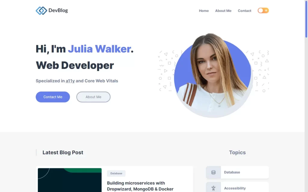
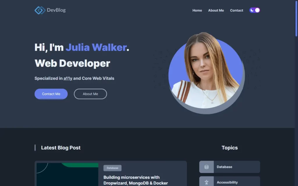
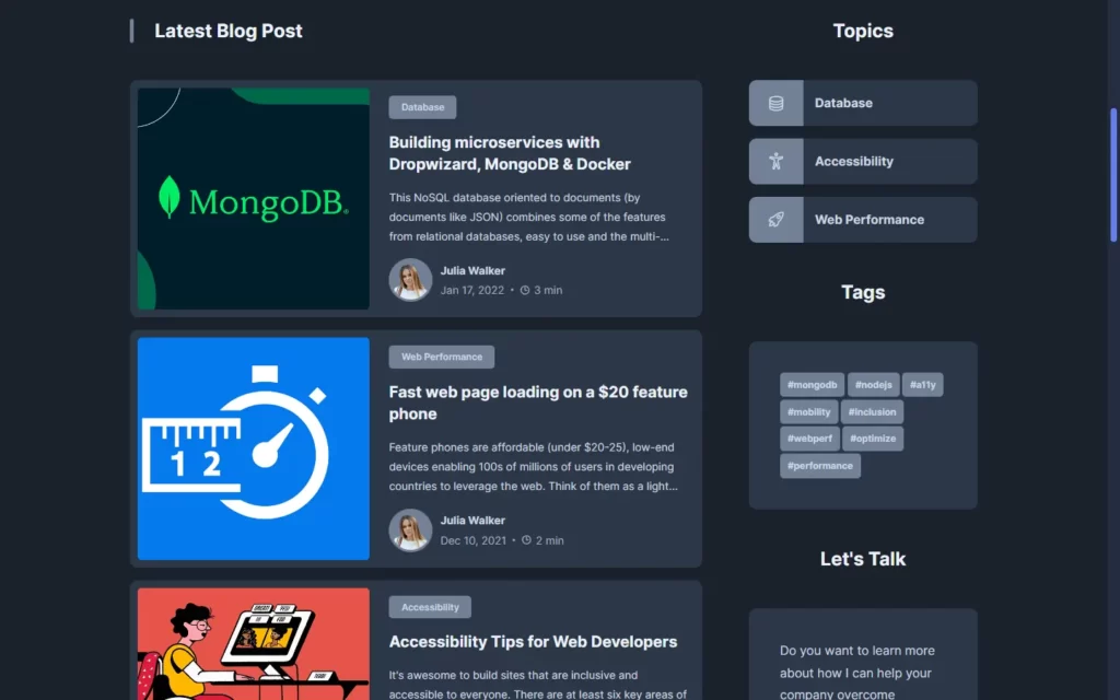
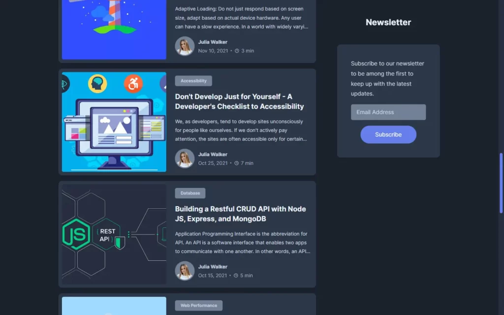
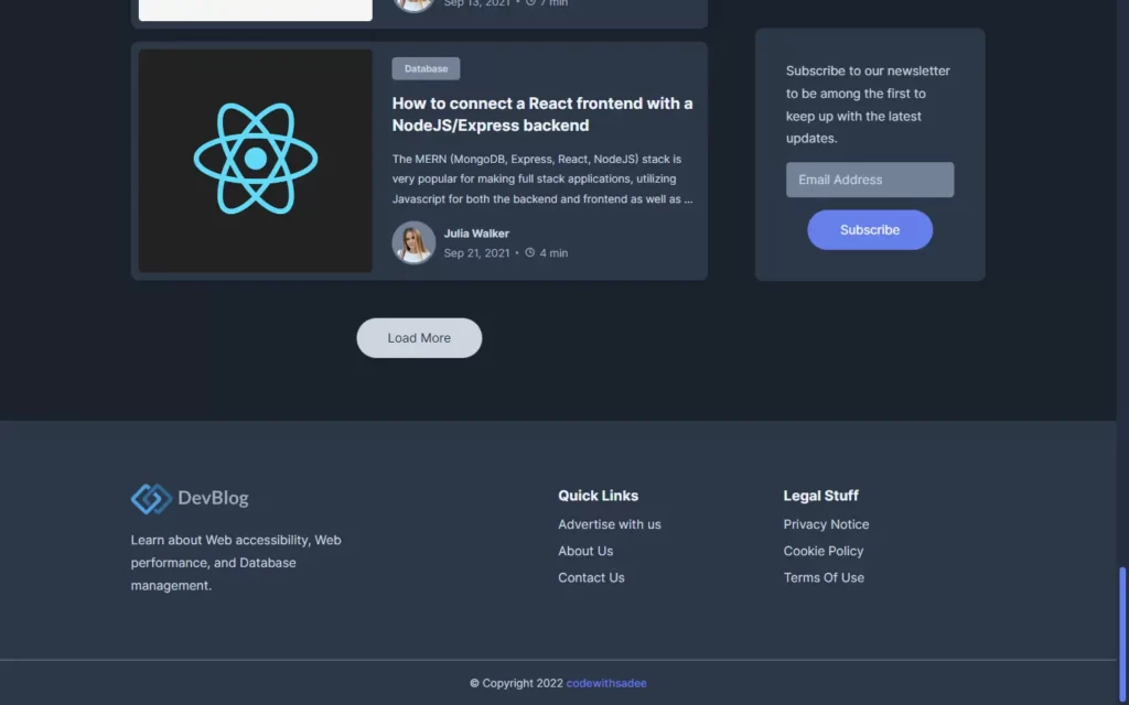
Checkout Video Reference Here:
You May Also Like:


