


What is CSS Flex-Layout?
CSS Flex-Layout, or CSS Flexbox, is a mechanism of layout designed to group all items in a single dimension or axis.
The FlexBox Layout Model may be a layout model designed for one-dimensional content. It excels at taking many things with completely different sizes and returning the simplest layout for those things.
This is the perfect layout model for this sidebar pattern. Flexbox not solely helps lay the sidebar and content out inline. However, wherever there is not enough house remaining, the sidebar can break into a brand-new line. Rather than setting rigid dimensions for the browser to follow, with a flexbox, you’ll instead offer versatile boundaries to hint at however the content may show.
A Flex Container(For Parent)
To use Flexbox, you need an element that will be the flex container. In your CSS, you use display: flex:
Each display value is described as a combination of an inner and outer display model. Display: Flex is what we mean when adding display: block flex. Our flex container’s outer display type is block. It acts as a block-level element in normal flow. The inner display type of our flex container is flexible. Items within the container will be able to participate in flex layout.
We can also define our container with a value of inline-flex, which is like using display: inline flex, i.e., a flex container that acts like an inline-level element, with children that participate in flex layout. The children of our inline flex container behave in the same way that children of our block flex container behave; the difference is how the container itself behaves in the overall layout.
flex-direction in CSS Flex Layout
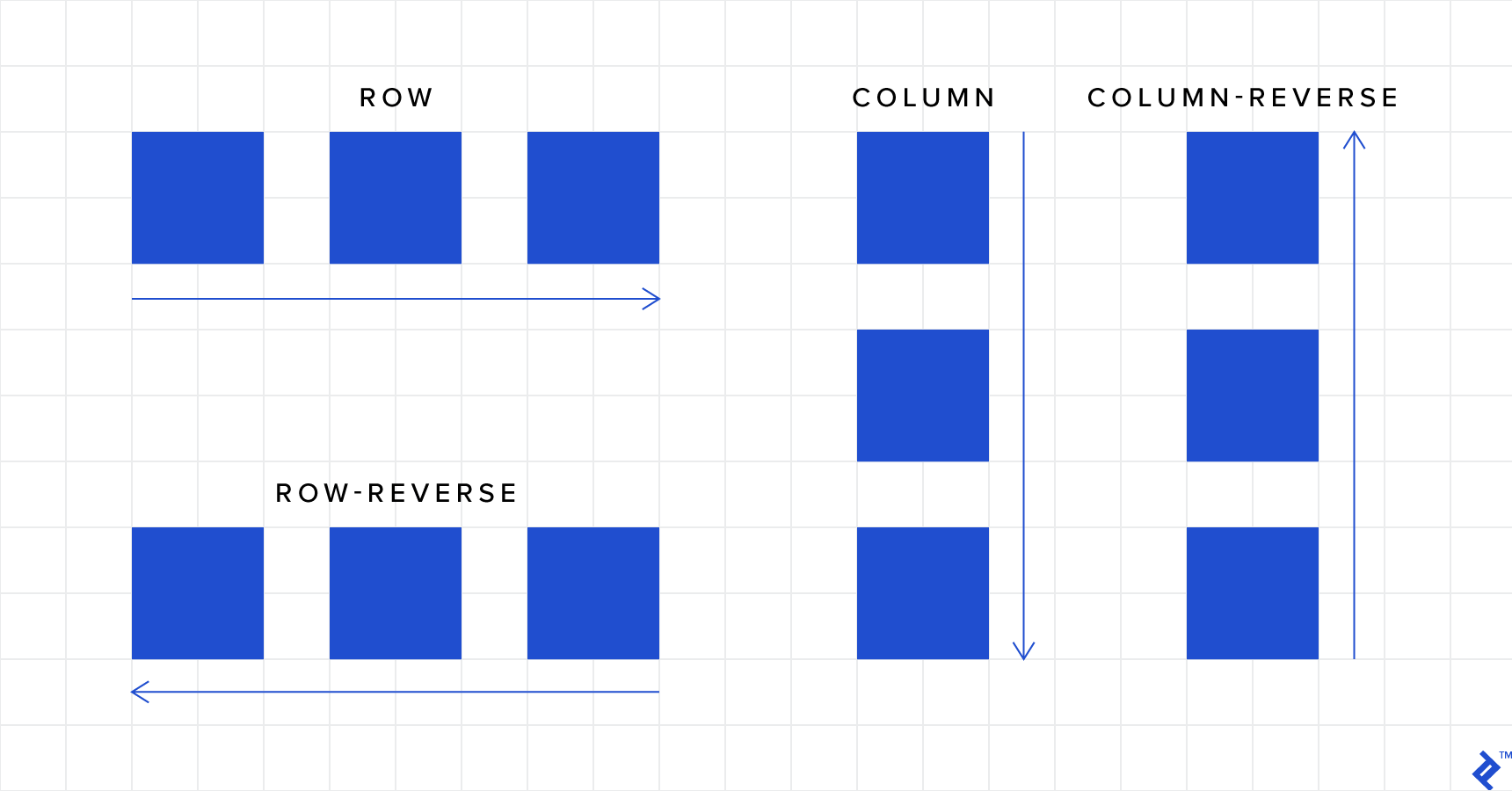
Some initial values will be used once we have defined the flex container. The flex items will display as a row without any additional properties. This is because the flex-direction property’s initial value is a row. You get a row if you don’t set it.
The flex-direction property is how we set the direction of the main axis. Other values for flex-direction are:
- row (default): left to right in LTR; right to left in RTL
- row-reverse: the right to left in LTR; left to right in RTL
- column: same as row but top to bottom
- column-reverse: same as row-reverse but bottom to top
Example:

flex-wrap in CSS Flex Layout
By default, flex items will all try to fit onto one line. You can change that and allow the items to wrap as needed with this property.
- nowrap (default): all flex items will be on one line
- wrap: flex items will wrap onto multiple lines, from top to bottom.
- wrap-reverse: flex items will wrap onto multiple lines from bottom to top.

flex-flow in CSS Flex Layout
This is a shorthand for the flex-direction and flex-wrap properties, defining the flex container’s main and cross axes. The default value is row nowrap.
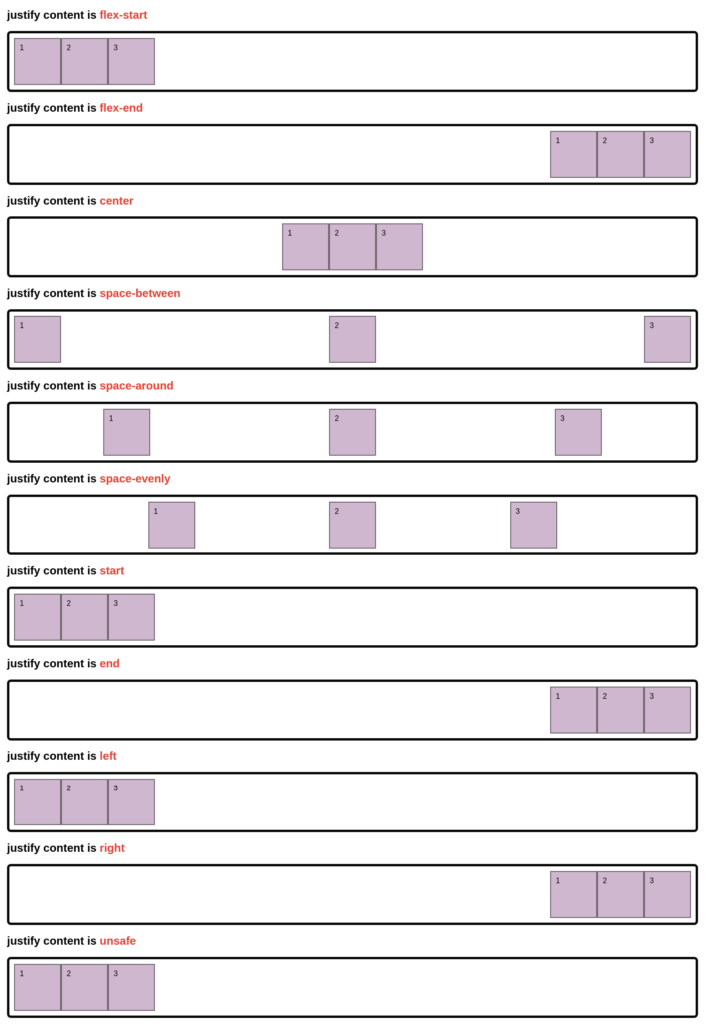
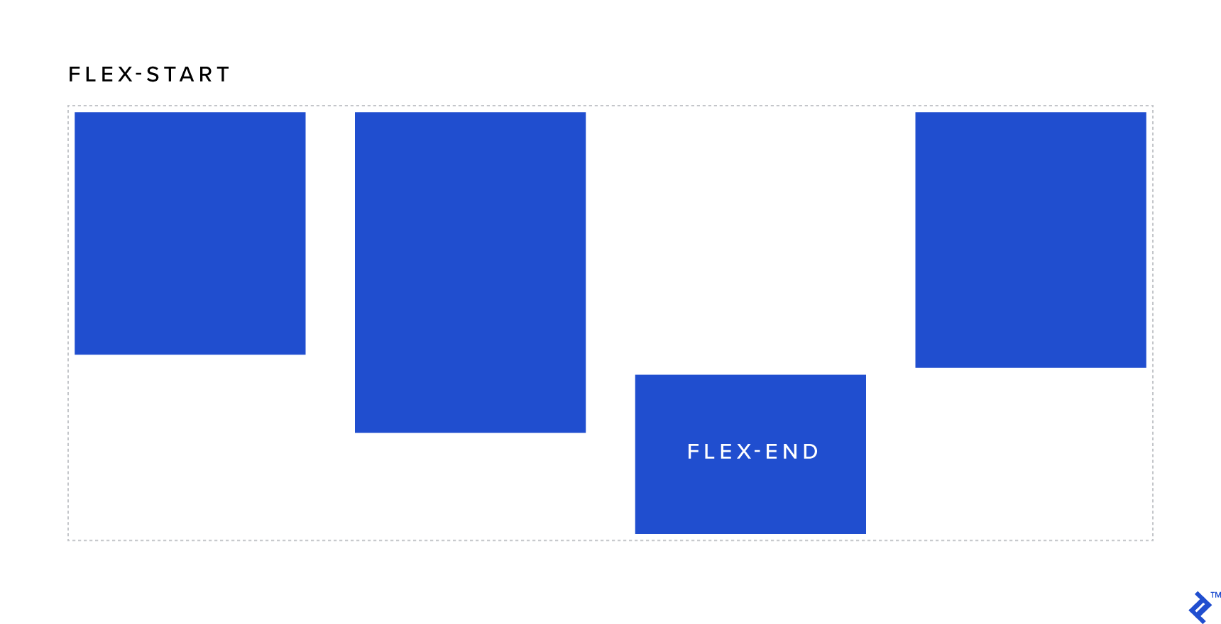
justify-content in CSS Flex Layout
This defines the alignment along the main axis. It helps distribute extra free space left over when all the flex items on a line are inflexible or flexible but have reached their maximum size. It also exerts some control over the alignment of items when they overflow the line.
- flex-start (default): items are packed toward the start of the flex-direction.
- flex-end: items are packed toward the end of the flex-direction.
- start: items are packed toward the start of the writing-mode direction.
- end: items are packed toward the end of the writing-mode direction.
- left: items are packed toward the left edge of the container unless that doesn’t make sense with the flex-direction, then it behaves like a start.
- right: items are packed toward the right edge of the container, unless that doesn’t make sense with the flex-direction, then it behaves like a start.
- center: items are centered along the line
- space-between: items are evenly distributed in the line; the first item is on the start line, the last item on the end line
- space-around: items are evenly distributed in line with equal space around them. Note that visually the spaces aren’t equal since all the items have equal space on both sides. The first item will have one unit of space against the container edge but two units of space between the next item because that next item has its own spacing that applies.
- space-evenly: items are distributed so that the spacing between any two items (and the space to the edges) is equal.
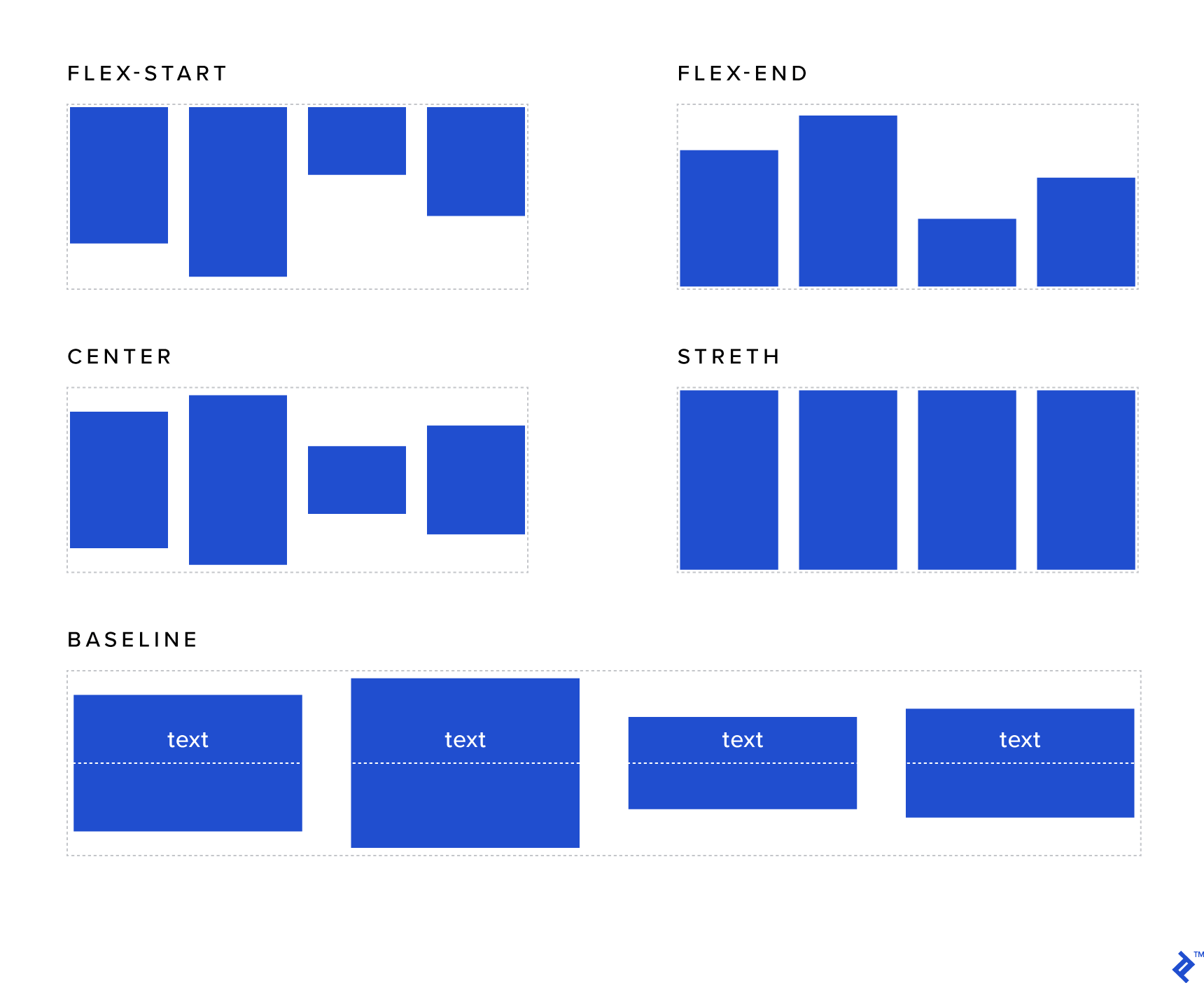
align-items in CSS Flex Layout
This defines the default behavior for how flex items are laid out along the cross axis on the current line. Think of it as the justify-content version for the cross-axis (perpendicular to the main axis).
- stretch (default): stretch to fill the container (still respect min-width/max-width)
- Flex-start / start / self-start: items are placed at the start of the cross axis. The difference between these is subtle and is about respecting the flex-direction rules or the writing-mode rules.
- flex-end / end / self-end: items are placed at the end of the cross axis. Again, the difference is subtle and is about respecting flex-direction rules vs. writing-mode rules.
- center: items are centered in the cross-axis
- baseline: items are aligned, such as their baselines align
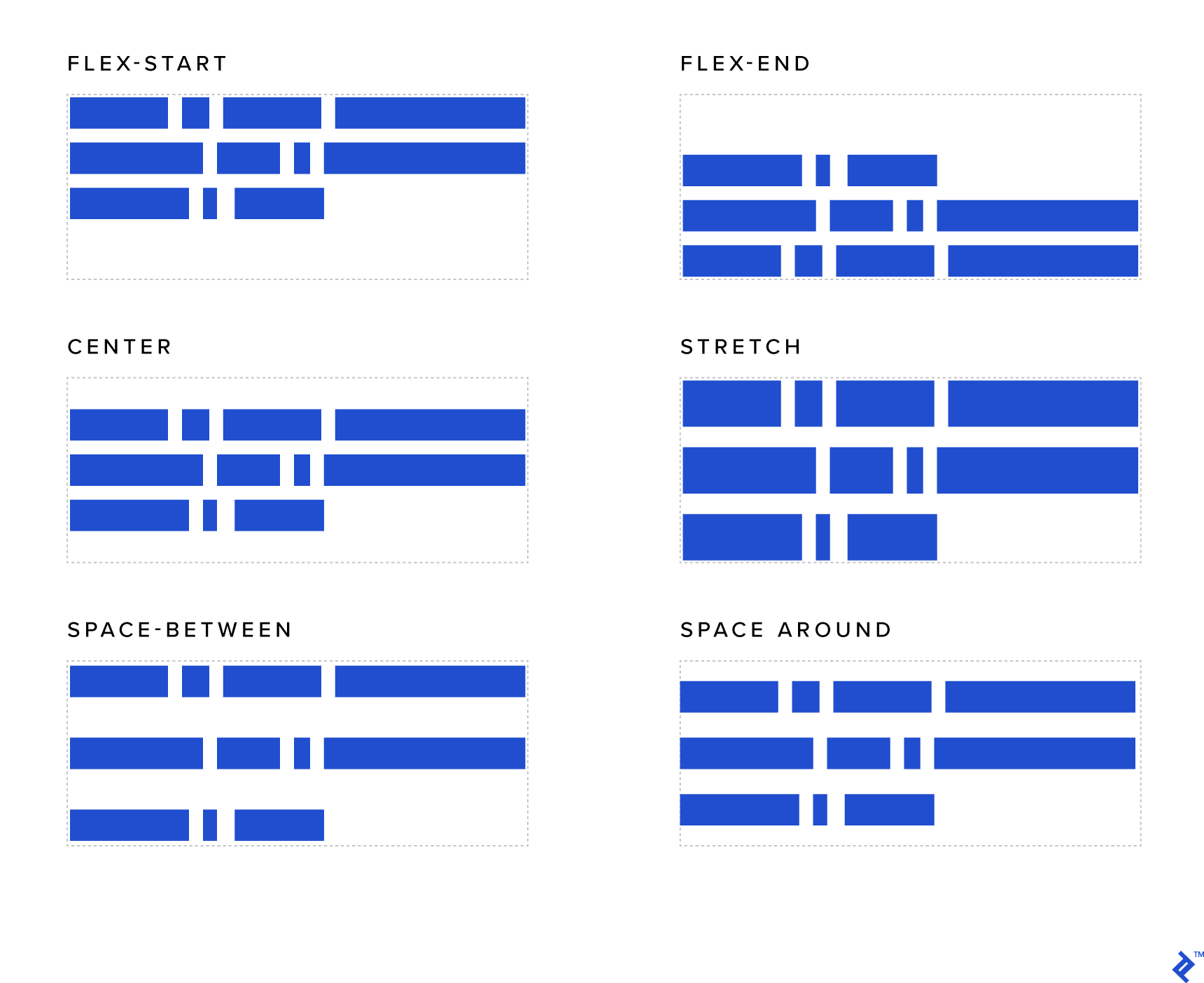
align-content
This aligns a flex container’s lines when extra space is in the cross-axis, similar to how justify-content aligns individual items within the main axis.
- Normal (default): items are packed in their default position as if no value was set.
- flex-start / start: items packed to the start of the container. The flex-start (more supported) honors the flex direction, while the start honors the writing-mode direction.
- flex-end / end: items packed to the end of the container. The (more support) flex-end honors the flex-direction while the end honors the writing-mode direction.
- center: items centered in the container
- space-between: items evenly distributed; the first line is at the start of the container while the last one is at the end
- space-around: items evenly distributed with equal space around each line
- space-evenly: items are evenly distributed with equal space around them
- stretch: lines stretch to take up the remaining space
Flex Items (For Child)
order
By default, flex items are laid out in the source order. However, the order property controls the order in which they appear in the flex container.
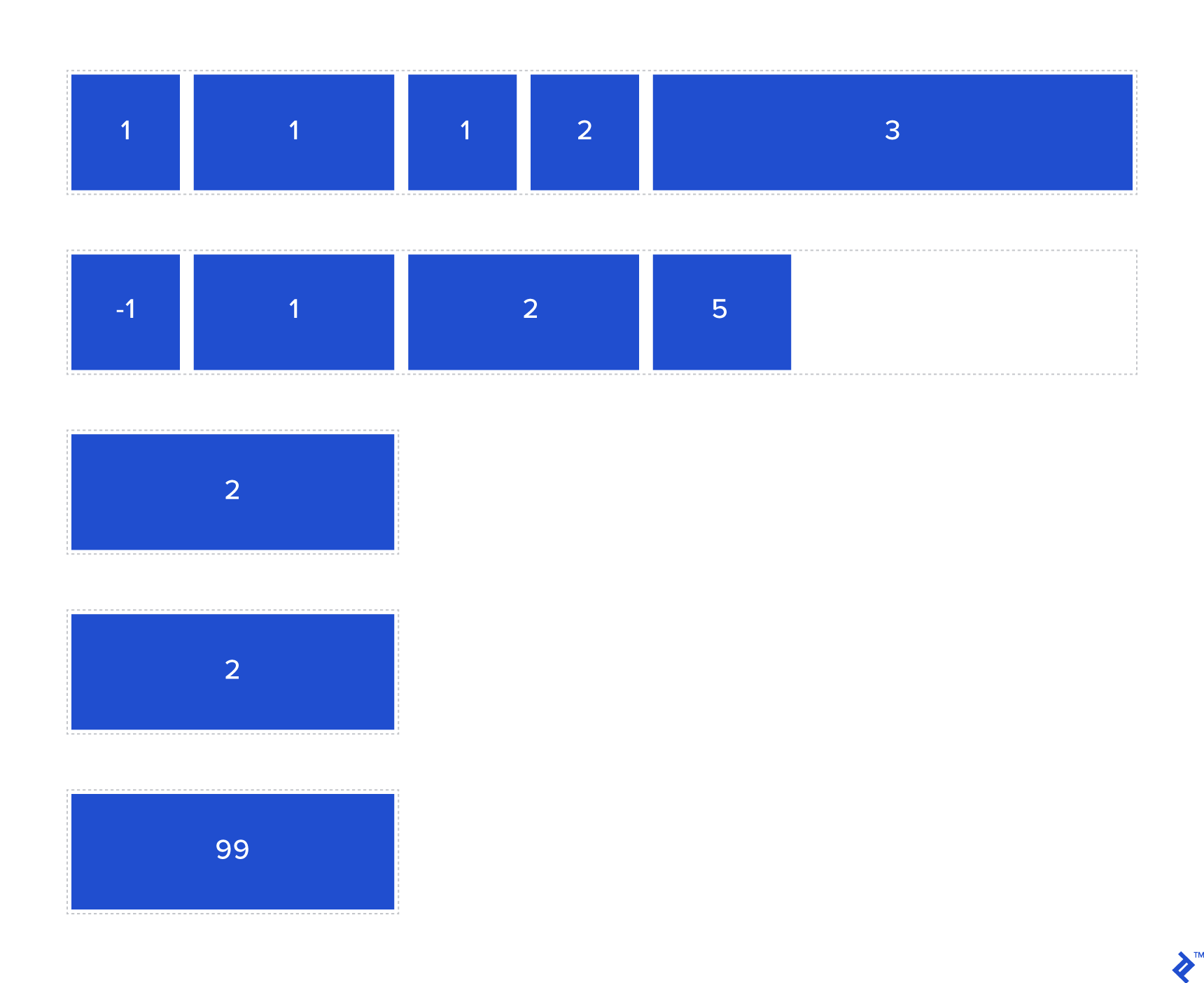
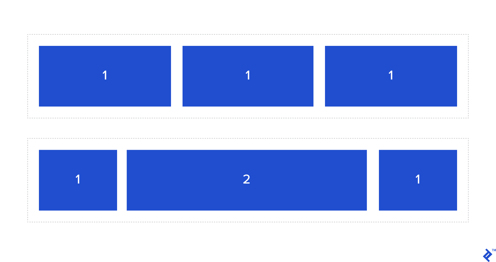
flex-grow
This defines the ability for a flex item to grow if necessary. It accepts a unitless value that serves as a proportion. It dictates what amount of the available space inside the flex container the item should take up.
If all items have flex-grow set to 1, the remaining space in the container will be distributed equally to all children. If one of the children has a value of 2, that child will take up twice as much of the space as either one (or it will try, at least).
flex-shrink
This defines the ability for a flex item to shrink if necessary.
flex-basis
This property is used to define the initial size of an element before available space is distributed, and elements are adjusted accordingly.
flex
This is the shorthand for flex-grow, flex-shrink and flex-basis combined. The second and third parameters (flex-shrink and flex-basis) are optional. The default is 0 1 auto, but if you set it with a single number value, like flex: 5;, that changes the flex-basis to 0%, so it’s like setting flex-grow: 5; flex-shrink: 1; flex-basis: 0%;.
align-self
This allows the default alignment (or the one specified by align-items) to be overridden for individual flex items.
Please see the align-items explanation to understand the available values.
If You want to learn more about CSS flexbox then watch this video


With havin so much content and articles do you ever run into any issues of plagorism or copyright violation? My website has a lot of completely unique content I’ve either written myself or outsourced but it seems a lot of it is popping it up all over the internet without my authorization. Do you know any solutions to help stop content from being ripped off? I’d genuinely appreciate it.