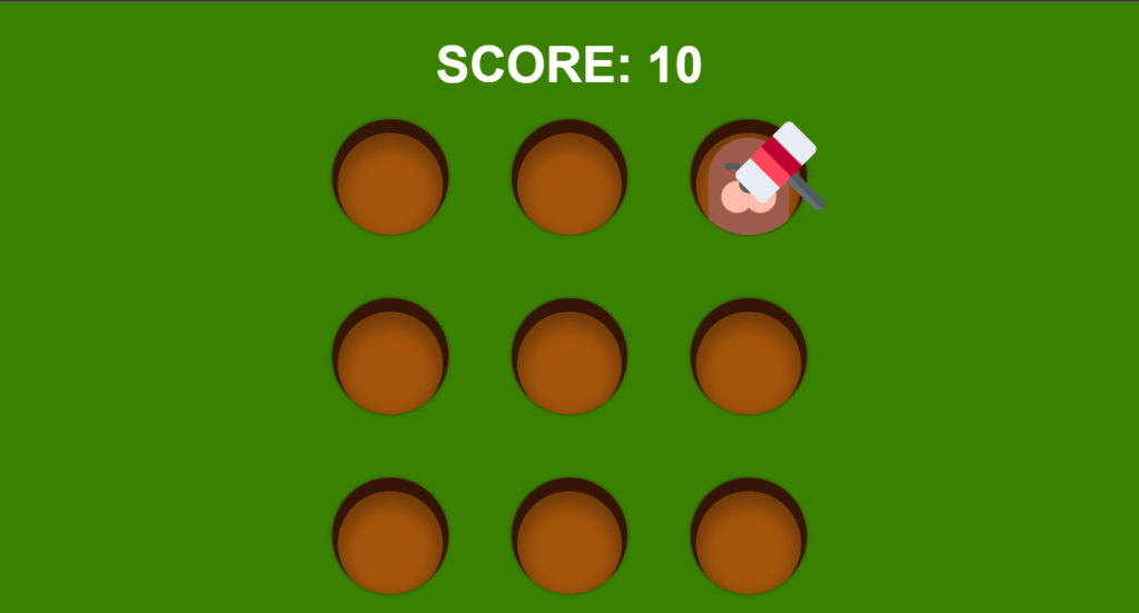
in this article, we’ll see how to create a whack-a-mole game using HTML CSS & JavaScript, so this is a very simple game we have a hammer that follows our mouse, so you can use your mouse to control this hammer and all you have to do is take your hammer above them all and click on it to smash the mole and as you smash the mole your score will increase and the mole will come from random hole, so this is the game this is a fun and simple game.
Pre-requisites To Build Whack-A-Mole Game Using HTML CSS & JavaScript
- A good knowledge of HTML.
- Knowledge of CSS and CSS3.
- Good knowledge of JavaScript.
Setting Up Default Values
*{
    margin: 0;
    padding: 0;
}
html, body{
    height: 100%;
}
body{
    font-family: Arial, Helvetica, sans-serif;
    background-color: rgb(58, 129, 0);
    color: #fff;
}
Let’s go to our style sheet, first let’s target everything we’re going to say margin 0 and padding to also 0, so now we have removed the white space, now let’s target our HTML and our body let’s just say both of them will have a height of 100%, the body can have a font-family to Arial and this will have a green background, and the color will be white.

Creating Scorecard To Count
<h1 class="score">SCORE: <span>00</span></h1>
body{
    font-family: Arial, Helvetica, sans-serif;
    background-color: rgb(58, 129, 0);
    color: #fff;
    display: flex;
    flex-direction: column;
    justify-content: center;
    align-items: center;

}
.score{
    font-size: 4em;
    margin-bottom: .5em;
}
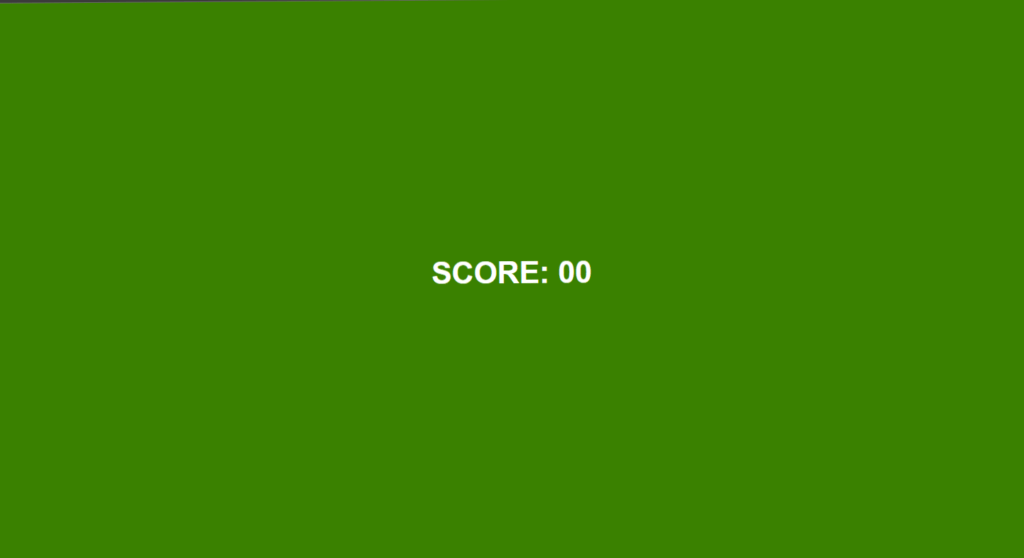
Now here we are going to have a h1 with a class of score here we are going to say score, and then we are going to have a span tank so span inside the span we are going to show the actual score by default it will be 00, let’s see our body will have a display of flex, so we can say display flex, then after we are also going to say flex direction, so flex direction will be column after that we are going to justify content to center and align item to center, now let’s target our h1, it will have a font size of 4rem, and we will provide margin from bottom of 0.5rem.
Setting Up Board For Holes
.board{
    height: 600px;
    width: 600px;
    display: grid;
		border: 1px solid red;
    grid-template-columns: repeat(3, 1fr);
    grid-template-rows: repeat(3, 1fr);
    gap: 80px;
}
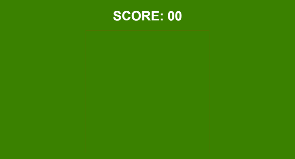
Now let’s check out our board, let’s say our board will have a height of 600 pixels and a width of 600 pixels, let’s say border equals to one pixel solid red, and let’s say our board will have a display will grid, and we’re going to say grid-template-columns we’re going to repeat 3 times because we want a 3×3 grid and 1fr, so each of them should have same amount of width we are going to do the same for our rows so grid-template-rows to repeat 3 with 1fr.
Setting Up Holes On Board
<div class="board">
        <div class="hole"></div>
        <div class="hole"></div>
        <div class="hole"></div>
        <div class="hole"></div>
        <div class="hole"></div>
        <div class="hole"></div>
        <div class="hole"></div>
        <div class="hole"></div>
        <div class="hole"></div>
    </div>
.hole{
    background-color: rgb(165, 85, 11);
    border-radius: 50%;
    box-shadow: inset 0 10px 0 7px rgb(53, 21, 6),
                inset 0 20px 20px 15px rgba(0, 0, 0, .3),
                0 0 5px rgba(0, 0, 0, .5);
    position: relative;
    overflow: hidden;
}
Now inside the board, we are going to have the holes from which our mole will appear, so we are going to create a div for each of the hole, we can copy this eight more times, so now we have nine div.
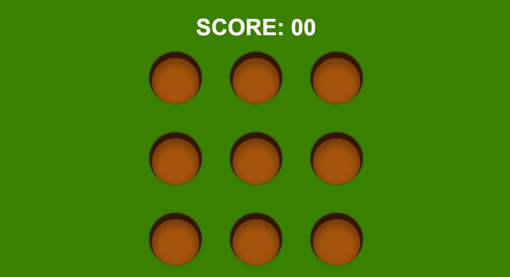
Let’s target our hole, now let’s just say background color so background color of red, let’s remove the border from board class, for background color we can again copy it, now we want holes to be circular shape.
So let’s say border radius of 50%, we’re going to use box shadow, since we want our box shadow to be inside our hole we are going to say insert to make the shadow be inside let’s say the offset x will be 0 the offset y can be let’s say 10 pixels, and the blur will be 0 pixels, but the spread will be 7 pixels and for the background color we can say rgb it will be 53 21 and 6.
we can also add multi layer shadow, then add another layer of shadow we are going to say insert and this time it will be 0 pixels from the x-axis again 20 pixels from the y-axis 20 pixels for the blur 15 pixel spread so 15 pixels for the spread and the color will be rgba 0 0 0 and for the opacity we’re going to say 0.3.
and finally we can add the outer shadow we can say this time it won’t be inset because we want the shadow to be outside we can say 0 0 and 5 pixels, so the shadow will be everywhere and again rgba 0 0 0 for the opacity this time let’s say 0.5.
Setting Up Hammer On Cursor
.cursor{
    height: 110px;
    width: 100px;
    position: absolute;
    top: 100px;
    left: 100px;
    background-image: url('assets/hammer.png');
    background-size: 100% 100%;
    transform: translate(-20%, -20%);
    transition: transform .1s;
    pointer-events: none;
}
.cursor.active{
    transform: translate(-20%, -20%) rotate(-45deg);
}
const cursor = document.querySelector('.cursor')

window.addEventListener('mousemove', e => {
    cursor.style.top = e.pageY + 'px'
    cursor.style.left = e.pageX + 'px'
})
window.addEventListener('mousedown', () => {
    cursor.classList.add('active')
})
window.addEventListener('mouseup', () => {
    cursor.classList.remove('active')
})
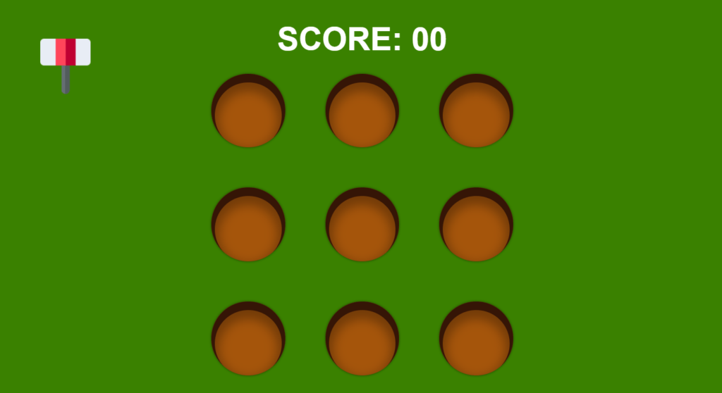
Now we want to create the cursor with hammer, let’s say the height of our cursor will be 110 pixels the width will be 100 pixels, so width will be 100 pixels and the position will be absolute, top to something like 100 pixels, left 100 pixels also we want to use the image, we’re going to say background image will be url it will be assets/hammer.png, we are also going to say background size be 100% 100%.
Let’s see how we can bring hammer on pointer in our JavaScript first we are going to say const cursor = querySelector(cursor), then we’re going to say window.addEventListener, we’re going to listen for the mouse move event when we move our mouse this function will be executed.
so here we’re simply going to use cursor,style.top = e.pageY. e dot page y will give us the position of y-axis of our mouse, and we can do the same for our x, so we are going to use cursor.style.left, we can also say our cursor will have some transform = translate so translate let’s just say -20% and -20%, so now our hammer is actually this should be negative.
so our hammer is always below the cursor, hammer will also have a transition will transform, and the duration can be 0.1 second, and here when our cursor has a class of active let just copy this transform will also have rotate, so we’re going to say rotate of -45 degree.
so we’re going to use event listener this time we’re going to listen for the mouse down event, but even if we release our button from the mouse this stays the same we don’t want that, so let’s add another event listener, we are simply going to remove the class.
Adding Mole To The Hole
.hole .mole{
    width: 70%;
    position: absolute;
    left: 50%;
    transform: translateX(-50%);
    bottom: 0;
    animation: rise .3s ease-out;
}
@keyframes rise {
    0%{
        transform: translateX(-50%) translateY(100%);
    }
    100%{
        transform: translateX(-50%) translateY(0);
    }
}
const holes = [...document.querySelectorAll('.hole')]
const scoreEl = document.querySelector('.score span')
let score = 0

const sound = new Audio("assets/smash.mp3")

function run(){
    const i = Math.floor(Math.random() * holes.length)
    const hole = holes[i]
    let timer = null

    const img = document.createElement('img')
    img.classList.add('mole')
    img.src = 'assets/mole.png'

    img.addEventListener('click', () => {
        score += 10
        sound.play()
        scoreEl.textContent = score
        img.src = 'assets/mole-whacked.png'
        clearTimeout(timer)
        setTimeout(() => {
            hole.removeChild(img)
            run()
        }, 500)
    })

    hole.appendChild(img)

    timer = setTimeout(() => {
        hole.removeChild(img)
        run()
    }, 1500)
}
run()
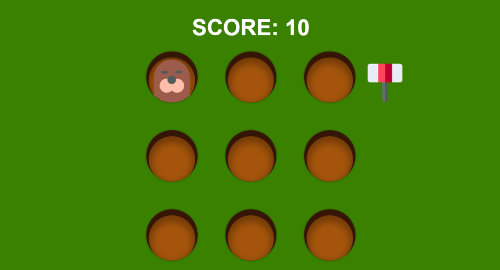
Now we want to do is randomly show this mole, let’s target our mole let’s say our mole will have a width of 70% also position will be absolute, and left to 50% and then transform to translate X so translate x to -50%, now bottom it will be 0 pixels, the mole will also have animation so animation the name of the animation can be let’s say rise, so it will rise from the bottom let’s say the duration will be 0.3 second, and ease in out.
next we’re going to add keyframe we called it rise at 0% transform equals to translate X -50%, we are going to also have a translateY so at 0% the translateY will be -100 let me just copy this and say at 100 it will be 0.
In JavaScript, here we’re going to say const holes = document.queryselectorall (hole), now we will create a function called run which will run the game, so function run now we know that the mole should come from a random hole, so we are going to say math.floor math.random and host. Length will be 9.
now we can set const hole = holes [i], then we had the image here, but now we want to create the image manually, so we are going to set const img = document.createElement image we are going to add a class list, so we are going to say image dot class list dot add, and our image will have a class of mole, and then we are also going to say image dot source equals to it will be assets forward slash mold.png, and we have to add this image to our hole, so we can say hold dot append child image.
hen it is clicked we’re going to run this function, next we will add an event listener which listens our click, in that case we will increase the score by 10, and whenever click hits on mole we just need to show whacked mole image to do that we will simply add an image called whacked-mole.png, after that we will play a sound on hit as well. after that we need to put timeout something like 500 and remove the mole from that hole.
Full Source Code Of Whack-A-Mole Game Using HTML CSS & JavaScript
index.html
<!DOCTYPE html>
<html lang="en">
<head>
    <meta charset="UTF-8">
    <meta http-equiv="X-UA-Compatible" content="IE=edge">
    <meta name="viewport" content="width=device-width, initial-scale=1.0">
    <link rel="stylesheet" href="style.css">
    <title>Document</title>
</head>
<body>
    <h1 class="score">SCORE: <span>00</span></h1>
    <div class="board">
        <div class="hole"></div>
        <div class="hole"></div>
        <div class="hole"></div>
        <div class="hole"></div>
        <div class="hole"></div>
        <div class="hole"></div>
        <div class="hole"></div>
        <div class="hole"></div>
        <div class="hole"></div>
    </div>
    <div class="cursor"></div>

    <script src="main.js"></script>
</body>
</html>
style.css
*{
    margin: 0;
    padding: 0;
}
html, body{
    height: 100%;
}
body{
    font-family: Arial, Helvetica, sans-serif;
    background-color: rgb(58, 129, 0);
    color: #fff;
    display: flex;
    flex-direction: column;
    justify-content: center;
    align-items: center;
    overflow: hidden;
}
.score{
    font-size: 4em;
    margin-bottom: .5em;
}
.board{
    height: 600px;
    width: 600px;
    display: grid;
    grid-template-columns: repeat(3, 1fr);
    grid-template-rows: repeat(3, 1fr);
    gap: 80px;
}
.hole{
    background-color: rgb(165, 85, 11);
    border-radius: 50%;
    box-shadow: inset 0 10px 0 7px rgb(53, 21, 6),
                inset 0 20px 20px 15px rgba(0, 0, 0, .3),
                0 0 5px rgba(0, 0, 0, .5);
    position: relative;
    overflow: hidden;
}
.hole .mole{
    width: 70%;
    position: absolute;
    left: 50%;
    transform: translateX(-50%);
    bottom: 0;
    animation: rise .3s ease-out;
}
@keyframes rise {
    0%{
        transform: translateX(-50%) translateY(100%);
    }
    100%{
        transform: translateX(-50%) translateY(0);
    }
}

.cursor{
    height: 110px;
    width: 100px;
    position: absolute;
    top: 100px;
    left: 100px;
    background-image: url('assets/hammer.png');
    background-size: 100% 100%;
    transform: translate(-20%, -20%);
    transition: transform .1s;
    pointer-events: none;
}
.cursor.active{
    transform: translate(-20%, -20%) rotate(-45deg);
}
main.js
const cursor = document.querySelector('.cursor')
const holes = [...document.querySelectorAll('.hole')]
const scoreEl = document.querySelector('.score span')
let score = 0

const sound = new Audio("assets/smash.mp3")

function run(){
    const i = Math.floor(Math.random() * holes.length)
    const hole = holes[i]
    let timer = null

    const img = document.createElement('img')
    img.classList.add('mole')
    img.src = 'assets/mole.png'

    img.addEventListener('click', () => {
        score += 10
        sound.play()
        scoreEl.textContent = score
        img.src = 'assets/mole-whacked.png'
        clearTimeout(timer)
        setTimeout(() => {
            hole.removeChild(img)
            run()
        }, 500)
    })

    hole.appendChild(img)

    timer = setTimeout(() => {
        hole.removeChild(img)
        run()
    }, 1500)
}
run()

window.addEventListener('mousemove', e => {
    cursor.style.top = e.pageY + 'px'
    cursor.style.left = e.pageX + 'px'
})
window.addEventListener('mousedown', () => {
    cursor.classList.add('active')
})
window.addEventListener('mouseup', () => {
    cursor.classList.remove('active')
})
Output
